HEX rebrands Composio and rethinks developer brand design
HEX built Composio an identity out of saturated light beams and ABC Diatype, and made a case against the dark-mode monospace look every dev tool wears.
HEX published its rebrand for Composio on 25 August, and the studio used it to name something that has been true of developer brand design for years: it all looks alike. Dark background, monospace type, terminal-green accent, faint grid behind everything.
"When someone says 'developer-friendly brand,' what comes to mind?" asks Ayush Soni, founder and creative director at HEX. "This visual language borrows from the tools developers already use, which sounds like a reasonable instinct until you realise it produces the same brand for every company in the space. The result is not developer-friendly; rather, it is developer-familiar."
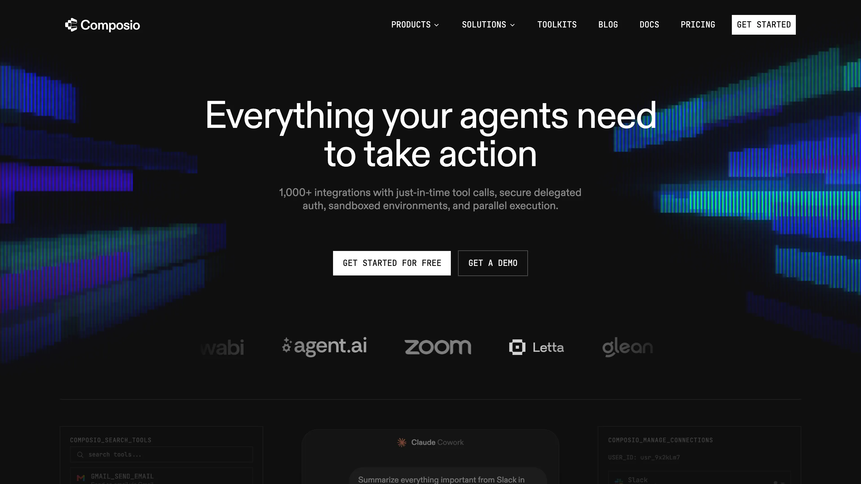
Composio sells the plumbing under AI agents: delegated authentication, sandboxed execution, and tool calls across more than 1,000 apps. Zoom, Glean, HubSpot, Letta and agent.ai run along the logo strip on the homepage. HEX's scope covered strategy, art direction, the visual system, graphic design and motion, built on a logomark from an earlier refresh.
Electricity, meant literally
The system runs on beams of saturated light. Blue and green striations cut across the black hero at an angle and blow out where they overlap. They read as energy fields, which is the point. "The electricity was the most technically accurate way to represent what Composio truly offers, and we doubled down on this," Soni says. "One quick look at the system and you should be able to feel the power."
Where the current gets contained
Composio sells to enterprise infrastructure buyers, so the energy had to stop somewhere. HEX held the saturation and changed the geometry instead: isometric patterns, gridlines and 2.5D visualisations do the calming. "Reducing saturation or simplifying the visual system were never the right way to approach this," Soni says. "By doing so, you are killing the energy of the brand."
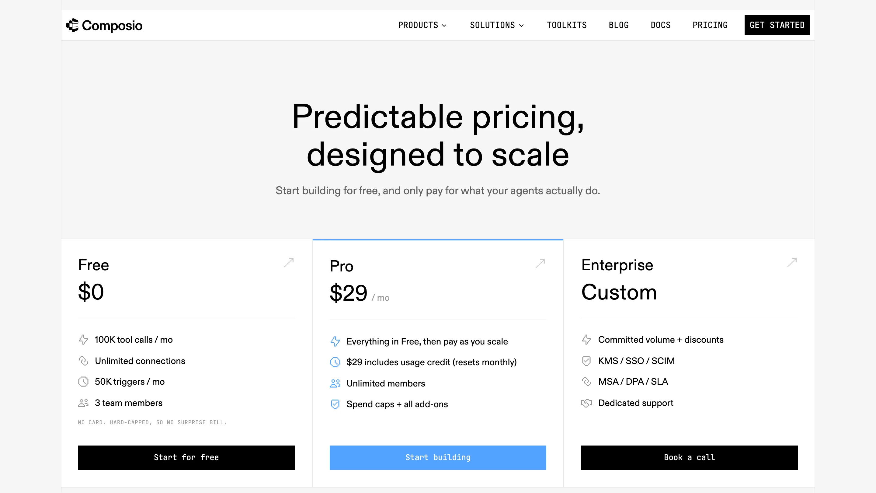
You can see the split on the pricing page, which drops to near-white with one blue accent on the Pro tier. Free, $29 a month, custom. The beams stay on the pages that have to grab you, and the page where someone decides to spend money gets out of the way.
The typeface choice carries the argument
HEX set the brand in ABC Diatype from Dinamo and pushed JetBrains Mono down to tags, button labels, diagram callouts and small product moments. That is the category default turned around. Monospace usually carries the headlines in this space, and here it plays the supporting voice. "It brings a compact structure to our visuals without drowning the system in an overly 'technical aesthetic,'" Soni says.
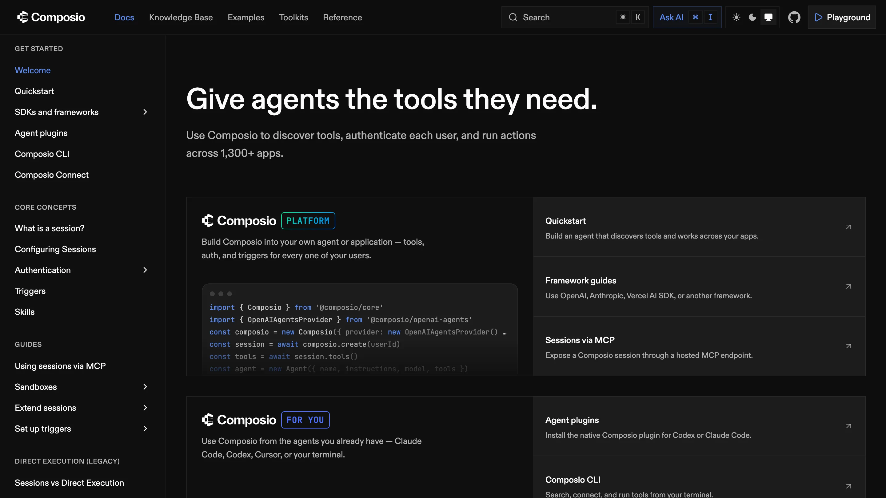
The docs site shows the split holding up under pressure. "Give agents the tools they need" sits in Diatype at display size, the sidebar navigation stays quiet, and the mono appears only in code blocks and the small PLATFORM and FOR YOU tags beside the mark.
Diagrams as brand material
The technical artwork came out of Composio's own documentation. Soni describes going back and forth with the client's engineers, "distilling complex diagrams and Excel sheets into easy visuals". His rule for that work is worth borrowing: pick one or two value props and draw those properly, instead of explaining a whole process "with the rigour of an academic textbook".
Composio is also moving its story from connecting agents to tools toward a "learning layer", agents that build skills as they run. HEX answered with modular icons that gain nodes as the idea gets bigger, so the drawing can grow with the pitch.
What it means for developer brand design
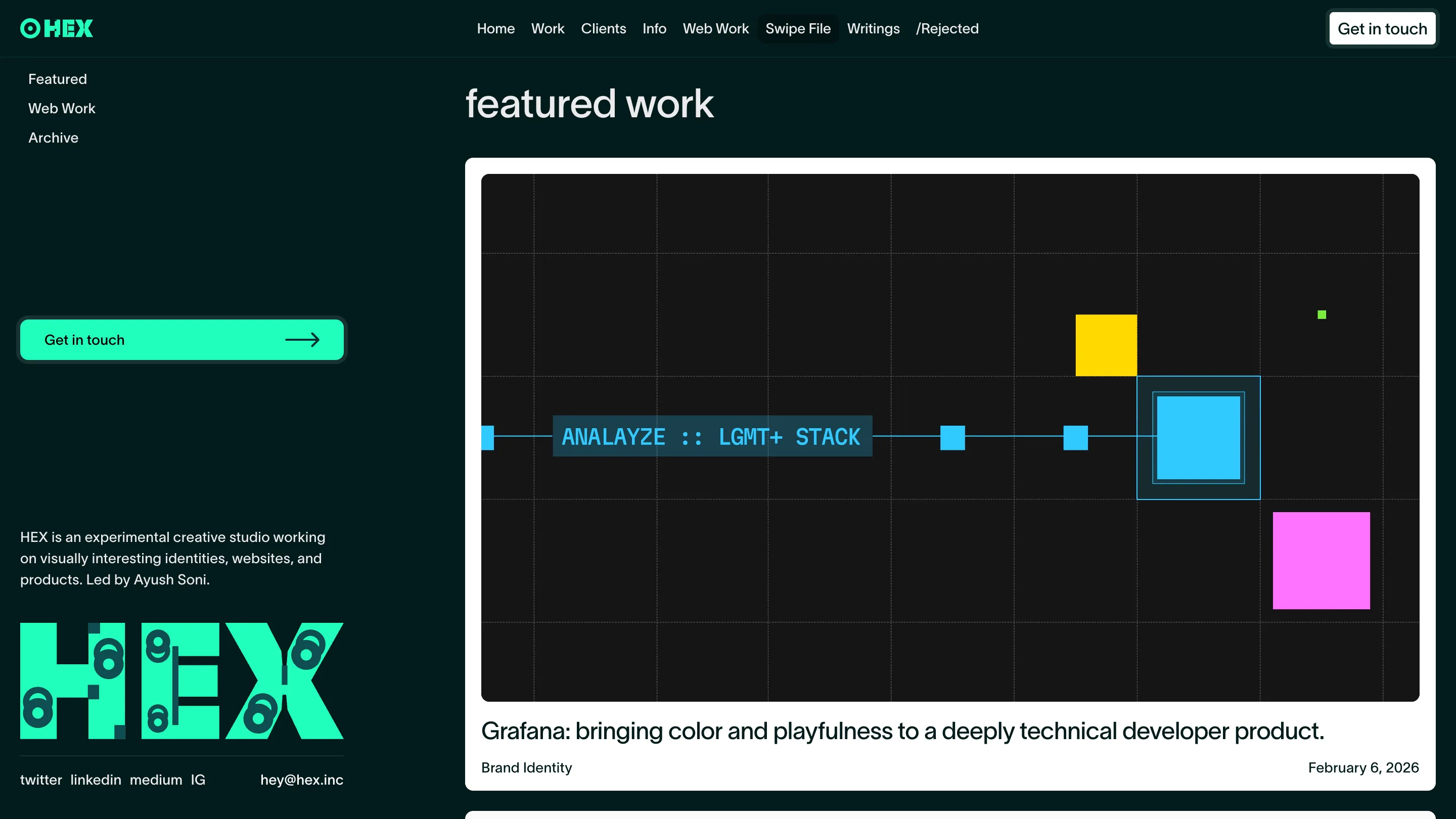
HEX has form here. Its featured work opens with Grafana, another deeply technical developer product it gave colour and play, and the client list runs through Replit, Square and Enterpret. A studio working almost entirely in tech has more to lose by breaking the category codes than an outsider does, which makes the position it is taking worth watching.
The test is whether the next AI infrastructure company that briefs a rebrand asks for beams. If it does, the default just moved.