

/zeroz runs a whole brand site on one green and one slash
Otsuka's /zeroz launch site sets every page in one green and turns the slash from its logo into the mark that opens each page title.
SHIFTBRAIN built Otsuka's new brand site on two decisions and then refused to add a third. One green. One slash. Everything on the /zeroz site follows from those two, and it took awwwards Site of the Day on 24 August 2026 with a 7.41.
/zeroz is a supplement from Otsuka Pharmaceutical, sold in Japan as a self-conditioning food. The site never puts the word supplement in its display type. It shows a green room, a pouch, and a tablet.
The hero is a room
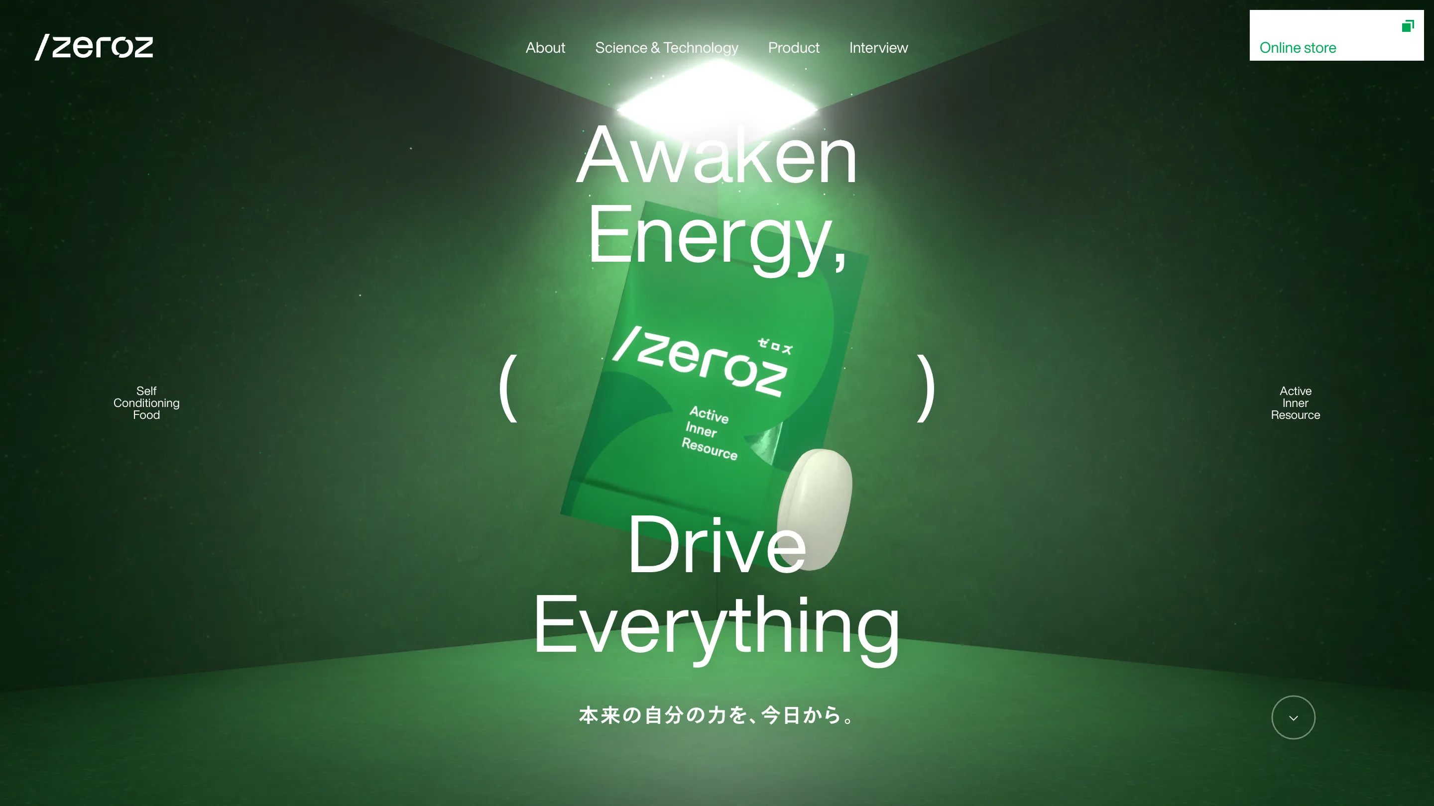
The home page opens inside a dark green box. You can see the corner where two walls meet, a single hard light overhead, dust in the beam, grain on the plaster. The pouch hangs in the middle at a tilt, a white tablet drifting off its bottom edge. Three.js and Blender are credited on the awwwards entry, and the render is doing set photography rather than product render.
The type sits on top in two blocks. "Awaken Energy," above the pack, "Drive Everything" below it, both in a light grotesque at a size that would look reckless on a busier page. Two thin parentheses float left and right of the pack at the same height, with "Self Conditioning Food" and "Active Inner Resource" set small outside them. The parentheses do a caption's job without a caption's weight.
Every page title starts with the logo
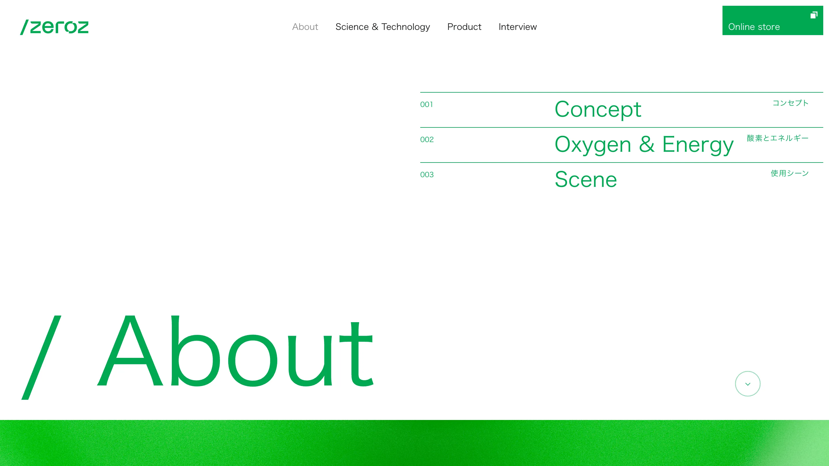
The mark is /zeroz. The slash is most of the identity, so SHIFTBRAIN spends it everywhere. Each interior page opens with its own name at the bottom left, set enormous, prefixed by that same slash: / About, / Science & Technology, / Product. It works as a page title and a logo lockup at once.
Top right, on the same first screen, sits the page's own index. Three rules, three rows, 001 Concept, 002 Oxygen & Energy, 003 Scene, with the English in the middle of the rule and the Japanese right-aligned at the end of it. You know the shape of the page before you scroll it. Product runs to five rows and looks identical.
One green across the whole brand site
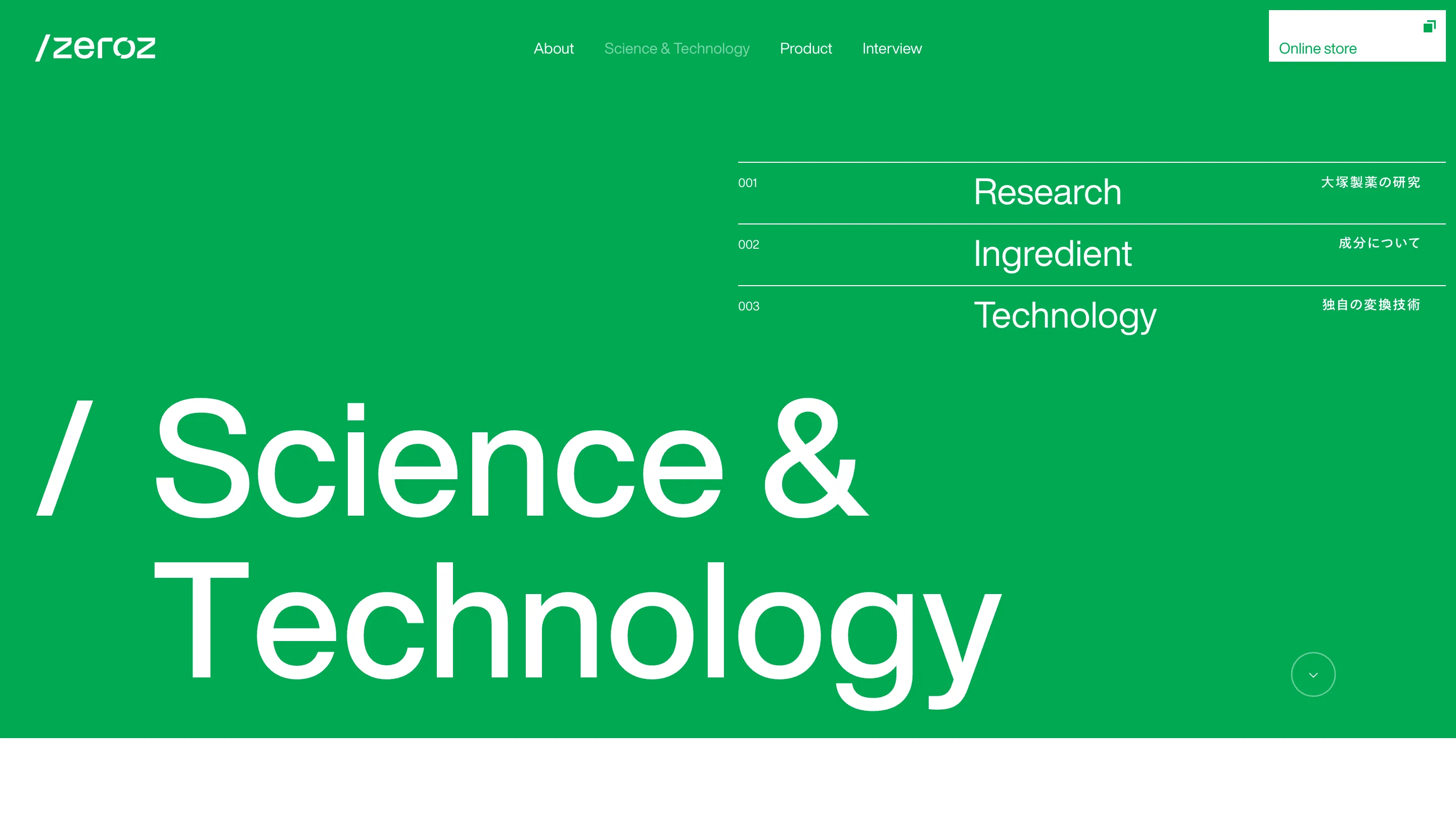
About sets green type on white. Science & Technology sets white type on green. Same grid, same header, palette inverted, and that flip is the only cue that you have changed section.
The green never shifts value either. There is one, close to Otsuka's own, and it carries the hero lighting, the store button, the hairlines under the index, and the page names. Everything else is white, black text at body size, and photography.
The Science & Technology page holds the actual pharma content, a plant compound called kaempferol, and files it in the same three rows as everything else: 001 Research, 002 Ingredient, 003 Technology.
What a judge is rating here
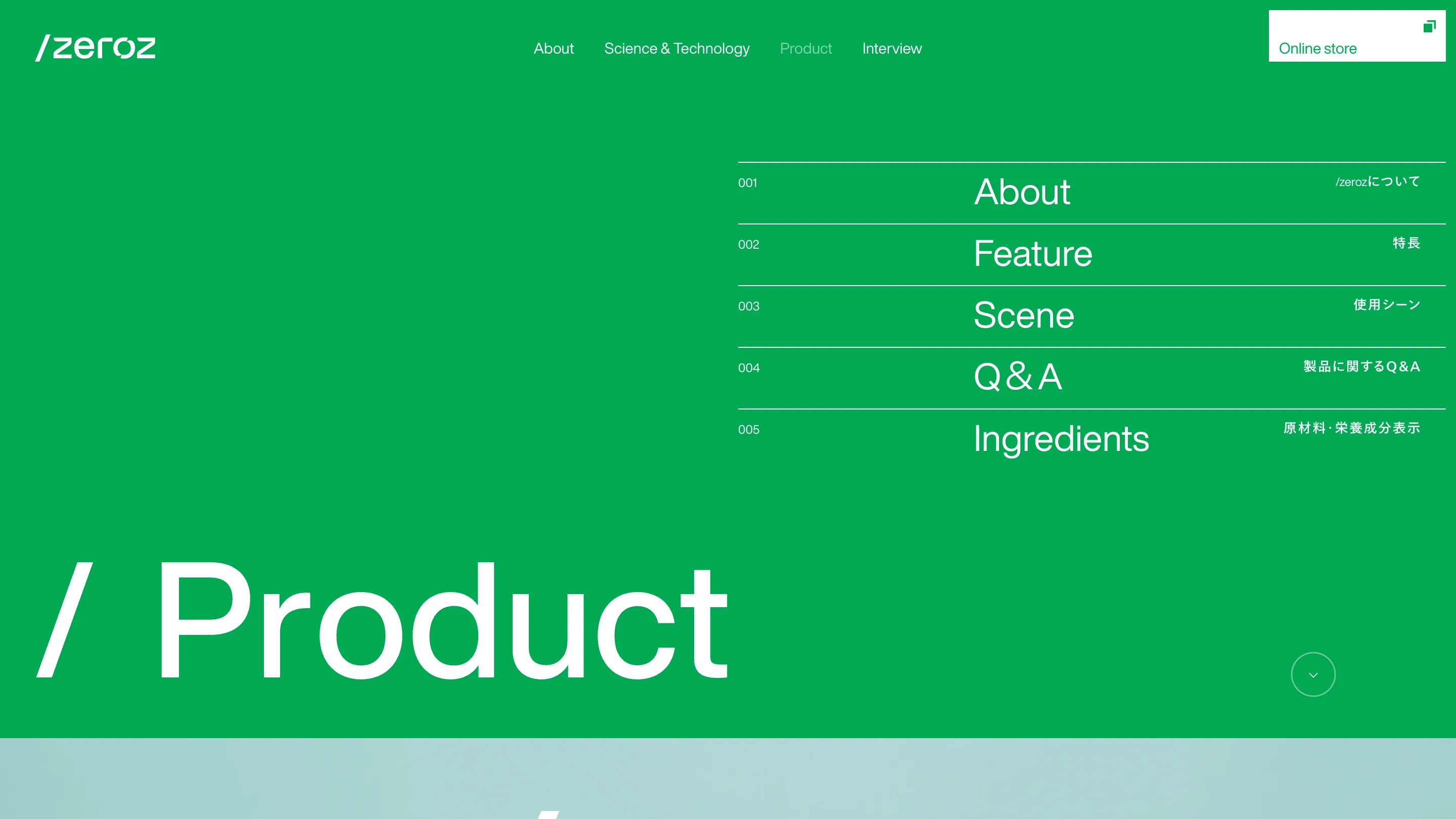
Consistency at this level is a production decision as much as a design one. Because five templates share one header, the interview section reads as part of the same document as the ingredient page. That section runs 11 features across two volumes, with a mountain athlete, two free divers, a Go player, a work-life balance consultant and the head of a sauna department, and none of them break the frame.
SHIFTBRAIN put the whole effects budget in one place, the room at the top, then left the other four pages alone. That is why the type holds at that size, page after page. It is also why the thing still reads as a pharmaceutical company's site, which is the harder half of the job.

