LPAS turns its acronym into a four-step process
Studio Naam's site for LPAS opens on four words that spell the firm's name, then runs an architecture practice like a calm, colour-coded index.

LPAS is a set of initials, and the site makes them mean something before you see a single building. The first screen is four words stacked in white on charcoal: Listen, Plan, Analyze, Shape. Read the first letters down and you have the name. It's the most direct piece of architecture website design we've seen this month, and it's why Studio Naam's build for the California firm took awwwards Site of the Day on 10 October 2026, with a 7.24 from the jury and 7.54 on the developer award.
LPAS is an architecture and interiors practice with offices in Sacramento and Oakland. Its work is housing, campuses, civic buildings and offices: serious, unglamorous, built to last. The site had to sell that without pretending to be a gallery. It does.
A name you can read as a method
LPAS puts its process in the preloader. The four words sit slightly off a shared left edge, Analyze and Shape stepping in a few pixels from Listen and Plan, so the stack reads as two pairs: the thinking half and the making half. Then the stack clears and the wordmark takes its place in the corner.
The wordmark carries the same idea in one glyph. The A in LP/S is a single diagonal stroke with a short crossbar, closer to a slash than a letter. It splits the name in two, the same break the preloader makes. You notice it once and then see it on every page.
Superscript counts do the selling
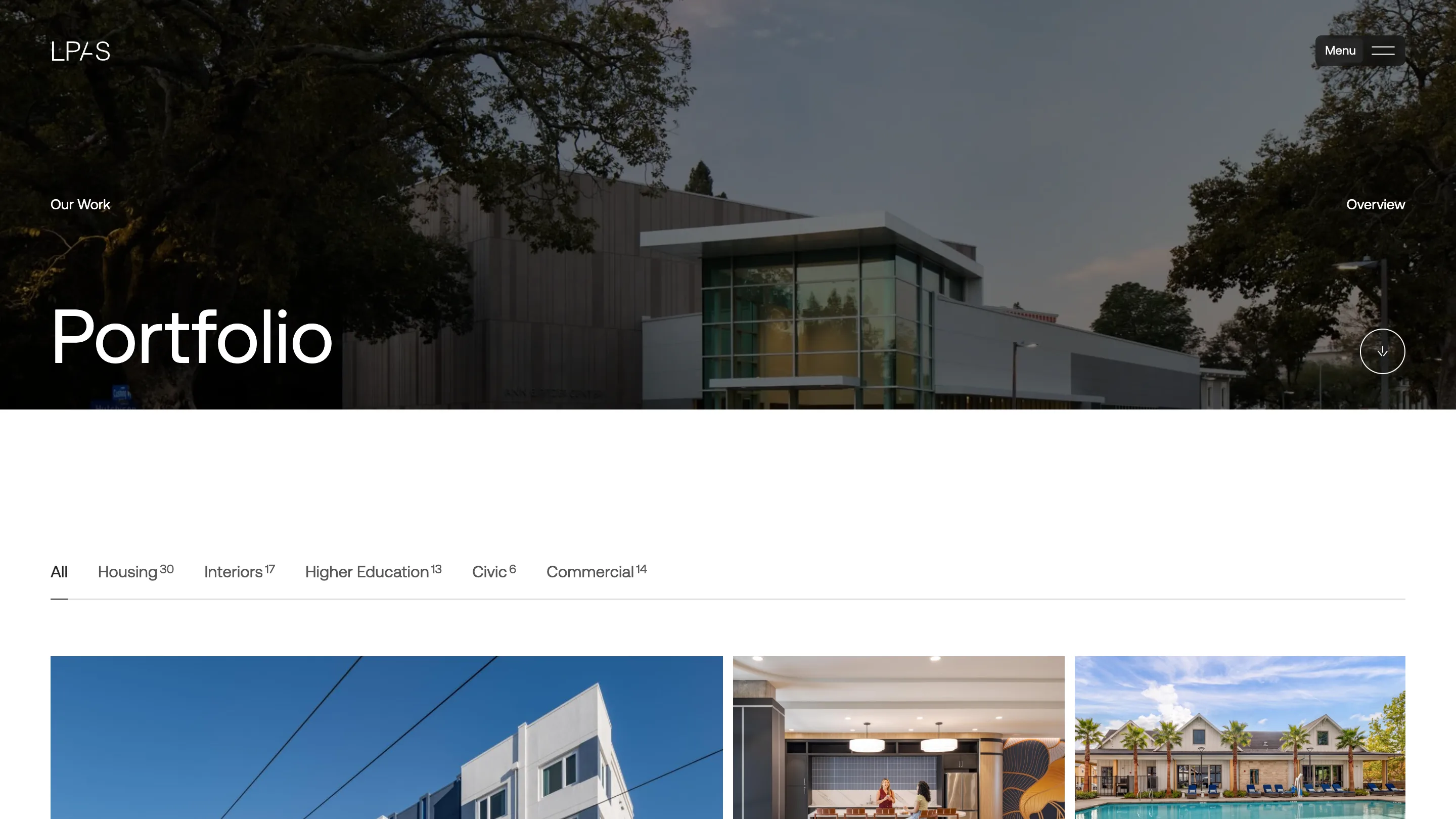
The portfolio index is where the site earns its usability score. Under a full-bleed hero, five filters run in a line: Housing, Interiors, Higher Education, Civic, Commercial. Each one carries a small superscript count. Housing 30, Interiors 17, Higher Education 13, Civic 6, Commercial 14.
Those numbers do more than any testimonial. A developer looking for a housing architect sees 30 before they click anything. A college sees 13 campus projects. The type is one grotesk at two sizes, and the counts sit at footnote scale, so they inform without shouting. The grid below breaks into one wide tile and two narrow ones, so the photography sets the pace instead of a uniform card wall.
Project pages that start with the site plan in words
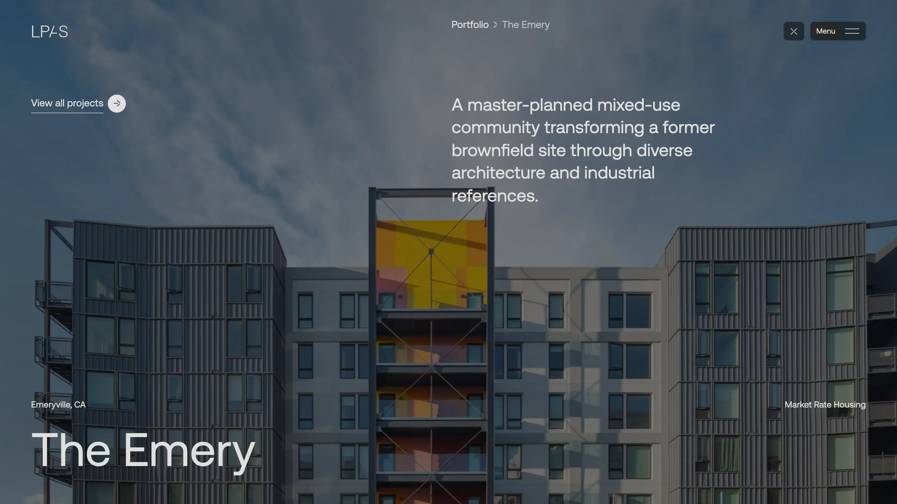
Open The Emery and the layout borrows from a drawing sheet. The project name sits huge in the bottom left. The city sits above it, the market sits opposite in the bottom right, and a one-sentence summary takes the upper right quadrant: a mixed-use community on a former brownfield. A darkened photograph of the building fills everything behind.
Then come the facts a client actually asks for. 8.6 acres. 500 units across four mid-rise buildings. 78,000 square feet of retail. Completed in 2023 for Quarterra Multifamily, on the old Sherwin-Williams paint factory in Emeryville. No adjectives needed when the numbers are that specific.
A focus switch with colour swatches
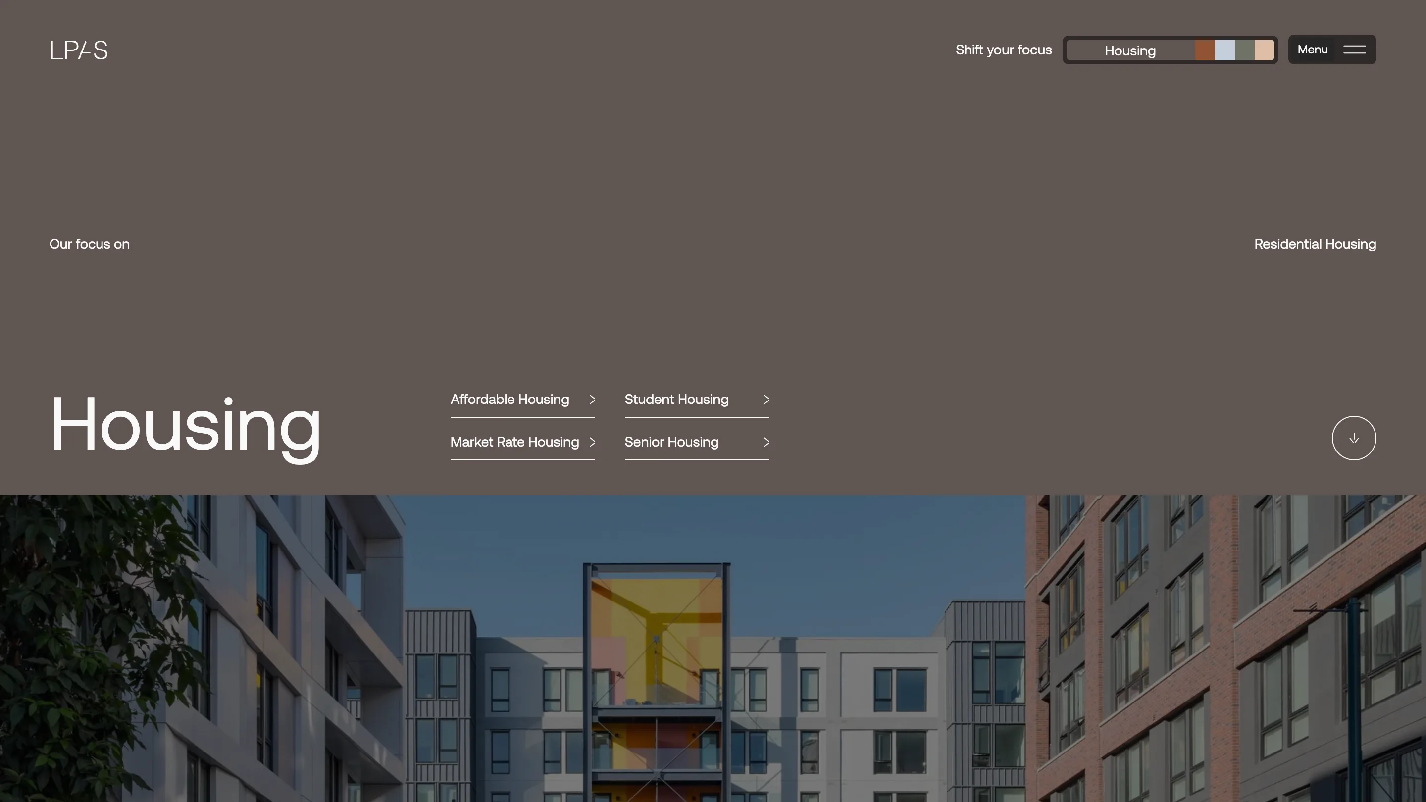
The market pages add the site's one playful control. In the top bar, next to the menu, a pill labelled Shift your focus shows the current market and four small swatches: rust, pale blue, sage, peach. Five markets, one name and four colours, so the switch reads as a palette before it reads as navigation. The housing page itself sits on a warm grey-brown that matches the timber and render in its photographs, with the four housing types (affordable, market rate, student, senior) as underlined links beside the title.
It's a small idea. It's also the right size for a firm whose buildings are about restraint. The motion, built with GSAP on WordPress, stays out of the way: fades, a slow hero, a scroll cue in a circle.
Why it won
The jury rated content highest, 7.5, and that tracks. The site never decorates. It turns a name into a method on the first screen, counts the work in superscript, and lets each project lead with acreage and units. For any studio building a site for a practice that sells process over spectacle, LPAS is the reference to open next.