Odyssée splits every page title across its footage
A Sydney skin clinic's site breaks each headline in two and pins the halves to opposite edges, so the footage gets the middle of the screen.

Every page on the Odyssée site opens the same way: a full-bleed film, and a headline torn in two, one half pinned to the left edge and the other to the right. "Guided by science" sits on one side, "refined through care." on the other, with half the screen's width of moving water between them. That split page title is the whole system, and it's why NIGHTJAR's site for the Hunters Hill medical aesthetics clinic took awwwards Site of the Day on 8 October 2026, with a Developer Award on top and an overall score of 7.38.
The brief is a hard one. An aesthetics clinic has to look calm and clinical at once. Odyssée gets there with type placement and almost nothing else.
The split headline does the art direction
A centred headline over a face covers the face. Odyssée moves the words out of the way. The home sets "Medical aesthetics for timeless results." on one line, level with the nav, so the logo, the tagline and the four menu links read as a single band across the model's shoulders. Her eyes and mouth stay clear.
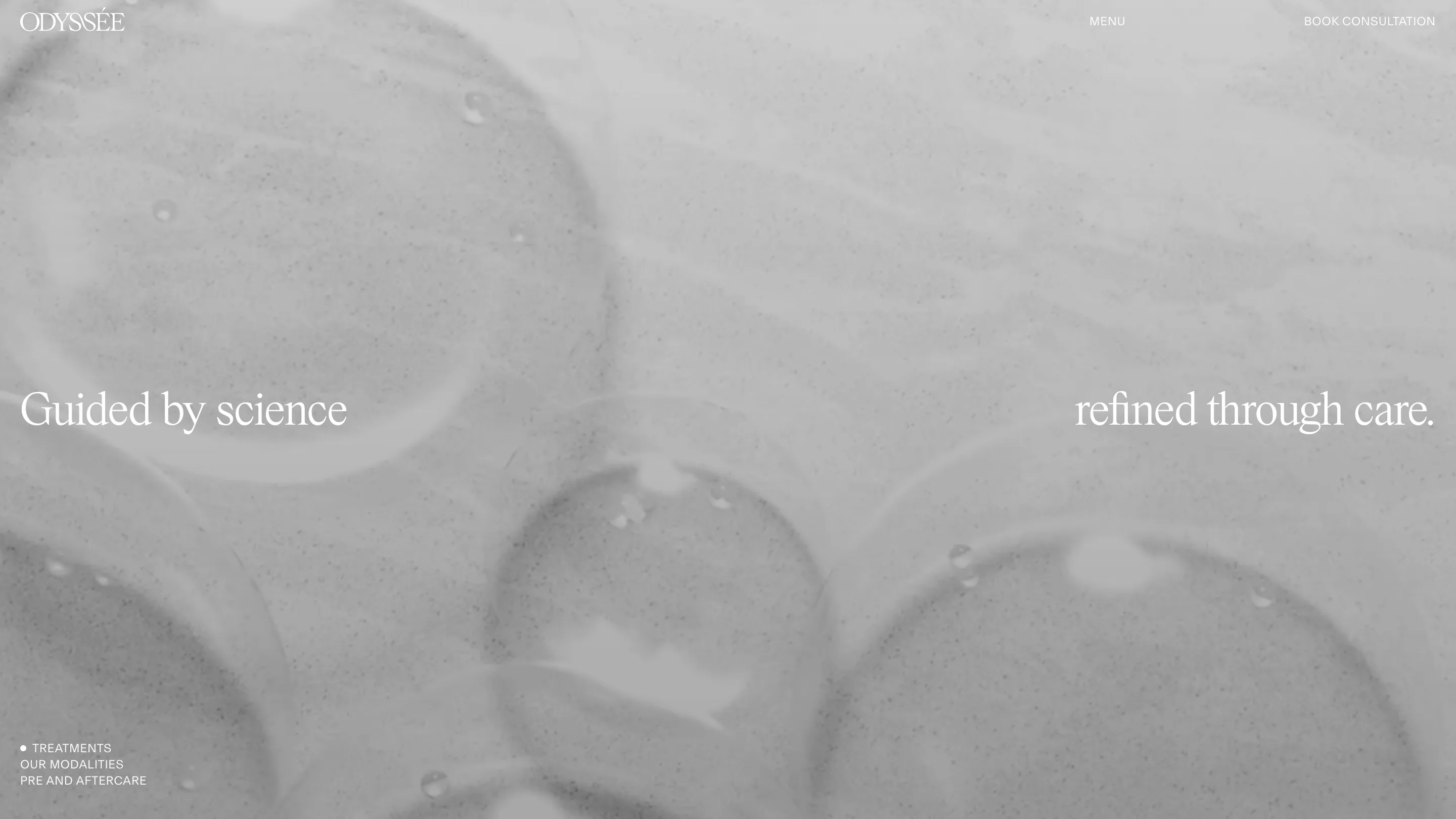
Inner pages push the idea further. Treatments breaks its line after "science" and sends the rest to the far margin. The gap in the middle holds the footage, slow macro shots of gel and bubbles, desaturated to grey so the white serif stays legible without a scrim. You read the left half, your eye crosses the image, you finish the sentence. The layout makes you look at the picture as part of reading the headline.
A serif that whispers and a sans that labels
The type pairing is two voices with strict jobs. A light, tightly spaced serif carries every headline and the wordmark, set large but thin enough to sit on skin tones without shouting. Everything functional, the nav, the section index, the captions, is a small uppercase grotesk with open tracking. You never see the two mixed in one line.
That discipline is what keeps a luxury site from turning into a perfume ad. The serif tells you how the clinic wants to feel. The grotesk tells you where things are. Bottom left on each page, a short uppercase index ("Treatments, Our modalities, Pre and aftercare") marks the current section with a white dot, which does the work of a sidebar in three lines.
Footage chosen for the gap
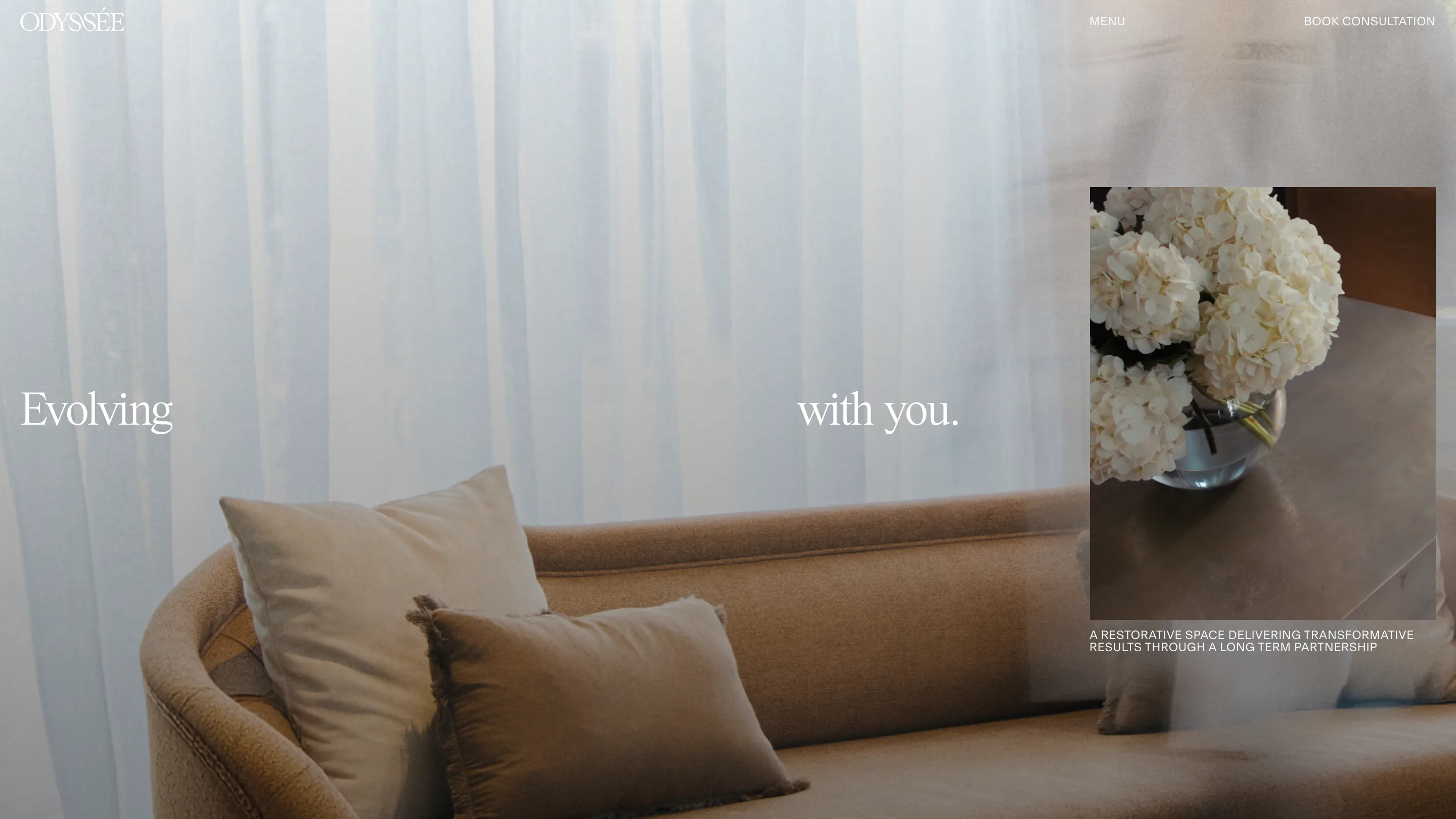
The split only works if the middle of every film is worth looking at, and the art direction plans for it. About puts "Evolving" and "with you." either side of a slow pan across the waiting room's sofa and curtains, then drops a framed still of white hydrangeas on the right column with a two-line caption under it. It's the one place the site layers an image over the footage, and it lands where the clinic talks about its own room.
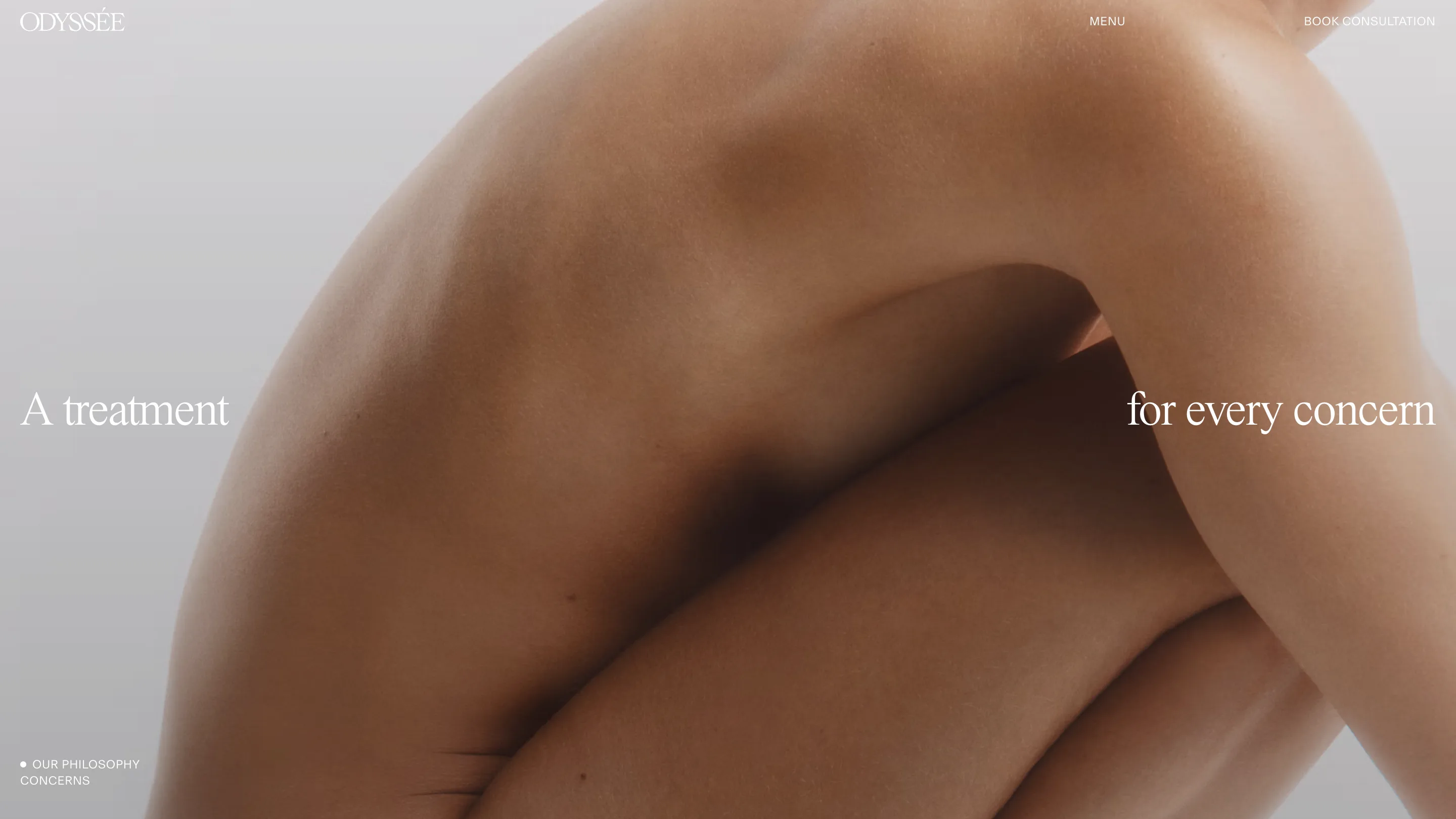
Concerns uses a body in profile, cropped so a shoulder and a knee fill the frame. "A treatment" and "for every concern" sit in the flat grey either side. No faces, no before-and-after, no promise in numbers. The palette on awwwards lists two colours, a navy and an off-white, and the site barely needs the navy.
Why the jury rated it
The scores lean on content (7.63) and design (7.56), and that matches what you see. NIGHTJAR built it on Next.js, Sanity and GSAP, and the motion is there to carry the transitions between films. It never competes with them.
The lesson for anyone designing in a crowded, trust-heavy category: pick one layout rule and let it hold every page. Odyssée's rule is that the words go to the edges and the picture gets the centre. It costs the clinic some headline size and a few line breaks that would fail a readability audit on a phone. In return, every screen looks like the same calm room. Visit odysseeclinic.com.au on a wide monitor to see the gap at its widest.