ViV's artist management website lives in the dot of its i
ViV shrinks its wordmark to a black half circle and hands every colour on its site to the photographers it represents.
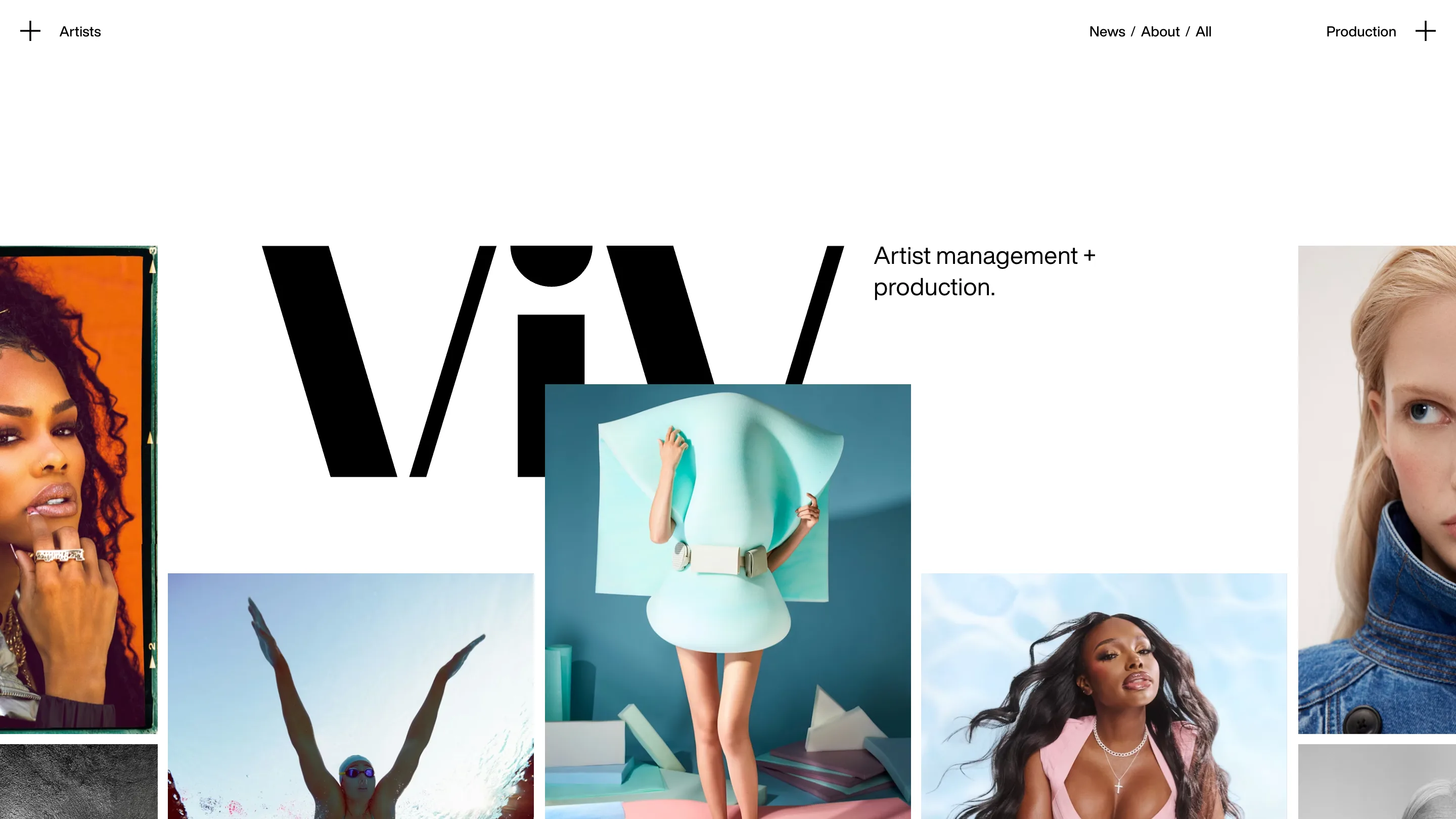
ViV's new site does one thing with its logo that tells you how the whole artist management website works. On the home page the wordmark is huge, three black letters with a round dot on the i, and the photographs crowd in around it. On every other page that dot is all that's left: a black half circle hanging from the top edge of the screen. The brand steps back so the roster can step forward.
Sam Dallyn designed the identity and the site for ViV, a New York company that represents photographers and runs commercial shoots. It took awwwards Site of the Day on 6 November 2026 with a score of 7.28, and its highest mark, 7.55, went to content. That fits. The content is other people's pictures, and the design is built to get out of their way.
A home page that lets the photos overlap the logo
The home page opens on the wordmark and a single line, "Artist management + production." Then the grid starts pushing in. Portraits from the roster sit in staggered columns, and one of them climbs right over the V and the i. The logo loses that fight on purpose.
It's a bold call for a brand launch. Most of the screen is somebody else's colour: orange film borders, a teal set, a pink jacket against a blue sky. ViV itself owns only black and white. Awwwards lists exactly two colours in the palette, #000000 and #FFFFFF, and the site never breaks that rule anywhere it speaks for itself.
Two typefaces with two jobs
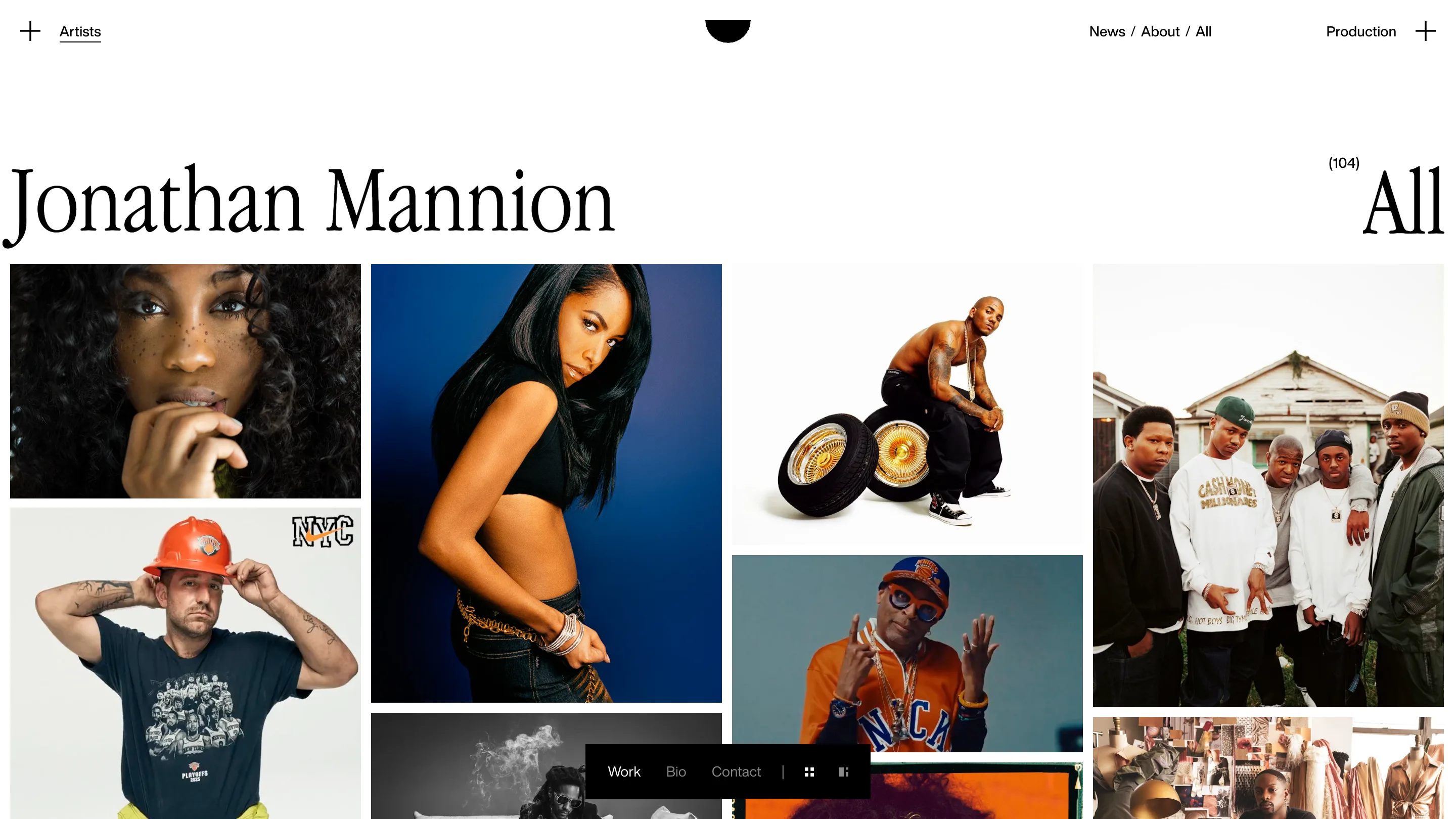
The type system is small and strict. Helvetica Now Display does the working parts: the nav, the captions, the contact names, all at one modest size. Garamond Narrow does the naming. On an artist page the photographer's name runs across the top at display size, with a count in brackets on the right. Jonathan Mannion's page says (104) next to "All", and then shows you all 104.
Narrow Garamond is a good pick for names. It's tall and condensed, so "Jonathan Mannion" fits on one line at a size that feels like a magazine cover, and it reads as a person's name in a way a grotesk wouldn't. A small floating bar at the bottom switches between Work, Bio and Contact, and flips the grid between two densities. You never leave the pictures to find the agent's email.
Production gets its own front door
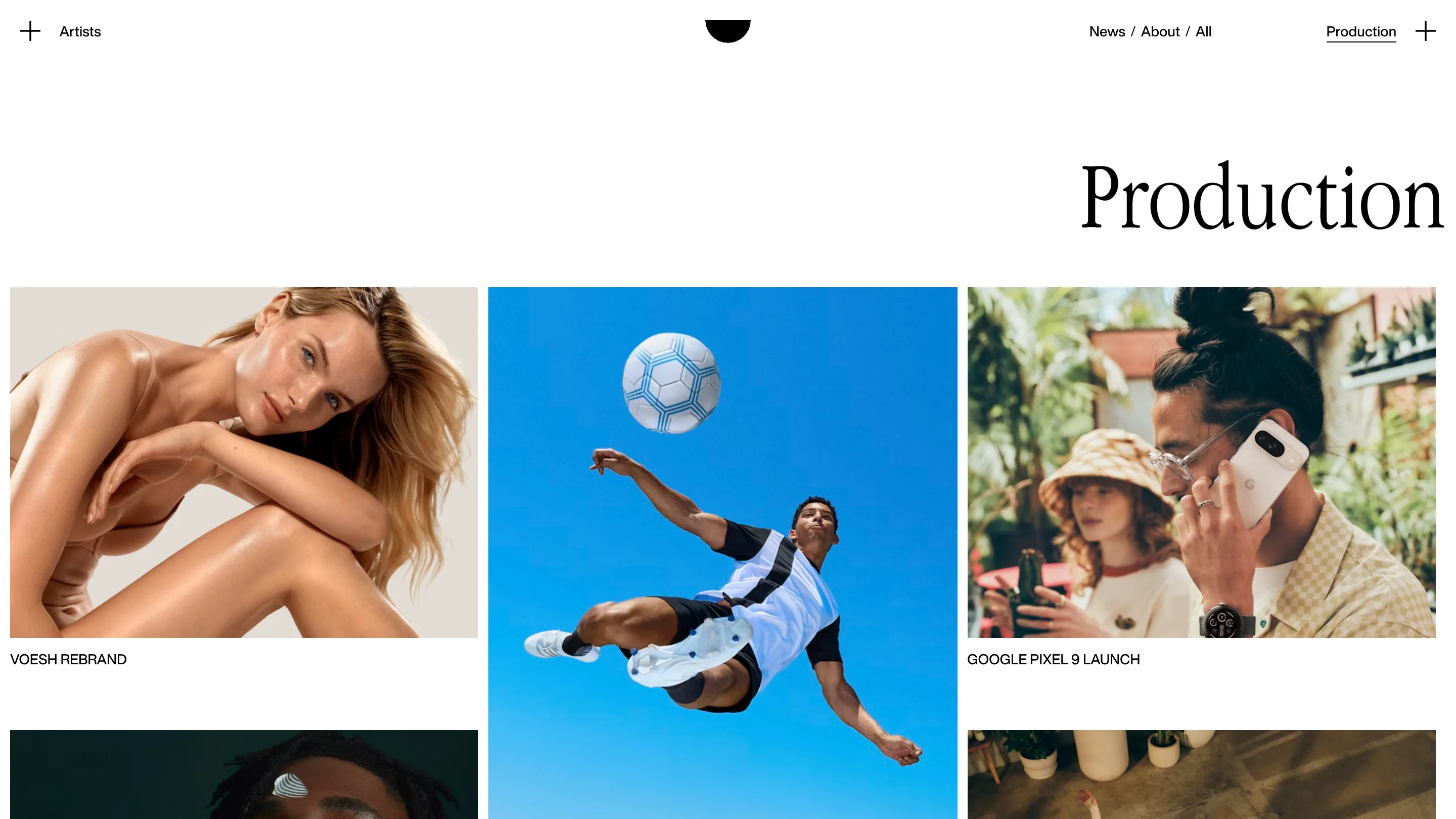
The nav splits the company in two. Artists sits top left behind a plus sign, Production sits top right behind another, and News, About and All sit between them. That symmetry says what ViV sells: a roster of eight photographers and a director on one side, and the shoots it produces on the other.
The production page flips the title to the right edge, mirroring the artist pages. Each job gets a caption in upper-case Helvetica, VOESH REBRAND, GOOGLE PIXEL 9 LAUNCH, and nothing more. The brand names do the selling.
An about page that talks like the agent
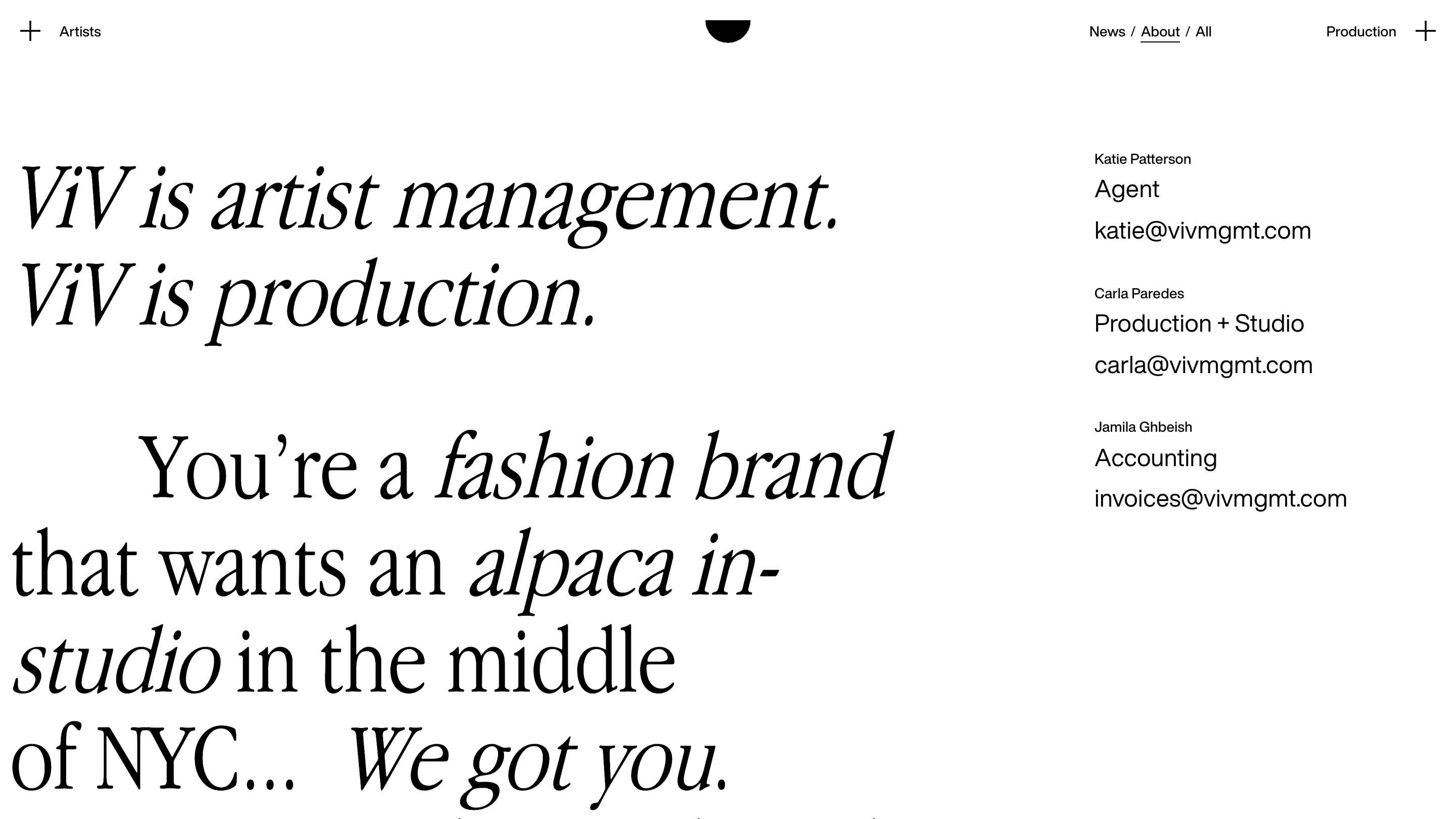
The about page is where the type gets loose. "ViV is artist management. ViV is production." Then a long sentence that swaps between roman and italic mid-line: "You're a fashion brand that wants an alpaca in-studio in the middle of NYC... We got you." The italics land on the specific, odd request, which is the part a producer would be proud of solving.
On the right, three people, three roles, three email addresses. No form. For a company whose clients are art buyers who already know what they want, that's the right amount of interface.
The lesson for anyone building a site for a roster is in that half circle. Say the name once, big, on the home page. Then shrink the brand to a mark and give every remaining pixel of colour to the work.