Justin Jefferson's site is printed on football leather
LayerTwo built Justin Jefferson's site on the pebbled grain of a football, then pressed his headlines and his brand deals into it.
Justin Jefferson's new site runs on one material: the pebbled grain of a football. LayerTwo turned that football leather texture into the page itself, black for his life off the field, cream for the brands he signs with, and every big headline is filled with the same bumps you'd feel under your thumb on a game ball. It took awwwards Site of the Day on 7 November 2026 with a score of 7.26, plus the Developer Award, and Creativity (7.41) was the jury's highest mark after development.
The idea is simple to say and hard to keep up across a whole site. LayerTwo picked a surface and stuck with it on every page.
The football leather texture is the page
Open the Off-Field page and the background is a macro shot of black ball leather, edge to edge. It reads as dark grey from across the room. Up close you see every pebble, and the light falls across it the way it does on a real ball.
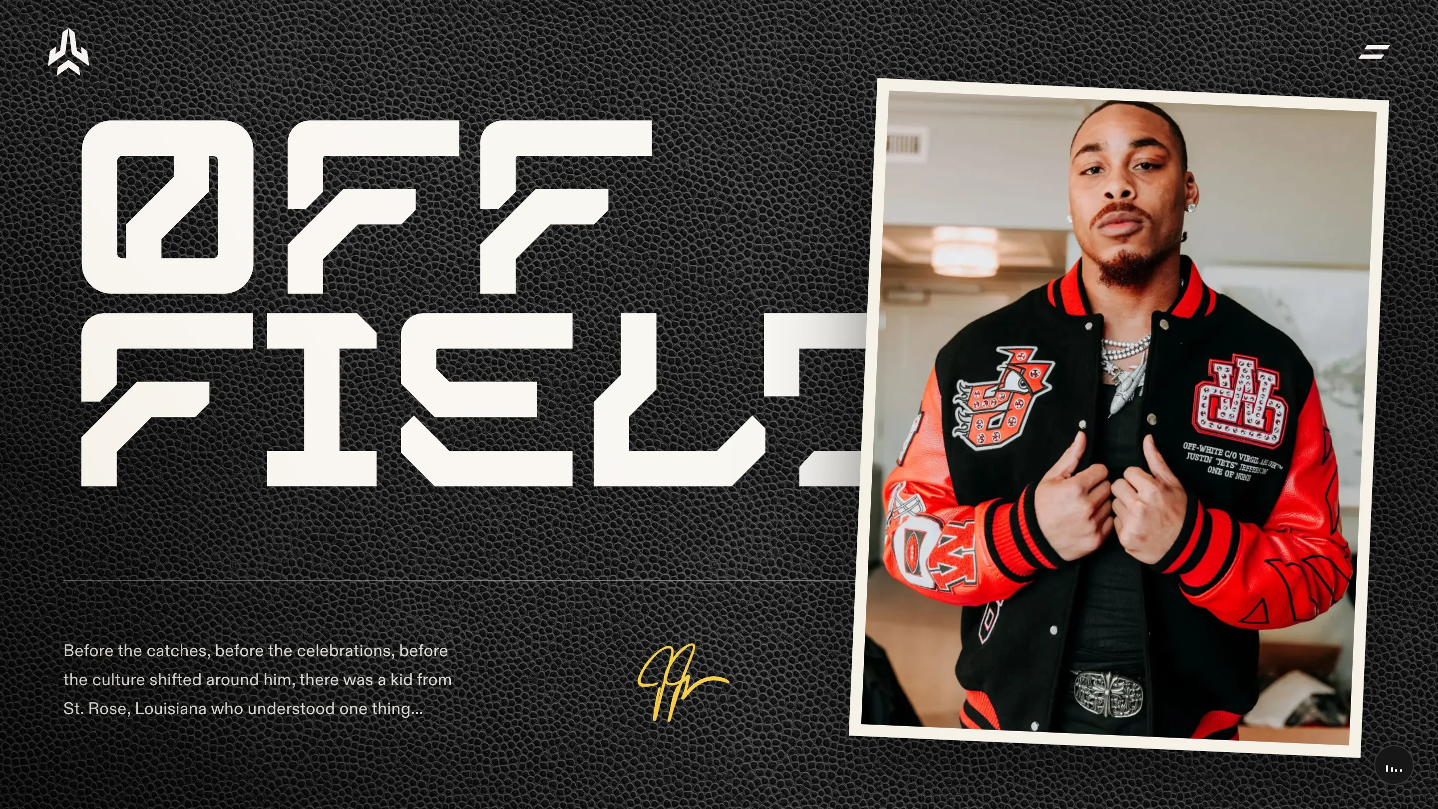
That texture does the job a brand colour usually does. It tells you where you are without a logo. And it gives the photos something to sit on: the portrait on Off-Field is a tilted Polaroid with a cream border, laid on the leather like a print pinned to a locker. Under the intro copy, his signature runs in gold, the one warm accent on the page.
Headlines filled with grain
The Partnerships page flips the leather to cream and does the cleverest thing on the site. PARTNERSHIPS runs the full width in a tall condensed face, and the letters are cut out of the same grain as the ground. They darken at the top and fade into the background toward the baseline, so the word looks embossed into the ball.
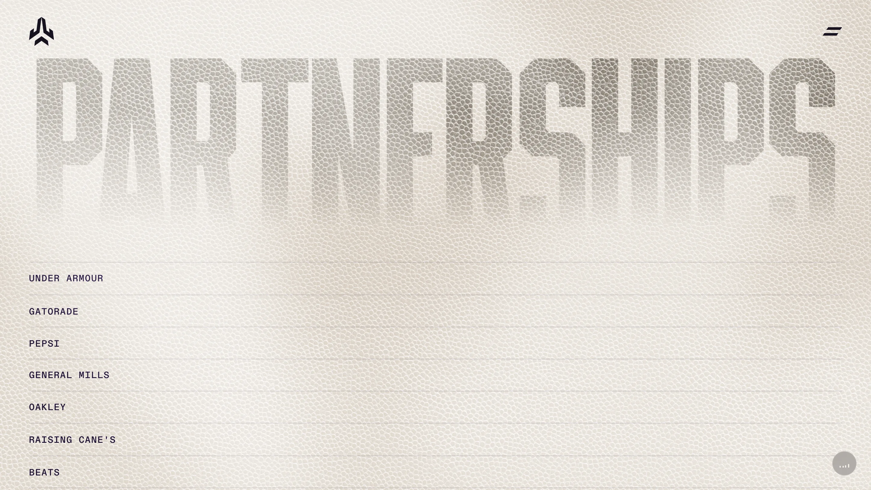
Below it, the brands sit in a ruled list set in a small monospace: Under Armour, Gatorade, Pepsi, General Mills, Oakley, Raising Cane's, Beats. Hairlines between rows, plenty of air, no logos. After a headline that loud, a plain ledger is the right call. The deals carry their own weight.
Two typefaces with one job each
The section titles use a square, stencil-cut display face with clipped corners, the kind you'd see on a jersey number or a stadium sign. ON-FIELD and OFF FIELD break across two lines at a size that fills half the screen. Everything else drops to a neat grotesk for body copy and the monospace for lists and stats.
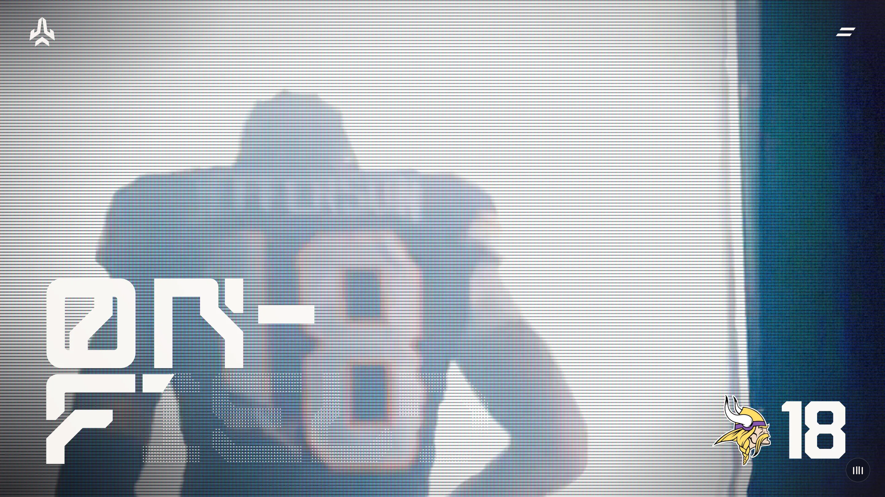
On the On-Field page, the stencil title sits over game footage treated with heavy scanlines, like a broadcast replay on an old monitor. The Vikings mark and a big 18 hold the bottom right corner. Further down, the numbers do the talking: 100 games, 607 receptions, 8,815 yards, 42 games to 4,000 receiving yards. It's a stat sheet, set with the same restraint as the brand list.
Motion that knows when to stop
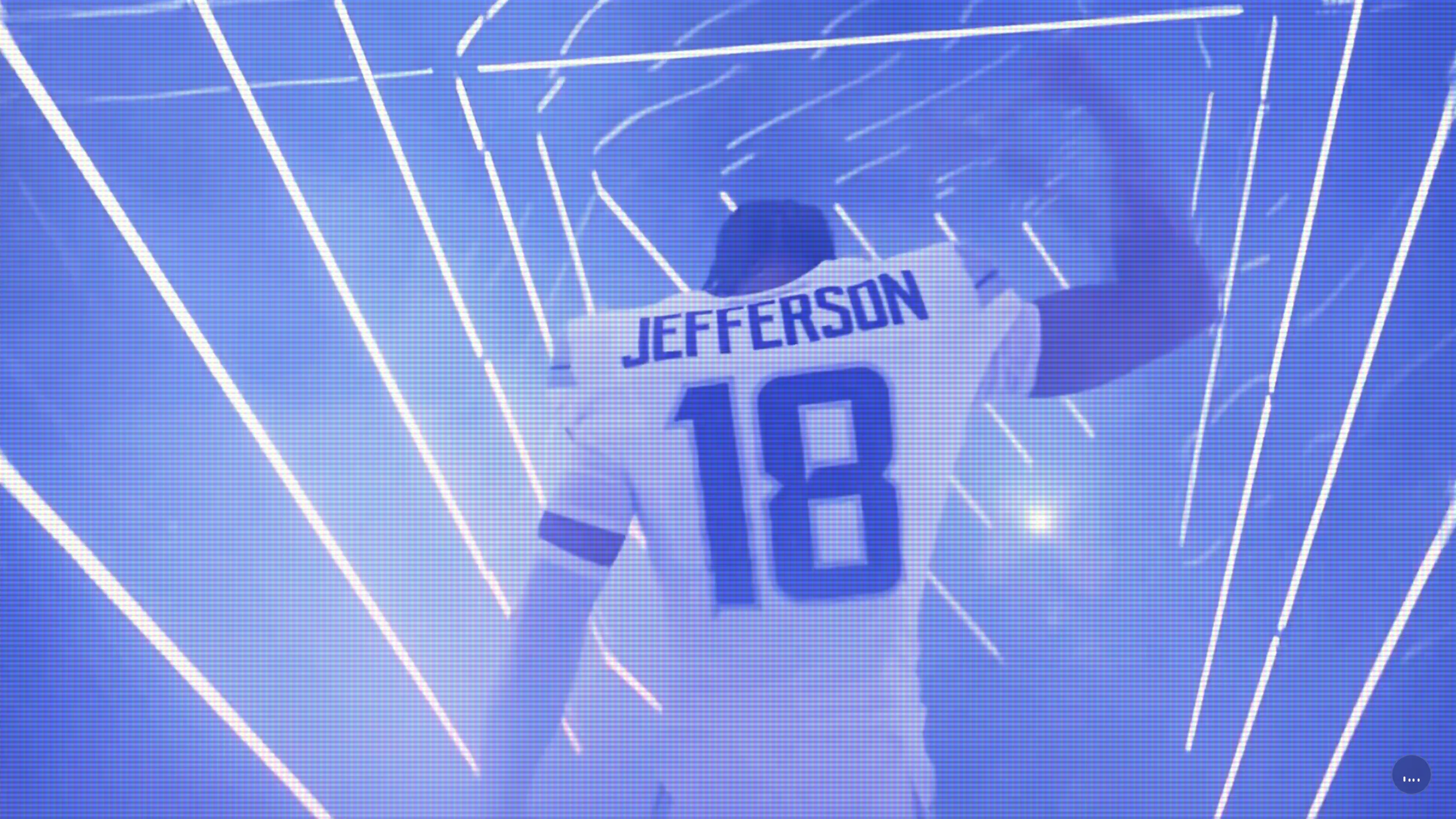
The home page opens on Jefferson from behind, JEFFERSON 18 across his back, walking into a tunnel of white light streaks washed in Vikings purple. It's a tunnel walk, the entrance his Off-Field page says he treats as a chance to say something without speaking. Between pages, a diagonal wipe slices the screen, dark on one side, the JJ mark and a loading count on the other. The cut is fast and it matches the angle of the logo.
The site is built on Next.js with GSAP and Three.js, and the content comes from Sanity. But the effects stay at the edges. Once a page loads, it holds still and lets you read.
That's why it won. LayerTwo found one physical thing every fan has held, the ball, and used it as paper, ink and frame. Pick a material that belongs to your subject, then commit to it on every page.