Agrumea Farm builds its food website from its jar labels
A Sicilian preserves maker whose site borrows everything from its packaging: the cut-paper fruit, the orange, the serif. The jars are the hero.
Agrumea Farm's food website looks like its jar labels, and that's why it works. The cut-paper fruit shapes, the burnt orange, the tall display serif: all of it comes off the glass and onto the page. Studio K95, an Italian brand and digital studio, built it for a farm in Catania and Floridia that grows citrus, almonds and pistachios and turns them into marmalades, pestos and spreads. It took awwwards Site of the Day on 5 November 2026 with a score of 7.33, and design and content tied as its best marks at 7.4.
The jars are the hero
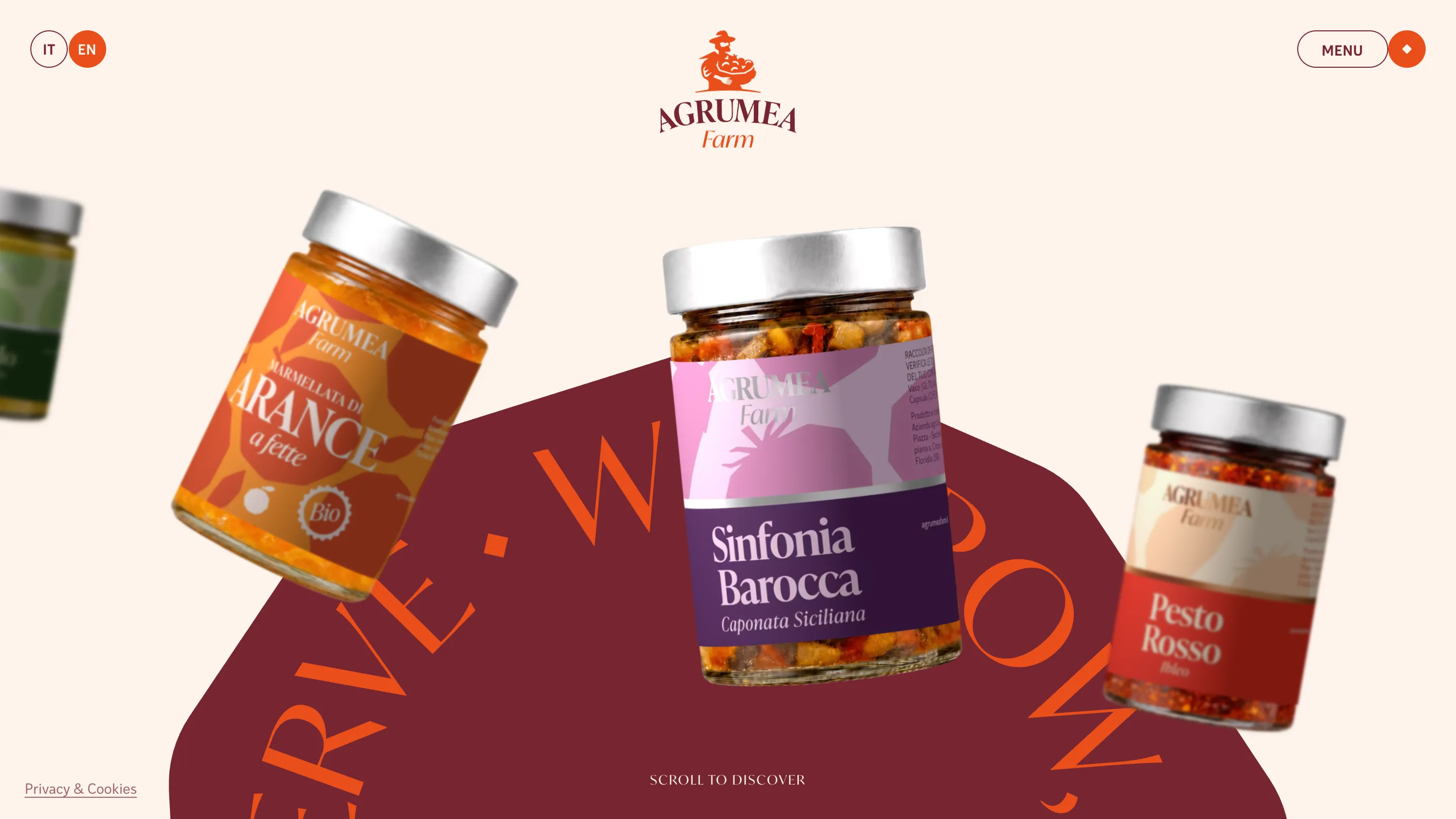
The home page opens on four jars floating at angles over a cream ground: orange marmalade, a pink and purple caponata called Sinfonia Barocca, a red Iblean pesto, a green one sliding off the left edge. They're rendered in 3D with Three.js, so the lids catch light and the glass shows what's inside. Behind them sits one big burgundy shape with a line of orange capitals bending around its edge.
There's no headline fighting for attention. The farm's name sits small and centred at the top, under its illustrated farmer carrying a basket. Everything else on screen is product. For a company that sells by the jar, that's the right call. You know what they make before you've read a word.
Packaging as the design system
Look at the labels and you have the site's whole palette. Each jar wears a flat silhouette of its main ingredient, cut like paper and set in a colour that only that product uses. The caponata gets pink and aubergine. The marmalade gets two oranges. The pesto gets tomato red.
The loading screen uses the same pieces. Before the page appears, those cut-paper fruits tumble across the cream: a purple shape, a yellow lemon, a red star of a stem. Then an orange panel wipes up over them. It lasts a second or two and it sets the vocabulary for everything that follows. When you meet the shapes again on a label, you already know them.
One serif, set huge
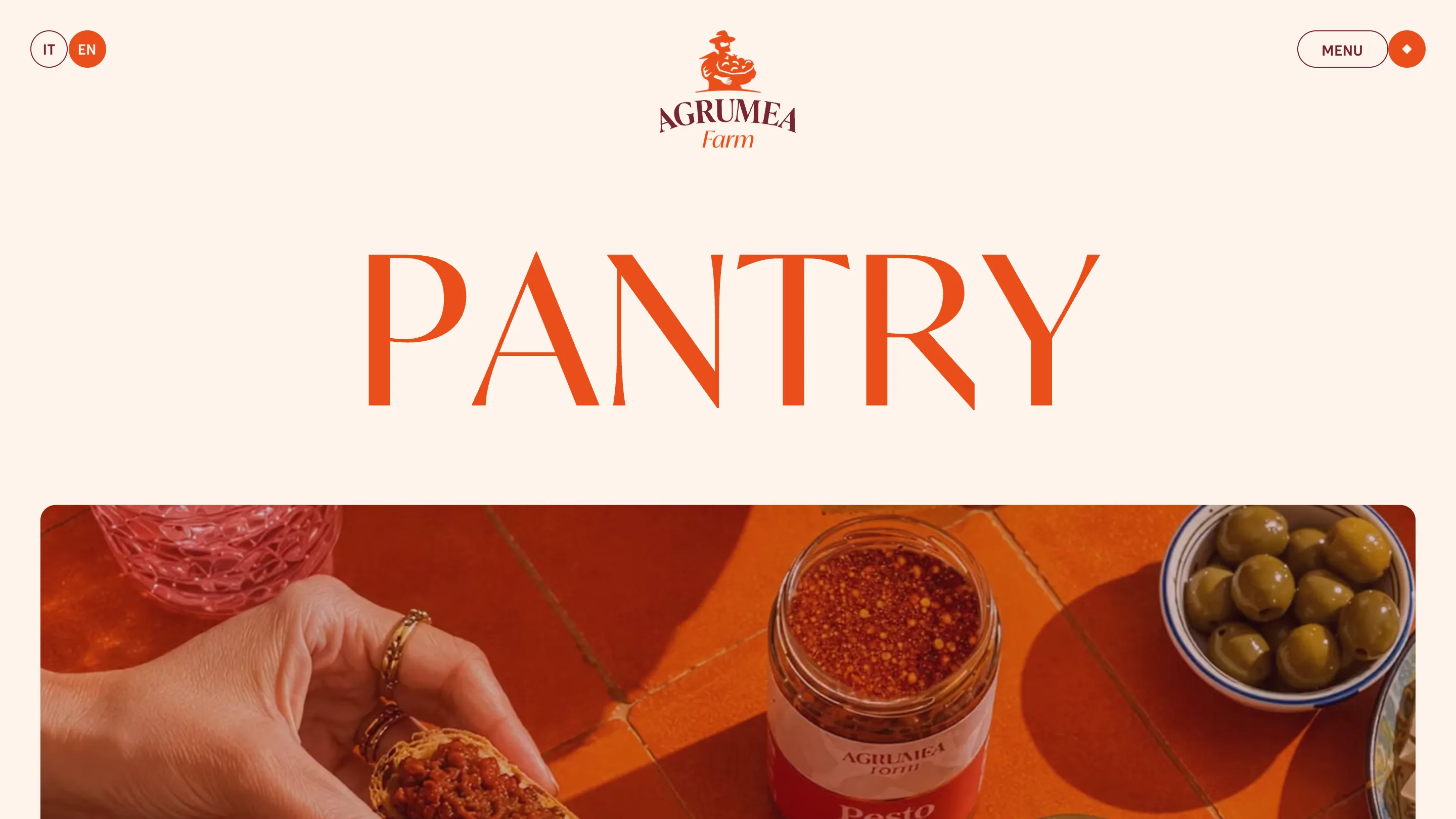
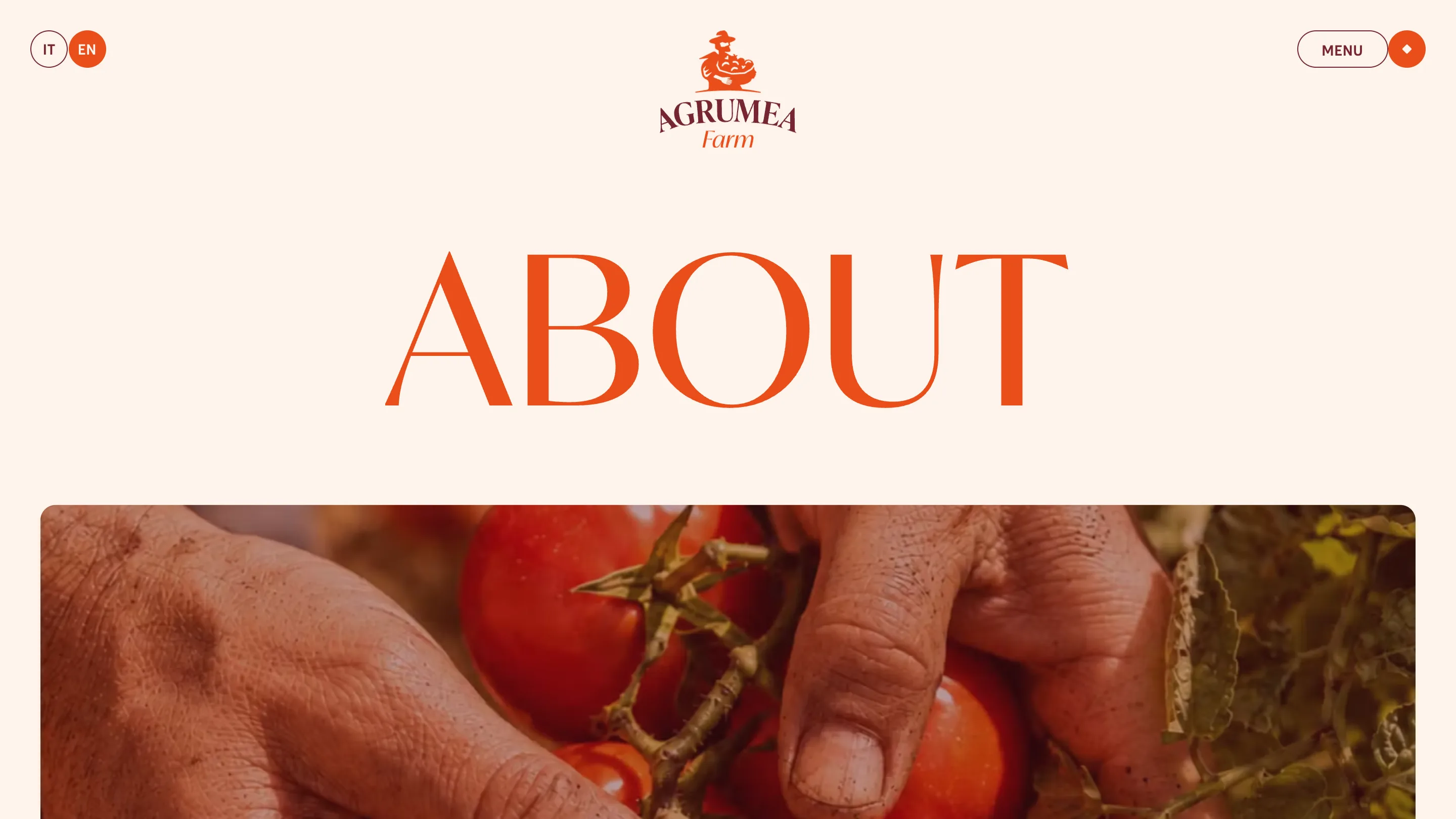
The inner pages run on a single move. The page name, PANTRY, PRODUCTION or ABOUT, fills the width in a high-contrast serif with long, thin hairlines and a slightly flared stroke. Below it, a photo with rounded corners and a warm orange cast. That's the whole header.
The serif carries a lot. It's the same family as the AGRUMEA wordmark, so every page title reads like part of the logo. And because there's nothing else above the fold, the word gets to be very large. PRODUCTION runs almost edge to edge on a desktop screen. The small sans for the menu button and the IT and EN toggle stays out of its way.
The photos are graded to the brand too. The lemons on the Production page, the hands picking tomatoes on About, the pesto on Pantry: all pushed towards the same orange as the type. Three different photos end up looking like one set.
Content that reads like a farm
The copy earns its 7.4. The Pantry page sorts the range into marmalades and jams, spreadable creams, savoury and single-serve packs, with sizes from 30g to 3kg. The Production page lists what's in season and when: Navel oranges from 20 November to 15 January, Moro blood oranges into February, Femminello Siracusano lemons until April. It's information a buyer or a restaurant would use, set calmly inside the same frame.
That's the lesson for anyone designing for a food brand. Agrumea already had strong packaging, and K95 let it run the site. The jars set the colours, the shapes and the type, and the web adds what the shelf can't: depth, motion and a little time with each product.