Squarespace's brand guidelines site fits a rule to a page
Resn built Squarespace's brand guidelines as six screens: one word, one paragraph and one band of image each, all set in Clarkson.
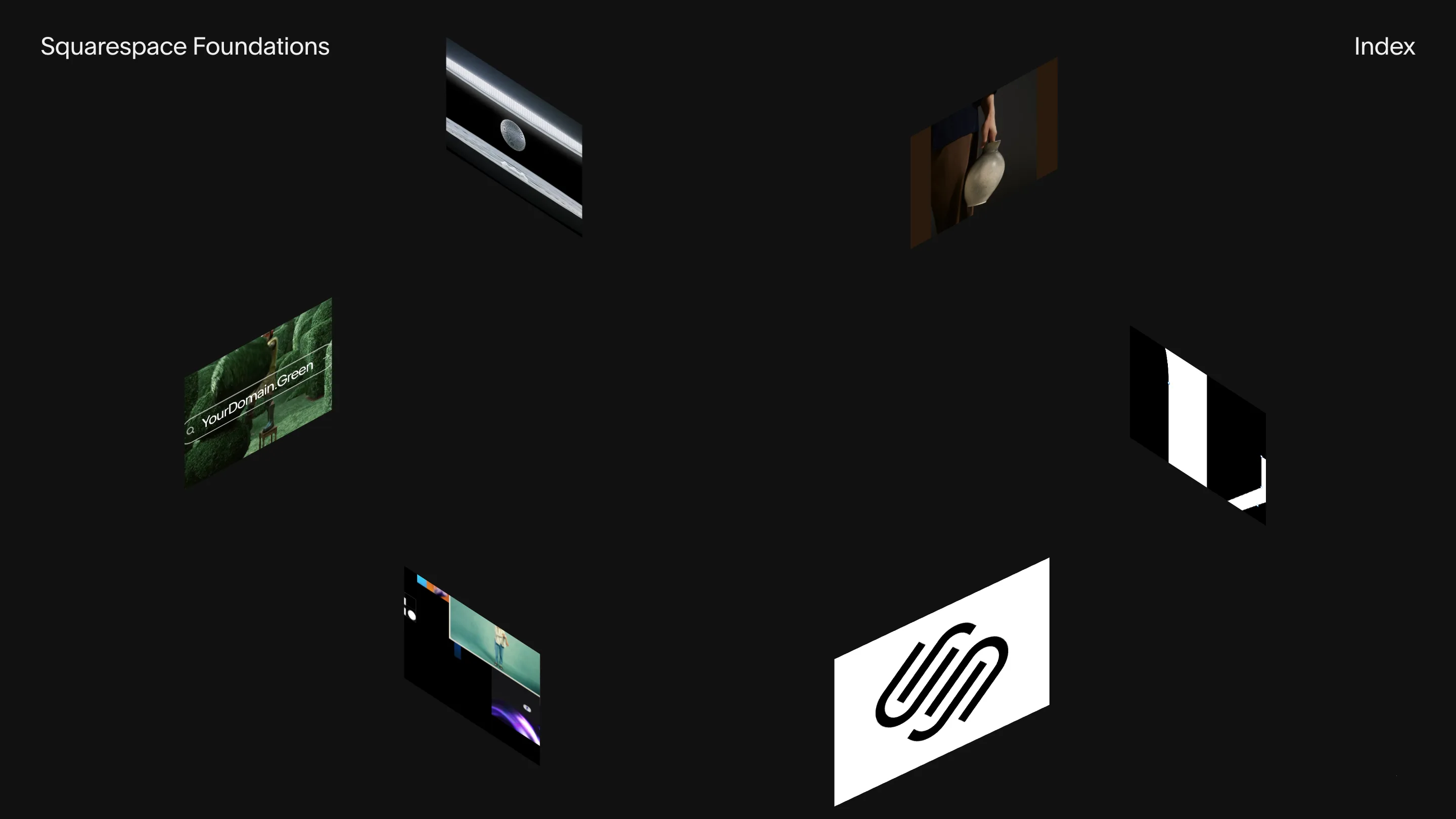
Squarespace Foundations opens with no menu and no scroll. Six images hang on skewed planes around an empty black middle: the logo on a white card, a still life with a vase, a hedge maze with a search field reading YourDomain.Green, a strip of product screens. An arrow turns the ring. A cursor label says Tap to Explore.
Resn built the site for Squarespace, and it took awwwards Site of the Day on 1 September 2026 with a 7.38. The move worth studying is the page unit. Each part of the brand gets one screen, one word, one paragraph.
Six pages, six ideas
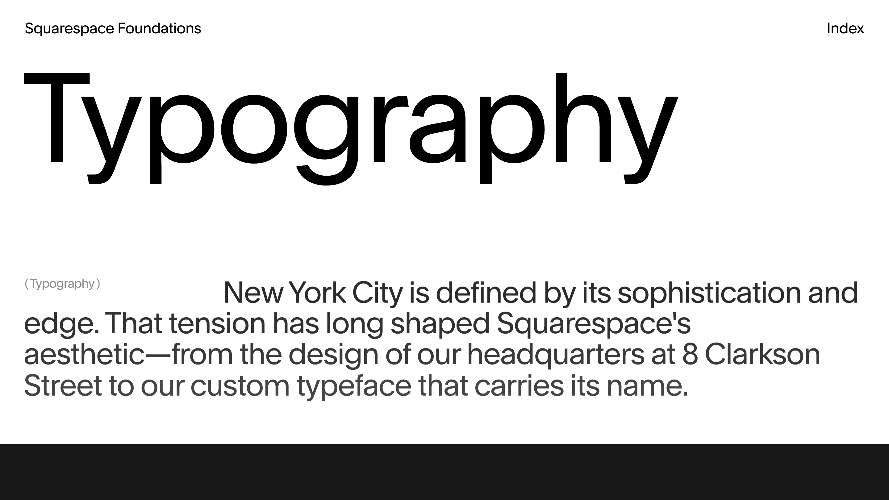
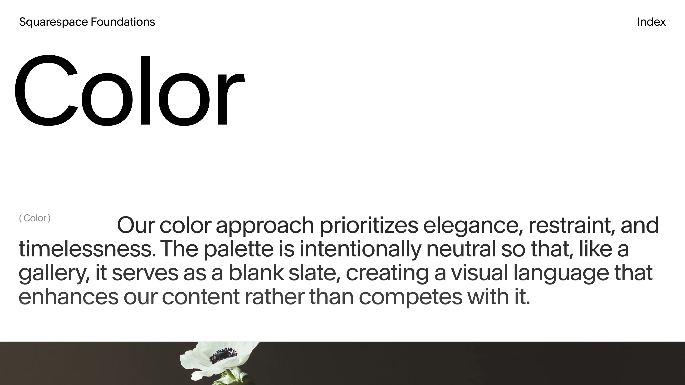
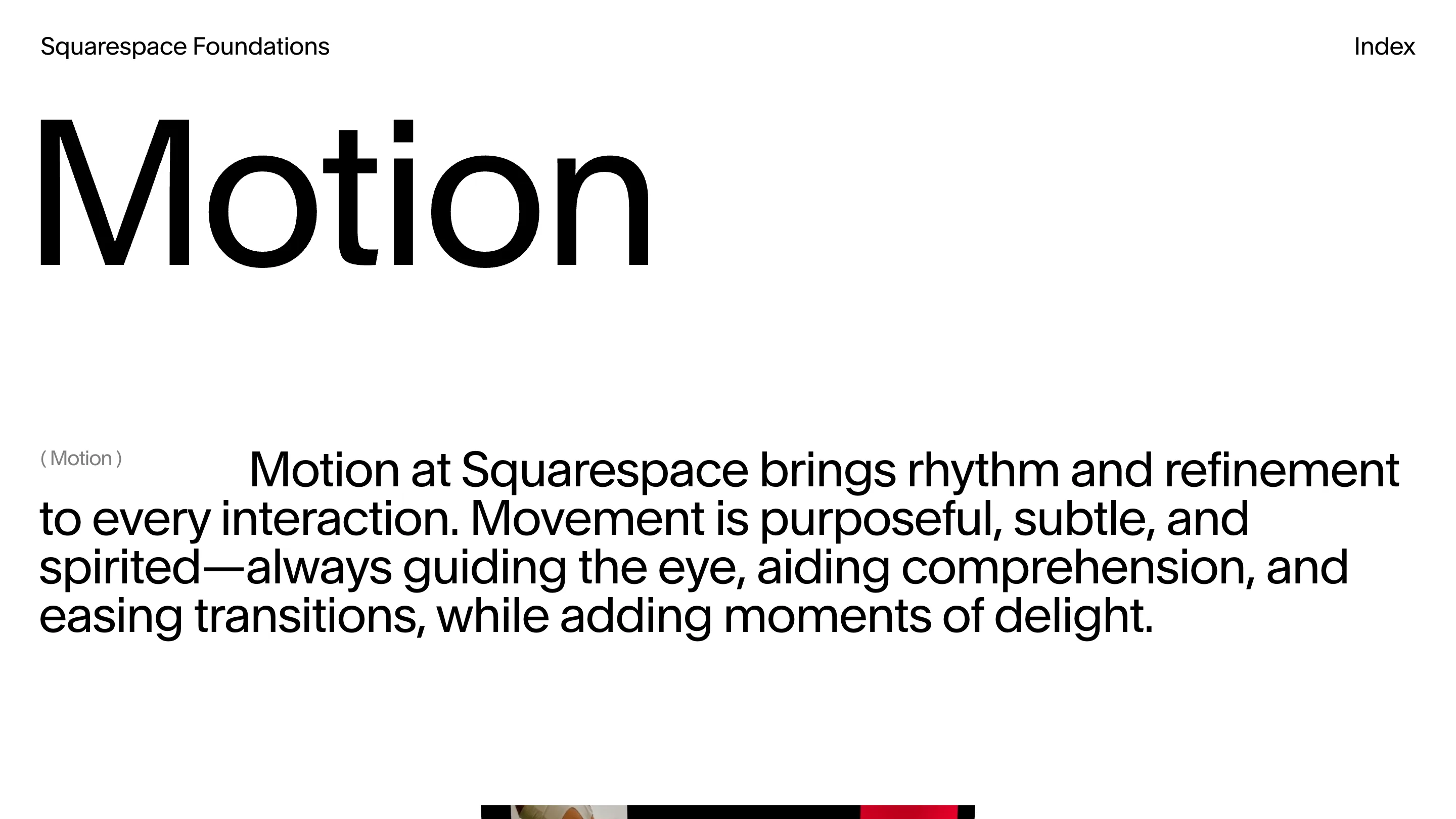
The index runs Logo, Typography, Color, Photography, Campaign, Motion, numbered 01 to 06. Each one opens white with the section name set across the top third of the screen, a small "( Typography )" label parked out in the left margin, and one paragraph running the full width under it, first line indented like the opening of a chapter. Then the fold cuts into a dark band of media.
That is the whole page above the fold. A word, a label, a paragraph, the top edge of an image. Nothing to expand, no sub-navigation, no download link.
The headline is the specimen
The type is Clarkson, the grotesk Squarespace commissioned and named after its headquarters at 8 Clarkson Street. Setting the section name at display size makes the page do two jobs at once: it names the section, and it shows the face at the size where you can actually read its drawing. The C in Color has horizontal cuts on both terminals and a bowl close to a circle. The paragraph underneath runs in the same family at reading size, grey instead of black. One family, two sizes, one shift in colour. That is the typographic system, on screen, doing its own explaining.
Colour argued, then demonstrated
The Color page says the palette stays neutral so it works like a gallery wall, holding content instead of competing with it. Then the page proves the point. Everything is white, black and grey, and the only colour in the frame belongs to a white anemone lit against a near-black band at the bottom edge. Motion pulls the same trick with a red frame sitting at the fold.
The controls carry the same idea
The menu holds a text-size control marked Aa, a Dark switch, and a "( NYC )" tag in the corner. On a site about typography, letting a reader resize the type is a working demo rather than a preference pane. Underneath, it runs on Nuxt with GSAP driving the transitions and Rive state machines behind the interactive pieces, and the loader counts to 100 before the ring appears, which is an honest warning about how much media is on the way.
What a judge would rate
7.38 is a solid awwwards score rather than a spectacular one, and this site earns it by knowing exactly what it is for. A brand guidelines site has one job: make the rules stick with the people who have to follow them. Six screens, six sentences, one typeface. You can hold that in your head after a single pass.