Huy Phan's portfolio typography speaks in one red serif
Huy Phan's portfolio took Site of the Day on one red flared serif, giant white numbers you barely see, and a grey grid that stays out of the way.
Huy Phan's portfolio typography does almost all of the work. One flared serif in a single red, #FF4949, carries every name and every headline. Everything else is a small grey grotesk on a pale grey ground. That split is the whole system, and it's why Huy Phan took awwwards Site of the Day on 14 October 2026 with 7.67, plus the Developer Award at 7.37.
Phan is an independent designer and art director in Ho Chi Minh City. The site is his second version, built with Chien Pham on GSAP, Three.js and Framer. It's a portfolio with 19 projects behind it, and it reads like one person's handwriting.
A name before anything else
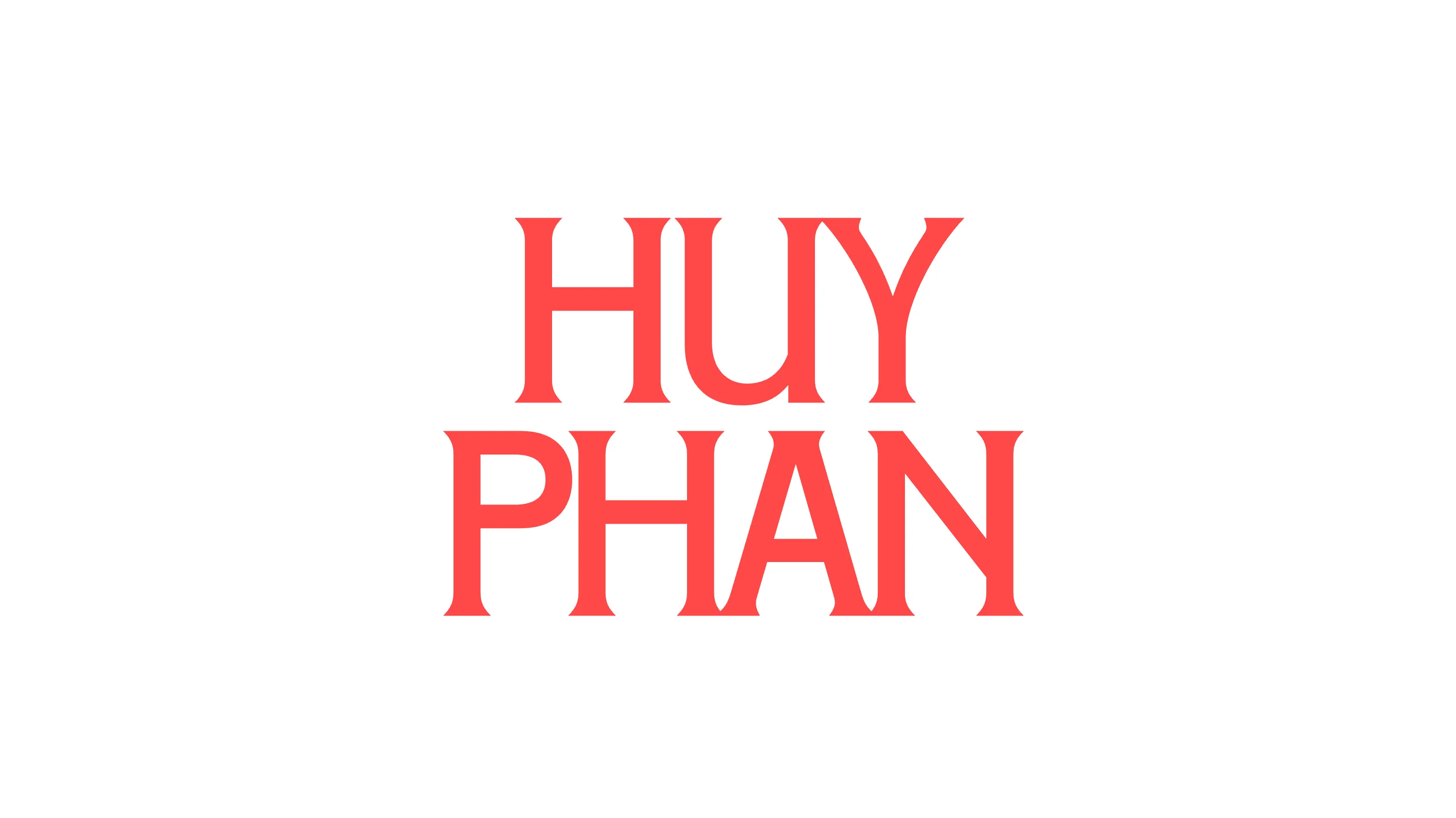
The site opens on his name and nothing else. HUY PHAN, stacked on two lines, in that red serif on white. The letters have flared stems that pinch at the top and the foot, so the capitals look cut rather than drawn. The U in HUY tucks its right stem into the Y. The A and N in PHAN share a stroke.
It's a loader, and it's also the brand. By the time the page arrives, you've already learned the typeface that will name every project.
Projects named in red, described in grey
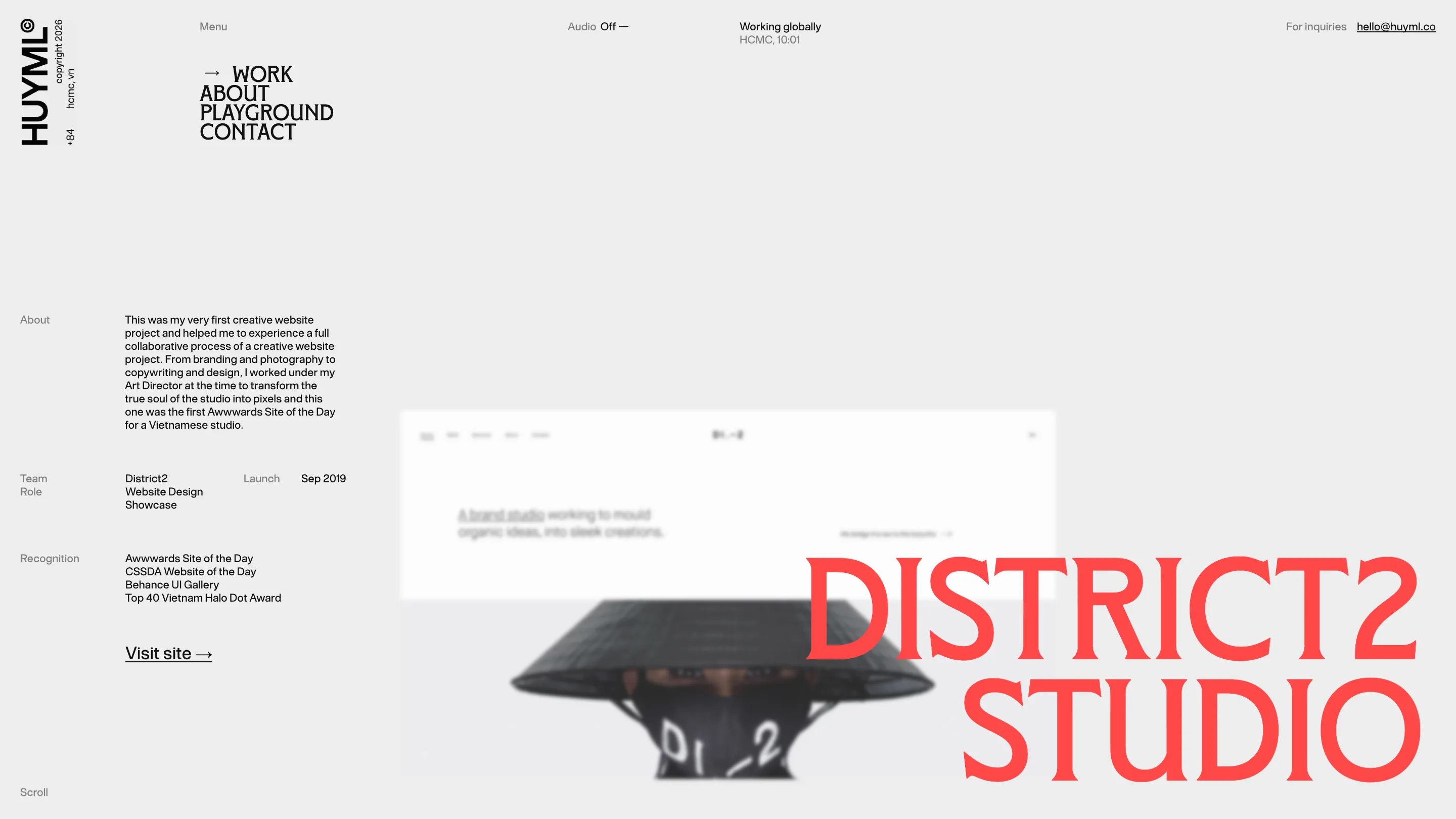
Open a project and the hierarchy holds. On the District2 Studio page, the title sits bottom right in the red serif, two lines tall, overlapping a blurred screenshot of the old site. The left column is a spec sheet in small grotesk: About, Team, Role, Launch, Recognition, then a single underlined Visit site link.
The copy is plain and personal. District2 was his first creative website, launched in September 2019, and he notes it was the first awwwards Site of the Day for a Vietnamese studio. Nobody had to dress that up.
The chrome stays fixed and quiet. A vertical HUYML wordmark runs up the left edge with the copyright, the city and the +84 country code beside it. The menu is four words in a condensed sans, and a small arrow slides to the page you're on. Up top, a live clock says HCMC and the local time, next to an Audio Off toggle and the email. It's a working designer's letterhead.
Giant numbers in white on grey
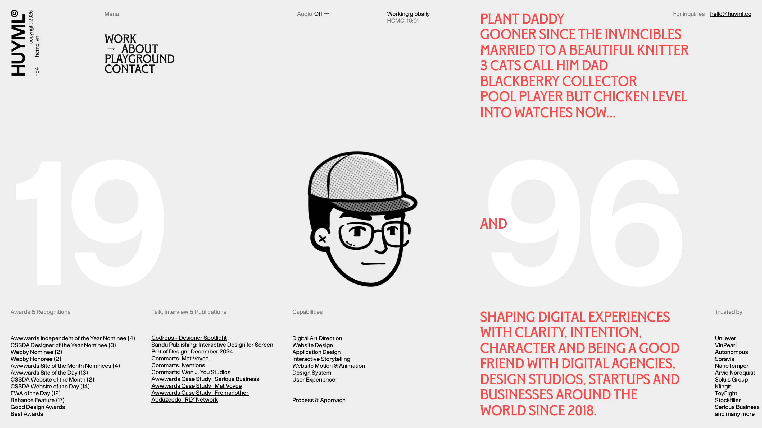
The move a judge would remember is on the about page. A 19 and a 96 fill the width in white, on a ground only a few shades darker. His birth year, set so large and so faint you nearly read past it. Between them sits a self-portrait in black line with a halftone cap, and one red word, AND, bridges the two halves.
Above it, the red serif turns into a list of confessions in capitals: plant daddy, Gooner since the Invincibles, married to a knitter, three cats, BlackBerry collector, chicken-level pool player, into watches now. Below it, the grey grotesk goes back to business with awards, talks, capabilities and clients in four tidy columns. Thirteen Sites of the Day sit in that list as one line among many.
The white numerals work because they're nearly invisible. They give the page scale without competing with the red. Phan uses them as texture.
A playground with a count
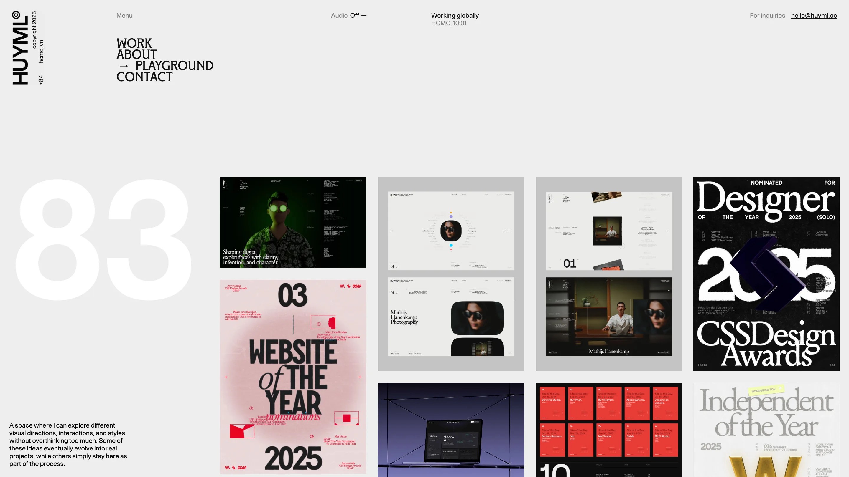
The playground repeats the trick. An 83 in the same pale white anchors the left side, and a short note explains the page: a space to try visual directions without overthinking them, where some ideas become projects and others stay put. The grid to the right is loud on purpose. Posters for his award nominations, red cards for each Site of the Day, interface studies on black.
That contrast is the lesson. The site's frame is so restrained that the work can be as noisy as it likes. One typeface in one red names things. One grey grotesk explains them. Big pale numbers give each page a size. Nothing else asks for attention, so the projects get all of it.