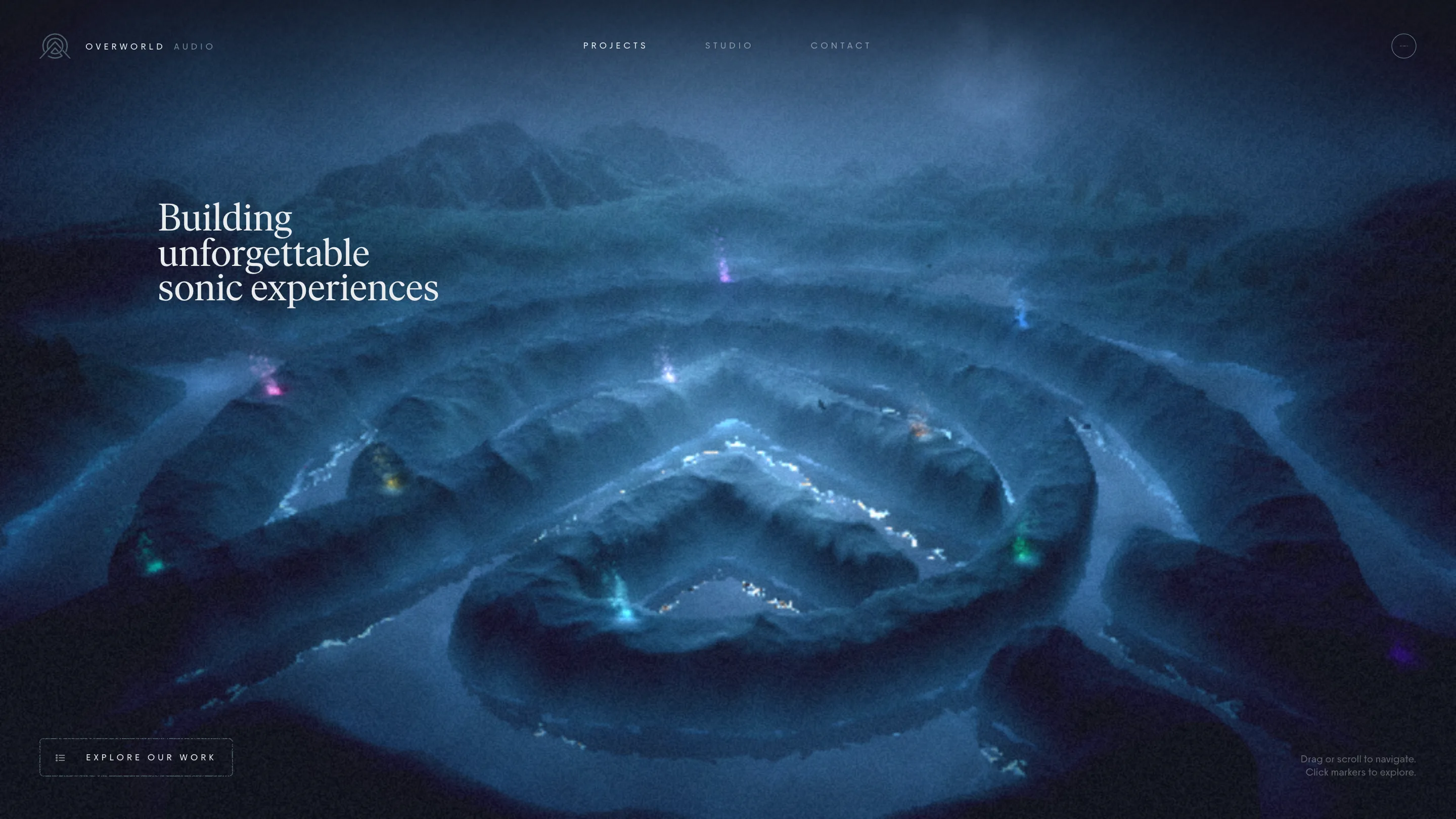
ERA Residence puts a day-night toggle under its wordmark
A BY DAY / BY NIGHT slider sits under the logotype and re-lights the hero. The Estepona property site took awwwards Site of the Day on 31 August.
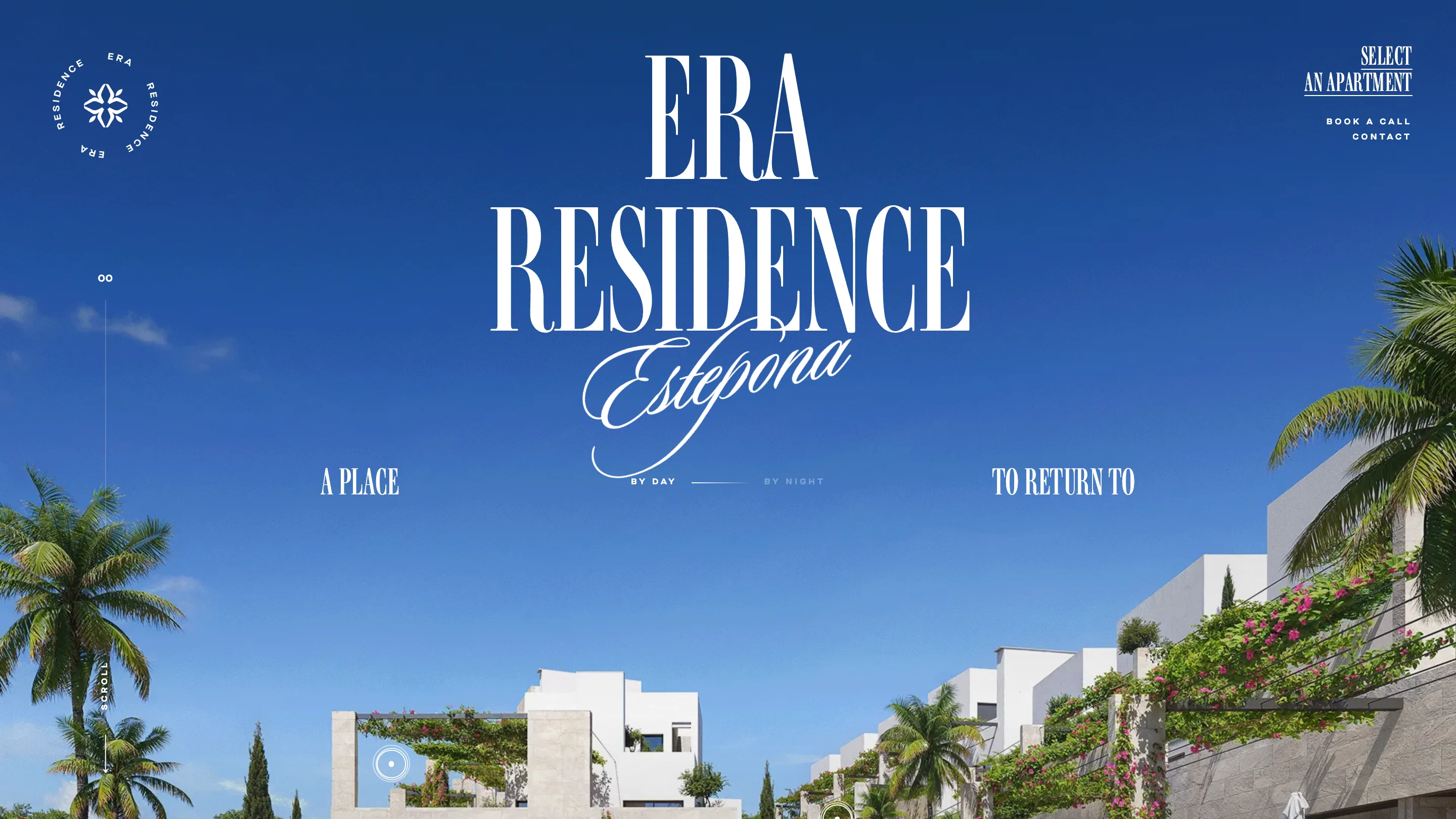
The first control on ERA Residence is a light switch. Under the wordmark, in letterspaced caps, a short slider runs between BY DAY and BY NIGHT, and moving it re-lights the hero: blue sky, palms and bougainvillea one way, the same white terraces after sunset the other. The usual opening for a development site is a video loop you can only sit through. Here the first frame comes with a control.
The day-night toggle is the sales argument, built as a control. Someone buying a second home in Estepona is buying light, so the site hands the light over in the first five seconds. It sits at the optical centre, directly beneath the logotype, and it is the only thing in the frame you can touch apart from the scroll cue. Nothing competes for the click.
The site took awwwards Site of the Day on 31 August 2026 with a 7.61, built by The First The Last with Maksym Stepenko and Ivan Chopei, on Webflow with GSAP. It sells 25 apartments in a gated scheme on the New Golden Mile, finishing in the last quarter of 2026.
The type does the branding
The identity rides on one typeface: a very high-contrast condensed didone. ERA RESIDENCE stacks in two lines at display size, and the word Estepona crosses the baseline in English roundhand script, the two letterforms overlapping instead of sitting politely apart. A small four-petal rosette in a circular ERA RESIDENCE lockup handles the corner. That is the whole system, and it holds across every page.
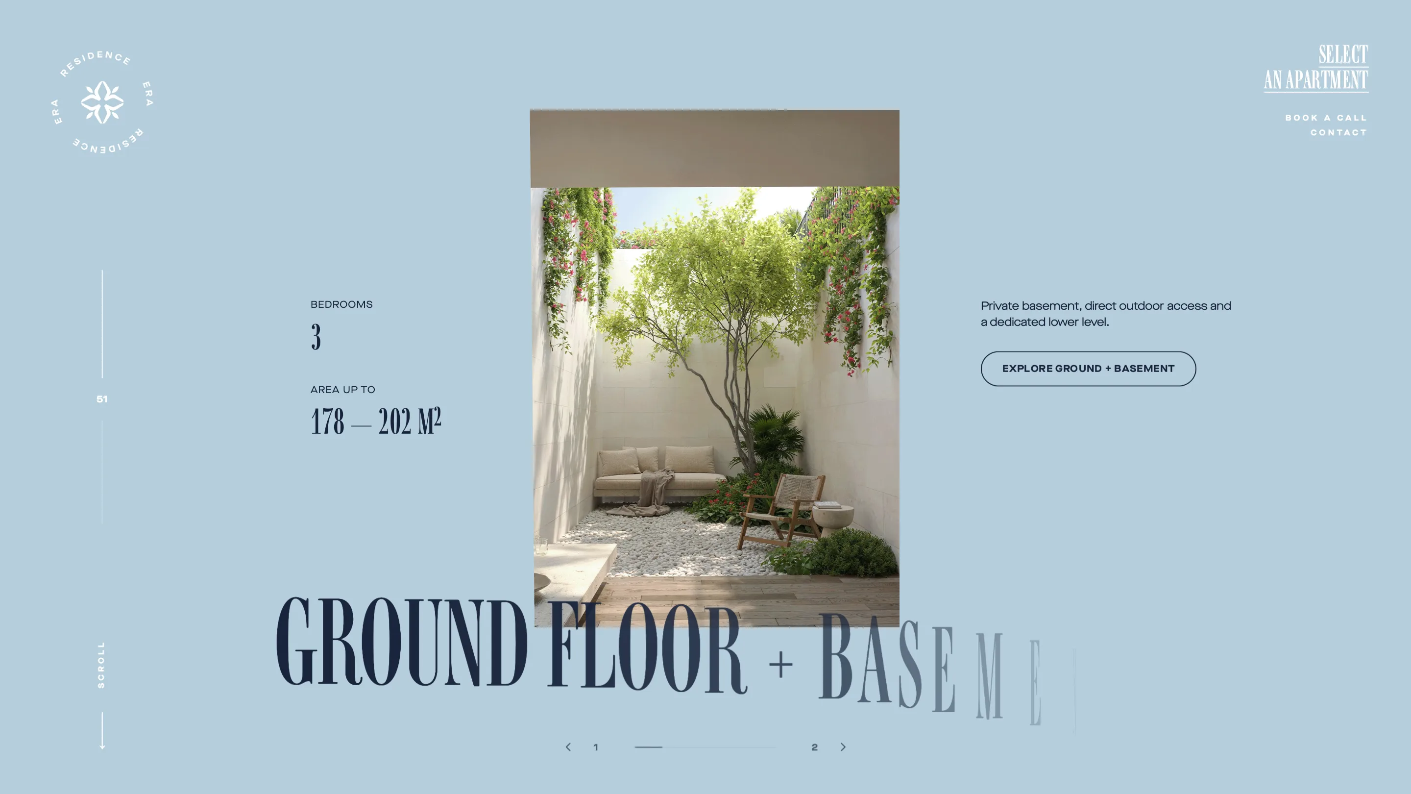
The same didone then runs at three volumes. Huge and pale behind a photograph, as with GROUND FLOOR + BASEMENT in the typology section. Mid-size and inky for the section headlines. Small and tightly tracked for the specification numbers, where 178 to 202 m² gets a proper superscript. Type this thin and this contrasted usually falls apart below 40px. It holds because everything under that size switches to a plain grotesk and stays there.
Colour by the section, and a page number in the margin
Each section gets its own field. The loader and the footer are a deep aubergine. The concept section is bone paper with a bougainvillea photograph bleeding in from the top left corner. The typology section is a pale ice blue. The apartment index goes back to bone. Nothing is tinted for the sake of it, and the ink navy stays constant, so the changes read as chapters rather than decoration.
In the left margin a number counts 00, 25, 51, 100 as you scroll, with a hairline rule and a rotated SCROLL label under it. It is a progress indicator drawn as a page number, which is the correct move for a site that wants to feel like a printed brochure.
The floor plan gets the whole page
Most developer sites bury the plans in a PDF. Here the plan is the hero of the unit page. NO. 011 opens with both levels drawn at size, the Spanish room labels left in place (Planta Baja, Salon-cocina, Dormitorio), and a compass rose sitting under them so you know which way the terrace faces.
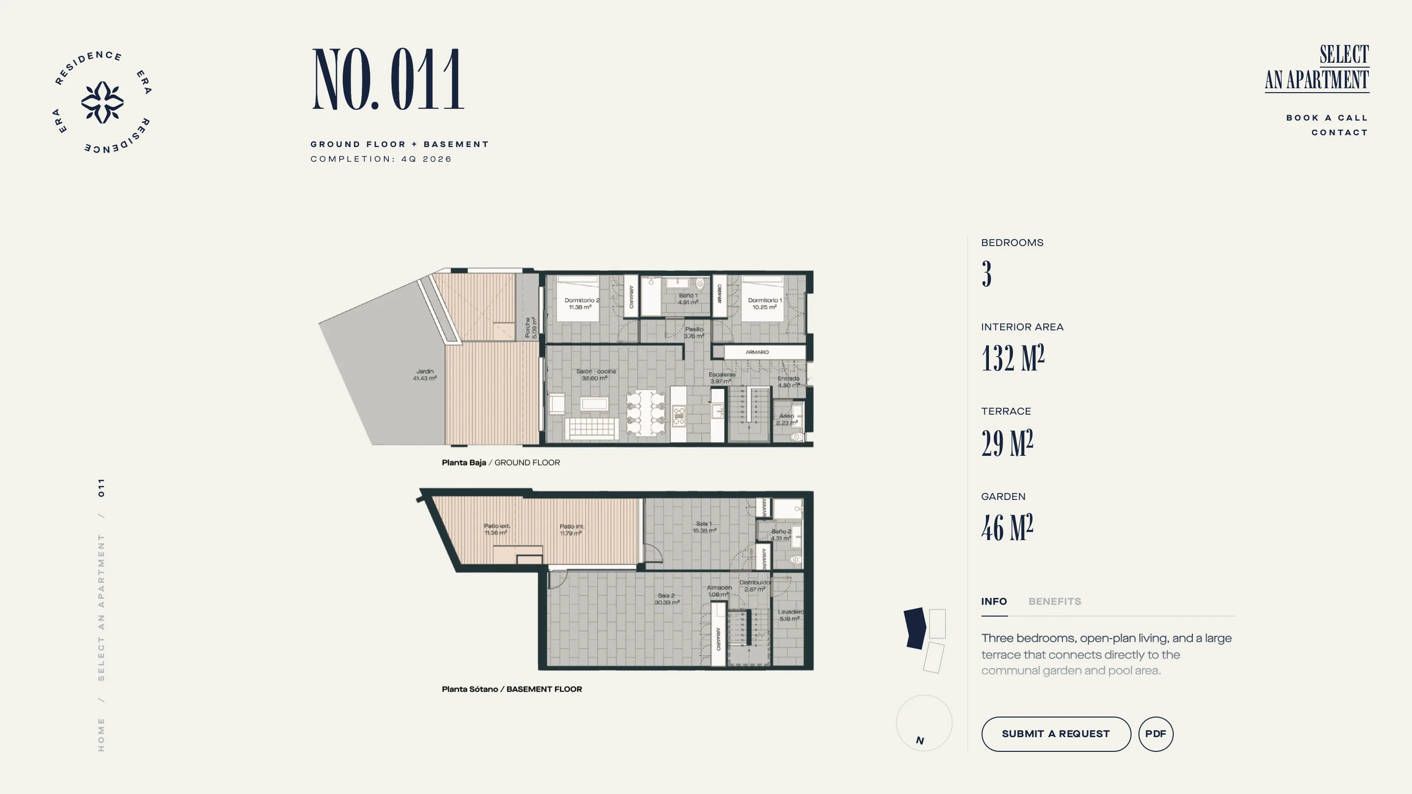
The right column holds four numbers and stops: 3 bedrooms, 132 m² interior, 29 m² terrace, 46 m² garden. Everything else is folded behind an INFO and BENEFITS tab pair. A small block diagram shows where this unit sits in B1, B2 or B3. Two buttons close it, SUBMIT A REQUEST and PDF, and neither shouts.
Where it earns the score
The index page is the test. Twenty-five units, a filter bar reading TYPOLOGY, BEDROOMS, SORT BY and RESET, and cards that show the actual plan drawing rather than another render of a sofa. A buyer comparing 011 against 031 can do it by eye.
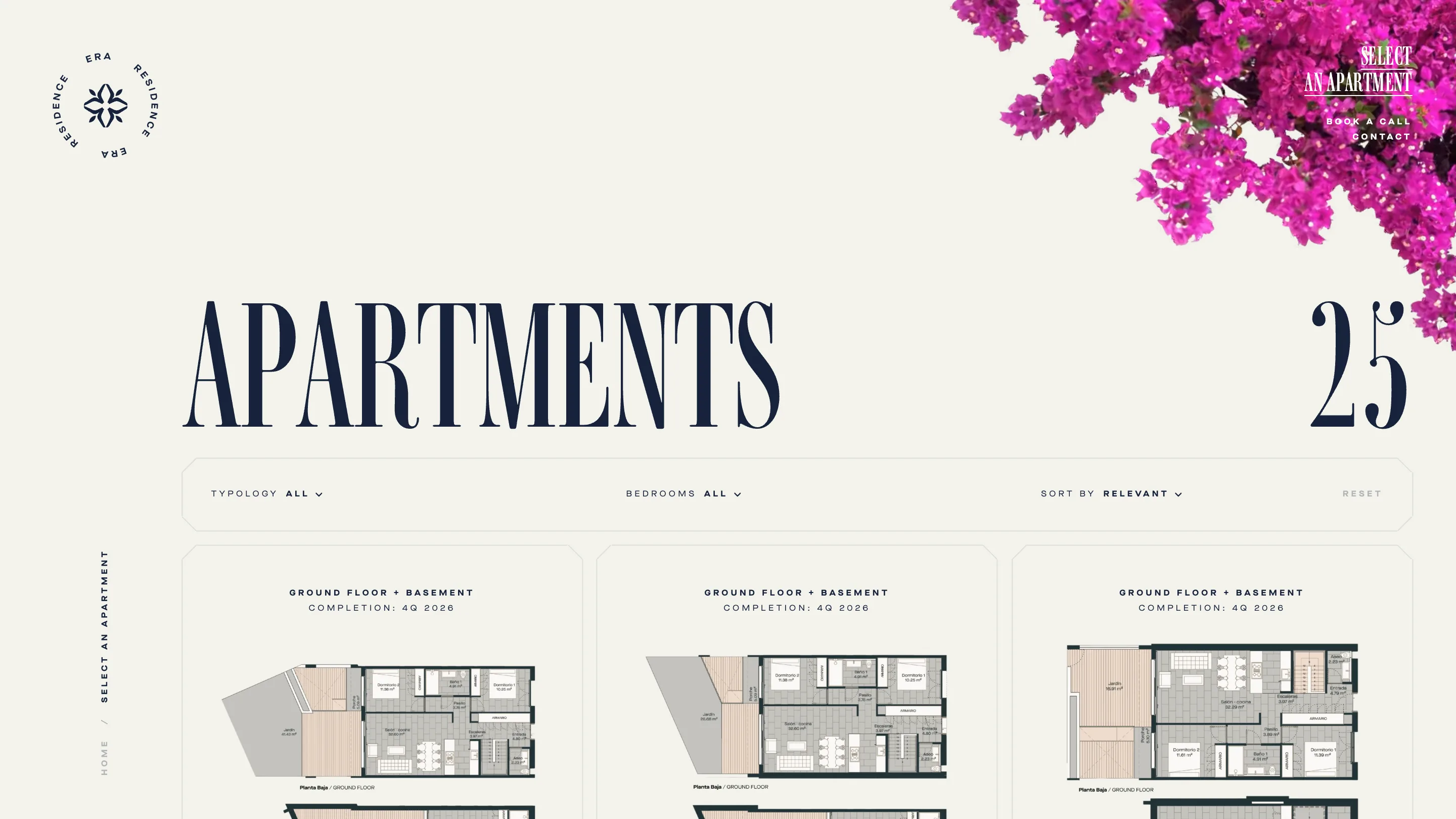
A 7.61 is a solid score rather than a famous one, and that reads right. Nothing here is a technical feat. The whole site runs on one idea carried the whole way down: give the buyer the controls. The light, the filter, the plan, the compass. The craft is in holding that line for 100 percent of the scroll and never adding a second idea on top.