Paul Kalkbrenner puts a video in the word space
Holographik set the techno producer’s name at full screen width and dropped a moving portrait into the gap between the two words.
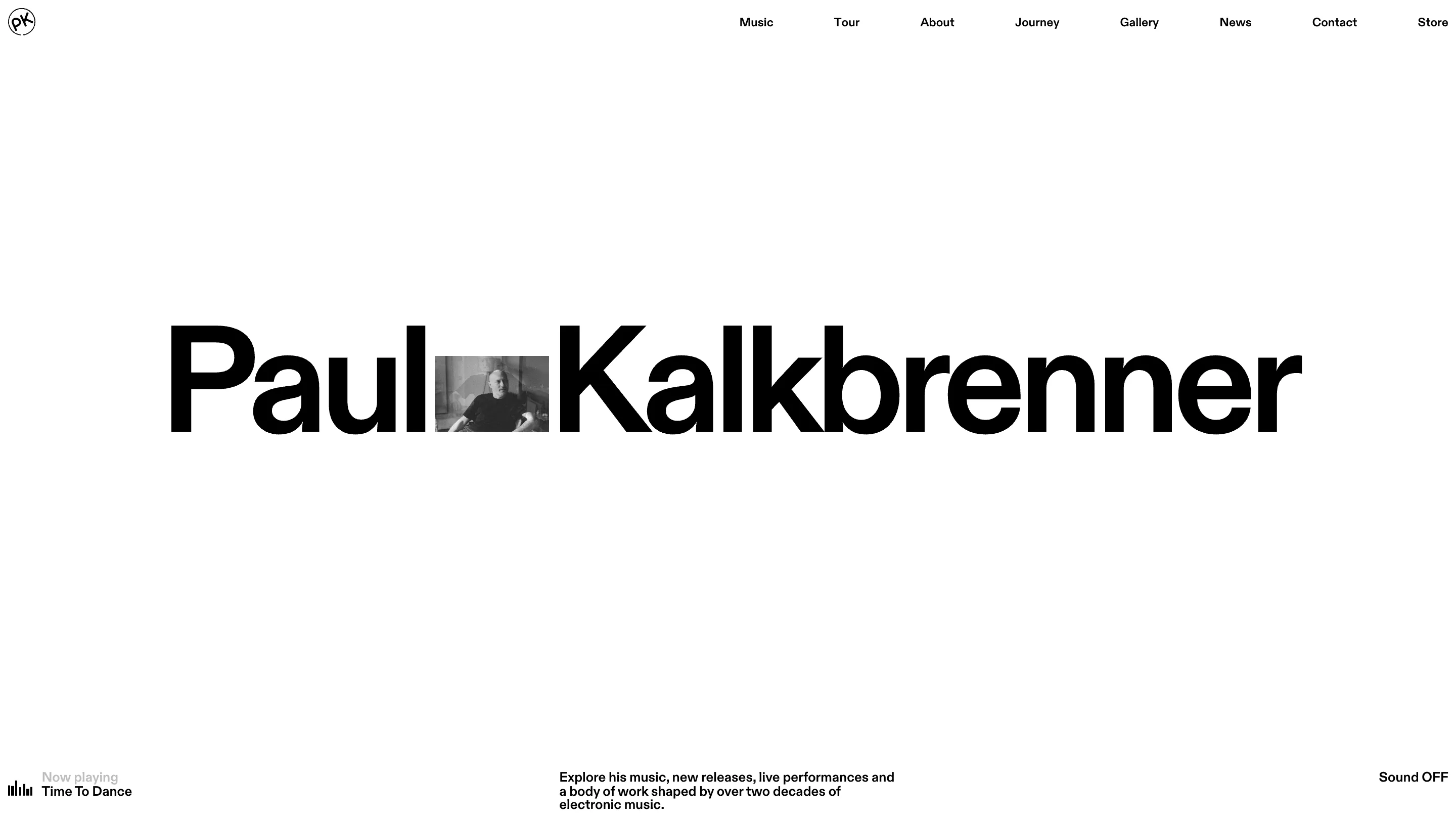
The hero on Paul Kalkbrenner's site is his name, set in a black grotesk that runs the full width of a white screen. The word space between "Paul" and "Kalkbrenner" holds a small rectangle of black and white video, cropped to cap height, of him sitting in a room. Nothing else is on that screen. The whole art direction is in that one swap.
It's branding and web work by the Croatian studio Holographik with Ilja van Eck, and it took awwwards Site of the Day on 2 September 2026 with a 7.47, its highest sub-score being 7.64 for design.
A video in the word space, not behind the type
Footage running behind a headline carries two costs. The type needs a scrim to survive it, and the video gets read as background, so nobody actually watches it. Holographik flipped the ratio. Their clip takes up under one percent of the screen and it's the only thing moving on the page, so your eye lands on it and stays. Cropping it to cap height and sitting it on the baseline makes it behave like a letter. It reads as part of the wordmark.
One headline system, every page
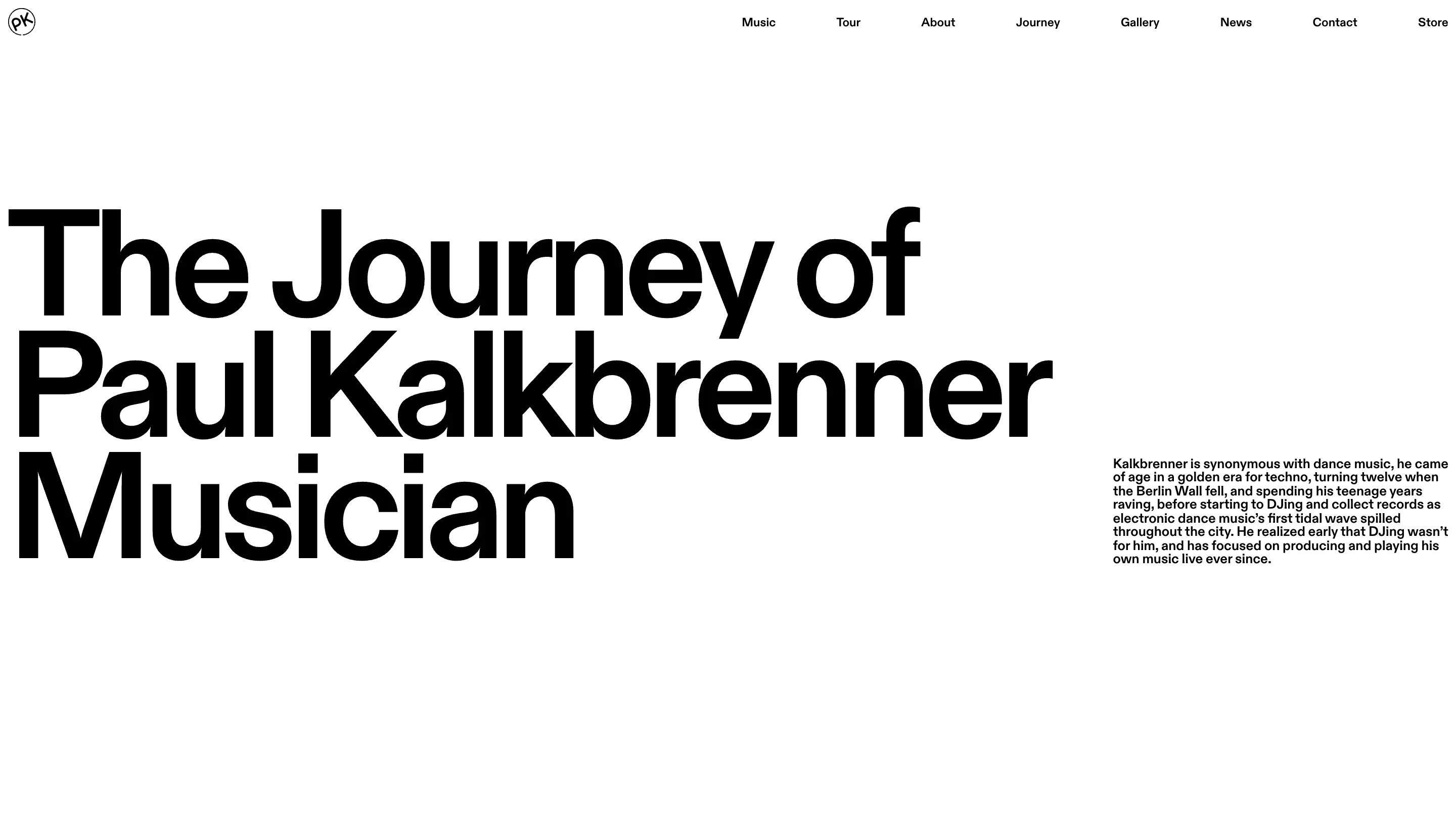
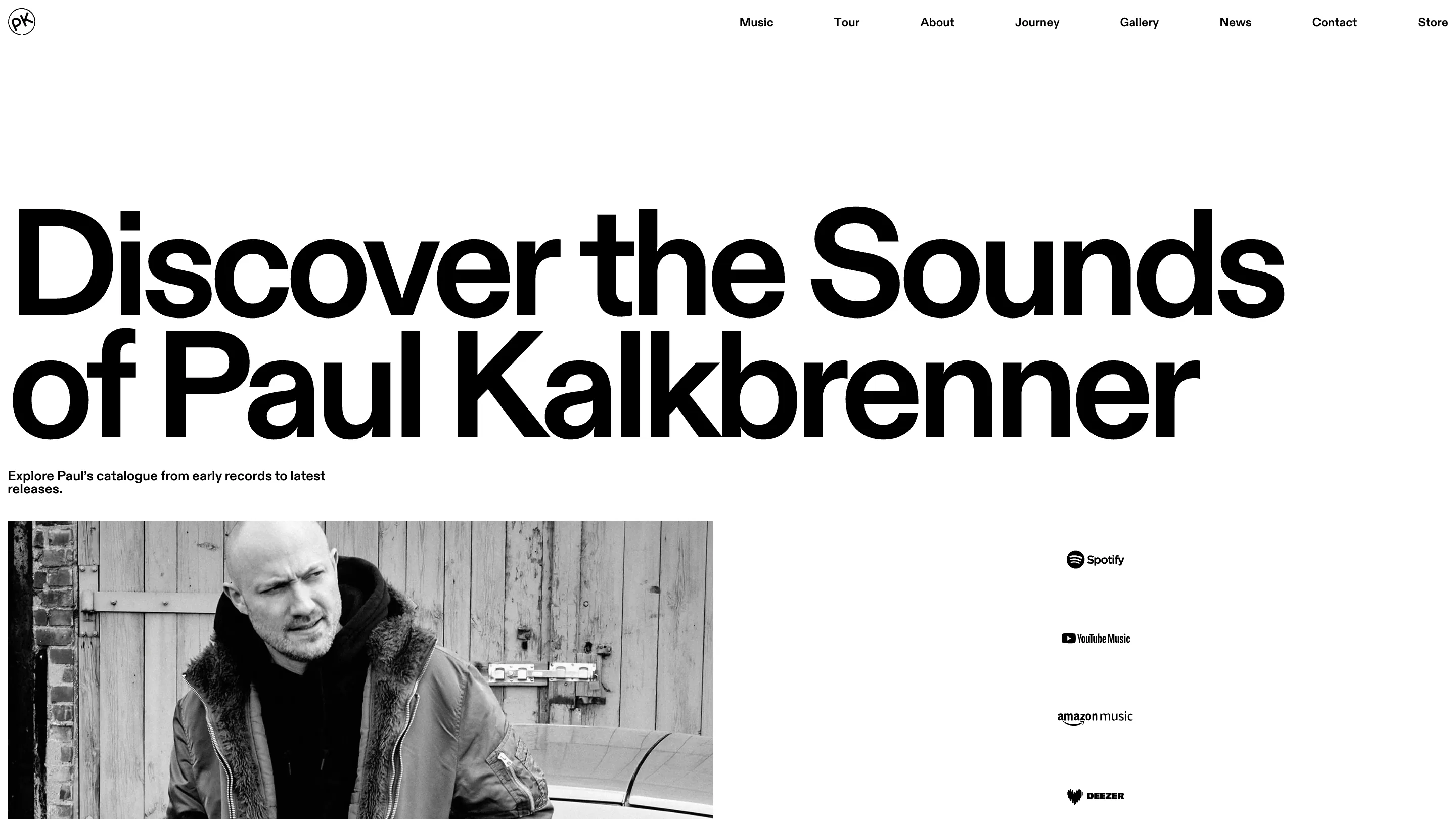
Each page opens the same way: a few words of display grotesk, flush left, tight leading, at a size that fills the upper half of the viewport. "All Tour Dates". "Discover the Sounds of Paul Kalkbrenner". "The Journey of Paul Kalkbrenner Musician". Beside or under it sits a paragraph of body copy at under a tenth of that size, bold, tightly leaded, in a narrow column.
That size jump is the layout. No intermediate scale, no subheads, no rules or boxes doing structural work. The only ornament on the site is a small filled square in front of an uppercase label like TOUR DATES.
Black, white, and photography that agrees to it
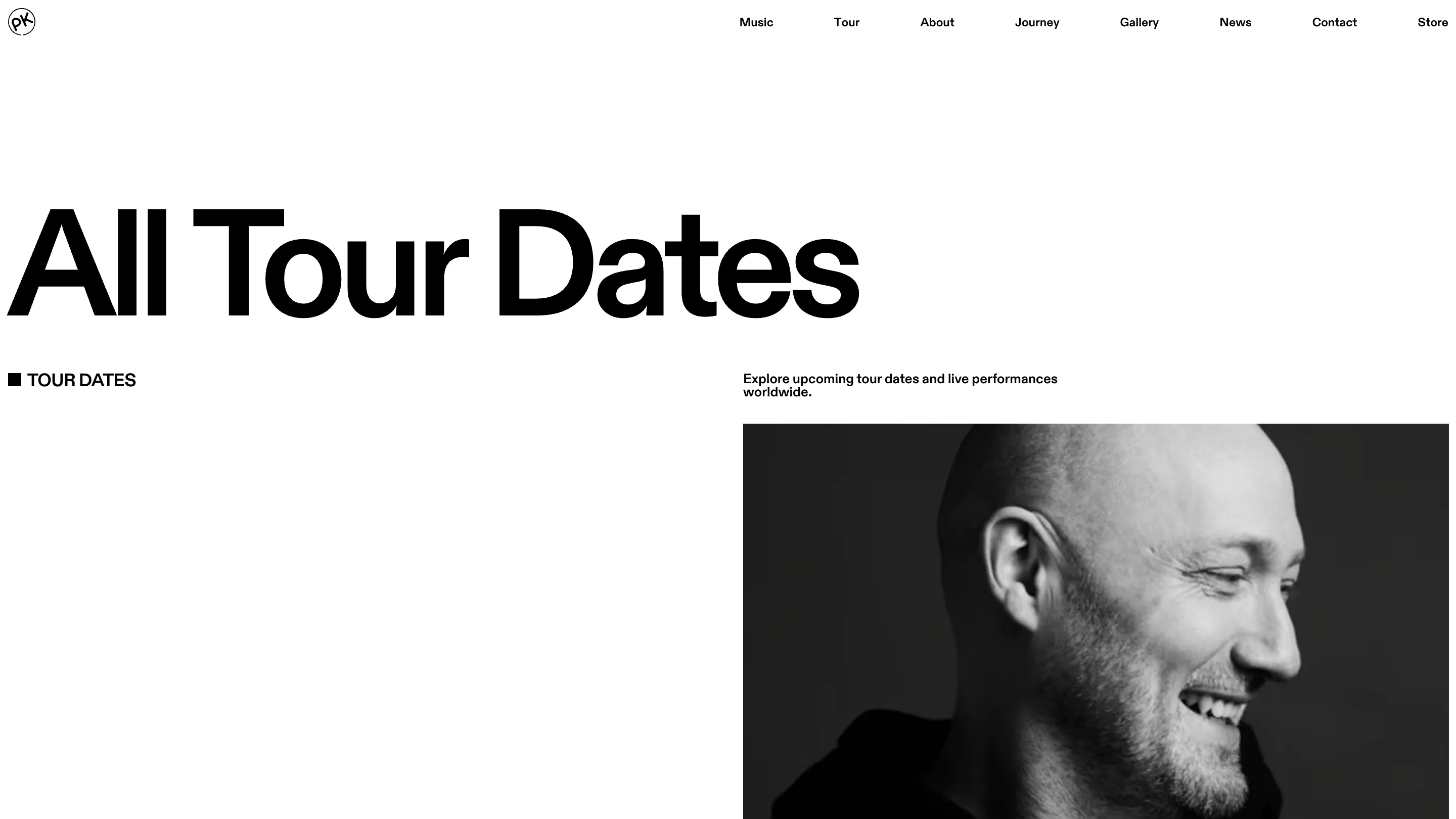
The palette is #000 and #fff. Every photograph is black and white, so no image ever introduces a third value the layout has to handle. On the tour page a hard-cropped portrait fills the right half of the screen at full bleed while the left half stays empty. That asymmetry is the only compositional move the site makes, and it repeats.
Restraint at this level is easy to admire and hard to hold for eight pages. What holds it up is the photography. The pictures have enough contrast and grain to carry a screen alone, which lets the layout stay flat.
The mute is the same size as the music
Bottom left, a five-bar equalizer and two lines of small type: "Now playing / Time To Dance". Bottom right, in the same weight and size, "Sound OFF". A techno producer's site that plays a track is defensible. Putting the mute in the opposite corner at identical weight is what makes it defensible, because you register the control in the same glance as the music. The music page carries the same logic into its streaming links, where Spotify, YouTube Music, Amazon Music and Deezer sit in a single column of small marks with no buttons around them.
Where it costs something
The template is the risk. Every page opens with the same headline treatment in the same position, so the pages tell themselves apart by wording alone, and by the fourth one you're reading the words to work out where you landed. On the tour page the headline and the standfirst take the whole first screen, which puts the actual dates below the fold on a page whose only job is dates. Usability scored 7.26, the lowest of the four judge marks, and that's about right.
The hero is still worth stealing from. It's the cheapest moving element you can put on a page, dropped into the one spot a designer would normally leave empty.