Overworld Audio lays out its portfolio as a game world map
Overworld Audio turns its logo into a 3D valley and sets every game it scored there as a glowing marker you drag the camera to reach.
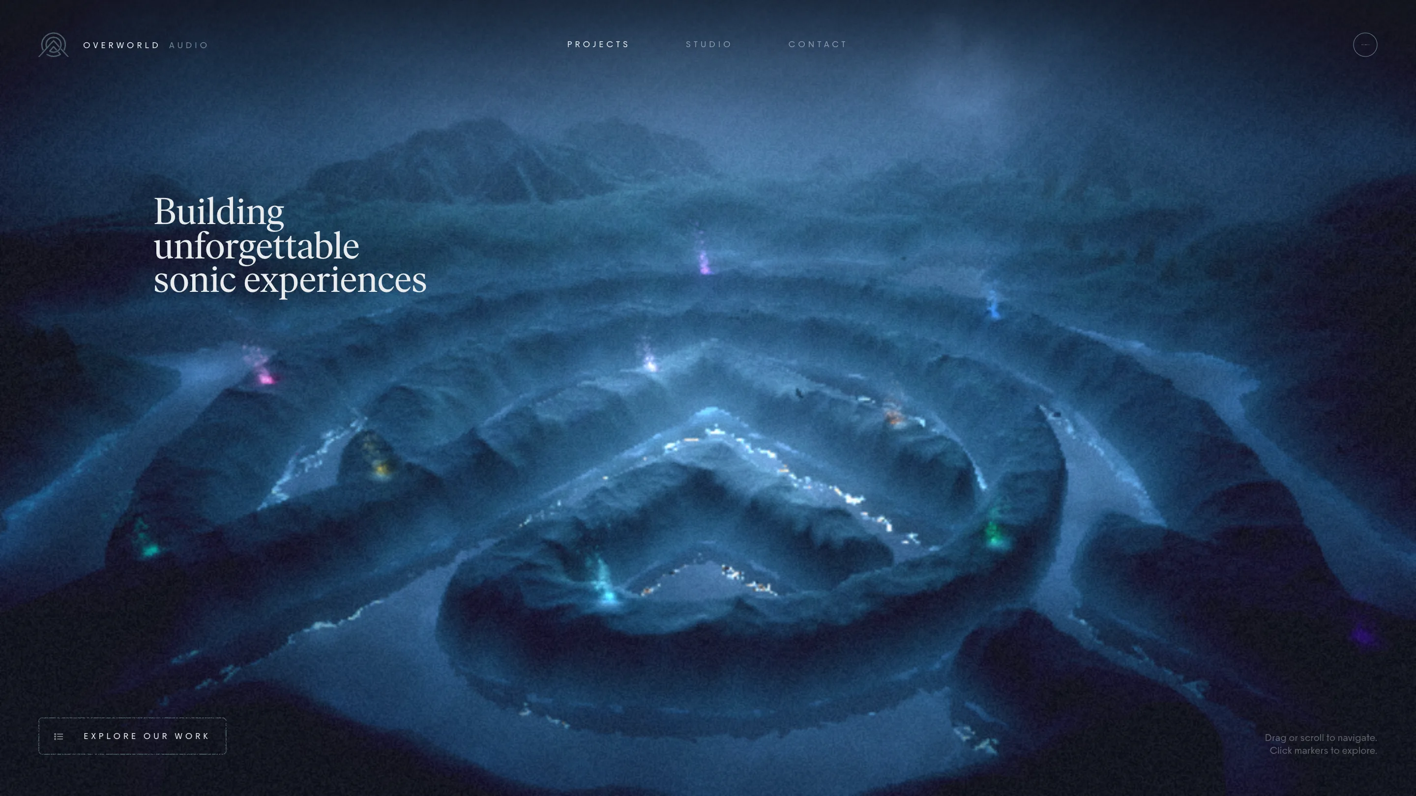
Overworld Audio's portfolio is a game world map, and the ground it's drawn on is the studio's own logo. The site opens on the mark as thin line art: a ring around a peaked A. Click past the sound prompt and that same mark becomes terrain, a night valley of ridges and rings, with every project the studio has scored set into it as a glowing marker.
That move earned it awwwards Site of the Day on 15 October 2026, with a score of 7.38 and the Developer Award on top. The site is by Rogier de Boevé, built on Three.js, Nuxt and Sanity.
A portfolio as a game world map
Overworld makes sound for games: League of Legends, Star Wars Jedi: Survivor, Palia, Supervive, MultiVersus. A game studio's client knows how an overworld works before the page finishes loading. You drag the camera, you scroll to pull back, you click a light to travel there. The hint in the bottom corner says exactly that, "Drag or scroll to navigate. Click markers to explore", and then gets out of the way.
So the list of work is a place. The markers sit on the ridges at different heights and distances, each in its own colour, a magenta here, a cold blue there, a green on the near rim. There's no grid of thumbnails to scan. You go and look, the way you'd clear fog on a map.
It works because the metaphor belongs to the client's world. A studio that scores games presenting its work as a level is a claim about taste, and the site backs it up by playing like one.
The logo is the level
Look at the home shot again. The concentric rings and the inner chevron are the Overworld mark, scaled up into a landscape and lit from inside. The loader draws the logo in hairlines; the map is that drawing with depth and weather. Brand and navigation are the same object.
That's the detail judges reward with a 7.83 for creativity. The 3D scene is the identity, so nothing about it feels bolted on.
Sound you choose to turn on
The first screen asks one question: enter with sound, or without. It's the right call for a studio whose product is audio. Nothing plays until you say so, and the choice itself tells you what the studio sells. A "Sound on/off" toggle stays in the header after you're in, so you can change your mind on any page.
Even muted, the map moves like it has a score under it. Markers pulse, fog drifts across the far ridges, and the camera eases with long, soft curves. The animation sub-score was 8.60, the highest in the Developer Award breakdown.
Quiet pages after the loud map
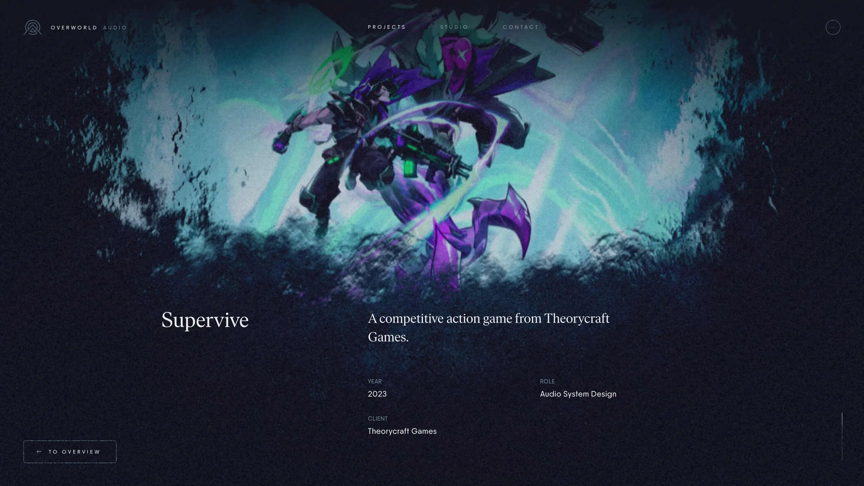
Click a marker and the project page is restrained. The game art sits at the top with ragged, painted edges that dissolve into the dark ground, as if it were torn out of the map. Below it, the title in Ivar Headline, a one-line description in the same serif, and three plain fields: year, client, role. The role lists read like a credits roll, "Audio Direction, Sound Design, Audio System Design, Cinematics".
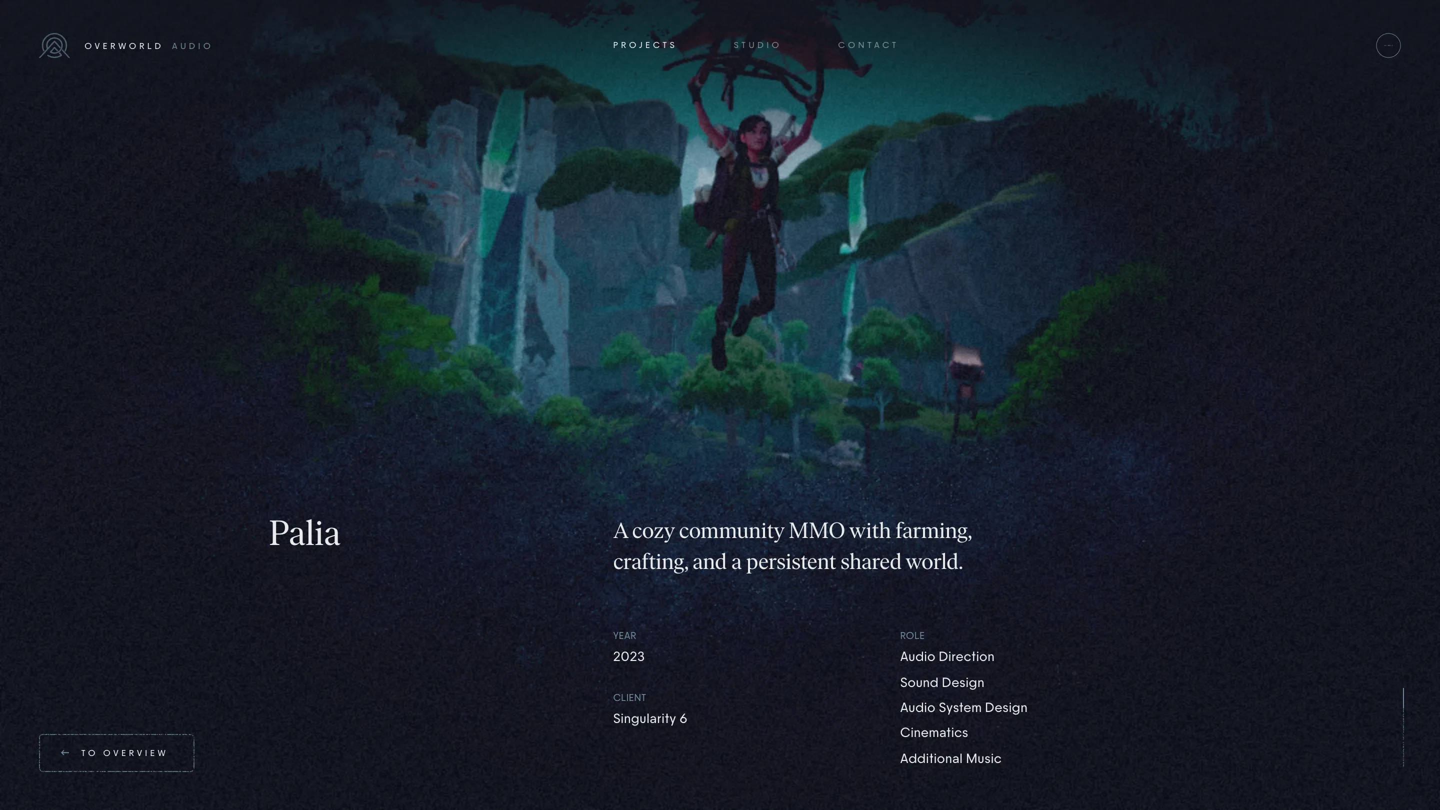
The type pairing carries the whole site. Ivar Headline, a sharp editorial serif, sets every heading. PP Frama, a grotesk, sets the navigation and the body in small, widely tracked caps and plain text. Two colours do the rest: a navy-black, #13151f, and a cool off-white, #e9ecee, with a grain texture laid over both so the dark never looks flat on screen.
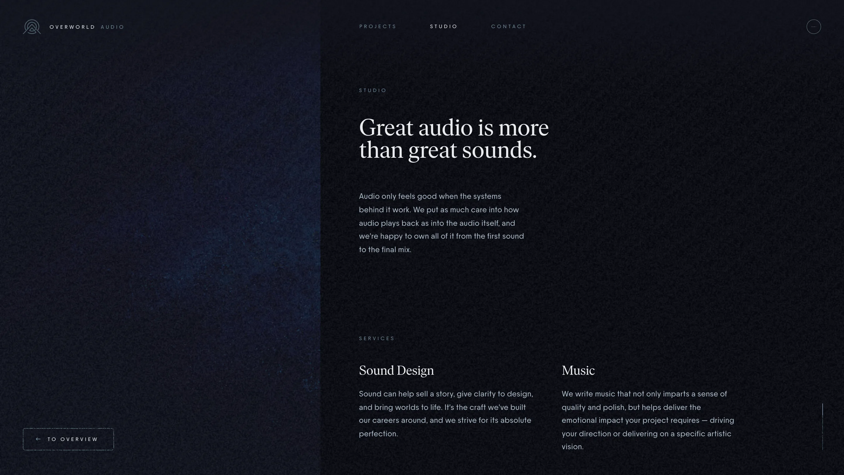
The studio page keeps the same hand. A panel slides in from the right, cut against the map behind it, with short paragraphs at a narrow measure. "No juniors, no training people while on your project." That line does more selling than the 3D does, and the layout gives it room.
What to take from it
The lesson for anyone building a portfolio: find the metaphor your client already lives in and make the navigation out of it. Overworld's clients play maps for a living, so the map reads at once. Then make the map out of your mark, and keep every page after it quiet enough that the work and the words can land.