OFFF Forum gives the mood to a serif, the facts to a grotesk
OFFF Forum's festival site splits its typography in two: a flared serif carries the mood, a tight grotesk carries dates, places and answers.
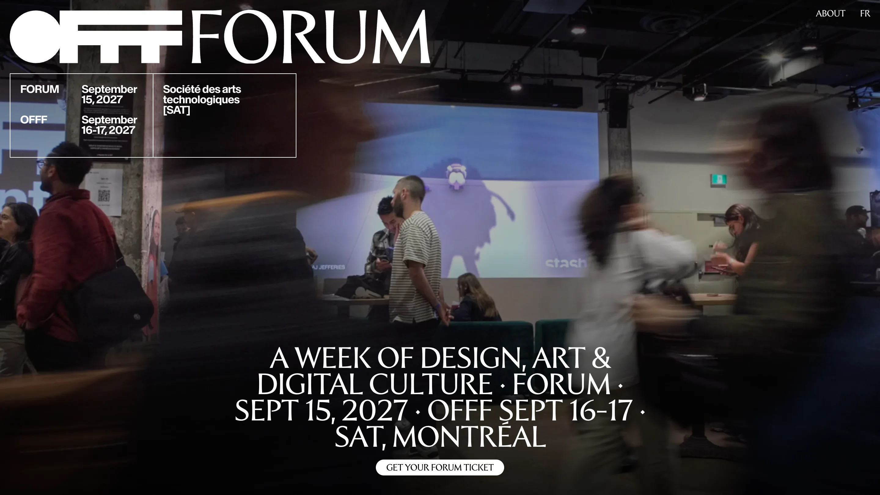
OFFF Forum's festival site runs on two typefaces with two separate jobs. A flared, high-contrast serif sets the mood: the name, the big promise, the menu, the ticket button. A tight black grotesk sets the facts: dates, the venue, page titles, the FAQ. Once you see the split, every screen reads faster.
The site, built by Montréal studio REF Digital for the festival's Montréal edition, took awwwards Site of the Day on 16 October 2026 with a score of 7.33, plus a Developer Award. Creativity and content both scored 7.5.
A wordmark that already holds both voices
The logo sets the rule before you read a word. OFFF is the festival's own mark: a solid black circle and three slab-cut Fs, pure geometry. FORUM sits right next to it in the flared serif, thin strokes swelling at the ends, all capitals. Same height, opposite temperaments. Everything below follows that pairing.
On the home page the hero is a long-exposure video shot inside the Société des arts technologiques, people smeared into streaks as they cross the room. Over it, the serif sets the line "A week of design, art & digital culture", the dates and the venue strung together with centred dots. It reads like a poster title. Above it on the left, a thin ruled box holds the same information in the grotesk: Forum, September 15, 2027. OFFF, September 16-17. Société des arts technologiques [SAT]. You get the event twice, once as a feeling and once as a schedule.
The grotesk does the filing
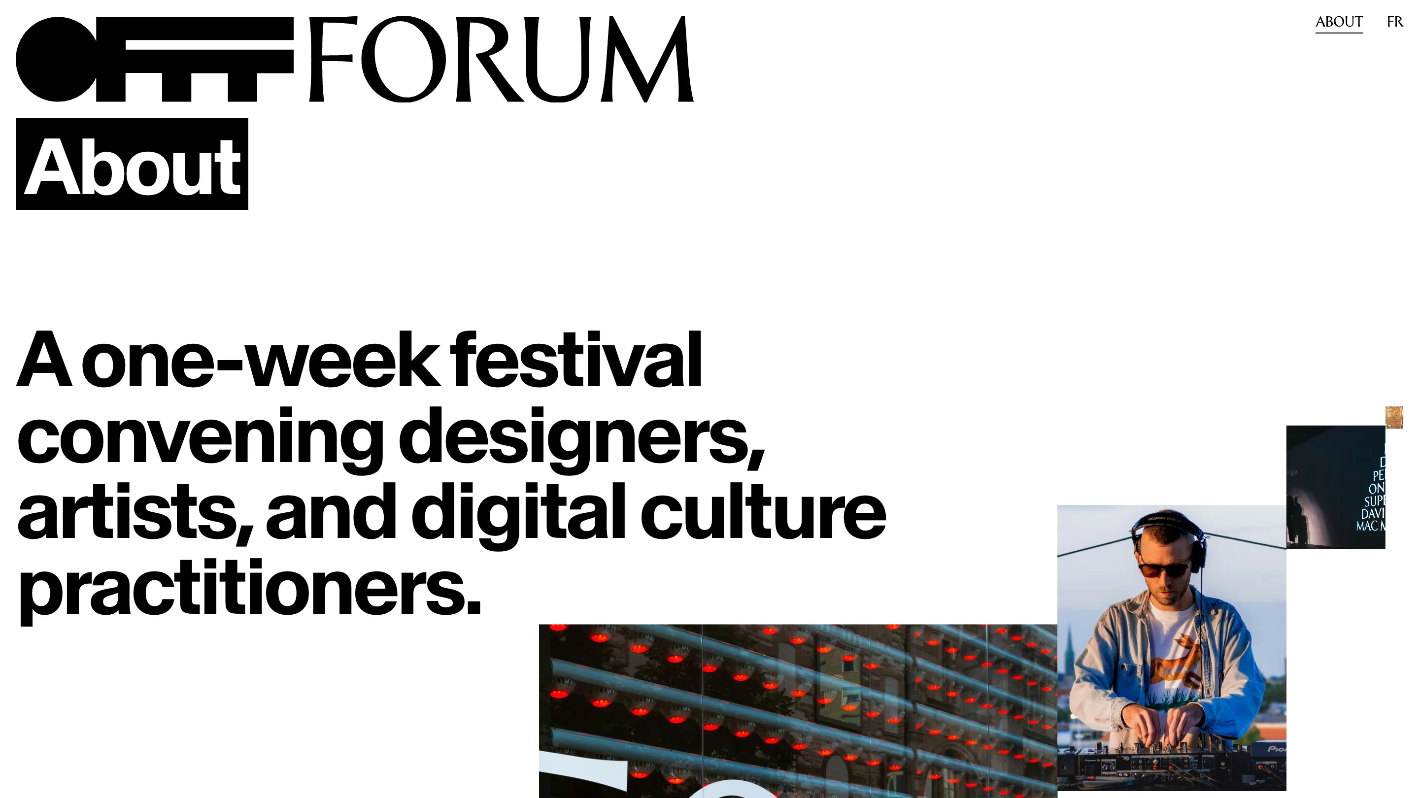
The inner pages switch to white and let the grotesk lead. Every page title sits reversed out of a black slab under the logo: About, Media room, FAQ. The slab is the width of the word and no wider, so a short title like FAQ gets a small block and Media room gets a long one. It works like a label on a box, and it's the only colour change on the page.
The About page opens on one sentence set huge and tightly tracked: "A one-week festival convening designers, artists, and digital culture practitioners." Photos from past editions, a DJ on a rooftop, a facade of red lights, a projection in the dark, drift in from the right at different sizes. The collage stays loose while the type stays rigid, and the contrast keeps it from feeling like a stock gallery.
A media room that reads like a spec sheet
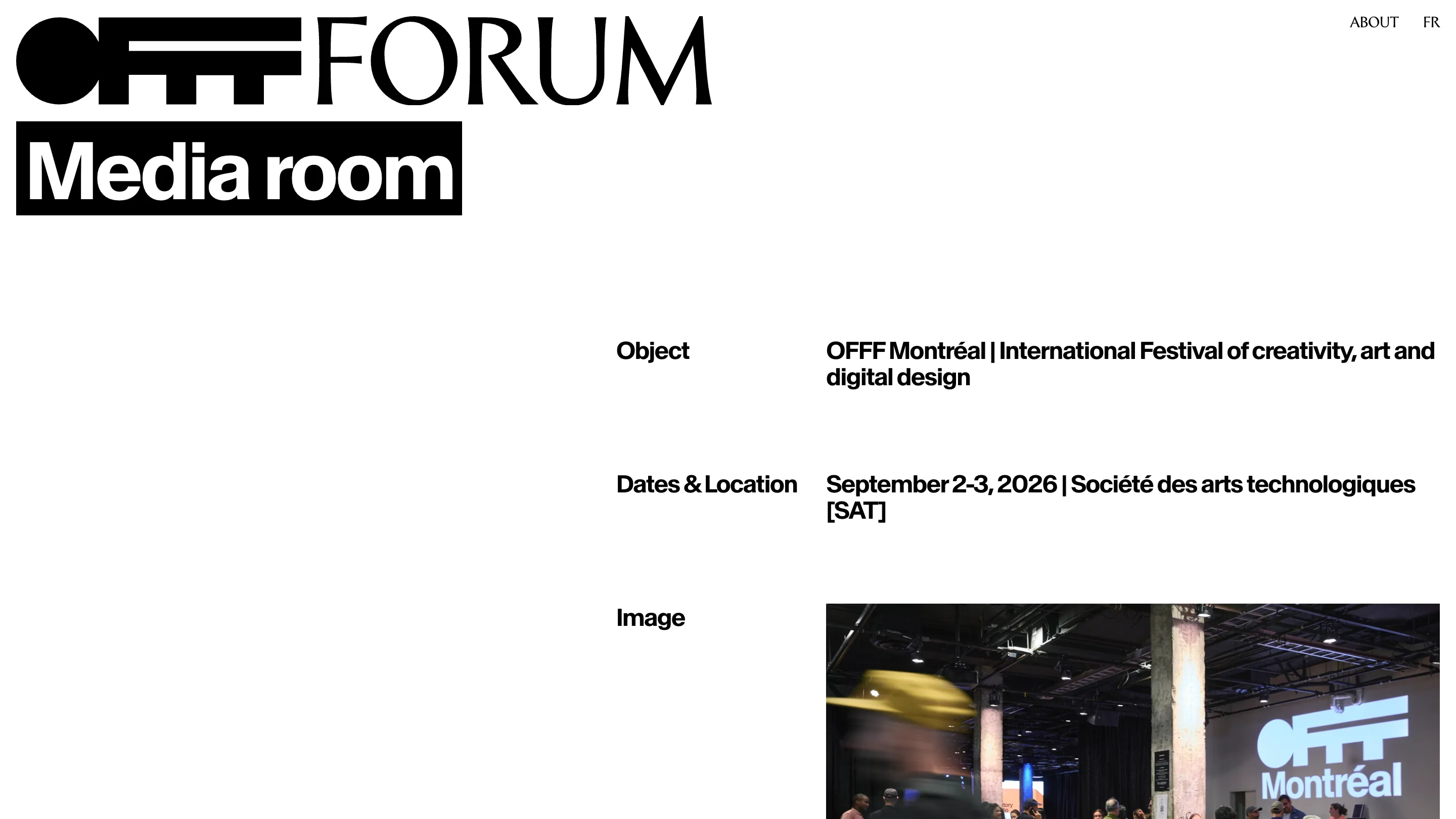
The media room is the plainest page on the site and one of the best. It's a two-column table pushed to the right half of the screen: Object, Dates & Location, Image, each label in the grotesk with its value beside it. A journalist looking for the official name and the dates finds them in two lines. The empty left half does the job a sidebar would, keeping the eye on the right.
The FAQ keeps the same grid
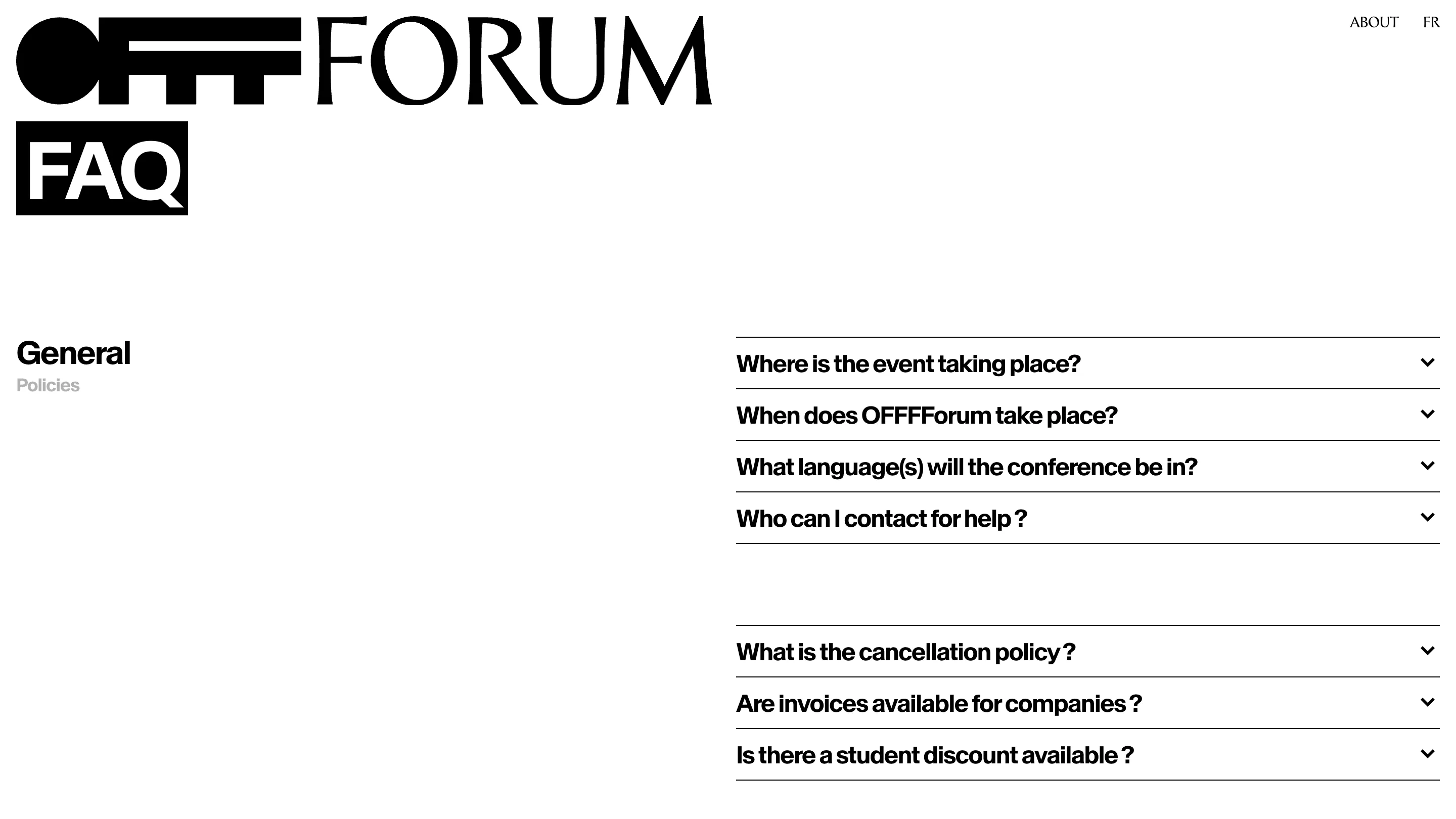
The FAQ uses the same split. Categories sit on the left, General in black and Policies in grey. The questions run down the right in thin-ruled accordion rows with a small chevron at the far edge. The question text is set big, close to the size of a subhead, so the page scans like a list of headlines. Nothing on it is decorative.
Why the judges rated it
OFFF Forum gives each kind of information one typeface and sticks to it: if it's the serif, it's the feeling of the week; if it's the grotesk, you can put it in your calendar. The motion lives in the footage, the type stays still, and the black-and-white palette lets the photos carry all the colour. A designer can learn the system from the logo alone, and that's why the site holds together across pages this different.