

Revelatio opens every page with one plain sentence
Revelatio's studio site runs one plain sentence per page on near-black and saves every colour for the work it shows.
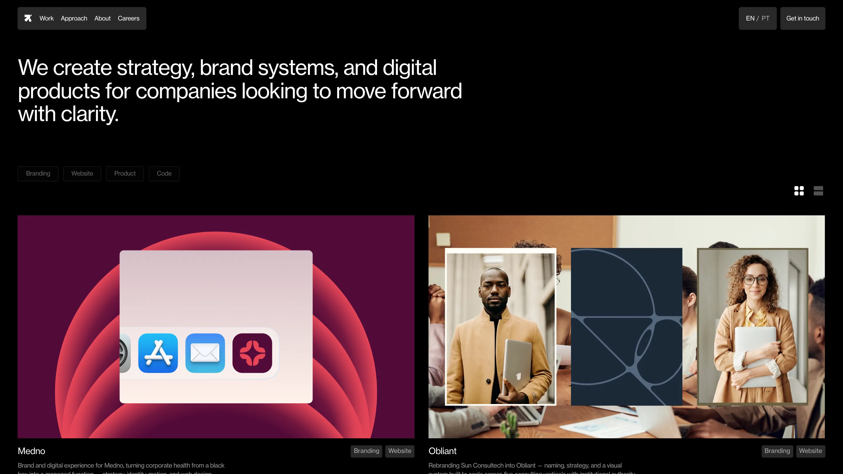
Open Revelatio's site and the first thing you get is a sentence, set large and plain: "We create strategy, brand systems, and digital products for companies looking to move forward with clarity." No hero reel, no strapline stack, no motion showing off. One line, one grotesque typeface, white on near-black. The Recife studio Revelatio runs this move on every page, and it's what earned the site awwwards Site of the Day plus a Developer Award on August 12, 2026.
The sentence is the hero
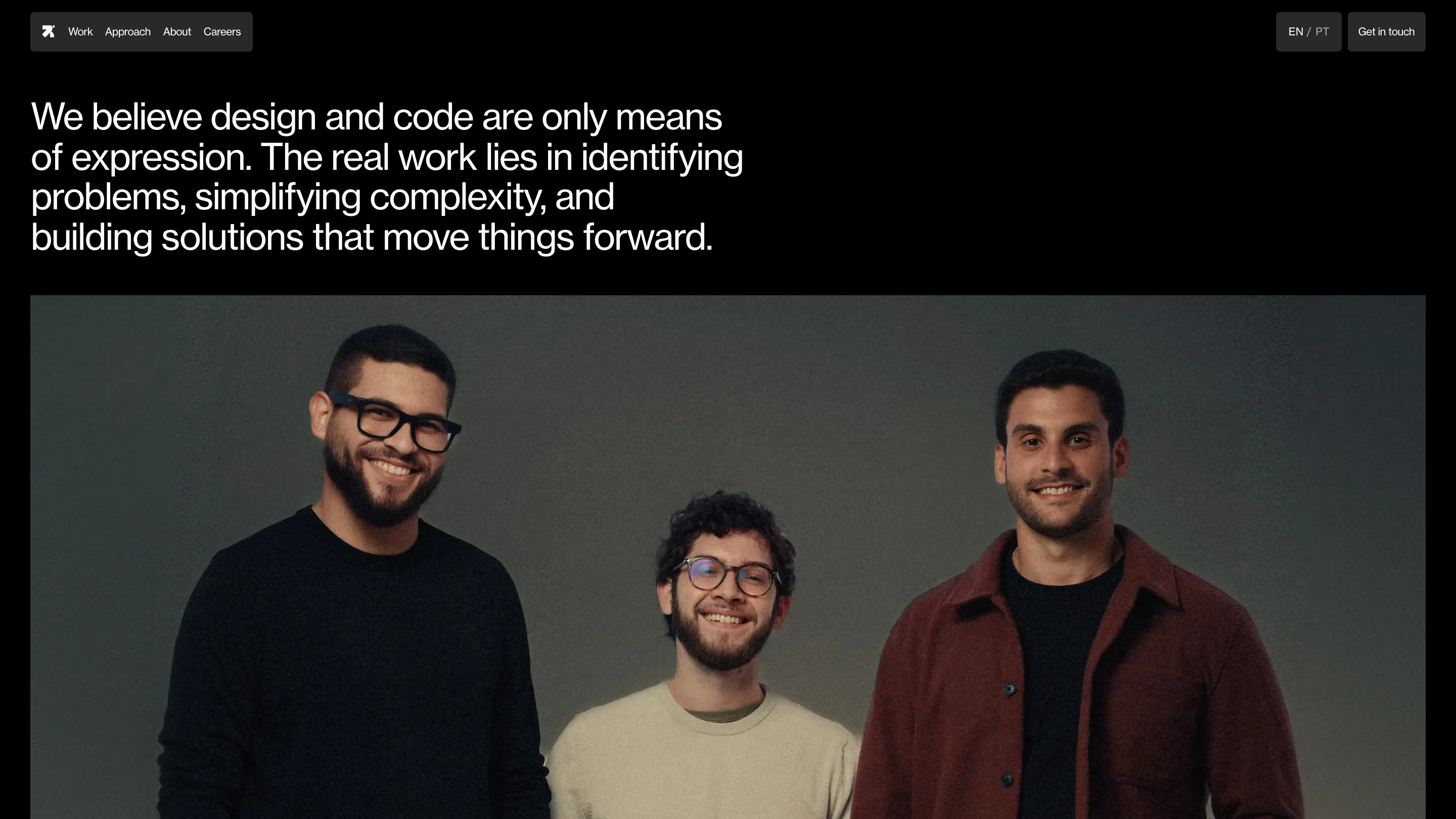
Each page leads with one plain-language line and trusts it to carry the screen. The work index opens on that clarity line. The approach page reads "We believe design and code are only means of expression. The real work lies in identifying problems, simplifying complexity, and building solutions that move things forward." The type is a neo-grotesque, big, medium weight, tight leading, ranged left, with nothing decorative near it. A working designer clocks the discipline fast. The studio believes the words can do the job, so it gives them the room and steps back.
Colour lives in the work, not the chrome
The frame stays close to black. Navigation, the filter chips for Branding, Website, Product and Code, the grid and list toggle, the EN/PT switch: all sit in low-contrast grey so they recede. Then the project thumbnails land and the colour arrives at once. Medno's card is a magenta radial gradient with an iOS dock floating over it. Obliant sets studio photography beside a navy geometric panel. On a black page those tiles read like lit windows. Holding the interface quiet is what lets the work shout.
A case study that folds into one screen
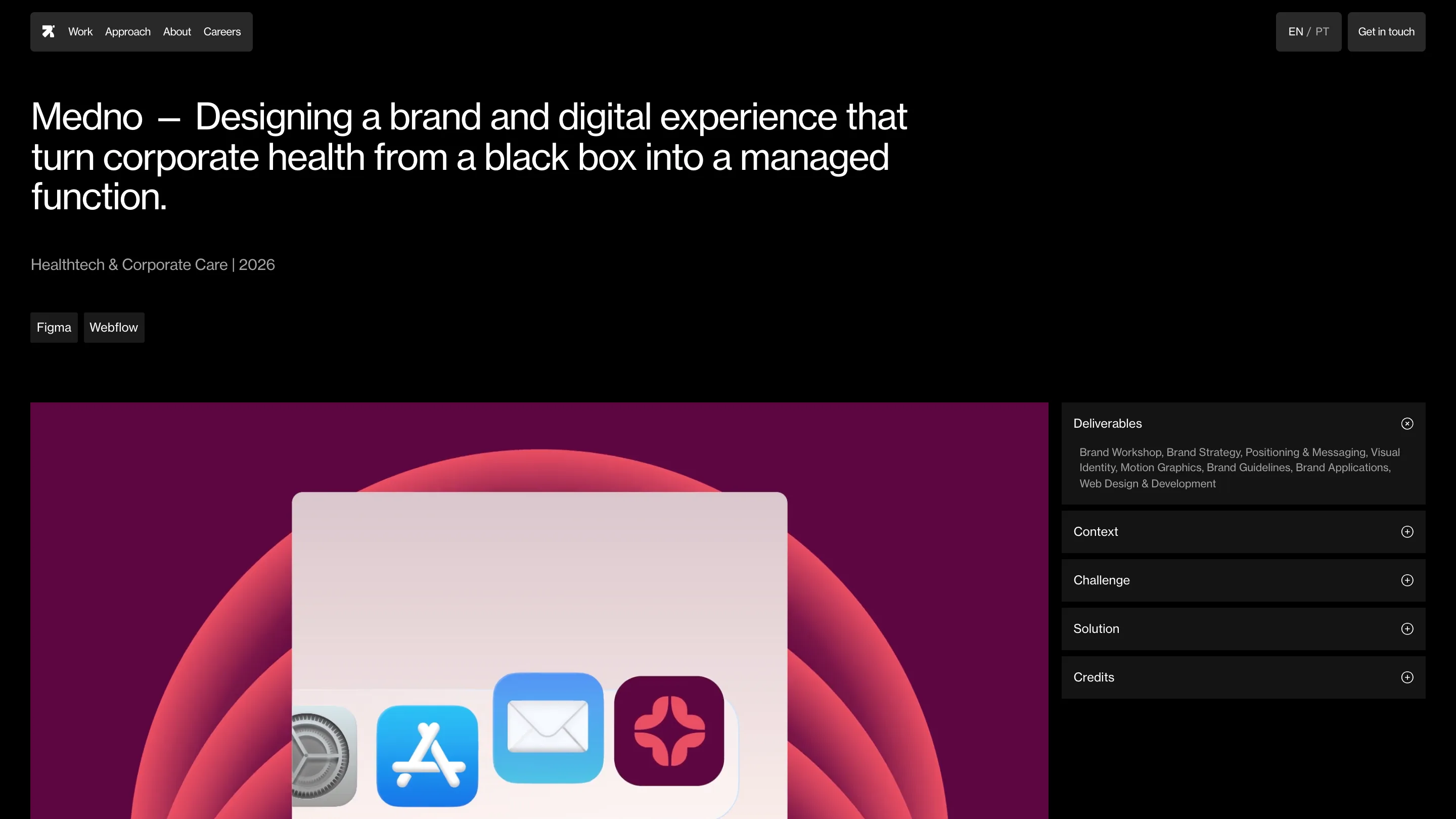
Click into Medno and the logic holds. A plain title: "Medno: designing a brand and digital experience that turns corporate health from a black box into a managed function." Below it, the sector and year, then two tool chips, Figma and Webflow. The case study is an accordion pinned to the right. Deliverables sit open by default, then Context, Challenge, Solution and Credits, each behind a plus. You can read the full scope of the brand build, the workshop, the strategy, the positioning, the motion, the guidelines and the web, without scrolling a wall of text. Open what you want and skip the rest.
Why it rates
Judges reward an idea carried all the way through, and this one holds on every template. Same black canvas, same single typeface, same one-sentence opener, whether you're on the home, the approach, or a project detail. Plain language does the art direction. The Developer Award is the tell on the build: the Webflow site stays quick and the interactions feel considered rather than busy. Nothing here is loud. That's the craft.
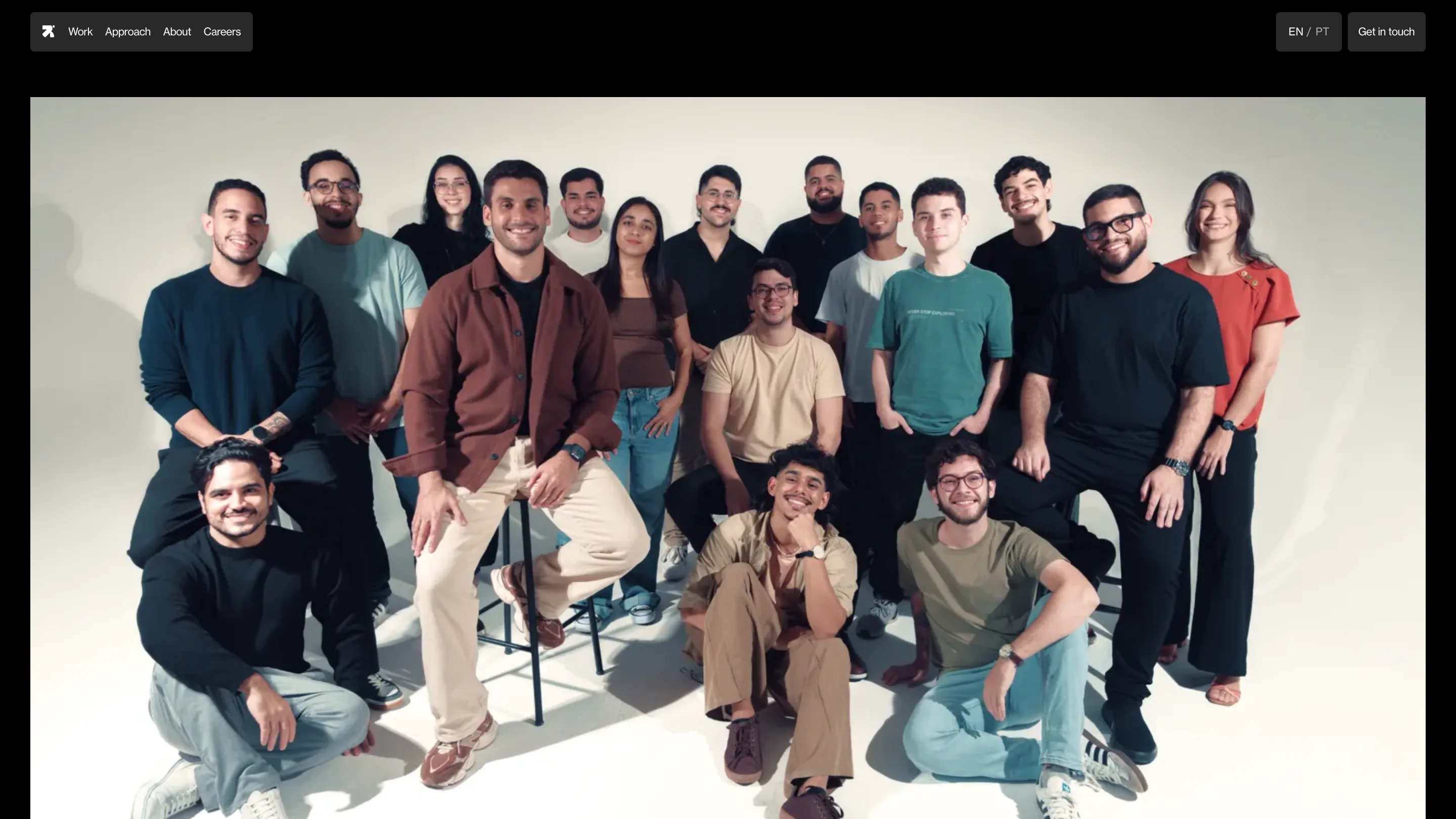
Revelatio positions itself around strategy, brand systems, product and code, and the site practises what it sells. It reads like a studio that decided what to leave out, then held the line. On a night when plenty of Site of the Day winners lean on WebGL and scroll tricks, a near-monochrome page built on plain sentences is the harder thing to pull off, and the more useful lesson for anyone building a studio site.

