Mosby's Files makes a filing cabinet its navigation
Tubik built its American Modernism archive to work like an actual filing cabinet: coloured folders you open by the tab, drawn entirely in CSS.
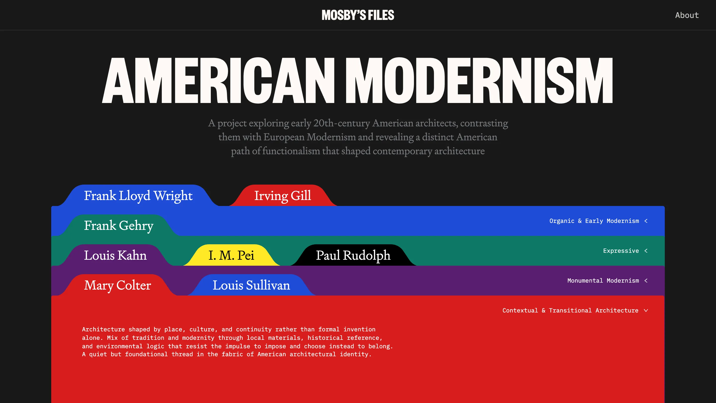
Mosby's Files is a research archive on early American architects, and you navigate it like a filing cabinet. The homepage stacks eight coloured folders across a black screen. Each carries a paper tab with a name set in serif: Frank Lloyd Wright on blue, Irving Gill on red, Louis Kahn on purple, I. M. Pei on yellow. Click a tab and that folder pulls to the front. A sheet of off-white paper rises with it, a black-and-white portrait clipped to the corner. The site took awwwards Site of the Day on August 13, 2026 with a 7.23, and the filing-cabinet idea is the reason.
The studio behind it is Tubik, a team who studied architecture in Ukraine before they moved into product design. That background shows. The site treats a website like a building: structure first, everything else hangs off it.
A filing cabinet, drawn in CSS
The folders aren't images. Tubik built the tabs, the rounded corners, the stacking, and the little three-hole punch down the left margin in CSS, then wired the motion with GSAP on top of Vue. Open a file and the details sell it. A wire paperclip holds the architect's photo. The other architects stay docked as coloured tabs along the right edge, so you always see the rest of the drawer while you read one file.
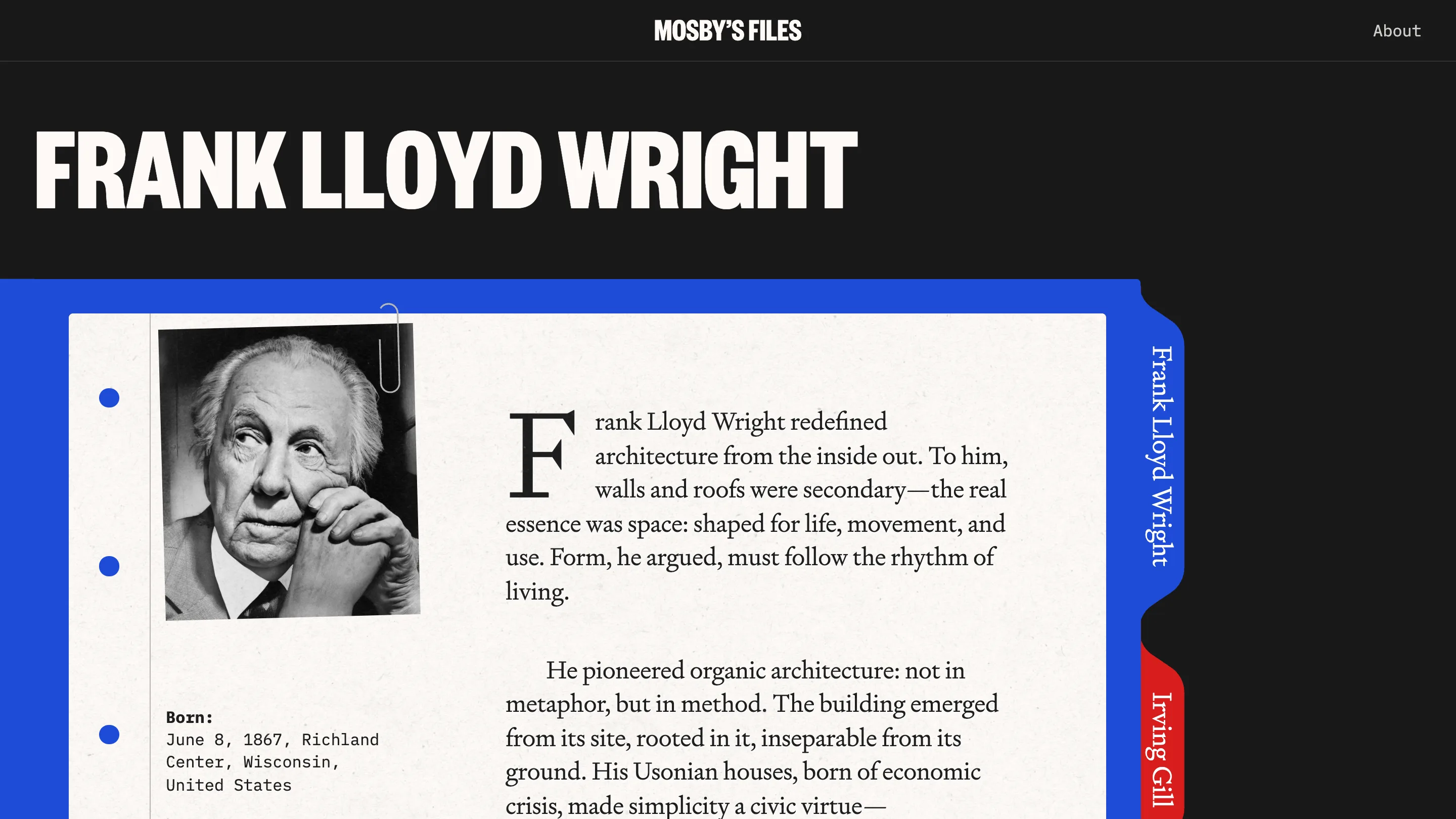
It's skeuomorphism, the thing flat design spent a decade burying. Here it earns its keep, because the subject is an archive and the interface is the archive. You don't learn a navigation. You already know how a folder works.
Three typefaces doing three jobs
The type system is the other half of the craft. Names and headlines run in a heavy condensed grotesque, all caps, packed tight, so AMERICAN MODERNISM fills the width of the screen. The reading copy switches to a warm old-style serif with a drop cap, set on the paper like a printed page. Labels and metadata (Born, Died, the category names) sit in monospace, the typeface of a card catalogue.
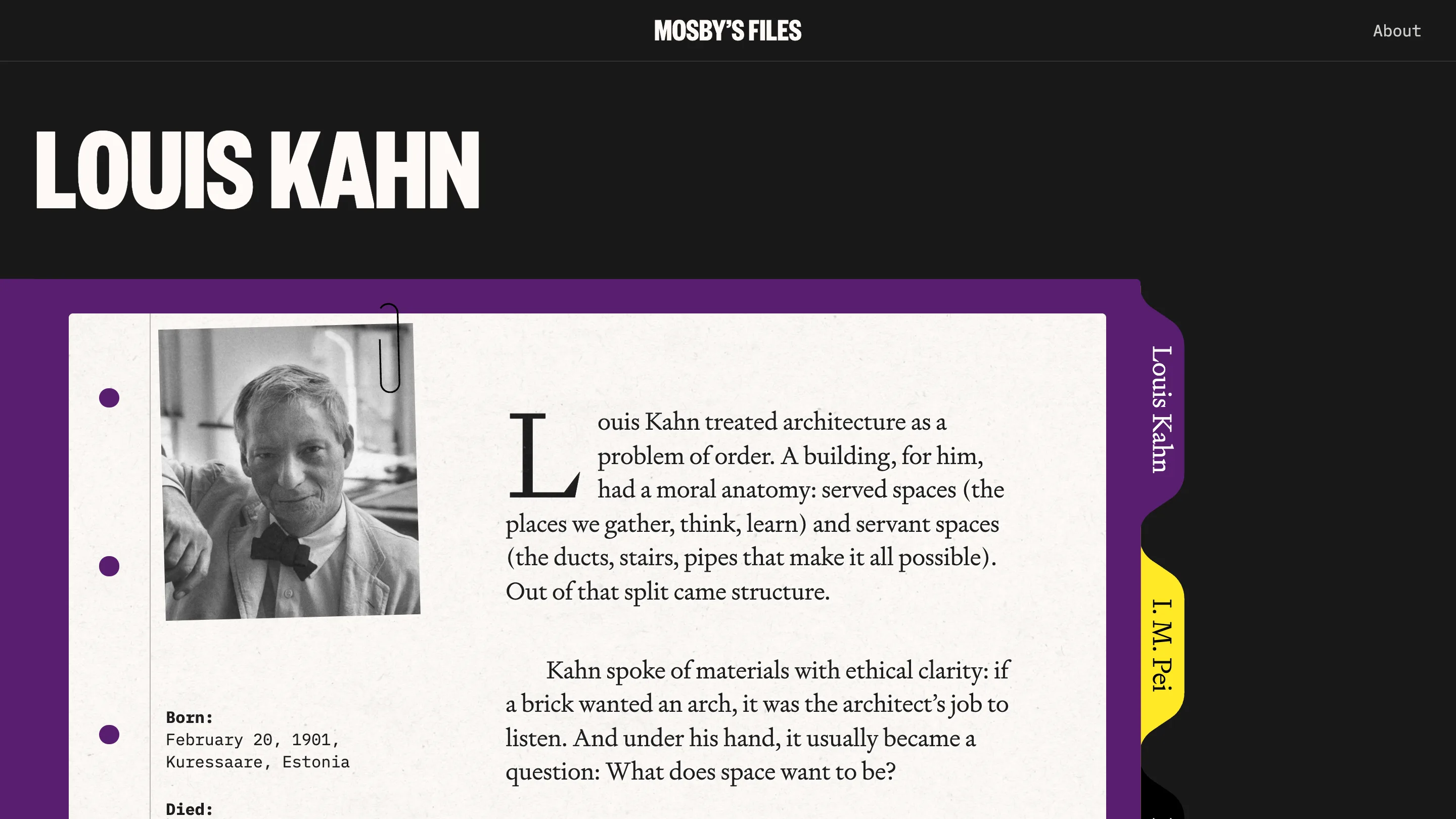
Three voices, three jobs, no overlap. The grotesque shouts, the serif reads, the mono files. Each face is cast to what it's good at, which is rarer than it sounds.
Colour that codes the archive
Six folder colours carry the structure: blue, red, green, purple, yellow, and a black tab. They aren't there to look loud. Each colour maps to one of the archive's groupings, so Organic and Early Modernism reads blue and Monumental Modernism reads purple, and the eye sorts the drawer before you read a word. Against the near-black background the primaries hit hard, and the off-white paper cools them the moment a file opens.
The writing earns the frame
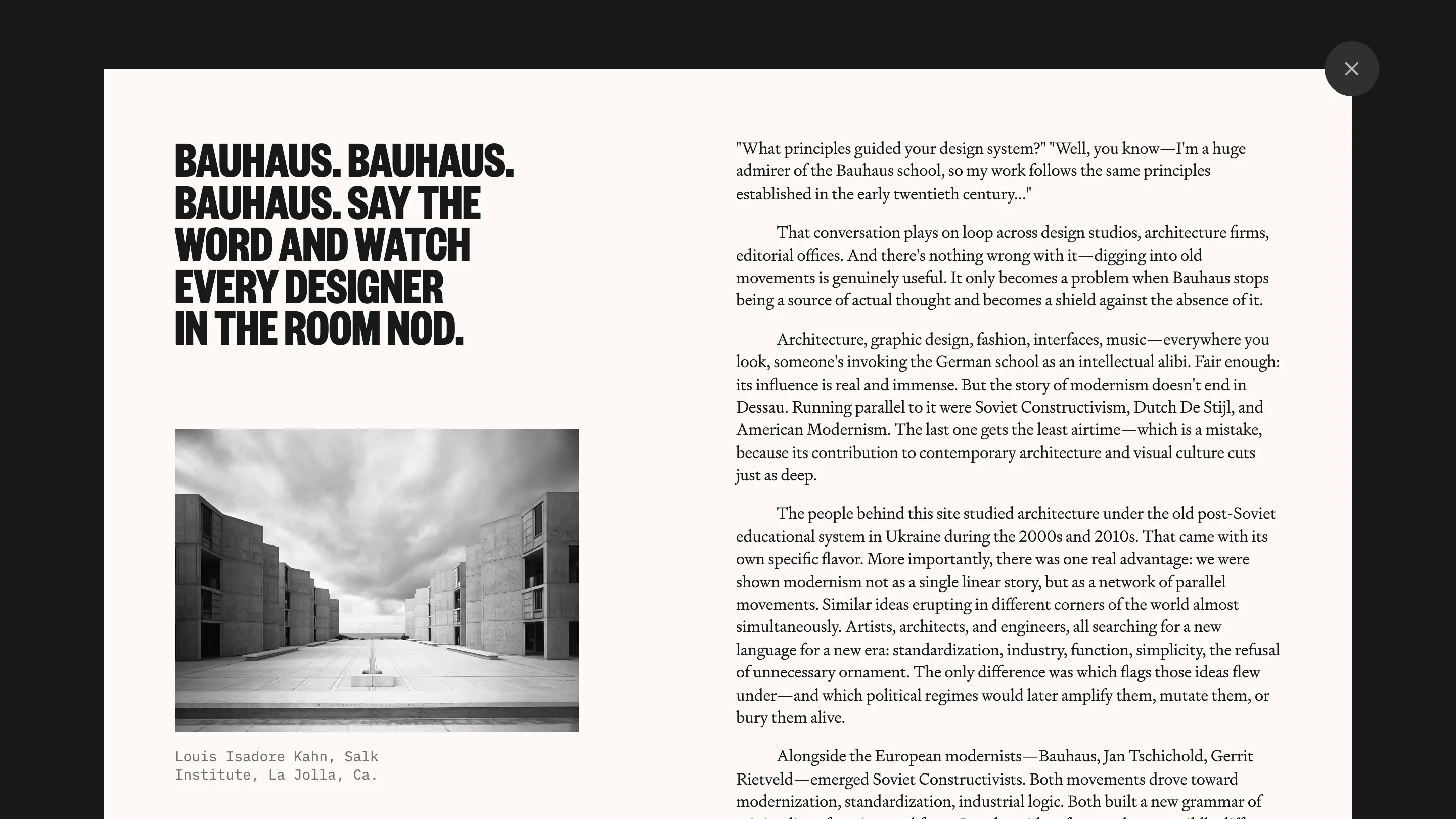
The About page is the tell that someone cared about the whole thing. It opens as a paper overlay with a headline about how every designer in the room nods at the word Bauhaus, then makes the case that American Modernism ran parallel to it and deserves more airtime. The copy is sharp and a little funny, written by a team who learned this history first-hand.
That's what pushes Mosby's Files past a nice visual trick. The folder metaphor, the three-typeface system, and the colour coding all point at one idea: an archive should feel like handling the documents. Tubik built the cabinet, then filled it with something worth reading.