

Studio K95 floats its whole portfolio in Klein blue
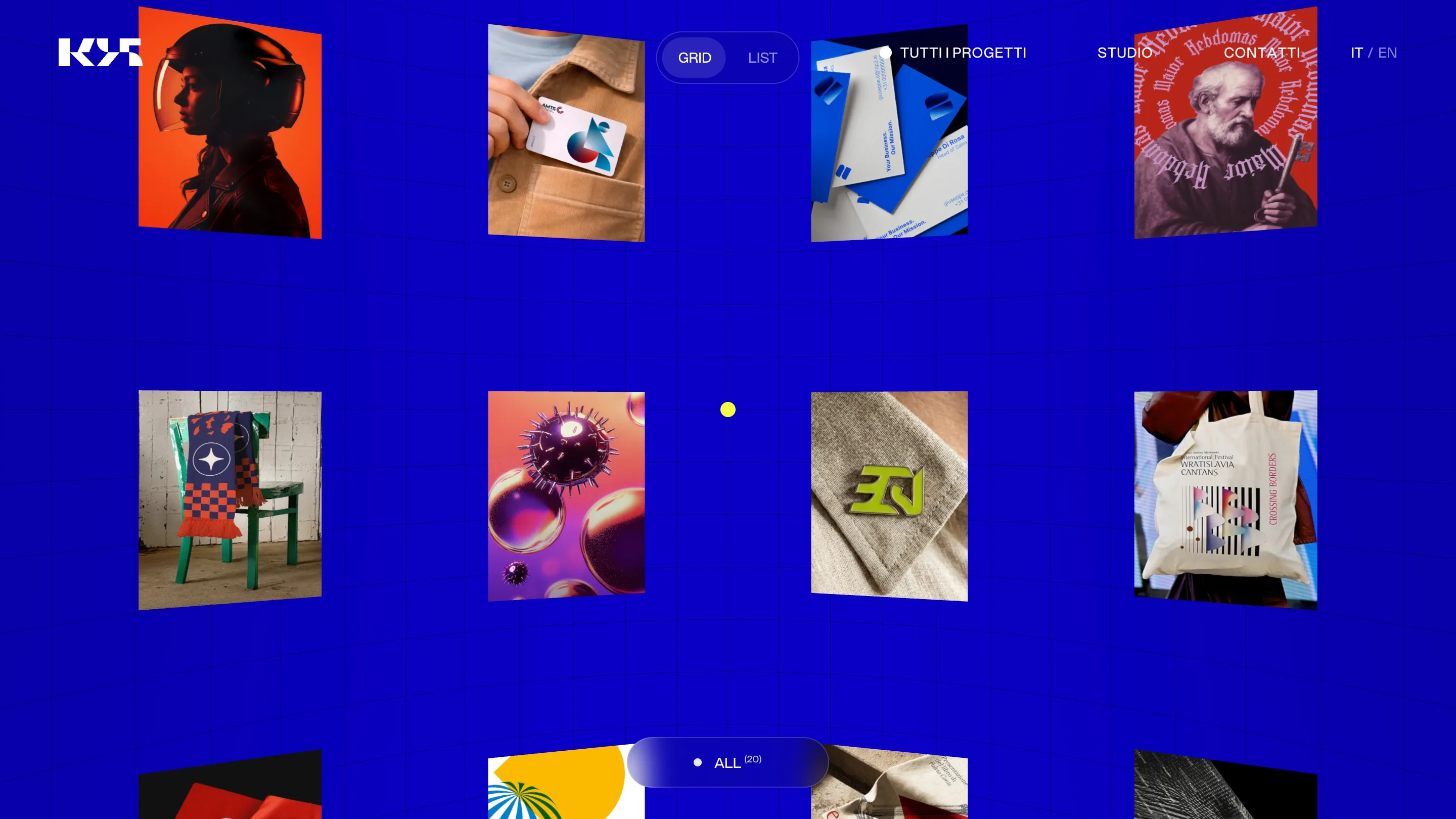
The Catania studio hangs every project in a 3D blue void you can reshape from rings to a spiral. It took awwwards Site of the Day on Aug 11.
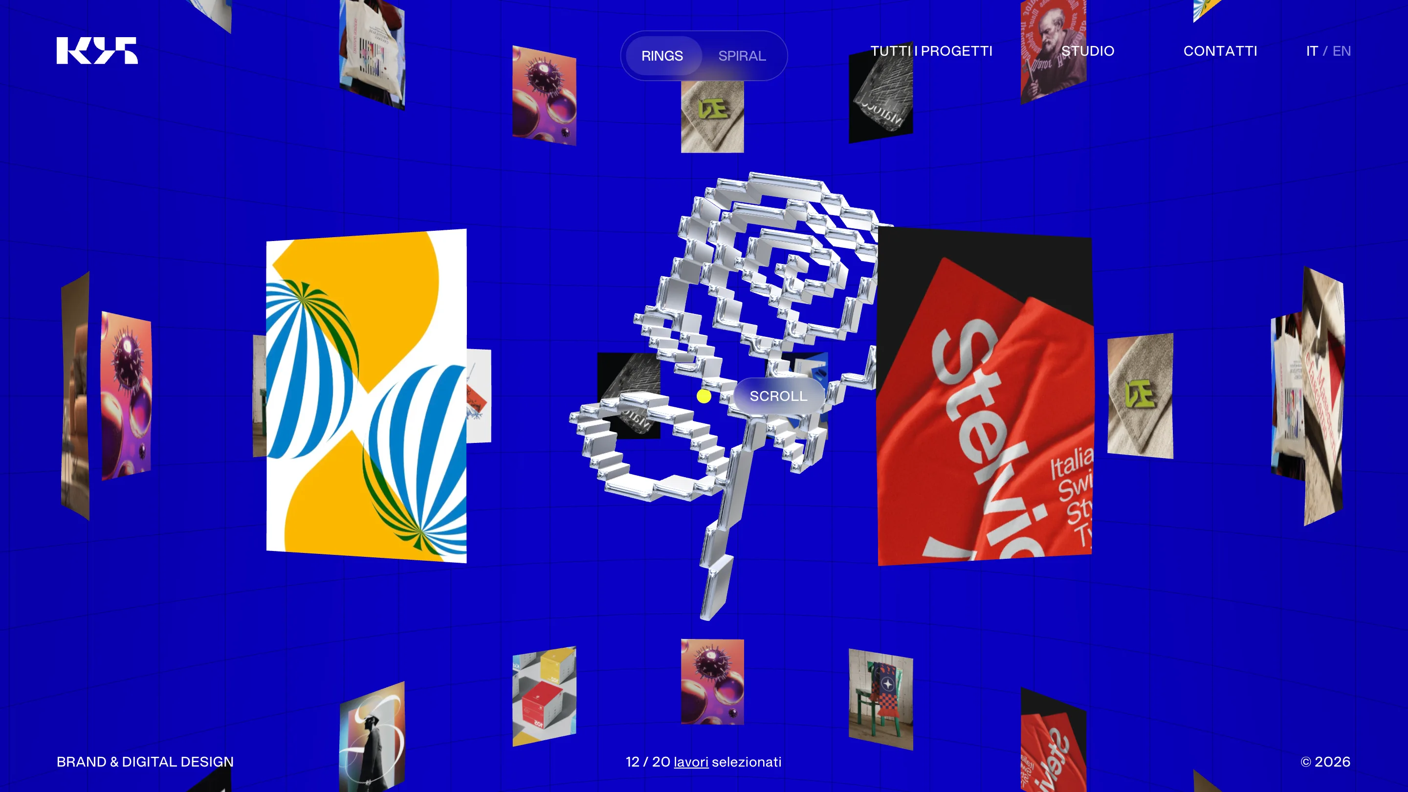
Studio K95 built its new site around one move: the whole portfolio floats in 3D, hung in a void of electric ultramarine, the blue people reach for when they mean Yves Klein. Every project is a small panel suspended in space, tilted toward you, close enough to read but never lying flat on a page. It took awwwards Site of the Day on August 11.
The portfolio is a space you move through
A studio portfolio is usually a grid you scroll. K95 gives you a room. Twelve of twenty selected works hang around a central axis, and a toggle at the top switches the arrangement between RINGS and SPIRAL. Rings stacks the work into orbits. Spiral winds it into a single coil you fall through as you scroll. Same projects, two geometries, and the switch is instant.
The thing pinning the center is a lump of liquid chrome, pixelated like a low-res cursor blown up and dipped in mercury. It reads as a Y2K icon and a piece of jewelry at once. It sets the register for everything else: playful, a little strange, built with care.
Klein blue does the heavy lifting
There's one background colour and it never changes. A saturated ultramarine, ruled with a faint grid so the space has depth and a floor. Against it, the thumbnails turn loud on their own. A helmet portrait shot in orange. A green chair draped in a scarf. The red Stelvio Grotesk specimen. The blue holds all of them together, which is the job minimal sites usually hand to black or white. K95 handed it to the most aggressive blue on the wheel and made it behave.
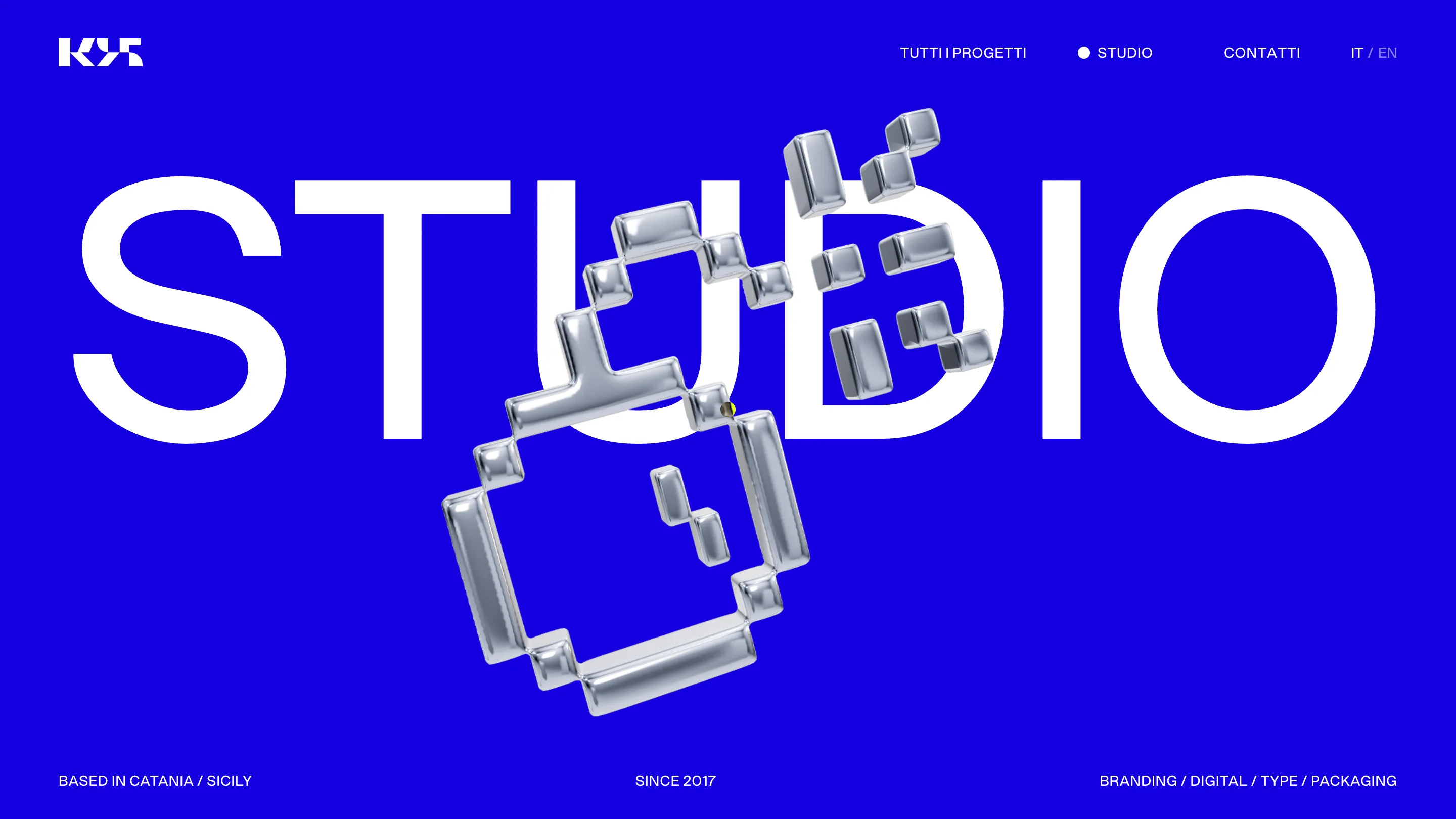
The type stays plain so the work can shout
Open the studio page and the restraint is obvious. STUDIO runs edge to edge in a plain white grotesk, no tricks, while the chrome blob drifts across it. The nav is four words. The footer is three facts: based in Catania, since 2017, branding and digital and type and packaging. K95 draws typefaces (Stelvio Grotesk, Herbert, the July 01 face), so setting the interface in a quiet sans is a deliberate call. The letters get out of the way.
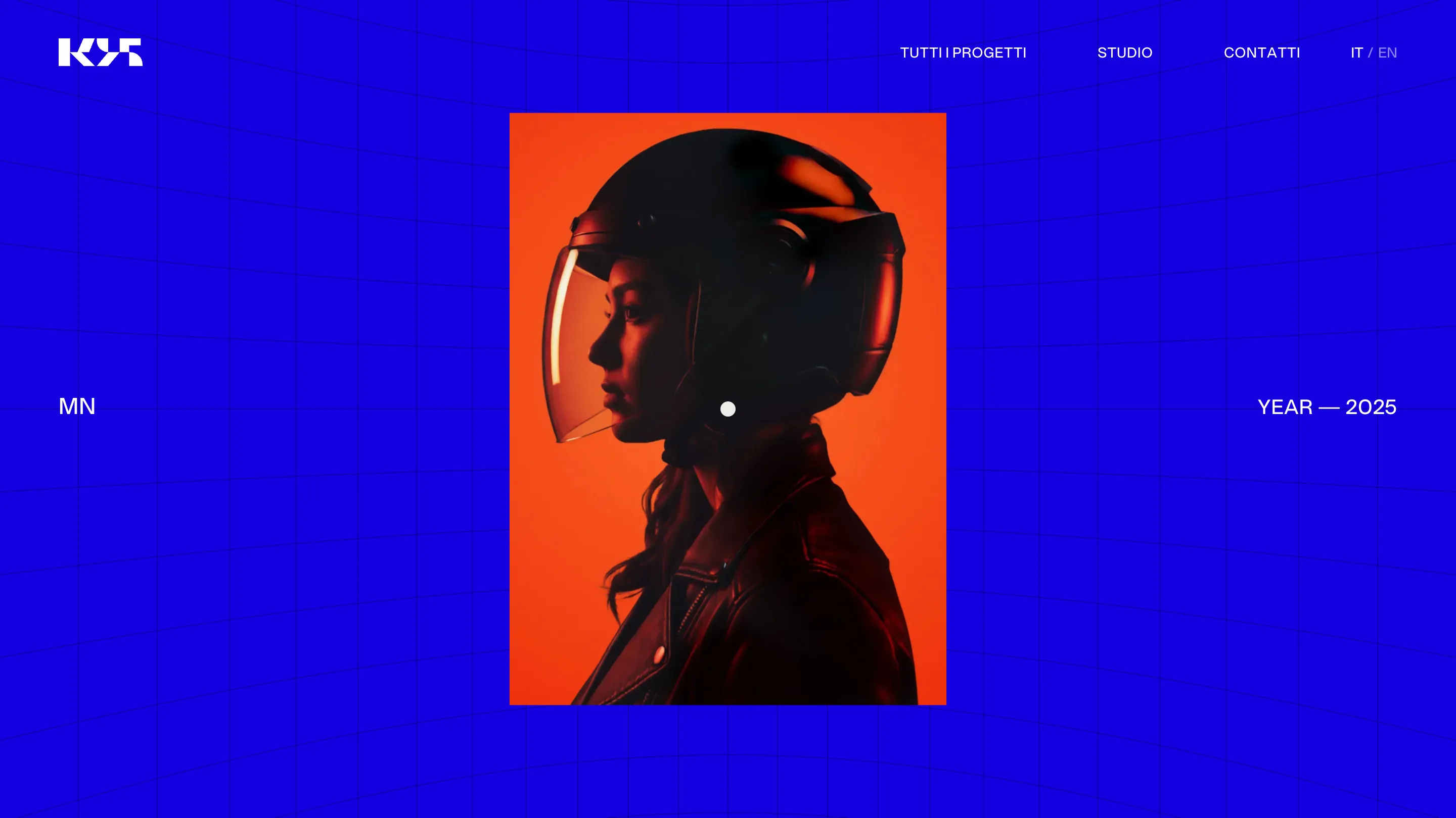
Project pages that trust one image
Click through and the noise stops. A project page is one image, centered, with the name on the left and the year on the right. The MN motorcycle-helmet work gets a single portrait on the blue field and nothing else competing for it. After the motion of the homepage, the quiet lands harder.
Why a judge would rate it
The craft is in the discipline. A 3D portfolio can turn into a tech demo fast, all camera and no work. K95 keeps the interaction legible: you always know where you are, the toggle does one clear thing, and every panel is a real project you can open. The blue, the chrome, the plain type and the spatial layout read as one idea rather than four effects stacked up. That coherence is what carries it past a hundred other WebGL sites, and it's why Studio K95 took the day.

