

PX PUSH dresses a design subscription in Y2K chrome
A monthly design subscription dressed as Y2K broadcast gear: chrome mark, CRT scanlines, one green dot. It took awwwards Site of the Day.
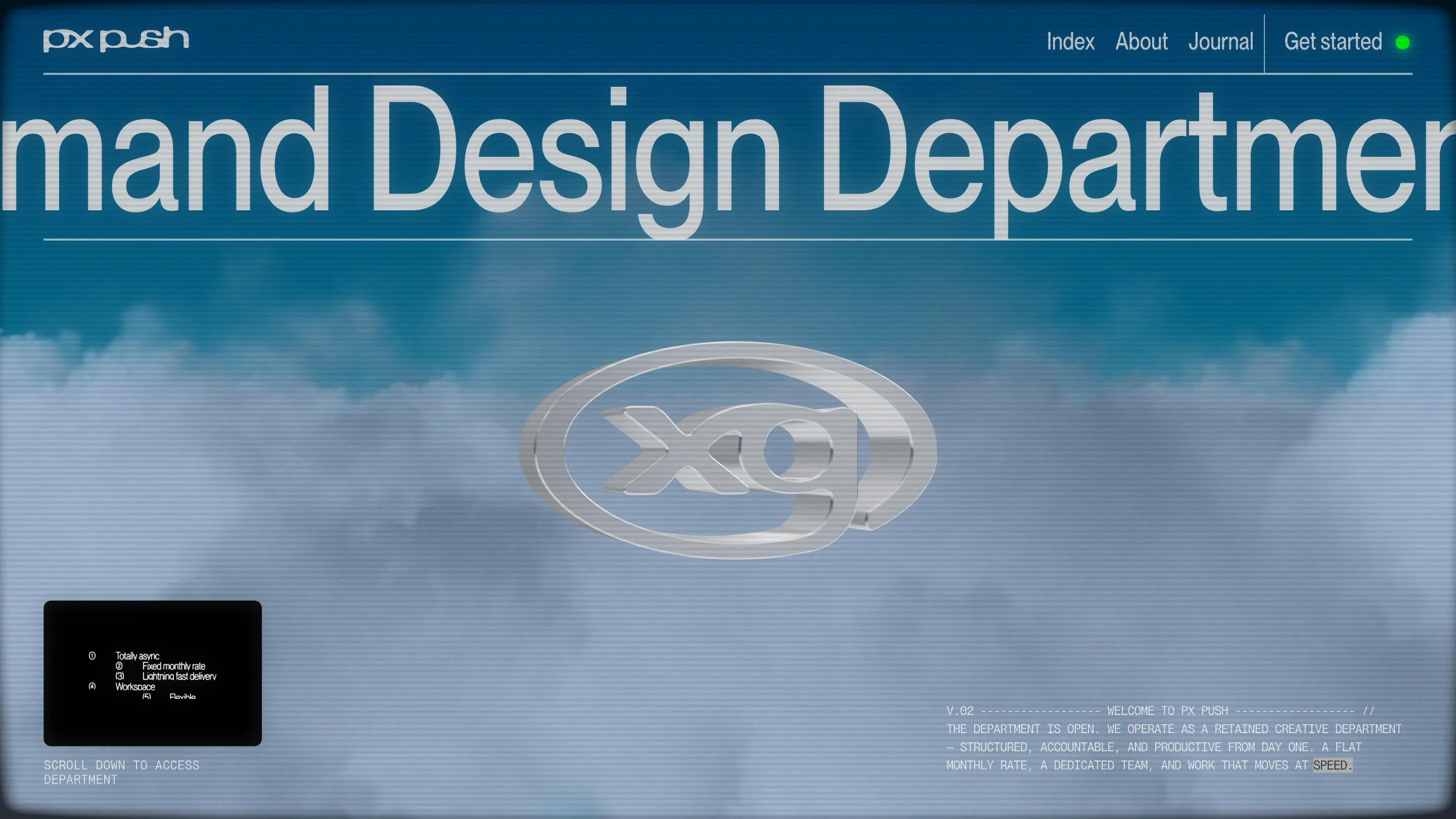
PX PUSH sells something dull on paper: a monthly design subscription, fixed rate, one request at a time. The site makes it look like a piece of Y2K broadcast equipment. On 15 August 2026 it took awwwards Site of the Day, and the judges handed it a Developer Award at 7.93, the highest number on the scorecard. The build is the reason. Stud Creative House and designer Lewis Webber wrapped a service page in Y2K chrome and CRT scanlines, and made every screen carry the same idea.
A chrome mark doing the color
The palette is black, grey, and one green dot beside "Get started" that reads as an on-air light. No other color anywhere. So the site needs one rich thing to look at, and it's the metal: a liquid-chrome "xg" mark rotating slowly in the middle of the screen. It's a real WebGL object, not a flat logo, catching a soft studio reflection as it turns. The look is Winamp-era, the kind of polished 3D lettering that shipped on burned CDs and skate decks around 2003. Rendered live in the browser, it reads as craft rather than nostalgia.
The nav label becomes the headline
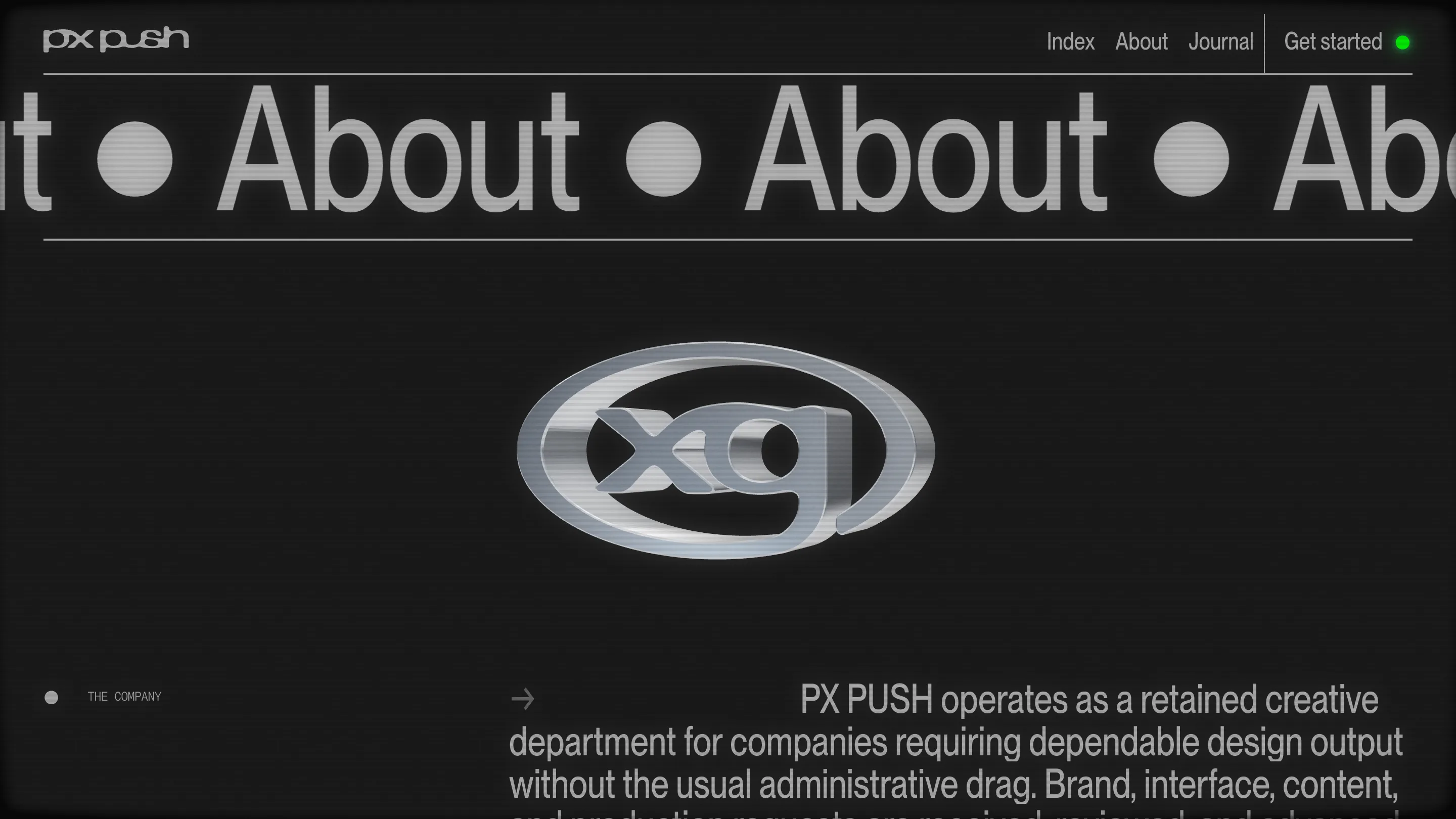
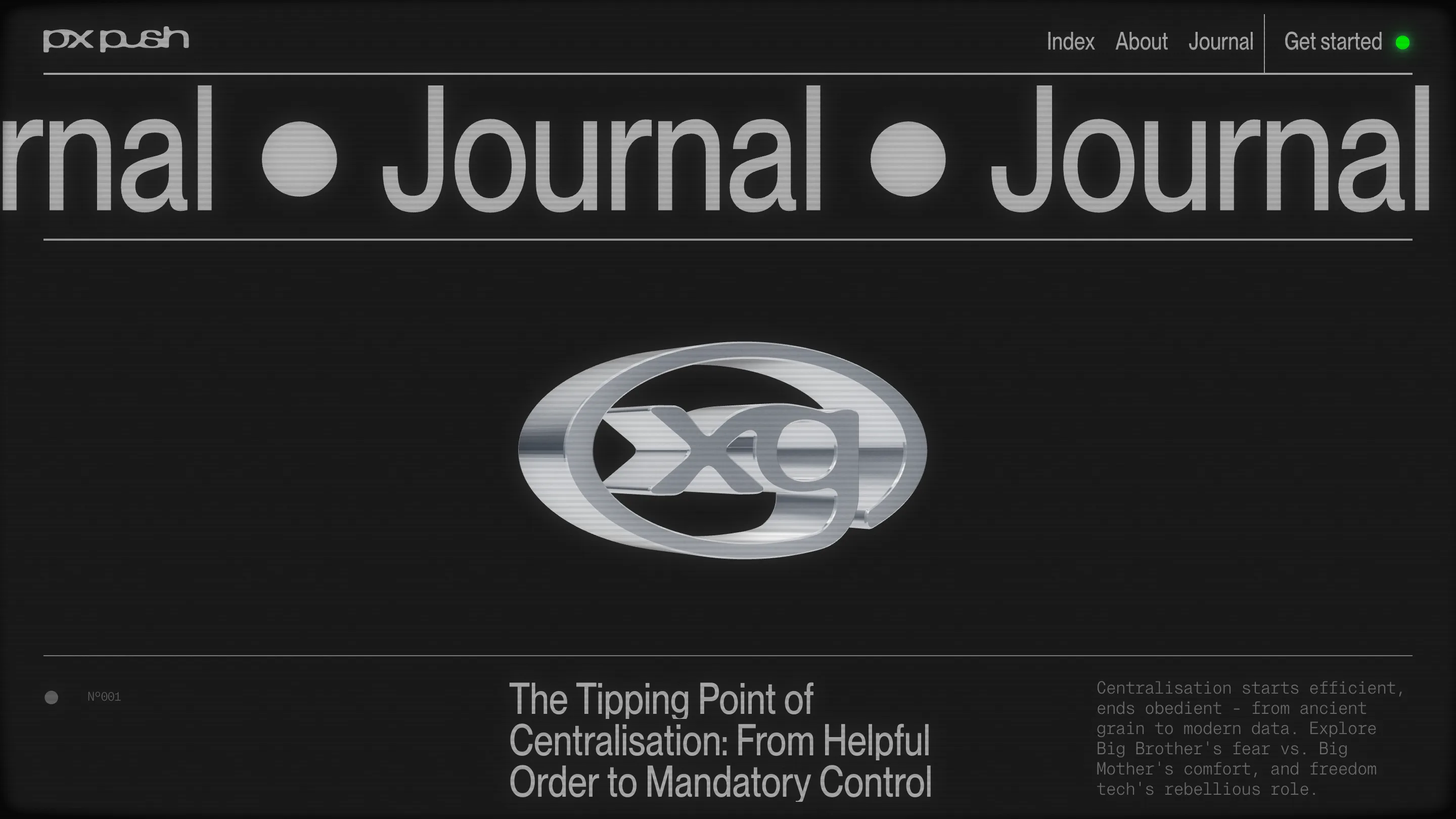
Click About and the word doesn't sit quietly at the top. It runs. A giant grotesk marquee slides "About ● About ● About" across the full width, each repeat split by the round PX bullet. Journal does the same. The page label and the page's biggest type are the same word, so you always know where you are without a breadcrumb. It's a small trick done with real restraint: one typeface, one motion, no decoration.
Everything wears the same CRT
The detail a judge rewards is consistency. A faint scanline sits over the whole interface, not just the hero. Horizontal lines, a slight edge vignette, a touch of bloom on the bright type. It turns a flat website into something you're watching on an old monitor, and it holds on every route, over the chrome, over the text, over the marquee. The copy plays along. "V.02, WELCOME TO PX PUSH. THE DEPARTMENT IS OPEN." A numbered manifesto sits in the corner: totally async, fixed monthly rate, lightning fast delivery. Even the journal is numbered, Nº001, set like a broadcast log.
Why it scored
Look past the theme and the discipline is the point. The type pairing is two families doing two jobs: a fat grotesk for the words you're meant to feel, a mono for the words you're meant to read as data. The status dot, the "SCROLL DOWN TO ACCESS DEPARTMENT" prompt, the green on-air light all sell one story, that you've tuned into a working studio rather than landed on a pitch. A design subscription is a hard thing to make feel considered. PX PUSH did it by committing to a single reference and rendering it well, which is most of what a Site of the Day rates. The Developer Award says the code kept up.

