

Likova's office finder looks like the rest of the site
Vide Infra ran Likova on two colours and one typeface, then built the office and parking finders inside the same system.
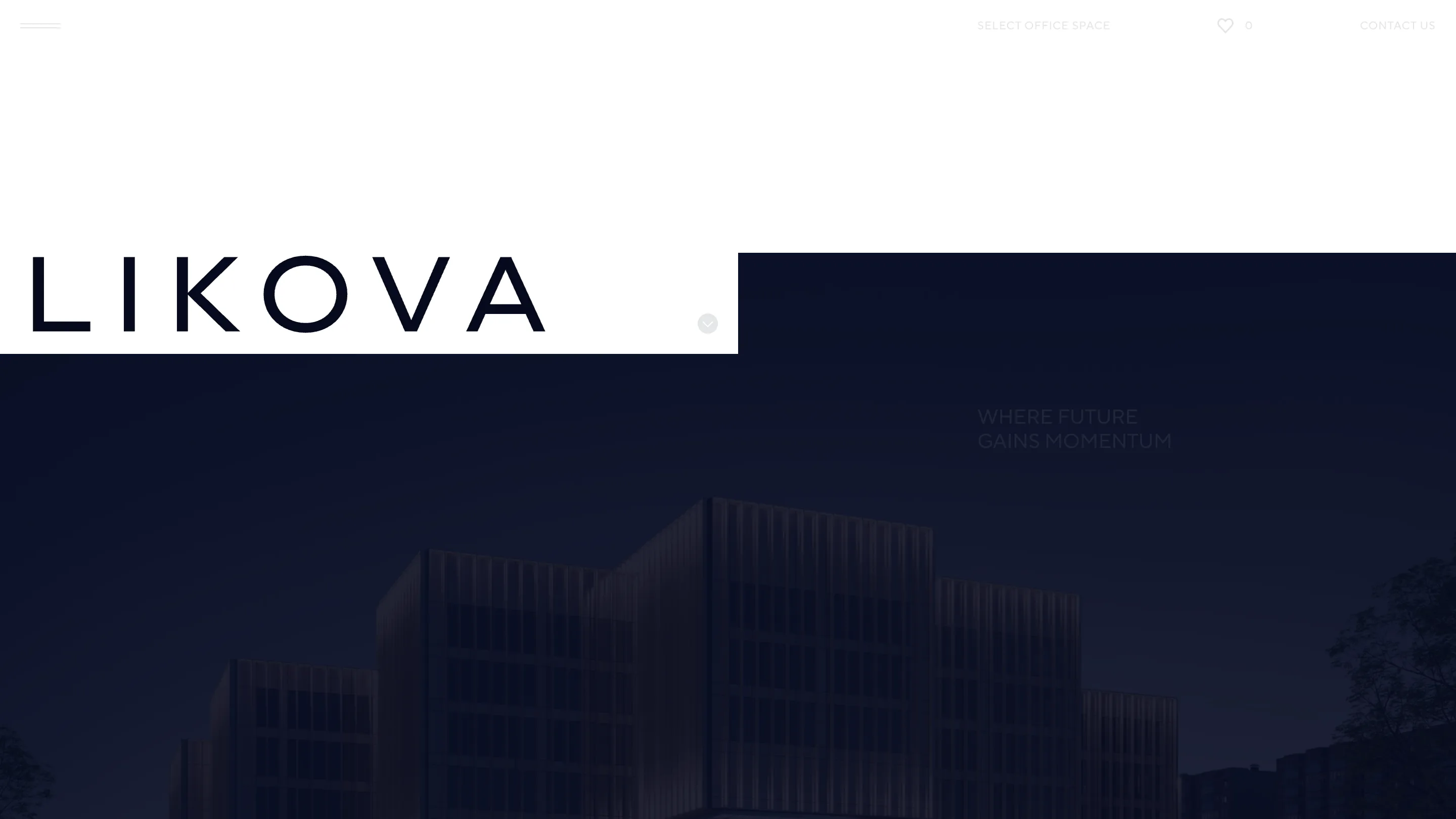
Likova's office finder is built out of the same two colours as its homepage. Same typeface, same white blocks cut into the renders, same spacing. Click from the marketing pages into the leasing tool and nothing tells you that you have crossed into a different piece of software. On a commercial property site, that is rare enough to be worth studying.
Vide Infra built it for Likova, a Class A business centre going up near Vnukovo, on the western edge of Moscow. 53,300 square metres, six to eight floors depending on where you stand, handover in the third quarter of 2026. It took awwwards Site of the Day on 19 August 2026 with a 7.33, plus a Developer Award at 7.41 and an 8.20 on animations and transitions.
The whole interface runs on two colours
#070B20 and #E3E6EB. A near-black navy and a pale grey, and that is the palette. Every warm note on the page arrives inside a render: amber facade lighting, the gold reflection running down a glazed corner, the orange columns in the parking garage. The interface itself never adds a colour. No accent, no green for available, no red on the contact button.
One typeface, TT Norms Pro, at two weights. The wordmark is the same face letterspaced wide, sitting in a white rectangle that takes a bite out of the night render. That rectangle is the only piece of chrome in the design, and it comes back everywhere: splitting OFFICE from RETAIL on the finder, splitting the L and M parking sizes on the garage page. One shape, reused.
The finder is part of the site, not a portal bolted to it
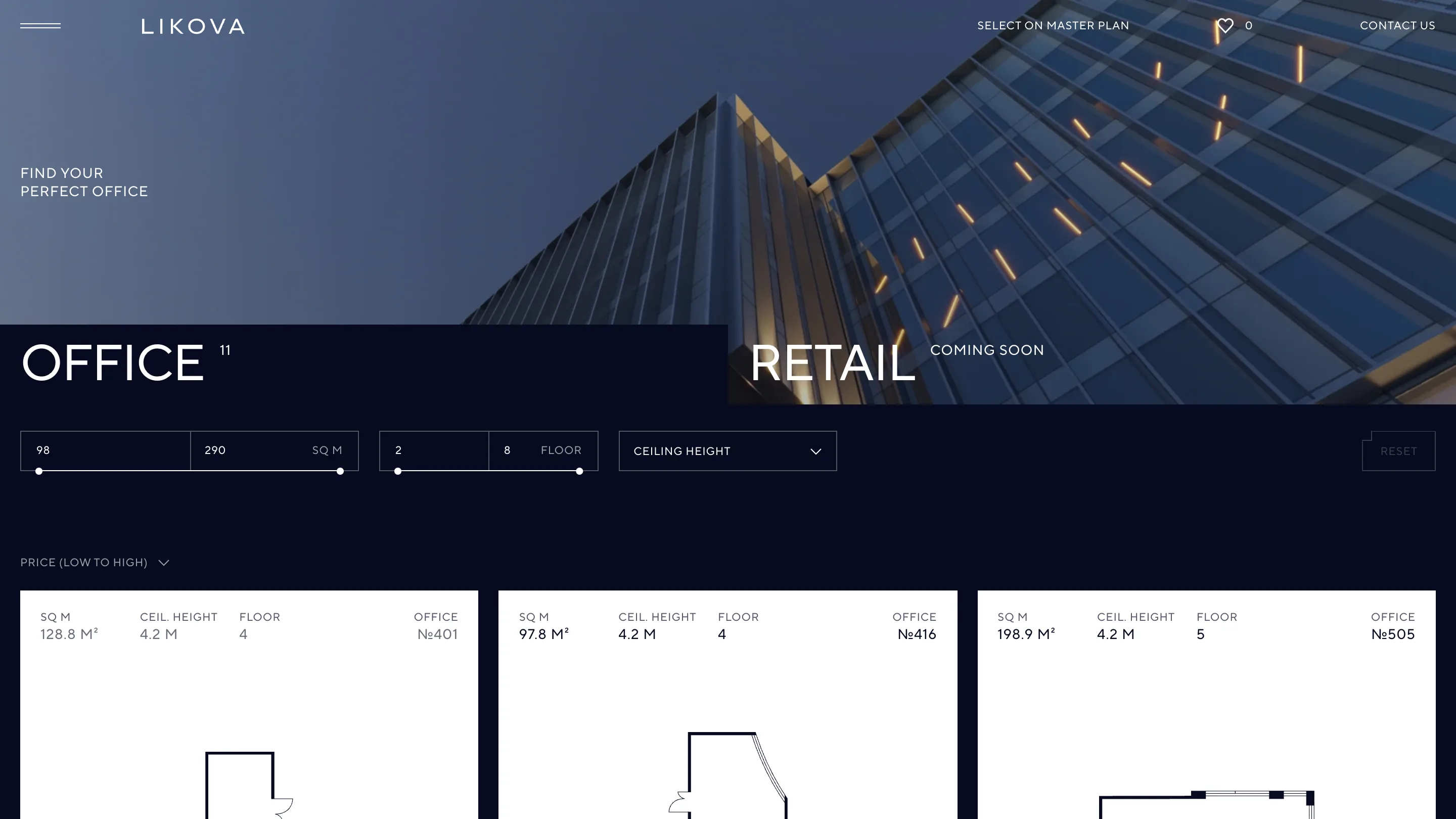
Two ways in. Filter by specification, or pick off the master plan. The filter is three controls: a range slider for area, 98 to 290 square metres, a range slider for floor, 2 to 8, and a dropdown for ceiling height. Sort by price. Eleven offices available today.
What comes back is the interesting part. Each result is a white card carrying four numbers along the top, square metres, ceiling height, floor, office number, and underneath, the floor plan drawn as a thin black outline. No stock photo of a meeting room. No render of somebody's future desk. The plan is the product shot, and it is drawn at a weight that matches the rest of the typography, so a wall of them reads as a grid rather than as a spreadsheet.
Parking gets the same care as the lobby
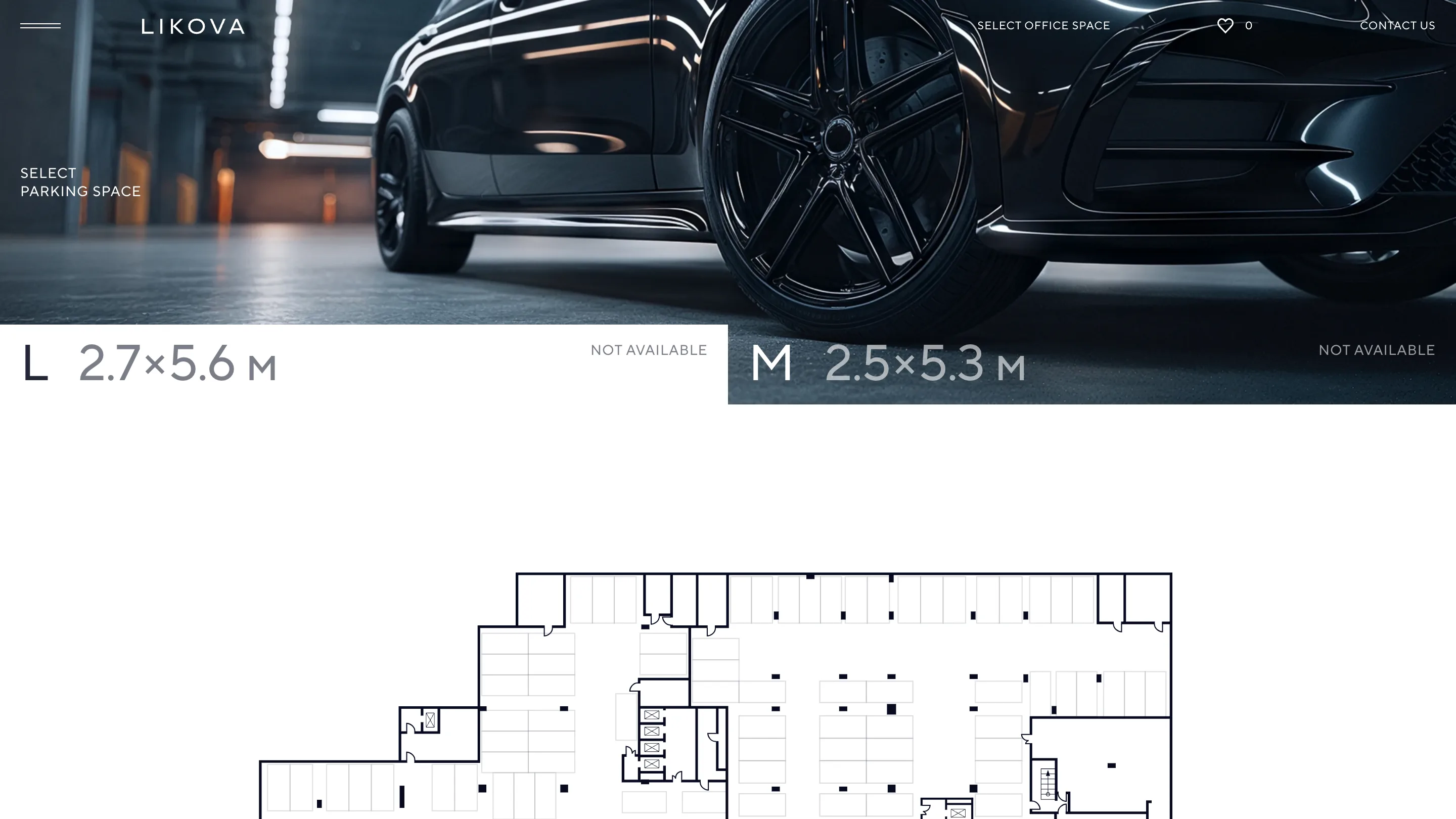
Parking has its own page, its own hero, its own sizes set as display type. L at 2.7 by 5.6 metres. M at 2.5 by 5.3. Below them the underground plan runs the full width, every bay drawn to scale, sold ones filled. 266 underground spaces and 254 at ground level, and you can see all of them.
This is the part most sites skip. Likova drew it.
Even the consent page got designed
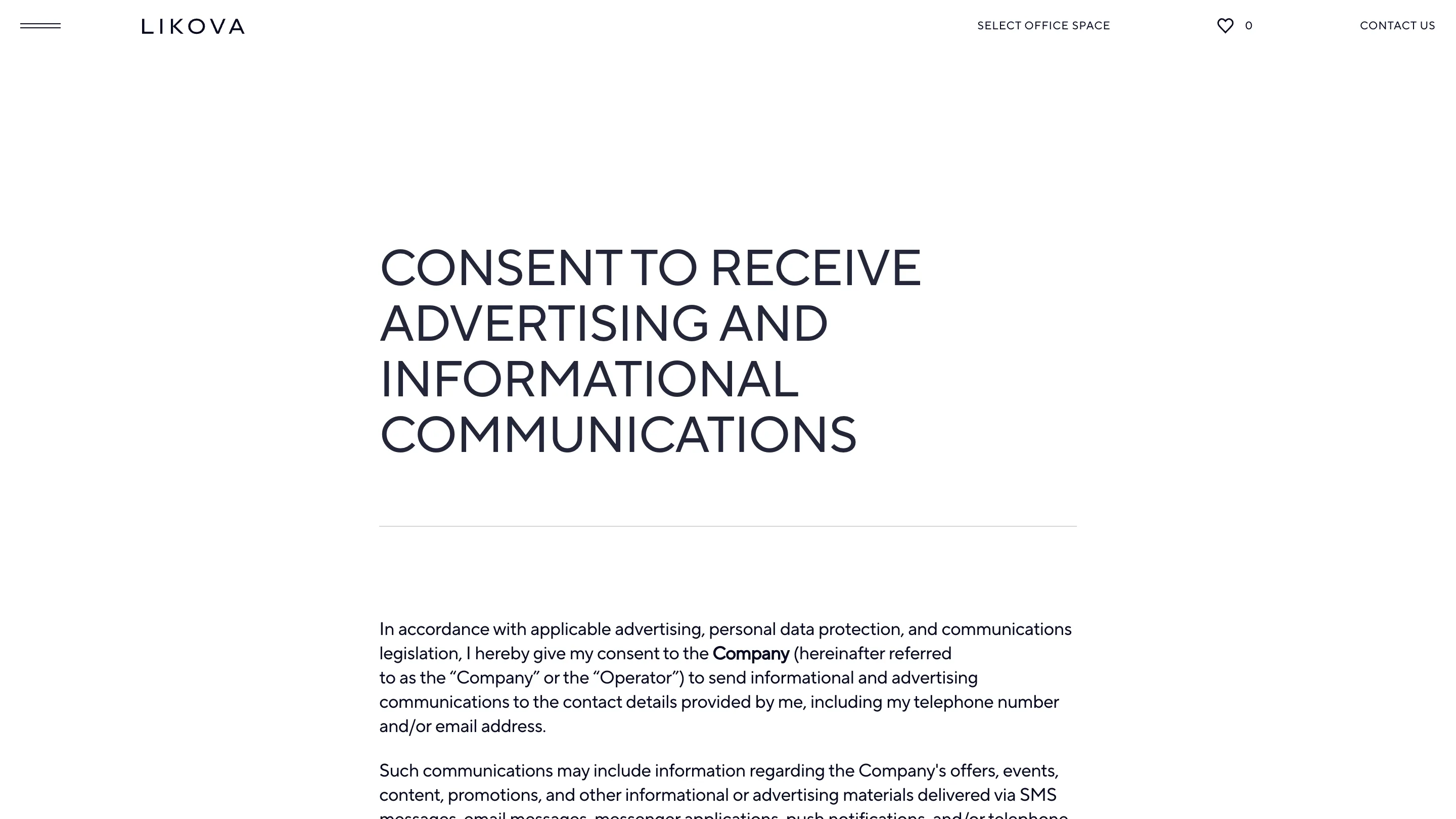
The advertising consent page sets its title in the same face at the same size as the section headings on the homepage, black on white, one column, generous leading. Nobody arrives here on purpose. It still got the grid.
Where the score dips
Design 7.49, creativity 7.28, content 7.44, usability 7.13. Usability is the low one and you can find it. All nine chapters, About through Team, are anchors on one long page behind an intro sequence, so a link to the master plan drops you at the loader and makes you wait. The site plan, the architecture notes, the lobby, the technology list, all of it sits behind that one scroll.
Worth the trade for what it buys, which is a real estate site where the sales tool, the brochure and the legal page were drawn by the same hand.

