

Haoqi Wen runs his portfolio like an instrument panel
A design engineer's portfolio that frames soft 3D type inside a monospace cockpit, with a live clock and your cursor coordinates in every corner.
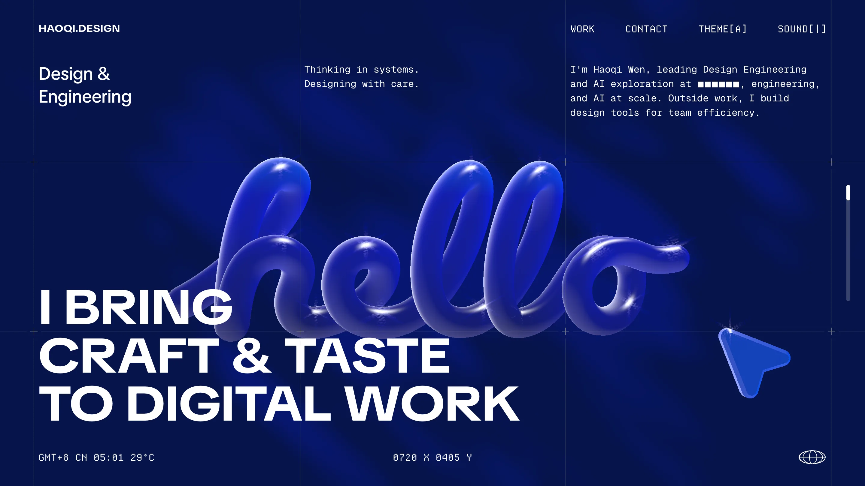
Load haoqi.design and the first thing you read isn't the work. It's the corners. Bottom left: a live clock reading GMT+8 CN 05:01 29°C, the time and temperature where he sits. Bottom center: 0720 X 0405 Y, your cursor's exact position, ticking as you move. The whole page is dressed like an instrument panel, and that framing is the idea.
It's the personal site of Haoqi Wen, a product designer and design engineer at TikTok. It took awwwards Site of the Day on August 14, 2026, scoring 7.36, and picked up a Developer Award on the same day. Here's the craft that got it there.
A monospace cockpit around a soft blob
The home screen is one flat field of Klein blue. Across it runs a headline in a tight grotesque, all caps, set huge: I BRING CRAFT & TASTE TO DIGITAL WORK. Behind it sits the one warm move on the page, the word "hello" drawn in glossy inflated 3D, like chrome balloons catching a studio light. Even the cursor gets the treatment: a little triangle rendered in the same puffed material, so the pointer belongs to the art direction instead of fighting it.
Everything else is monospace and rigid. The nav labels carry bracket notation, THEME[A] and SOUND[|], the kind of syntax you'd see in a terminal. That contrast, one soft object held inside a hard technical frame, is the whole personality of the site in a single view.
The readouts aren't decoration
Plenty of sites bolt on a fake HUD for the look. Wen's actually track something. The clock is his real timezone. The coordinate pair follows your mouse. The theme and sound toggles change the page in front of you. For a designer whose tagline is "thinking in systems, designing with care," the telemetry is the argument: the site behaves like an interface he'd ship, not a poster he'd print.
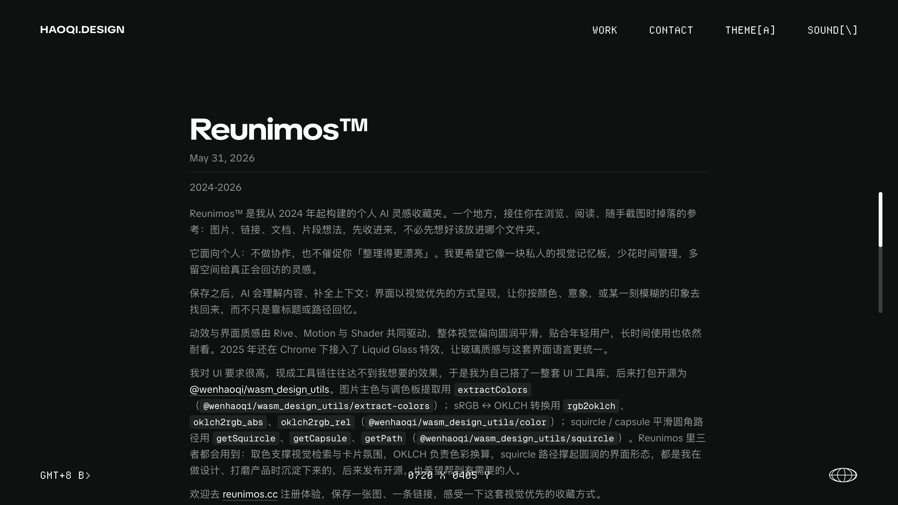
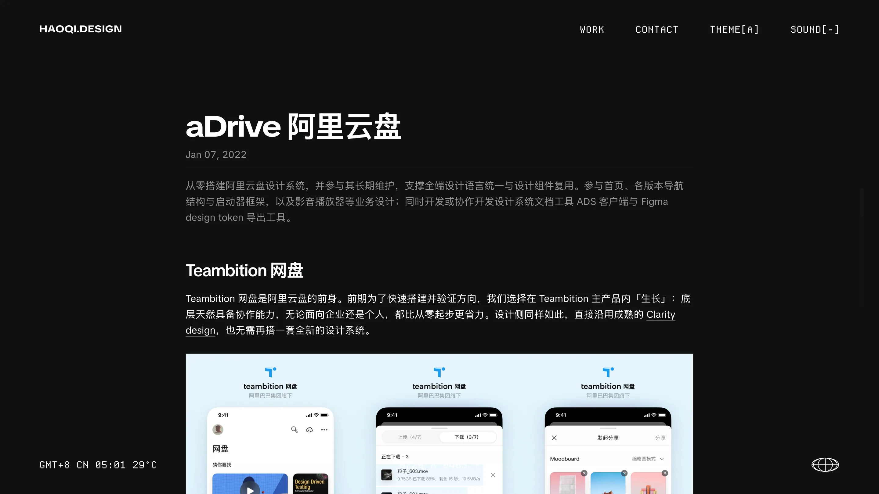
The frame stays consistent when you leave the hero. Click into a project and the palette flips to black, but the same corner readouts, the same mono nav, and the same measured spacing carry over. The site reads as one machine with many screens.
He builds the tools he designs with
The writing backs up the engineering claim. His Reunimos project page runs its prose right alongside code chips: extractColors for pulling palettes, rgb2oklch for color conversion, getSquircle and getPath for smooth rounded shapes. He open-sourced the lot as a WebAssembly utility library and shipped Figma plugins on top. The animation on that page, he notes, is driven by Rive, Motion, and shaders together.
This is where the design engineer portfolio earns its label. Most portfolios show the output. Wen shows the workshop, and the site itself is built from the same parts he's describing. The OKLCH color work and squircle geometry he credits in the text are visibly holding up the interface you're reading it in.
Why the judges rated it
The scores tilt toward creativity, 7.69, and the Developer Award at 7.43 tells you the build impressed as much as the look. That tracks. The concept is legible in three seconds, the execution is clean across every page, and the technical layer is real rather than cosmetic.
Restraint carries a lot of it. One accent color, one typeface family, one warm 3D flourish, and a monospace system doing the rest. Nothing on the page is there for effect alone. For a portfolio selling craft and taste, Haoqi Wen made the site prove both.

