The monochrome studio site that saves colour for the work
Prødux made its studio site near-black and held every colour for the work reel. It took awwwards Site of the Day on August 9 with a 7.19.
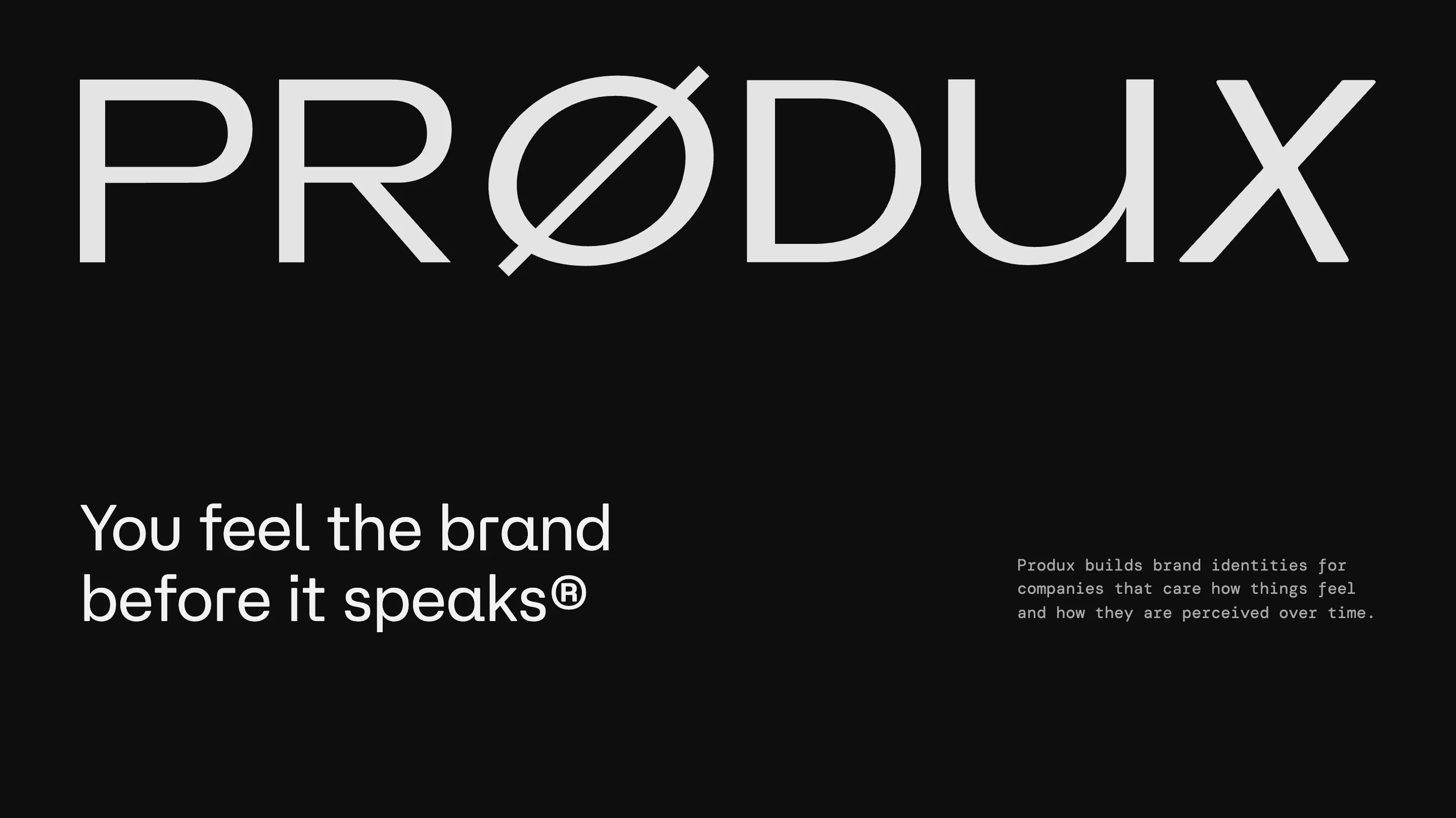
Prødux painted its whole studio site near-black and saved every colour for a single screen. That one decision is most of why the monochrome studio site took awwwards Site of the Day on August 9, 2026, with a 7.19, and picked up a Developer Award alongside it.
The Barcelona and Wyoming studio Prødux builds brand identities, and the site argues its own thesis before you read a word: you feel the brand before it speaks. The homepage is one line of type on black. No hero image competes with it. The restraint is the pitch.
A black stage, held on purpose
Most branding portfolios open with colour because the work is colourful. Prødux does the opposite and lets the black do the talking. The background sits just off pure black, warm enough to read as a room rather than a void. Against it, a single white wordmark and one promise. The eye has one place to go.
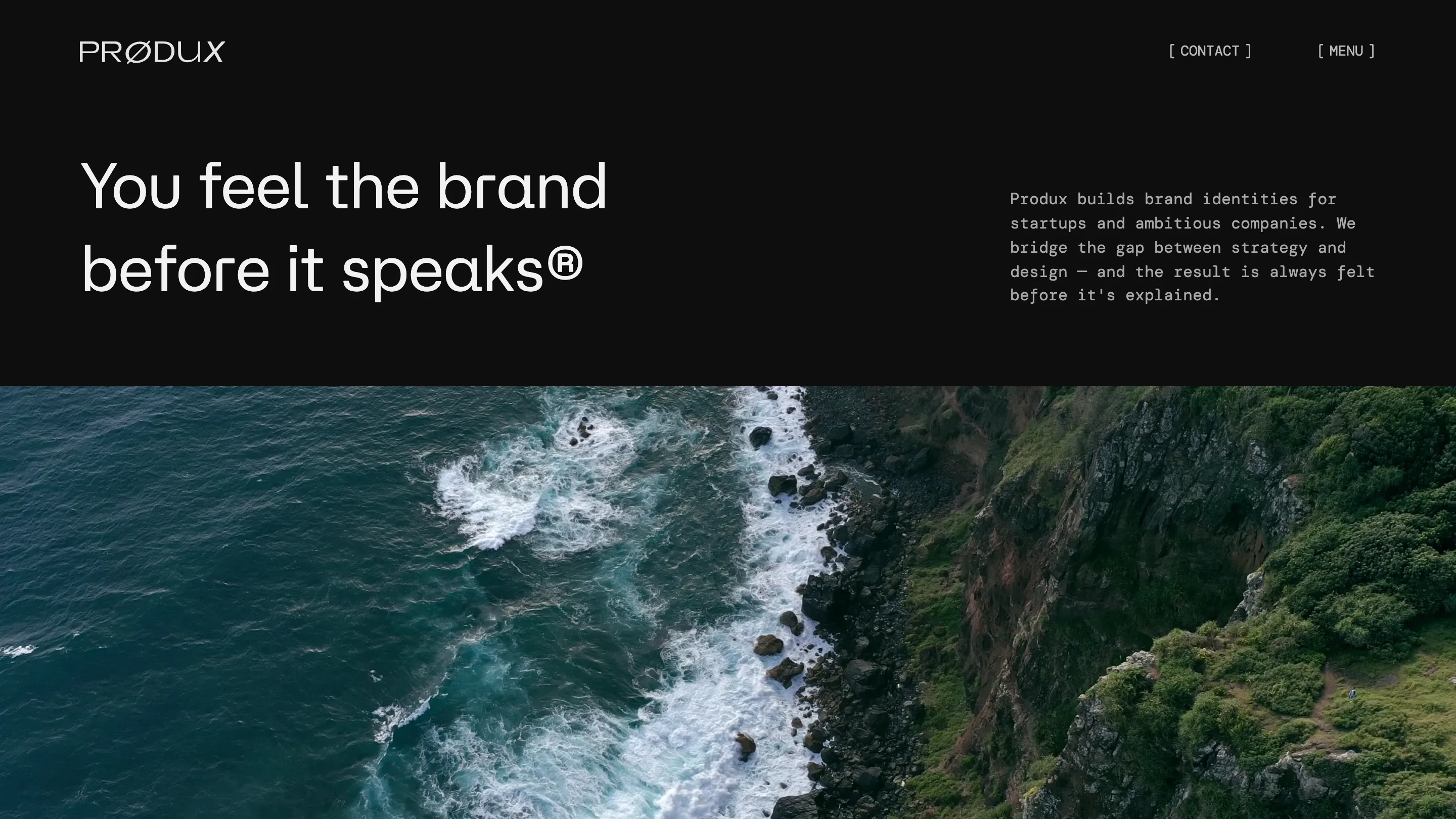
That black also sets up a cinematic aerial shot lower on the page: a coastline, waves breaking on rock, shot from above and cropped into a hard horizontal band under the headline. The cut from flat black to full-bleed footage lands because nothing before it moved.
Two typefaces, two jobs
The type pairing carries the craft. The display face is a wide, soft grotesque with a slashed O, so the name reads PRØDUX and the mark is baked into the logo instead of bolted on. It holds up at size and never shouts.
Underneath it runs a monospace, the kind you see in a code editor, set small for the running copy and the nav. Brackets frame the links, [ CONTACT ] and [ MENU ], like terminal prompts. The two faces set the studio's design side against its build side in the same frame, and they read as one voice rather than two fonts fighting.
The work reel is the payoff
Click into the work and the restraint pays off. The projects arrive as a loose arc of saturated tiles floating across the black: an orange, an acid green, a hot magenta, a school-bus yellow, each carrying a single client mark. After screens of grayscale, the colour hits hard.
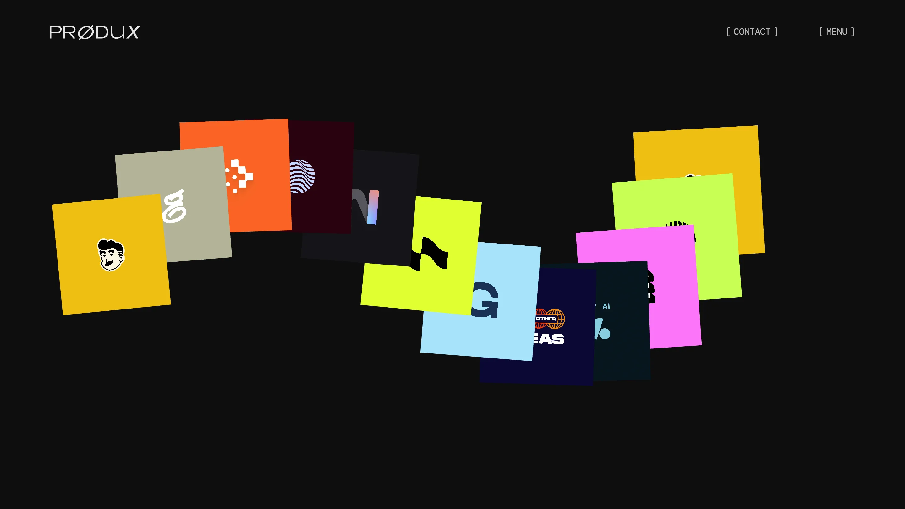
The arrangement does real work. The tiles curve in a shallow wave instead of a grid, so the page feels set by hand, and they drift on scroll and pointer. Every tile reads as one brand at a glance, which is the right move for a studio whose product is identity. The clients skew fintech and AI, names like Payy, Gather AI and Nolana, and the marks survive shrunk to a thumbnail.
Why it rated
A 7.19 on awwwards is a solid Site of the Day, and the Developer Award tells you the build backed the idea. The floating reel, the scroll, the video crop all run without the page feeling heavy. Creative director Alexandr Socoloff, with Yousuf Soomro and Alex Socoloff, made a site where the concept and the code say the same thing.
The lesson for anyone building a studio site is old and worth repeating. Decide what the one moment is, then spend the whole page setting it up. Prødux picked colour as its payoff and starved the rest of the page to make it land.