

Nick Ho's racing site makes car number 98 the headline
BORING sets a driver's car number bigger than his name, keeps the photos grey, and saves full colour for the helmet. It took Site of the Day.
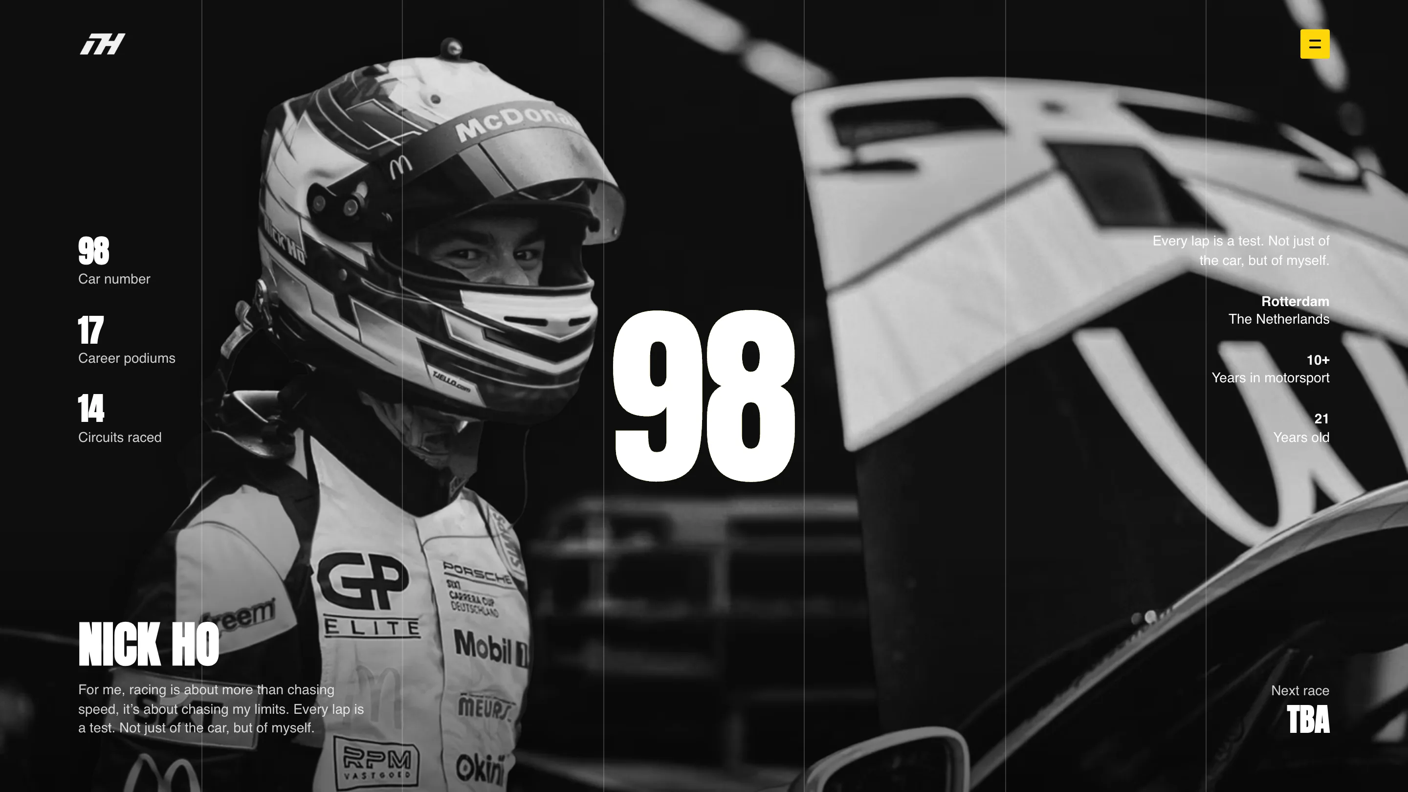
The biggest thing on Nick Ho's site is a number. A white 98 stands in the middle of the hero, about five times the height of the driver's name, and everything else on the screen lines up around it. That one call carries the whole racing driver website, and it's the reason the awwwards jury gave it Site of the Day on 11 October 2026, with a score of 7.24.
The site is by BORING, a Dutch studio, with Dion Ploeg credited alongside. Ho is 21, from Rotterdam, and drives car 98 in the Porsche Carrera Cup Deutschland. The site has to work for fans, press and sponsors at once, and it does it in one long page.
A racing driver website that leads with the car number
In motorsport the number is the identity. It's what a commentator reads off the door at 250 km/h, what a photographer captions, what a kid draws. BORING treats it that way. The 98 sits dead centre over a greyscale portrait of Ho in his helmet, set in a tall condensed grotesk that looks cut from vinyl for a livery.
The name gets the bottom left corner, at a size you'd give a section title. Around the number the stats line up in two quiet columns: 17 career podiums, 14 circuits, 10+ years in motorsport, 21 years old. Each figure uses the same condensed face as the 98, each label sits in a light grotesk underneath. You read the page the way you read a timing screen. Numbers first, words after.
Grey photos, one colour object
Every photograph on the site is black and white. The pit lane, the grid at Zandvoort, the car mid-corner: all grey. So when you scroll into the partner section and the helmet turns in front of you in full yellow and blue, it's the only coloured thing on the page, and you look at nothing else.
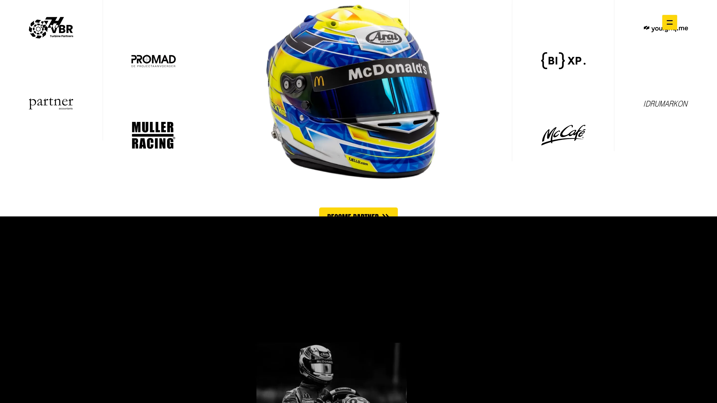
That's the 360 degree helmet viewer the jury singled out. It's driven by scroll, built with Three.js and GSAP, and it does a job beyond showing off: the helmet carries the McDonald's visor strip, the sponsors' logos sit in the columns around it, and the button under it says Become partner. The object that proves the sponsorship is the object the page spins. A sponsor scrolling through sees their logo on the thing Ho wears to work.
Yellow does the rest of the colour work. The menu button, the Skip and Submit buttons, the small square in the 5/5 slide counter are all the same yellow as the car's livery, and nothing else is.
Six hairlines hold every section
Thin vertical rules divide the screen into six columns, and they run through the whole page: over the hero photo, through the white partner section, down into the footer. They're faint enough to miss. But they explain why a page with this much scale never feels loose. The stats hang on the first column, the helmet fills the middle two, the footer's Menu, Socials and Contact each start on a rule.
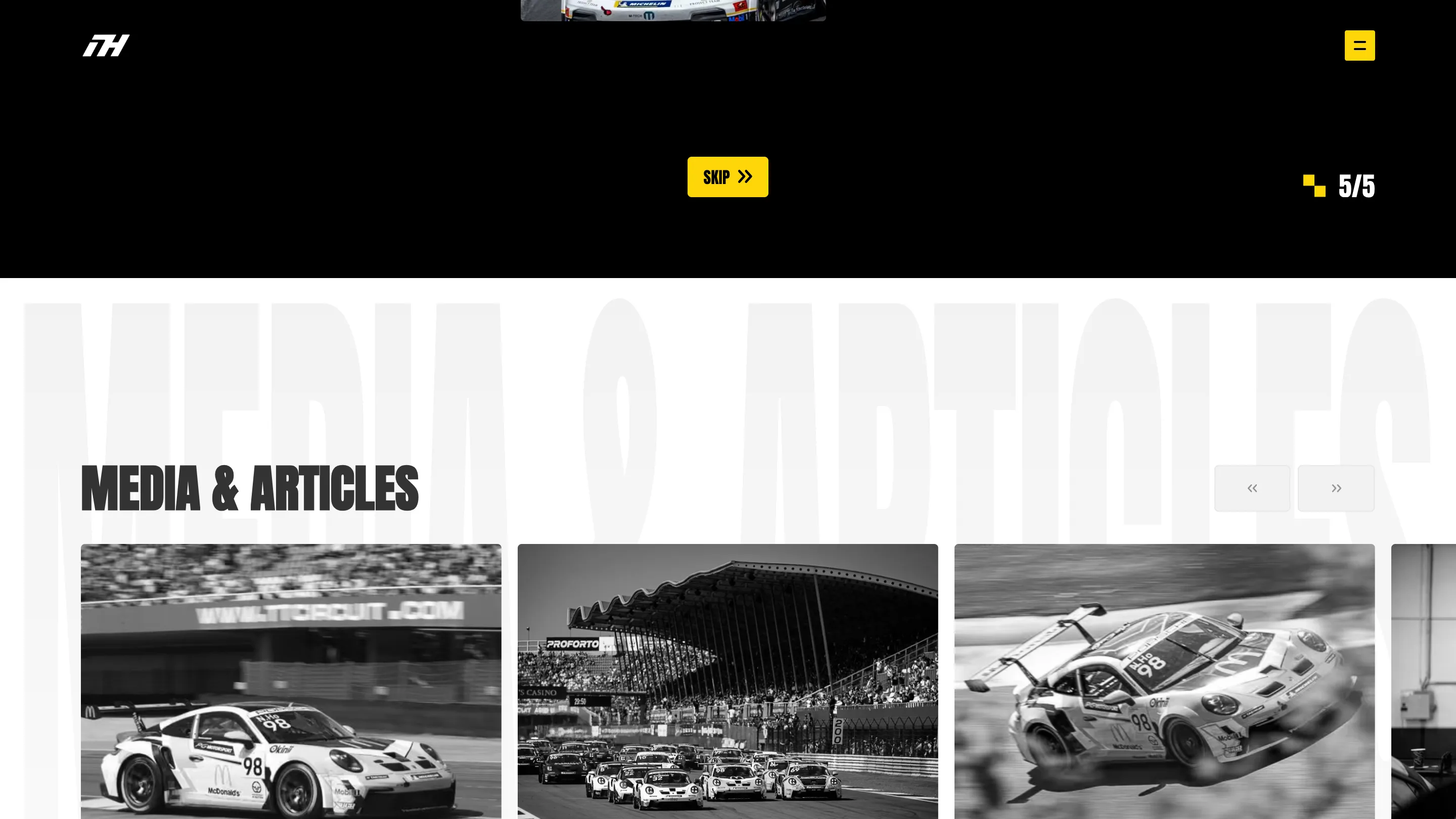
The section titles use a second trick. Media & Articles is set once at heading size and once behind it, enormous and nearly white, clipped by the edges of the screen. Contact gets the same treatment in near-black on black. It gives every section a header you can recognise in a fast scroll without adding a single extra element.
The car crosses the headline
The sponsor guide section is where the motion gets playful. A top-down render of the Porsche, number 98 on the roof, drives straight down through the middle of the headline as you scroll, splitting the words on either side of it.
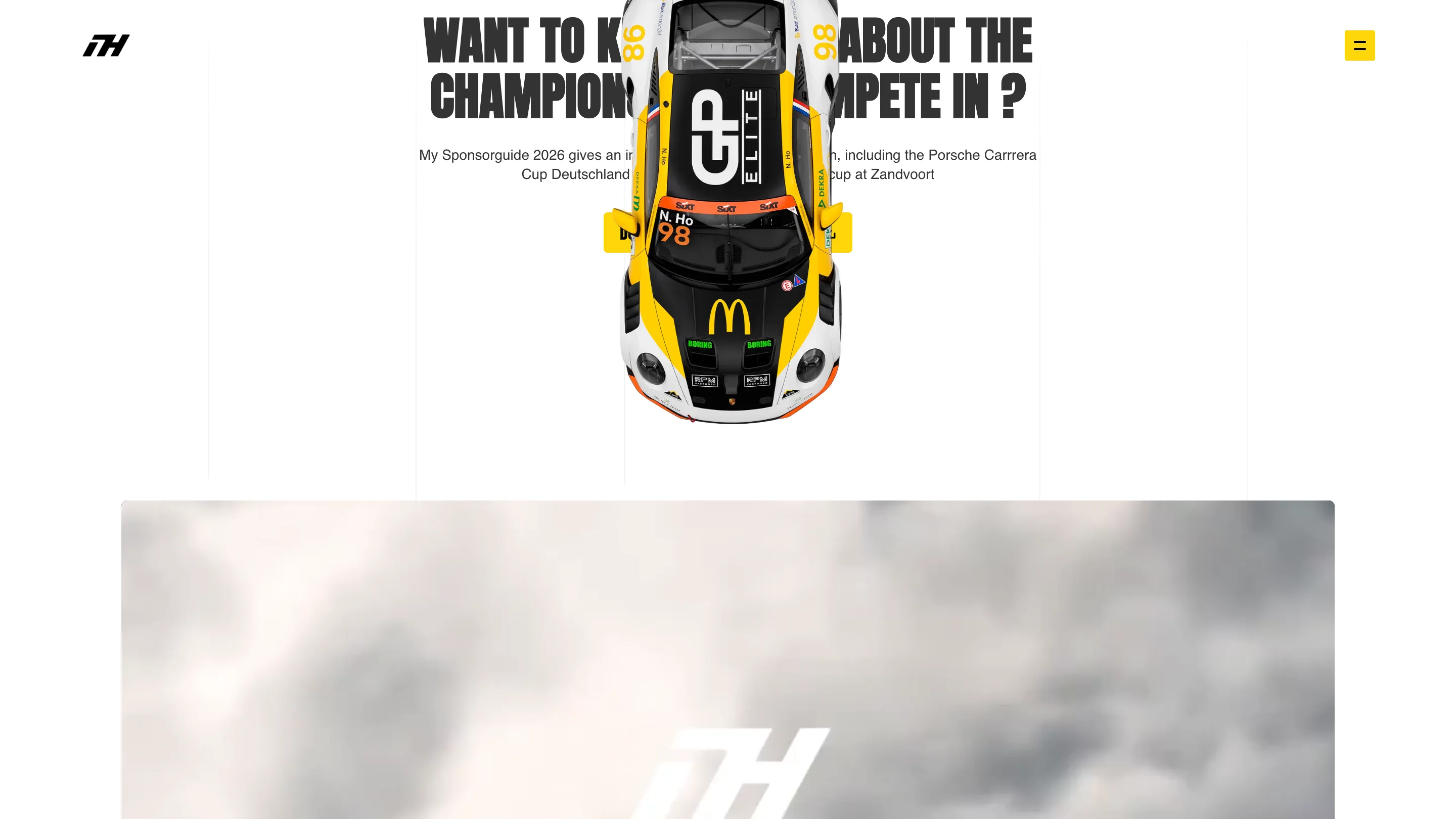
It's a small moment and it reads a bit messy in a still frame. In motion it's the right joke for a racing site: the car passes the text and moves on.
Why it won
The scores are even, 7.31 for design and 7.15 for usability, and that fits. Nothing here is a stunt that breaks the page. BORING picked one strong idea for a driver, the number as the brand, and kept the rest disciplined: grey photography, one accent colour, one coloured object, six columns. A sponsor can find the PDF, a fan can find the calendar, and anyone who lands on it remembers 98.

