

Vero slips a cursive word into each serif headline
Vero New York sets each headline in a tall serif, then drops one word into a swash italic. A look at the type craft that won it Site of the Day.
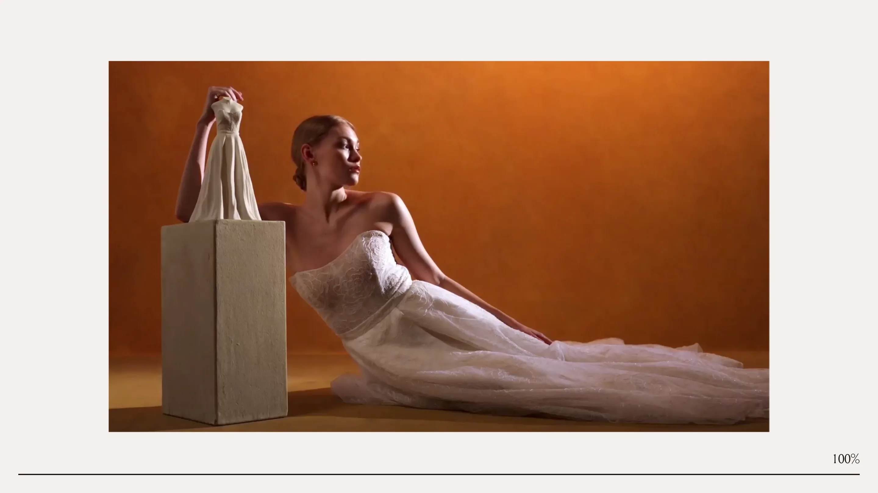
Vero New York builds every headline the same way: a wall of tall serif capitals with one small word dropped into a flowing swash italic. "every SCULPTURE BEGINS with A DRESS." The nouns stand up straight and shout. The connective words lean and whisper. That one contrast carries the whole site, and on August 8 it took awwwards Site of the Day with a 7.21.
The studio behind it is Rodéo studio, with plutot.cool on the build. Vero is a fine-art studio that turns a wedding dress into a ceramic sculpture. The website has one job: make that read as art, not a gift shop. The type does most of the work.
One italic word per line
Look at the pattern once and you can't unsee it. Each headline splits into two voices. The subjects sit in a spaced serif uppercase, wide and architectural. Then a hinge word, one of "every," "where," "with," "meets," arrives in a cursive italic with a real swash on the entry stroke.
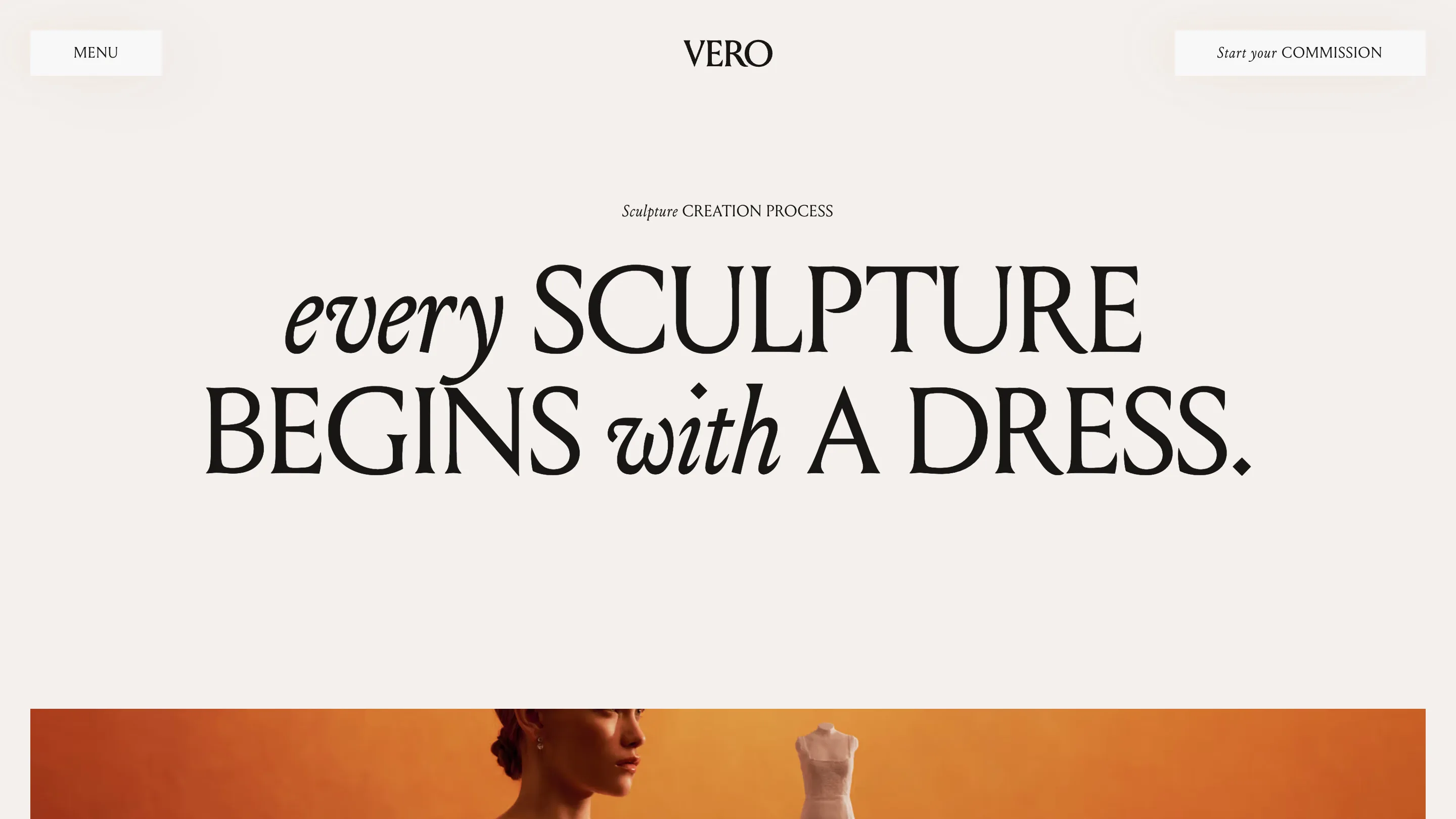
The rule holds across the site, so the reading rhythm never resets. Your eye learns it on the home page and coasts through the rest. That's a grammar for the page, and it's the kind of system thinking an awwwards jury rewards.
The small type plays along
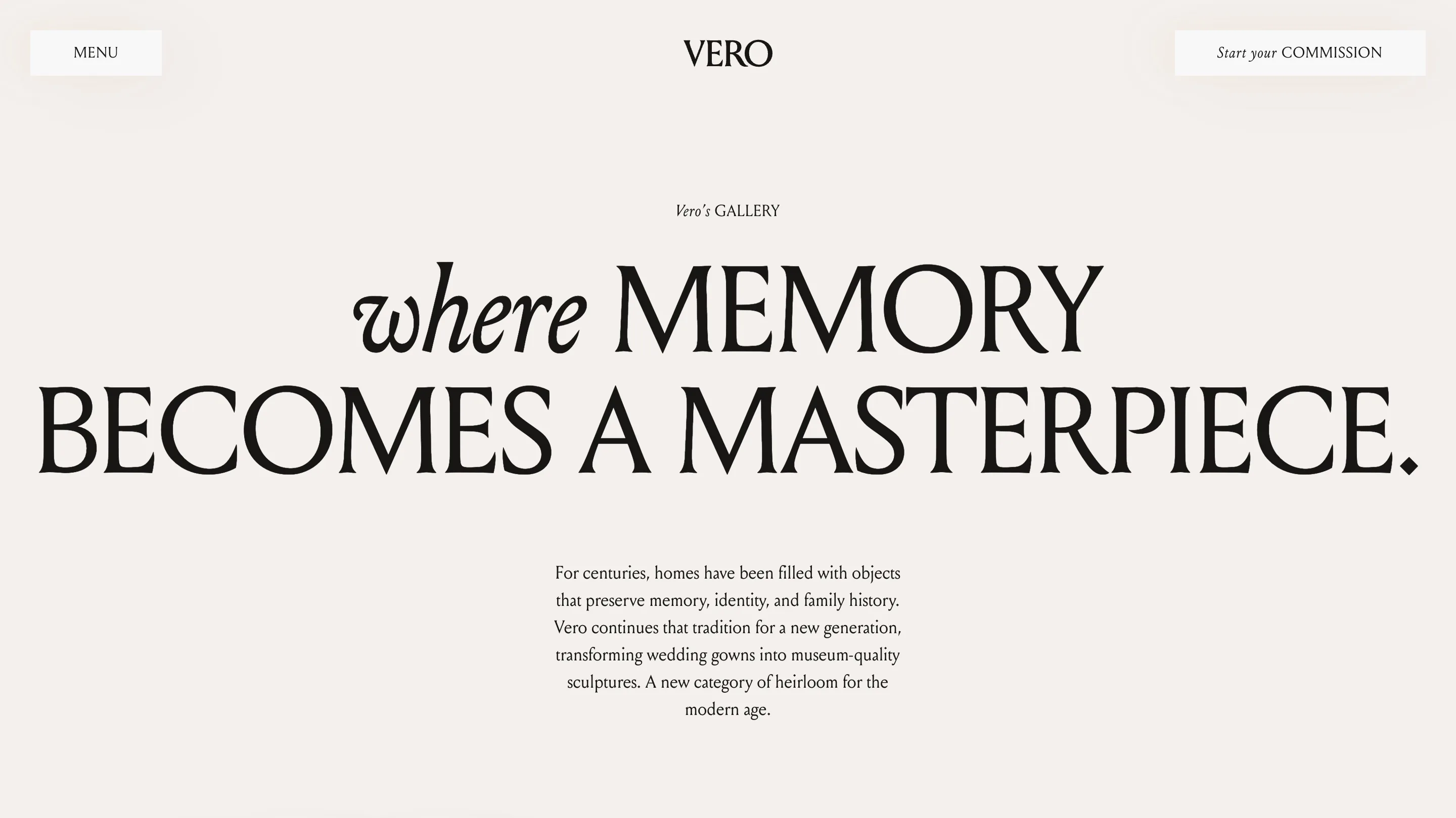
Even the overlines and buttons obey the rule. "Sculpture CREATION PROCESS." "Vero's GALLERY." "Start your COMMISSION." One word italic, the rest in quiet small caps. Nothing on the page is styled by accident. When the label above a section rhymes with the headline below it, the page feels authored instead of assembled.
Warm light, cold paper
Color does the second half. Every photograph is lit in the same amber studio glow: a model, a lace gown, a sculpture on a plinth, all in warm orange. Around them the page stays a cool off-white, close to unbleached paper. Two temperatures, nothing else. No accent hue, no gradient panels, no second idea. The warmth reads as skin and candlelight. The paper reads as gallery wall.
The home page opens on full-bleed video framed like a print inside that paper margin, so the motion feels hung rather than played. Strip a site to two temperatures and one type move, and every image has to be perfect. Here they are.
Why it scored
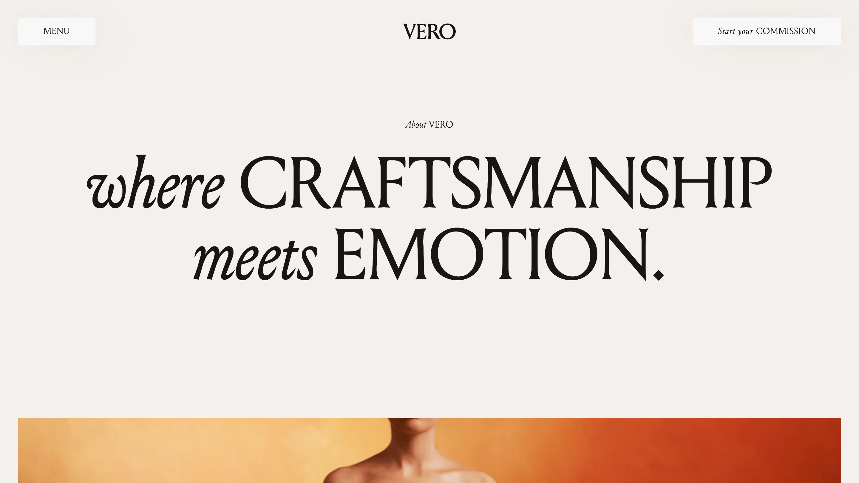
7.21 is a solid mark, not a landslide, and awwwards juries grade originality and craft hard. What likely earned it is coherence. One idea, heirloom as sculpture, runs through one typographic move and one lighting setup, held without a wobble across home, process, gallery and about. Nothing competes with the product. The dress is the loudest thing on the page, which for a studio selling the dress is the point.
Plenty of luxury sites reach for the same serif-and-cream look and land on generic. Vero earns its version by giving the type an actual rule instead of a mood. Set the nouns in stone, let the small words dance, keep the room warm. Easy to describe, hard to hold that steady. That's usually what the award is for.

