

Nothin' builds its studio site around one giant word
The Paris studio Nothin' gives its whole homepage to one giant wordmark and lets 3D objects carry all the color. A look at the craft.
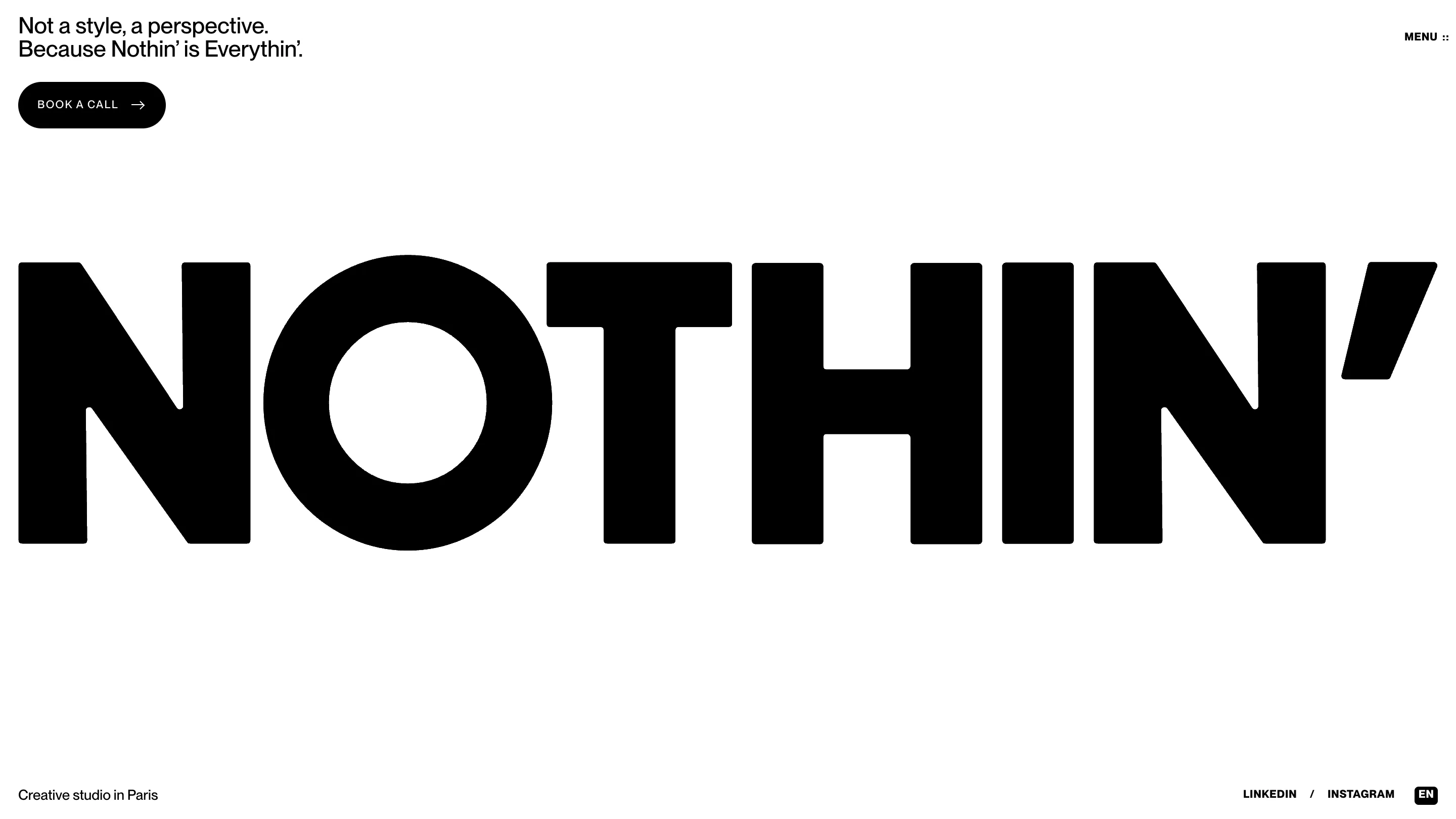
Nothin' is a creative studio in Paris, and its site makes one confident bet: give the whole homepage to a single word. NOTHIN' stretches edge to edge in a heavy grotesque, black on white, the apostrophe alone as tall as most headlines. The site took awwwards Site of the Day on August 10, 2026, scored 7.45, and picked up the Developer Award the same day. The craft is worth a closer look.
One word, full screen
Most studio sites open with a showreel or a grid of thumbnails. Nothin' opens with type and almost nothing else. The wordmark fills the viewport, a small line reads "Not a style, a perspective" in the corner, and a single black "Book a call" pill sits near the top. That's the fold. It works because the letterforms carry it: rounded terminals and tight spacing give the mark a friendly weight, and setting it this large makes the studio name the logo, the headline, and the art at once.
Scale is the trick. At this size you read the shapes before the word, so the O and the round of the N register as image first, meaning second. The studio site never has to explain its tone. You feel it in a glance.
Color lives in the objects, not the type
The page stays black and white until you scroll. Then the 3D work arrives: a bubble-wrap heart, a crumpled sheet of blue foil, a scoop of pink cream, a wrapped hard candy, each rendered in sharp studio light and dropped onto the black. The type stays monochrome. All the color and texture sit in the objects.
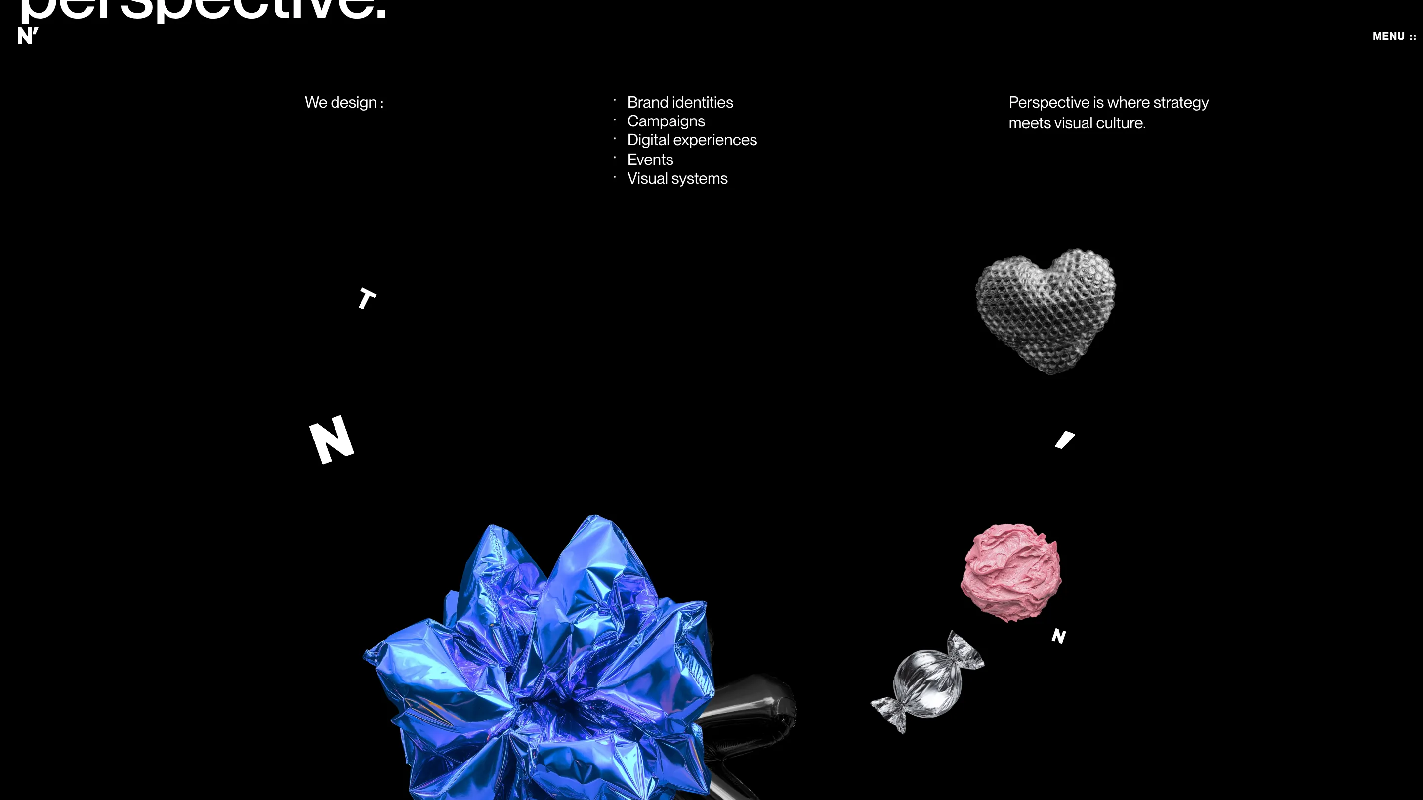
That split is a smart piece of art direction. Because the type never competes on color, the objects read as the studio's voice and the letters as its structure. The list beside them stays plain: brand identities, campaigns, digital experiences, events, visual systems. "Perspective is where strategy meets visual culture" is the only claim on screen, and the render does the persuading.
The video does the talking
Scroll into the work and the site hands the screen to film. The In_Cognita case study runs as full-bleed video: a figure in a shaggy silver suit sits in a bright waiting room next to an older woman reading a book, blue floor, steel chairs, no caption. A "Sound" toggle sits at the top. The still alone carries the idea, "the invisible, made visible," with no paragraph explaining it.
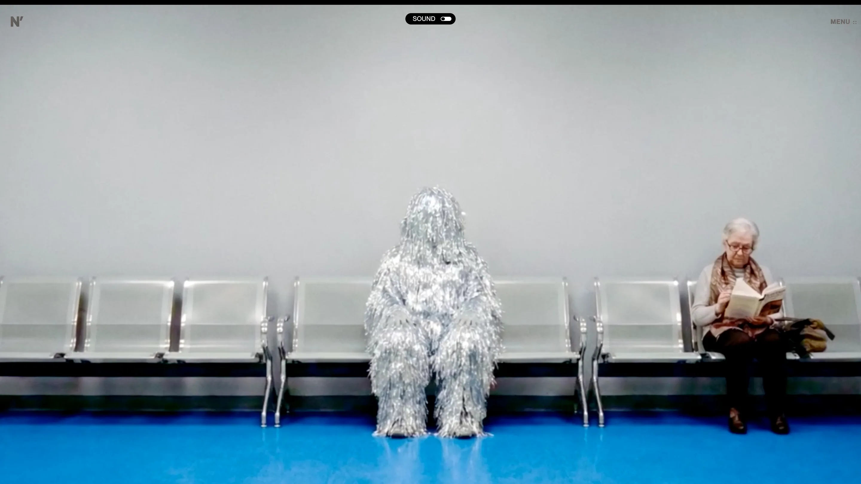
This is where the Developer Award shows. The hero runs a shader that reacts to the mouse, the projects load behind a preloader that counts to 100 over a rotating 3D heart, and the scroll stays smooth through video, WebGL, and type. The build carries the concept instead of fighting it.
Why it rates
Restraint earned it a 7.6 for creativity. The palette is two colors. The layout is mostly space. The studio trusts one word, a handful of objects, and a few films to say everything, then closes on the note it opened with: "Let's start from nothin'."
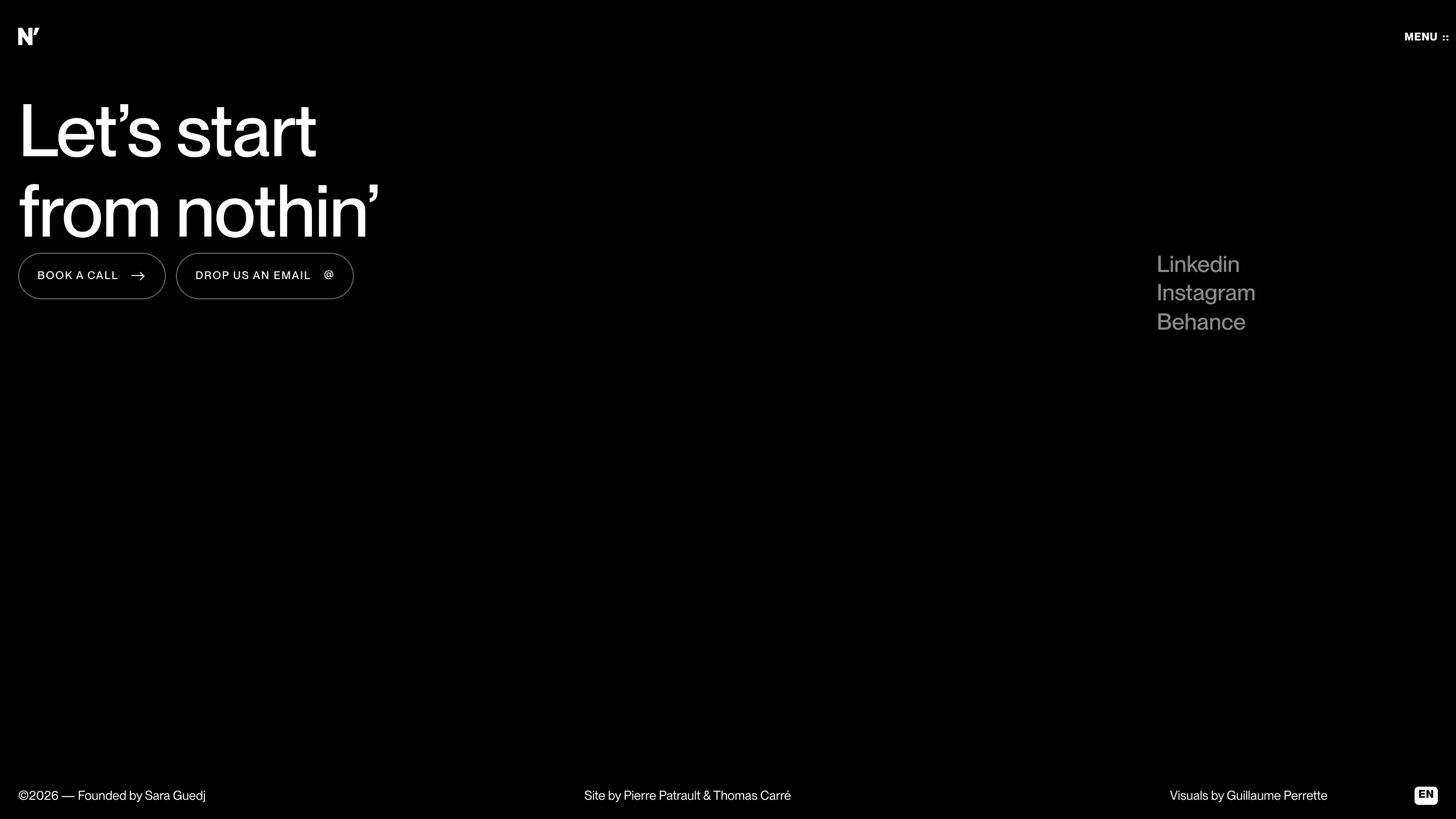
For working designers the lesson is old and hard: pick one idea and commit. Nothin' picked its own name, set it as large as the screen allows, and built the rest of the studio site to stay out of its way. Site by Pierre Patrault and Thomas Carré, visuals by Guillaume Perrette.

