

Heron AI draws its whole site as an architect's drawing set
Bearplus built Heron AI's site from an architect's own paperwork: a title block, an elevation for a loader, and orange as the redline pen.
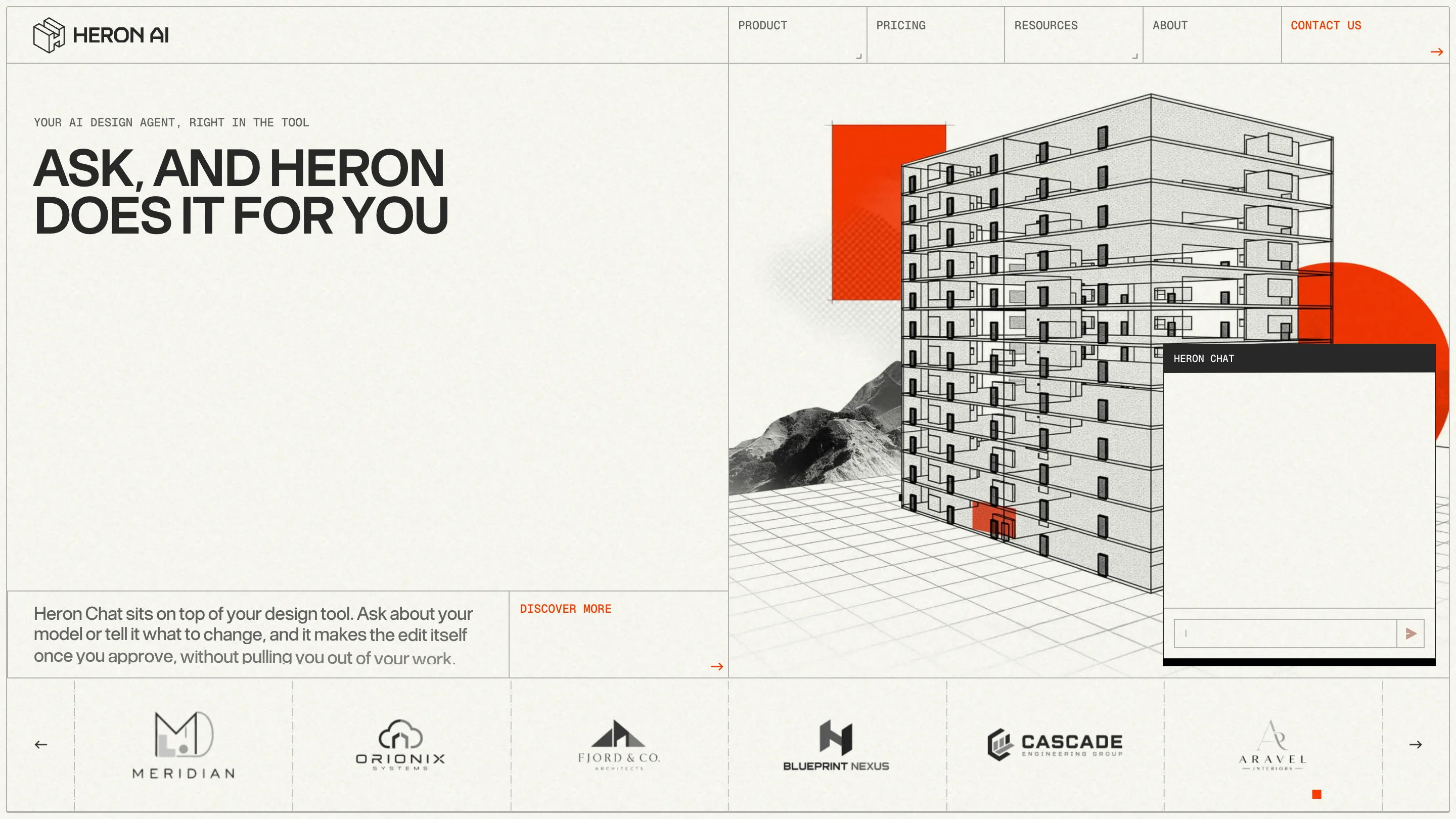
Heron AI's website reads like a set of architectural drawings, and that's the whole idea. Bearplus designed it with Kenny Ho for a product that lives inside Revit, Rhino, ArchiCAD and SketchUp, so the site speaks the language its buyers already draw in every day. It took awwwards Site of the Day on 12 October 2026 with a score of 7.7, plus the Developer Award.
The loader is an elevation being drawn
The first thing you see is a building. A two-storey elevation in thin black line, on warm off-white paper with a faint grain, while an orange line sweeps across it and counts the load. When we caught it, the line sat at 86%.
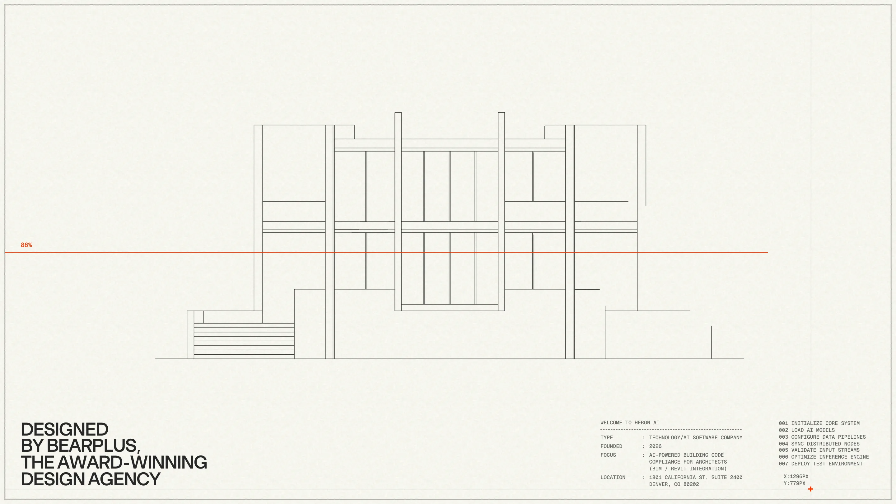
Look at the bottom of the screen. On the right sits a title block, the box every drawing sheet carries, set in a monospace: type, founded, focus, location, with colons lined up in a column. Next to it, a numbered boot log runs from 001 to 007, and a cursor readout tracks your pointer in pixels. On the left, in a heavy grotesk, the credit: designed by Bearplus. Two typefaces on one screen, each doing the job it would do on a real sheet.
A drawing sheet for a grid
Once the site opens, the sheet stays. A thin hairline frames the whole viewport, and the navigation is a row of ruled cells, each label pinned to the top left like a field on a form. Small corner ticks mark the cells that open a menu. Contact us is the only one in orange.
The hero splits the page down the middle. Big, tight uppercase headlines on the left ("Ask, and Heron does it for you"), with a monospace kicker above them. On the right, a wireframe tower stands on a perspective grid, cut away floor by floor, with halftone mountains behind and two flat orange shapes for colour. The Heron Chat window floats over it, the way the real widget floats over your modelling tool.
Orange is the redline
The palette is two colours: #282828 for the line work and #F15534 for everything that needs your eye. That orange is the markup pen. It marks the load on the elevation, the call to action in the nav, the review buttons, the flagged rooms.

The dashboard page shows how far the rule goes. Duplicate wall types, a door family missing a parameter, 39 unused families: each flag gets a small orange cube, and each pending approval gets an orange review button. Any architect who has had a set of drawings marked up in red reads this in a second. The colour means "check this", everywhere on the site.
Plans for transitions
The about page opens on a hexagonal floor plan with dimension strings along two sides, and the page frame turns into a scale ruler with crosshair marks in each corner. Orange rectangles sit over three spots on the plan, the same highlights the product draws over a model when it finds an issue.
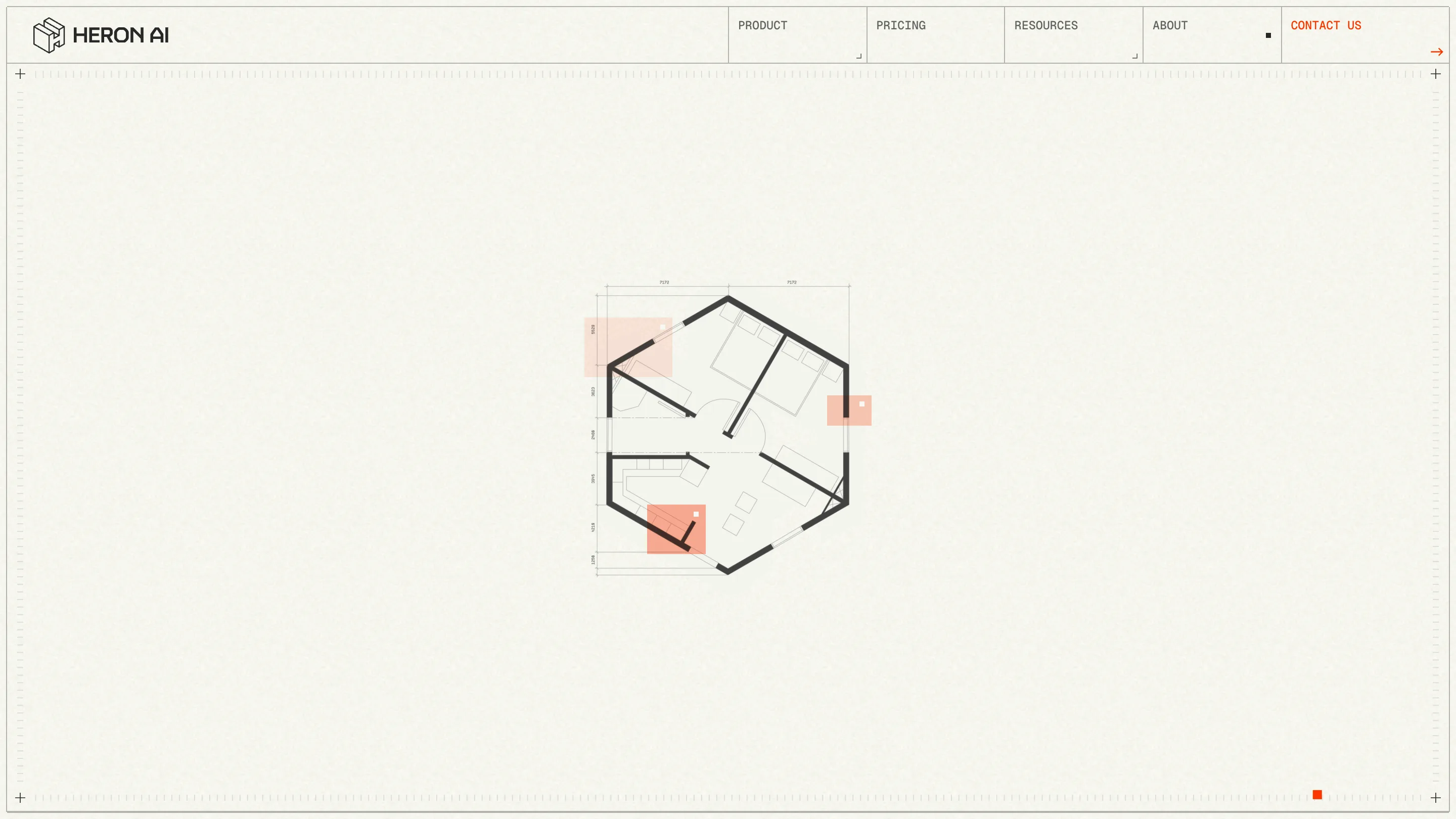
This is where the concept pays off. The site never has to explain what "Heron watches your model and flags problems" looks like. Every page shows it, in the drawings themselves.
Why it won
Heron's buyers are architects, BIM managers and drafters, so Bearplus built the brand out of their own paperwork: the title block, the elevation, the plan, the redline. The type pairs a dense grotesk for claims with a monospace for data, which is how a drawing set splits labels from notes. The motion is the drawing of lines. One accent colour carries the product's single promise. A judge sees craft. An architect sees a tool that already knows how they work.

