Partizan turns its homepage into a wall of playing film
Partizan's site drops the hero and gives the whole screen to autoplaying video. It took awwwards Site of the Day on July 26. Here's why it works.
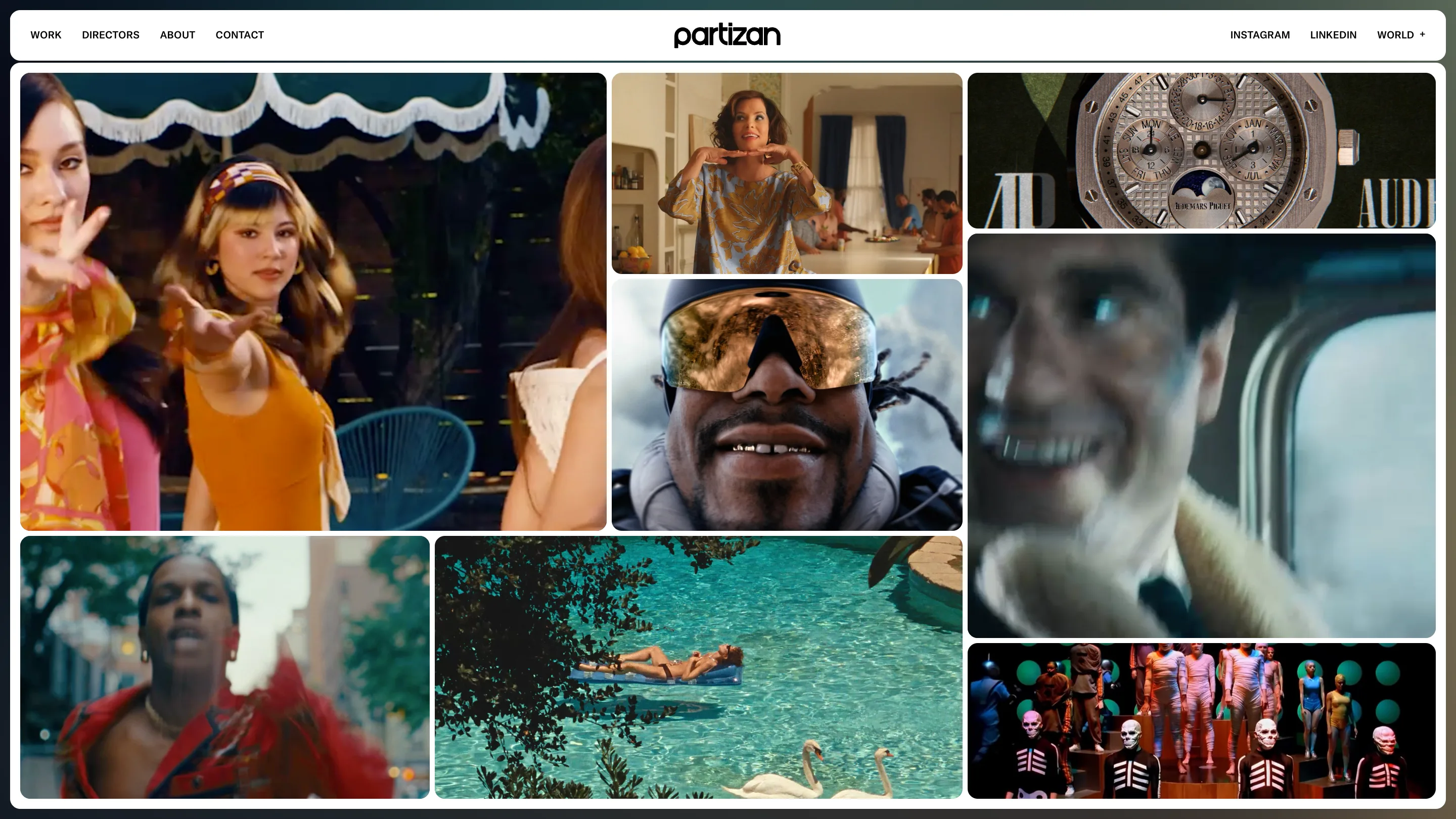
Partizan's homepage has no headline. You land on a wall of moving film.
What loads is a masonry grid of video thumbnails, all playing at once, muted, edge to edge. A production company's whole reel, assembled by your eye as you scan it. The studio behind the build, Beaucoup, a Lyon shop, took awwwards Site of the Day on July 26, 2026 with a 7.18. Here's the craft a judge would rate.
The reel is the interface
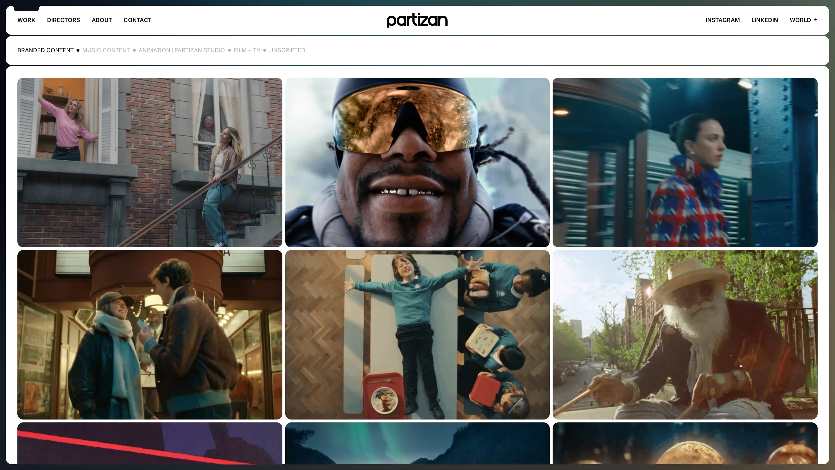
The grid does the pitch. There's no "we make films" line to read first. A close-up of a face behind gold goggles, a swan drifting across a turquoise pool, a gold Audemars Piguet watch turning against its own logo. The tiles vary: a tall portrait frame next to a wide 16:9, a small square tucked under a big one. That asymmetry is the whole trick. A uniform grid of same-size cells reads like a stock library. Partizan's tiles change size and rhythm, so your eye moves across them the way it would across a contact sheet.
Every tile autoplays. The homepage is a showreel you never press play on.
Chrome that gets out of the way
Look at the frame. The content sits inside a white panel with a big corner radius, floating on a near-black canvas. That dark gutter works like a passe-partout around a print: it mounts the video, isolates the color, keeps the browser edge from crowding the work. The wordmark is one lowercase geometric "partizan" centered up top. The nav is four small uppercase words. That's the entire UI.
The restraint is a decision. When the content is this loud, gold watches, pool turquoise, red coats on a street, the shell has to stay quiet or the page fights itself.
Filters as plain text
On the Work page, the categories sit as a quiet text row: Branded Content, Music Content, Animation, Film + TV, Unscripted. No pills, no dropdown, no icons. You read them like a table of contents and the grid re-flows underneath. The site trusts you to know a text link when you see one, and the honesty of that reads as confidence.
One page allowed to speak
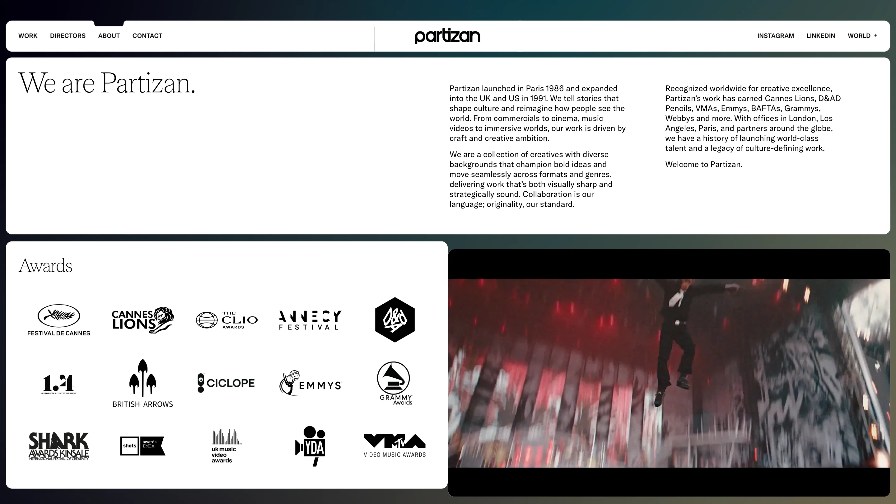
The About page changes voice. The mono sans gives way to a large, light serif: "We are Partizan." set big against the same floating panels. It reads editorial, closer to a magazine masthead than a studio deck. Below it, a flat wall of award marks: Cannes Lions, D&AD, Clio, Annecy, Emmys, Grammys, VMAs. Partizan launched in Paris in 1986, and this is the one screen where words do the work, so the type earns a different register. Everywhere else, the film talks.
Why it won
Beaucoup built the motion on GSAP and WebGL, and you feel it between pages: the next screen resolves out of a blurred wordmark instead of cutting hard. But the reason it scores is simpler than the tech. A production company's job is to make you watch. This site makes the watching the first thing that happens, before a single sentence lands. The design is sure enough of the work to say almost nothing and let the muted films carry it.
Credit to Beaucoup for the site, and to Partizan for the work playing inside it.