Made With GSAP makes the whole site its own demo reel
Made With GSAP sells 110 JS animation effects and demos every one right on the page. It took awwwards Site of the Day on 29 July, scoring 7.65.
Awards · The Editors · 4 min read ·
Featured: Manoir
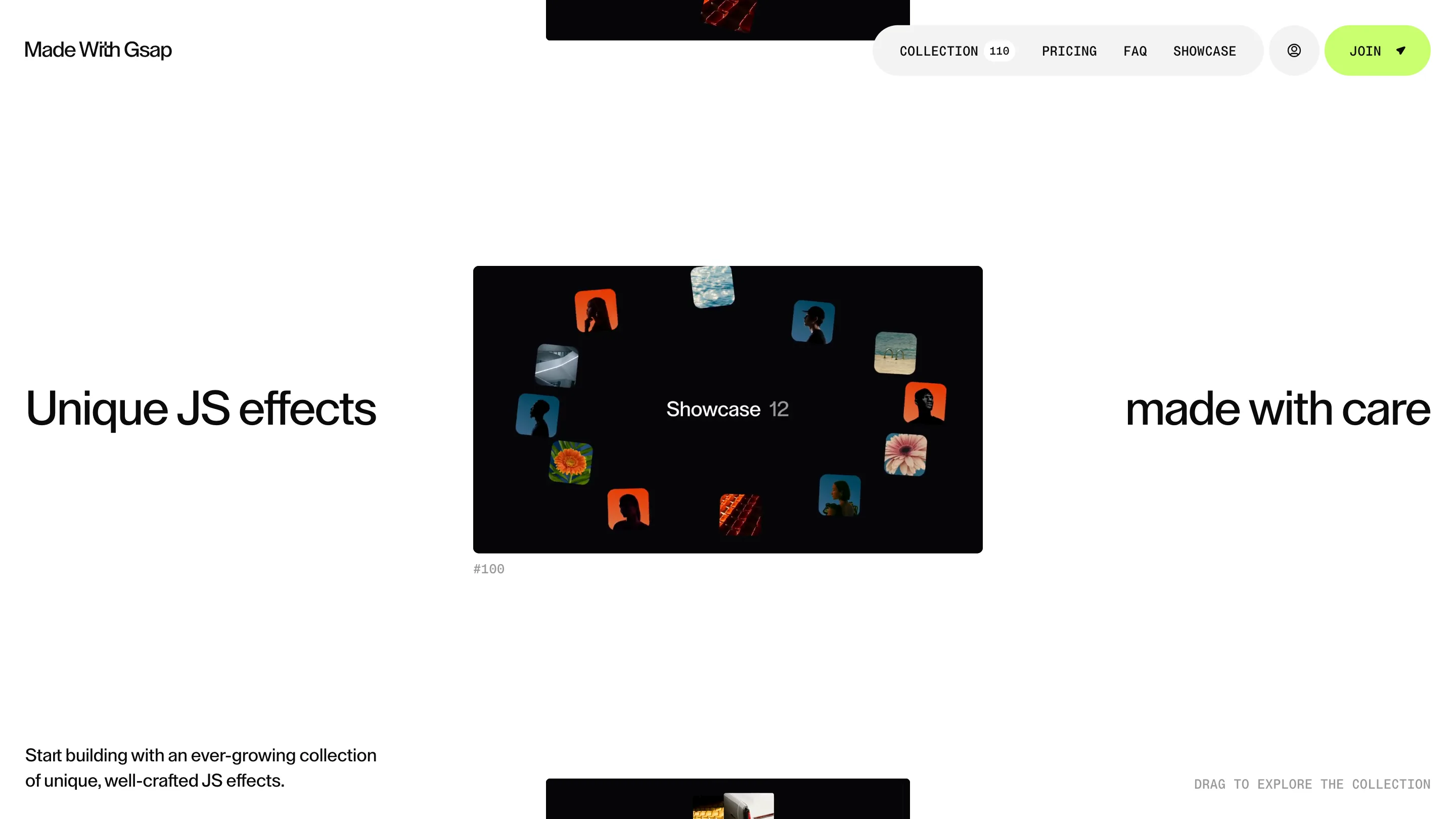
Made With GSAP sells 110 JavaScript animation effects, and it proves each one by running it on the page. Nothing here is a screenshot or a trailer. The ring of thumbnails on the home page is a drag effect you can throw around with the cursor, and the label under it reads DRAG TO EXPLORE THE COLLECTION in plain mono type. That decision, the product demoing itself, is what took the site awwwards Site of the Day on 29 July 2026 at a score of 7.65.
Manoir developer Michaël Garcia and designer Florent Roux-Durraffourt built it. The two already share an awwwards eCommerce Site of the Year, and the same discipline shows here: a shop where the storefront and the sample are the same object.
Every GSAP effect, sorted by how you touch it
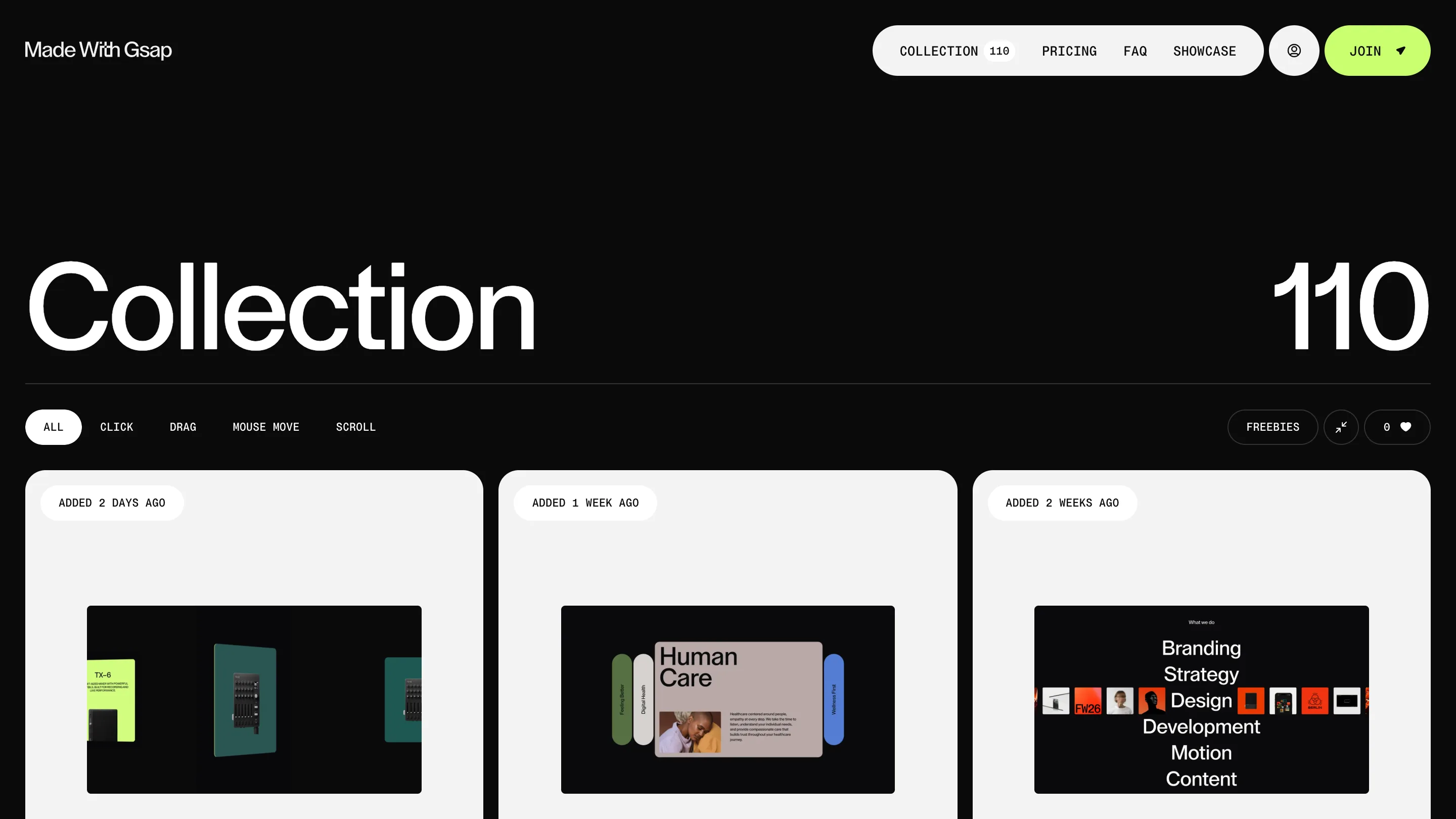
The collection page is where the craft reads clearest. Instead of naming the effects, it files them by the input that triggers them: CLICK, DRAG, MOUSE MOVE, SCROLL, with an ALL view and a FREEBIES toggle. A designer hunting for a scroll transition can jump straight to the ones that scroll. Each card is a working preview, tagged with when it landed, ADDED 2 DAYS AGO, ADDED 1 WEEK AGO, so the library reads as a feed that keeps growing.
Numbers carry the headlines
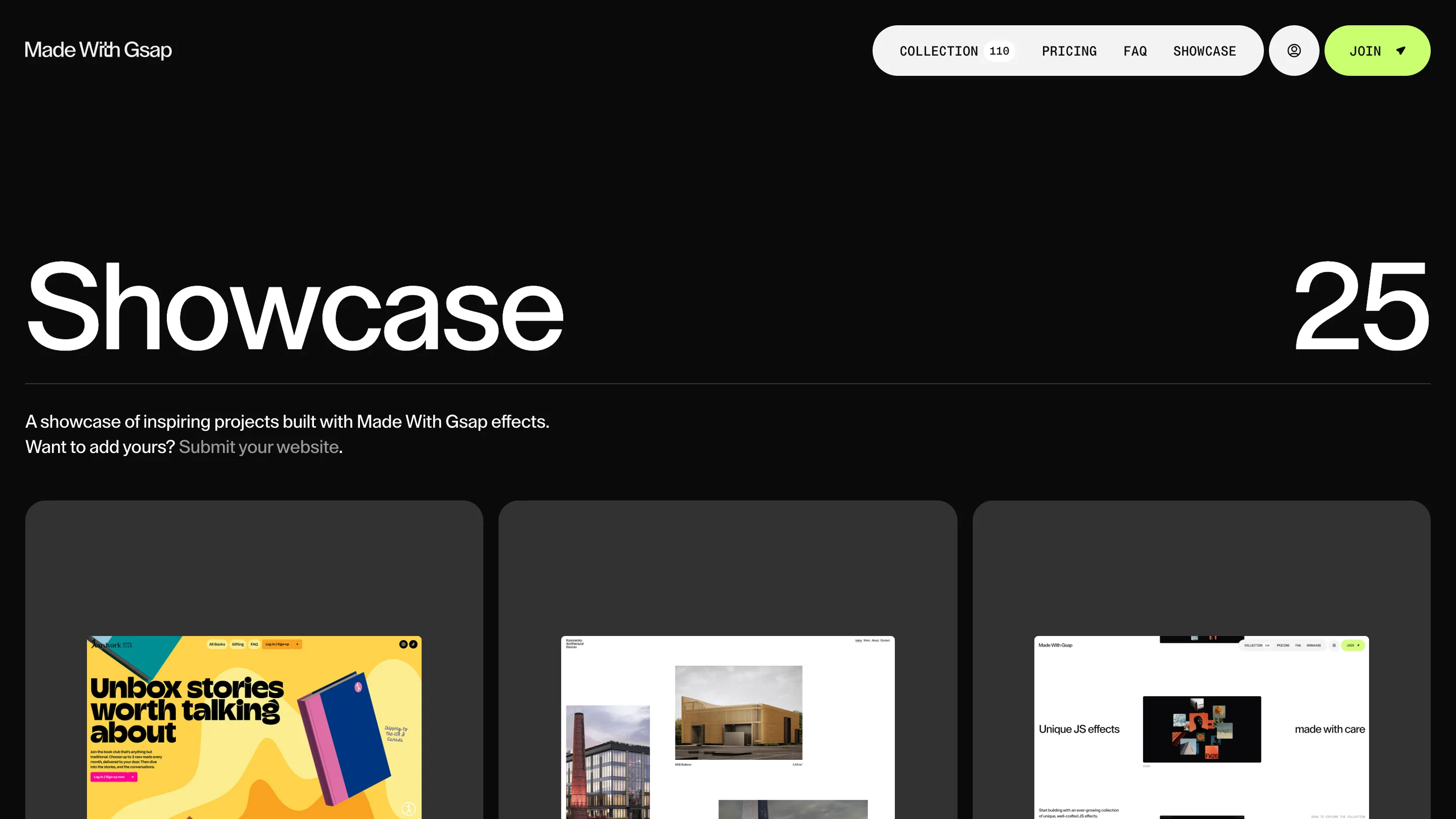
The type is doing a lot with very little. One grotesque sans runs the whole site, set large and tight. The section titles pair a word on the left with a numeral on the right at the same weight: Collection sits opposite 110, Showcase opposite 25. The number stops being a caption and becomes half the headline. It's a small move, and it gives every page an instant sense of scale.
Black, white, and one green
The palette stays close to monochrome. Black pages, white pages, a single lime green that shows up only on the Join button and the odd card. Everything colourful on the site comes from the effect thumbnails themselves, so the art direction hands the colour budget to the work and keeps the frame quiet. Mono labels like #100 and ADDED 2 DAYS AGO sit in the corners and give it the feel of a spec sheet.
The showcase page turns that restraint outward. It lines up 25 real sites built with the effects, a yellow book-club landing next to an architecture studio, each one credited and open for other builders to submit their own.
The offer, stated plainly
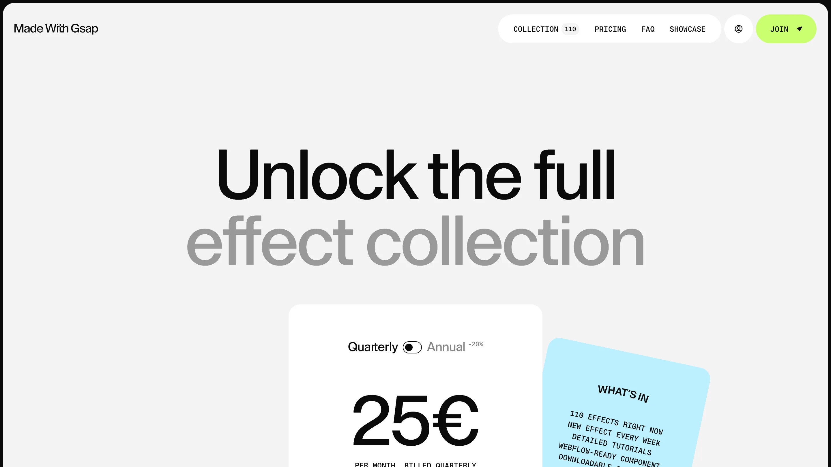
Pricing keeps the same voice. One card, a Quarterly and Annual toggle marked minus 20 percent, 25€ a month, and a tilted blue note listing exactly what you get: 110 effects now, a new effect every week, tutorials, and Webflow-ready components. No stock photography, no filler. The page trusts the work you've already scrolled through to do the selling.
That's the through-line a judge would rate. The subject is motion, the medium is motion, and the site never once has to tell you it's good at motion. It just moves.