The green scrawl that signs every title on this portfolio
Artem Shcherbakov's portfolio sets fat black type, then drags a green marker scrawl across every title. Awwwards Site of the Day, July 25.
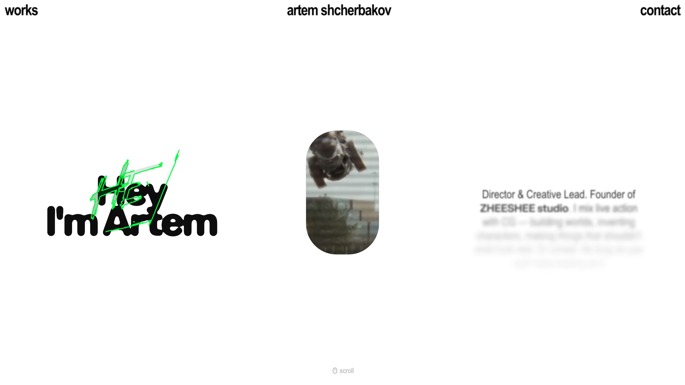
The first thing you read on Artem Shcherbakov's portfolio is his name in fat black rounded type. The first thing you notice is the green marker scrawl dragged straight through it. That layered mark is the whole identity of the site, and it carried the work to awwwards Site of the Day on July 25, 2026, with a 7.17.
A signature drawn over the type
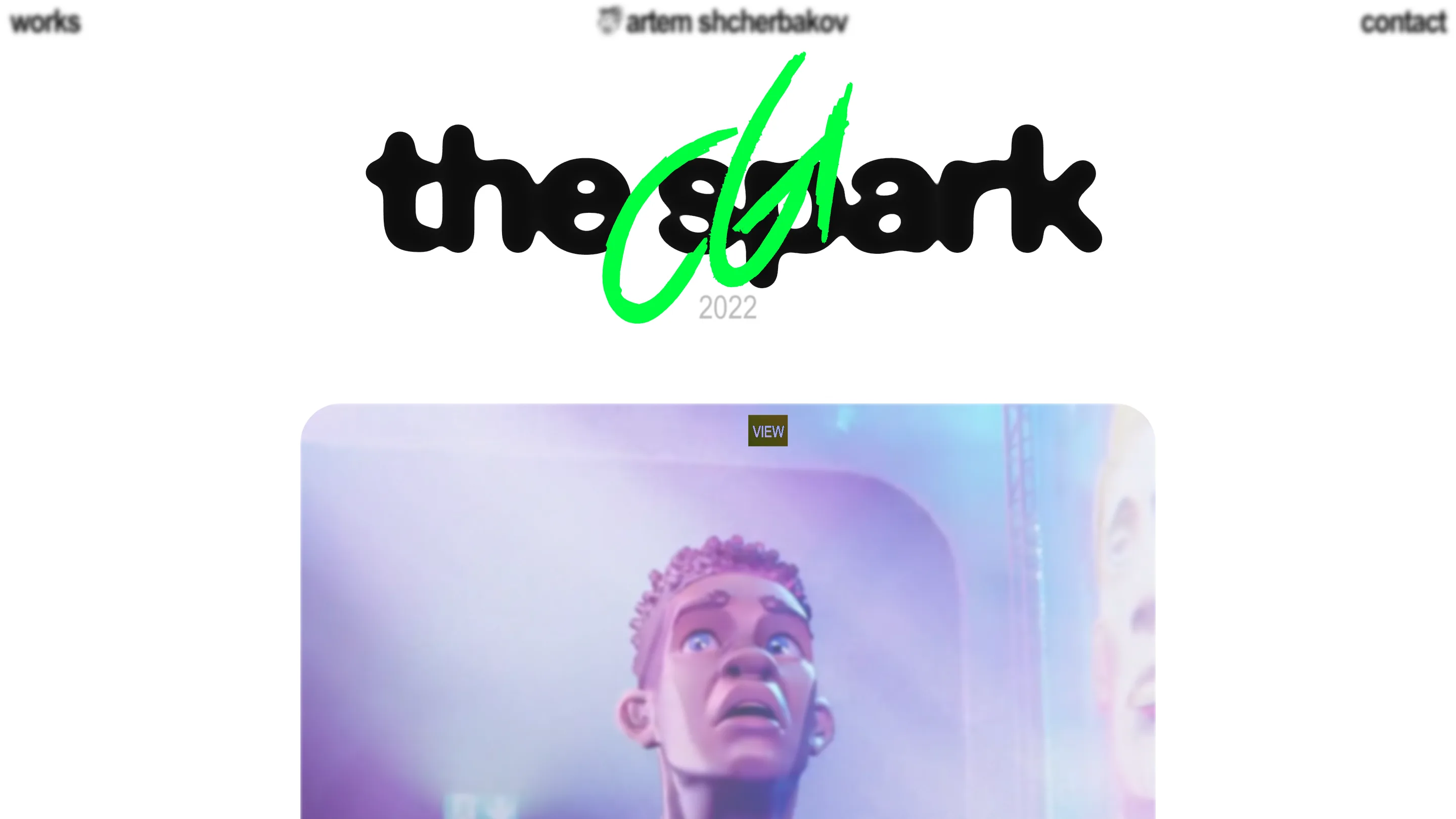
Every heading is a heavy rounded grotesque, close to black in weight, set big and centered on white. "Hey I'm Artem" on the home page. "the spark" on a project. Over each one sits a bright green scribble, drawn by hand, the kind of stroke you'd make signing a wall. It reads as a signature more than a decoration. The type stays dead legible underneath, so the scrawl adds energy without costing you the word.
Two marks, two registers, printed and handwritten, sitting in the same spot. The green is the only color that repeats. Everything else is black text on white, or the film work itself. One accent, used once per screen, does a lot.
White frame, dark reel
Shcherbakov directs and mixes live action with CG. He runs ZHEESHEE studio, and his reel is dark, cinematic, moody. Most film portfolios lean into that and go black wall to wall. This one goes the other way. The chrome around the work is bright white and quiet, so every clip you open drops you into color and contrast.
The video windows are rounded rectangles and soft pills, floating in the space with a small VIEW button. The frame recedes and the footage carries. That contrast is an editorial decision worth naming: white gives the type room and makes the green pop, and the dark clips get to be the loudest thing on the page by comparison.
The transition is the interaction
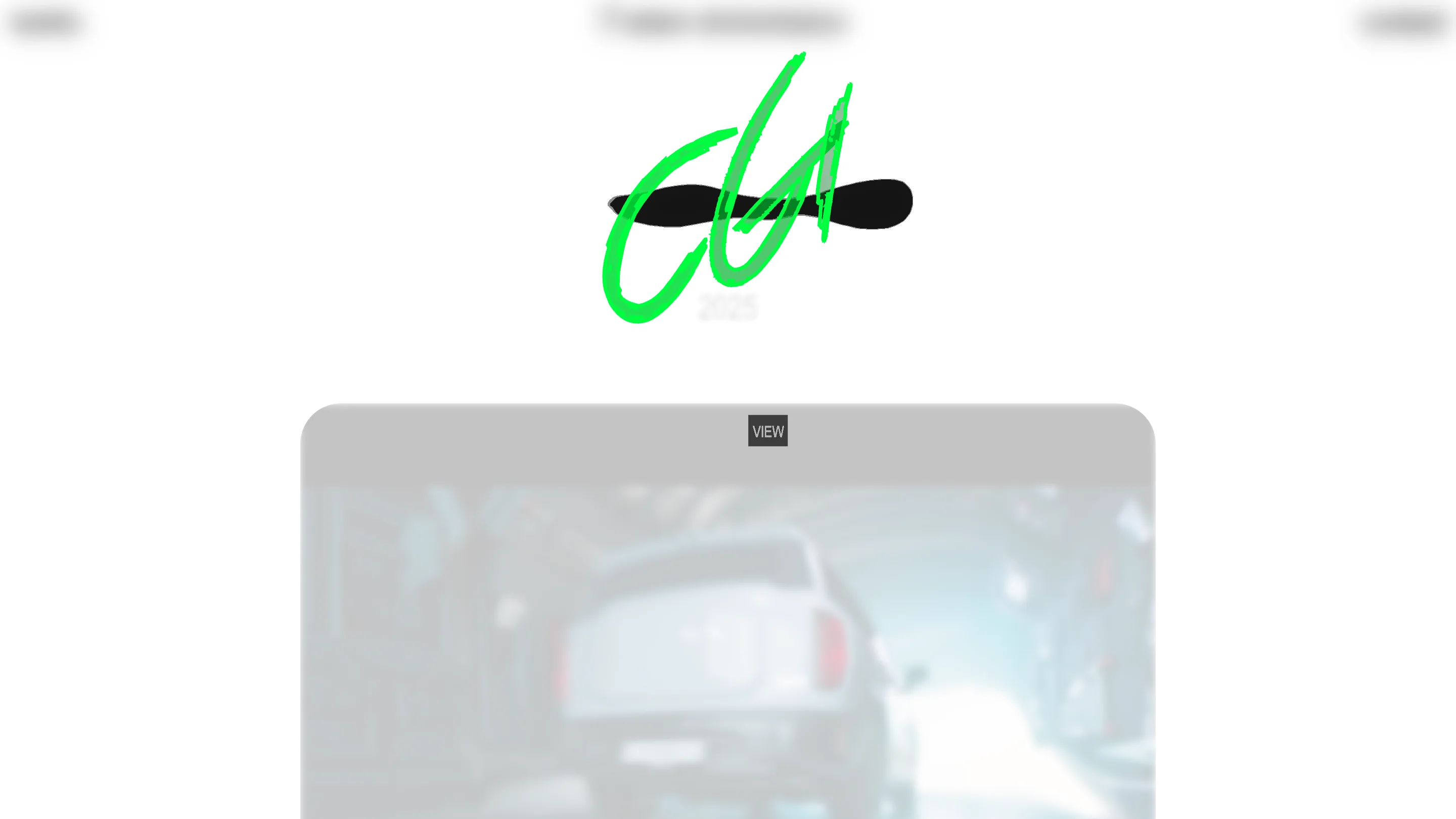
Move between projects and the page doesn't cut, it smears. Titles morph, thumbnails blur and slide, the green scrawl redraws itself for the next name. Catch it mid-motion and you get the whole layout in transit.
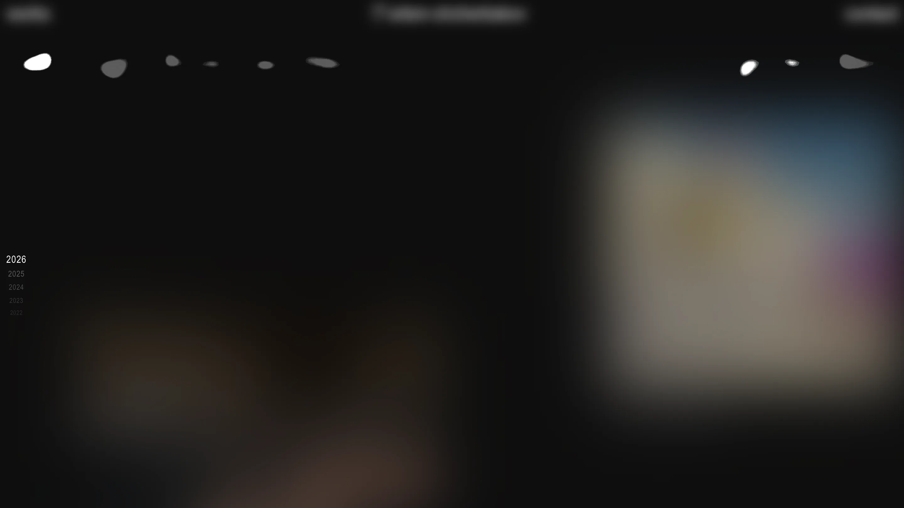
The works index files everything by year down a rail on the left, 2026 at the top running back to 2022. That rail is the navigation. Instead of a grid of everything at once, you scrub through time. It's a small idea, well suited to a director whose reel grows a little every year.
Why this portfolio rates
Take the parts on their own and none is exotic. Rounded display type. A hand-drawn accent. A white layout. Morphing transitions. The score comes from restraint. One typeface does display and nav. One accent color. One gesture, the scrawl, repeated until it becomes the mark. Nothing on the page sits there without a job.
For a portfolio, that discipline is the pitch. Shcherbakov sells taste and craft, and a site that says a lot with very little is the proof. Built with SALT AND PEPPER and Cedro, it took Site of the Day with a 7.17, and it earned the score on the small stuff: how the type is weighted, where the green lands, how one screen hands off to the next.