Emotion walks you through its 3D agency site room by room
Emotion's own site is three WebGL places: a purple lake, a ring of project cards and a dark studio. Each page is a room you walk into.
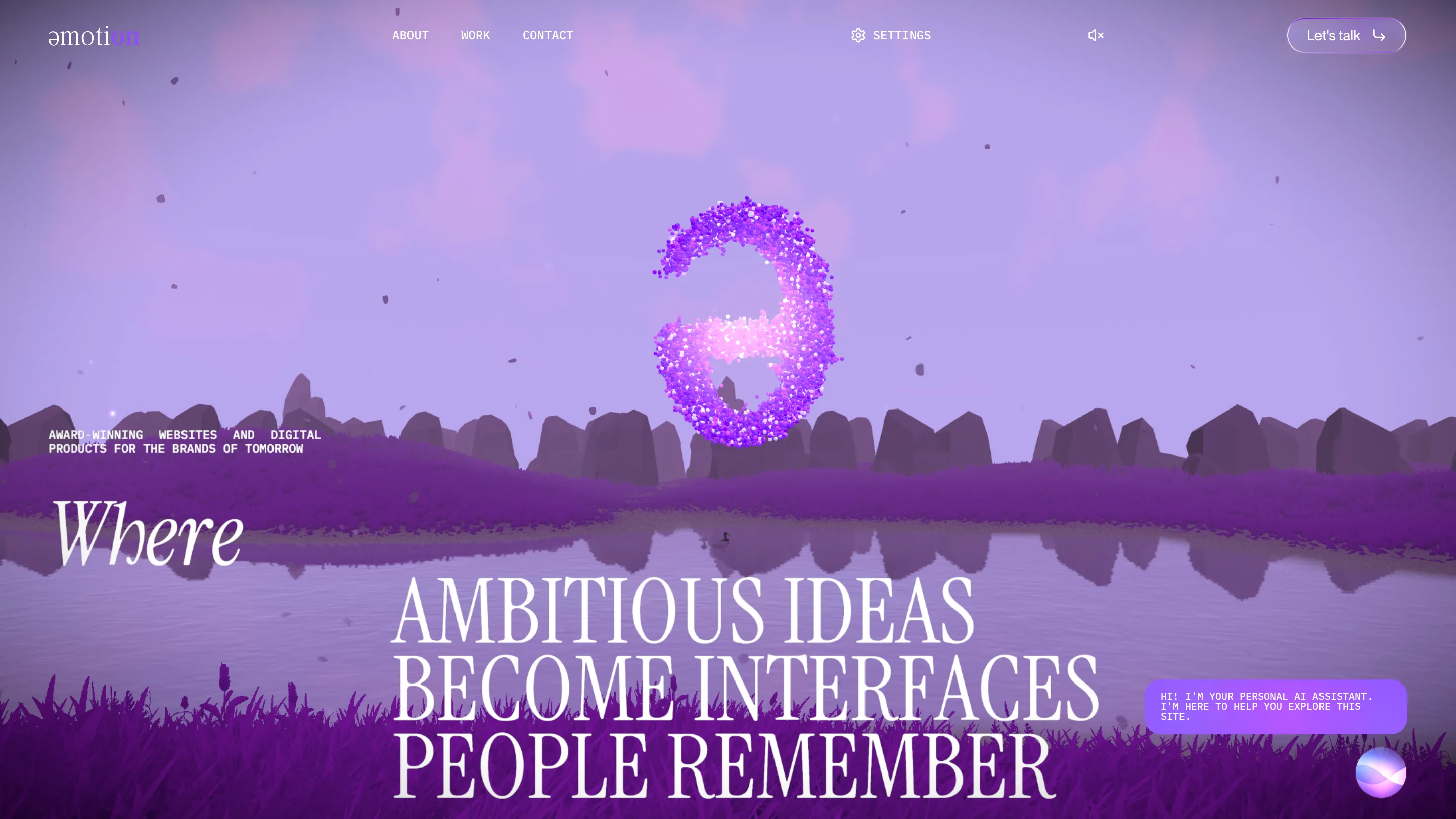
Emotion built its 3D agency site as a set of places. The home is a purple lake at dusk, the work page is a ring of glowing cards in a dark hall, and the about page is the studio's own meeting room. You walk between them, and every page has its own light.
That idea took awwwards Site of the Day on 22 October 2026, with a 7.56 overall: 7.58 for design, 7.69 for creativity, 7.6 for content and 7.45 for usability. The studio behind it is Emotion, two founders in Kryvyi Rih, Ukraine, working since 2018. Roman Stets and Leonid Kostetskyi are credited on the award.
The door asks how you want to come in
Before anything moves, the site gives you a pale lilac screen, the wordmark and two choices: enter with audio, or without. It's a small courtesy. A site built on sound and WebGL tells you so up front, and lets you pick. The settings menu in the bar keeps the same promise once you're inside: sound, dark mode and a quality switch for slower machines.
The wordmark sets the tone. It reads "əmotion", with a schwa in place of the first e, the unstressed vowel nobody notices. On the home the same schwa hangs over the water as a cloud of violet particles.
A lake for a hero
The hero is a landscape. Rocks line the far shore, leaves drift down through the frame, a duck sits on the water and the grass in the foreground sways. Over it the headline runs in a tall condensed serif in capitals: "Ambitious ideas become interfaces people remember." The first word, "Where", sits alone on the left in italic, as if someone said it out loud before the rest.
That swap between upright capitals and one italic word comes back on every page. The about page ends "how it made them feel", with the last word in italic. It's the type doing the voice, and it's the clearest bit of craft on the site.
The work page is a carousel you stand inside
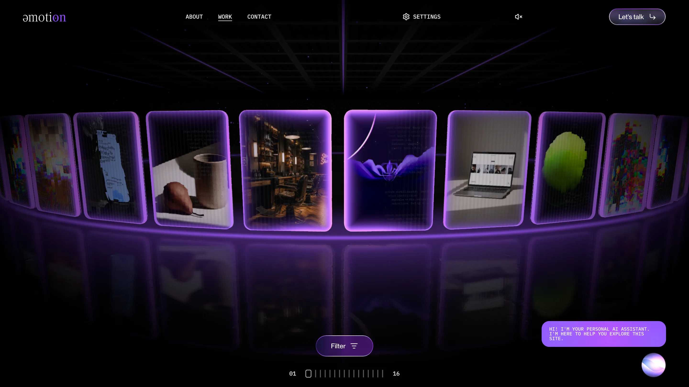
Sixteen projects stand on a curved ring around you, each card lit violet at the edge and mirrored on a glossy floor. A ceiling grid gives the hall its depth. The counter at the bottom, "01" to "16" with a tick for each card, tells you where you are without a word. One Filter button sits under the ring, and that's the only control.
On the home page the same projects are spec sheets set in IBM Plex Mono: "PRJCT /01", created at, name, type, scope, stack. GSAP, Nuxt 3, Three.js, Storyblok. A developer reads that line and knows what was built.
The about page is a room
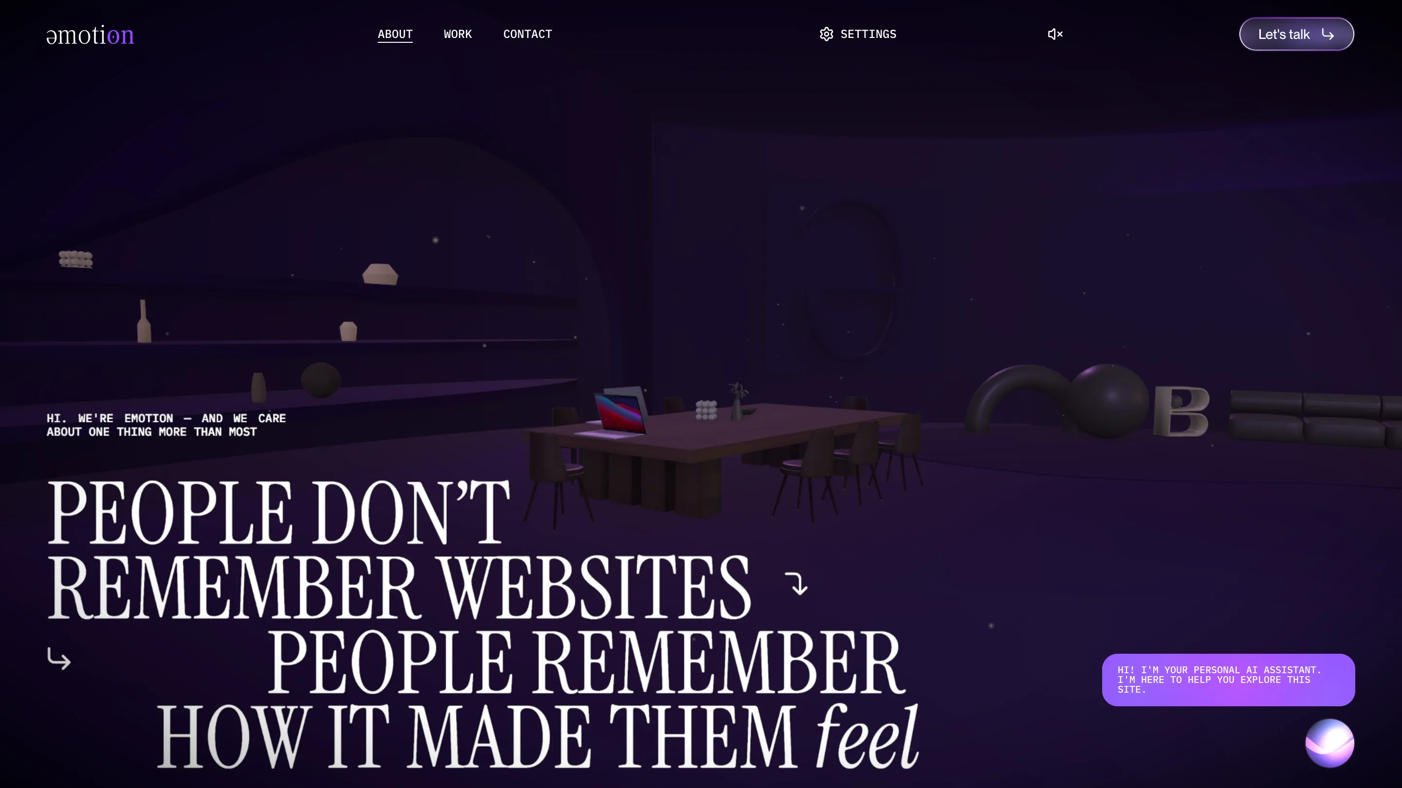
"People don't remember websites. People remember how it made them feel." The line sits over a dim studio: a long table with a laptop open on it, chairs, shelves with vases, a sofa and a big letter B. It's the same scene language as the lake, turned indoors and turned down. The text below tells the founding story in plain first person: two freelancers who taught themselves design and then code.
Case studies drop the 3D
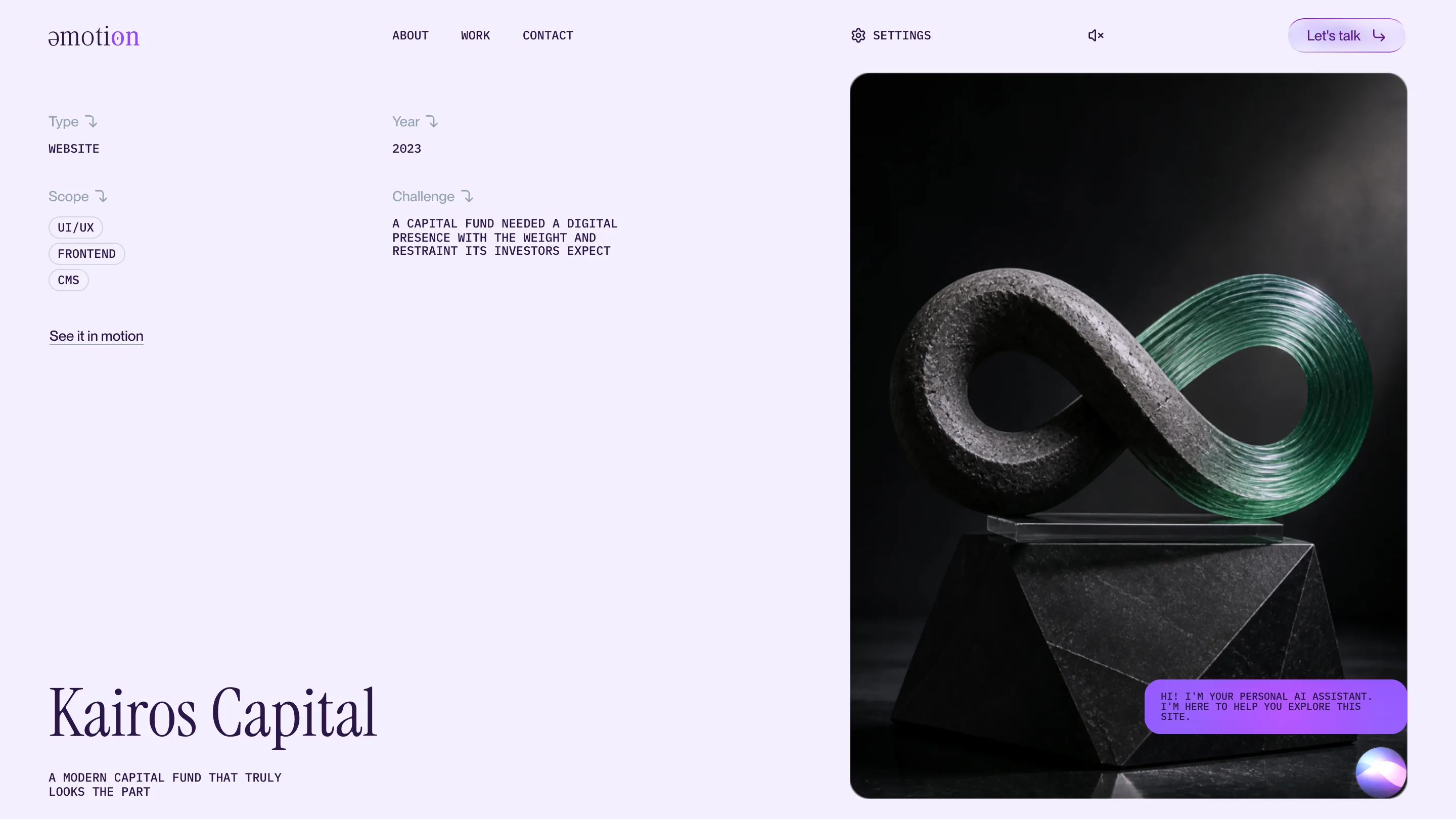
Open a project and the scene goes away. Kairos Capital gets a light lilac page with four labelled fields, type, year, scope and challenge, each with a small hooked arrow, and one big picture of the client's work. That restraint is the right call. The rooms are for Emotion; the case study is for the client, and it reads like a brief.
One accent colour, #9047FF, ties the rooms together. It's in the particle schwa, the glow on the cards and the "Let's talk" button. Three WebGL scenes and a set of plain case studies, and it still reads as one building.