Brandon Yasin's portfolio changes colour with the clock
Brandon Yasin's portfolio sets its palette by the hour, and a dial in the corner lets you drag the day forward. Two colours do all the work.
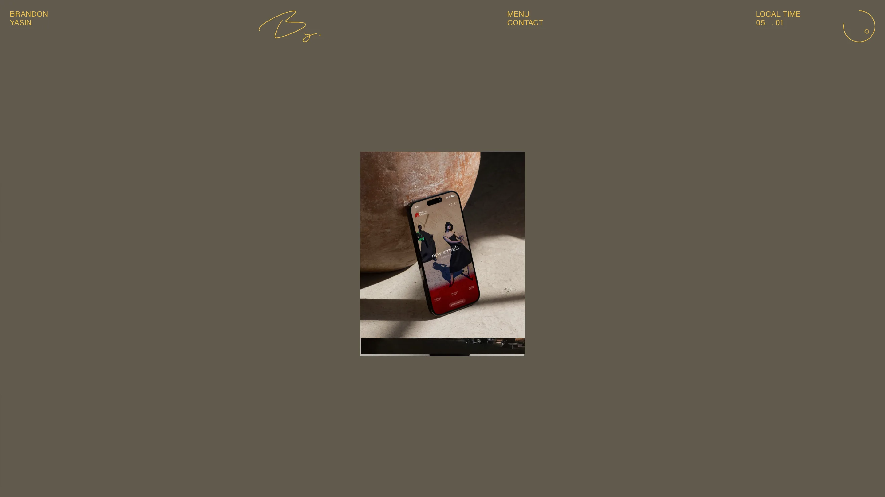
Brandon Yasin's portfolio changes colour with the clock. The ground and the type are picked by the hour you visit, and a small dial in the top corner lets you drag the time forward and watch the palette move with it. That one idea took the Danish designer's site to awwwards Site of the Day on 24 October 2026, with a score of 7.31 and a Developer Award on top.
Open it at five in the morning and you get a muddy olive ground with mustard type. Come back after lunch and it's somebody else's site. Same layout, same words, a different room.
A colour palette that follows the time of day
The clock is the whole brand system. Top right, next to the menu, a label reads LOCAL TIME with the hour and minute, and beside it sits a thin circle with a dot riding its edge. The dot is the hand. Grab it and you scrub through the day.
What makes it work is how little changes. Each palette is two colours: one for the ground, one for everything printed on it. Type, the signature monogram, the outline of the dial, the hairline labels, all share the one ink. There are no accent colours fighting for attention, so when the hour turns, the whole page turns at once and reads as a new edition.
It also suits the work. Brandon Yasin does brand and creative direction for clients like Louis Vuitton, Rains and Copenhagen Fashion Week. A fashion house reissues itself every season. His site does it every hour.
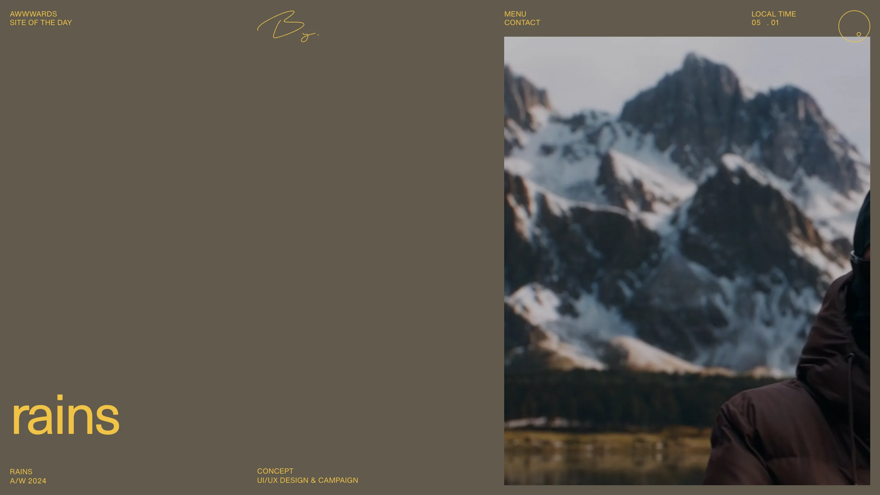
Lowercase headlines set like a magazine cover
The headlines are Neue Haas Unica Pro at 400, tracked in by 4%, and all lowercase. On a wide screen they scale with the viewport to about 6% of its width. Each case study opens on a single word: rains, archive. It sits at the bottom left like a masthead, with the client, season and scope set in small capitals underneath.
That pairing is the editorial part. Big lowercase for the name, tiny uppercase for the facts. The small labels sit on a four-column grid that the header shares, so BRANDON YASIN, the monogram, MENU and LOCAL TIME line up with the case credits below. Nothing floats.
The Rains page gives the photograph the whole right half and leaves the left almost empty. A designer would call that brave. A client would call it calm.
Restraint where the work has to show
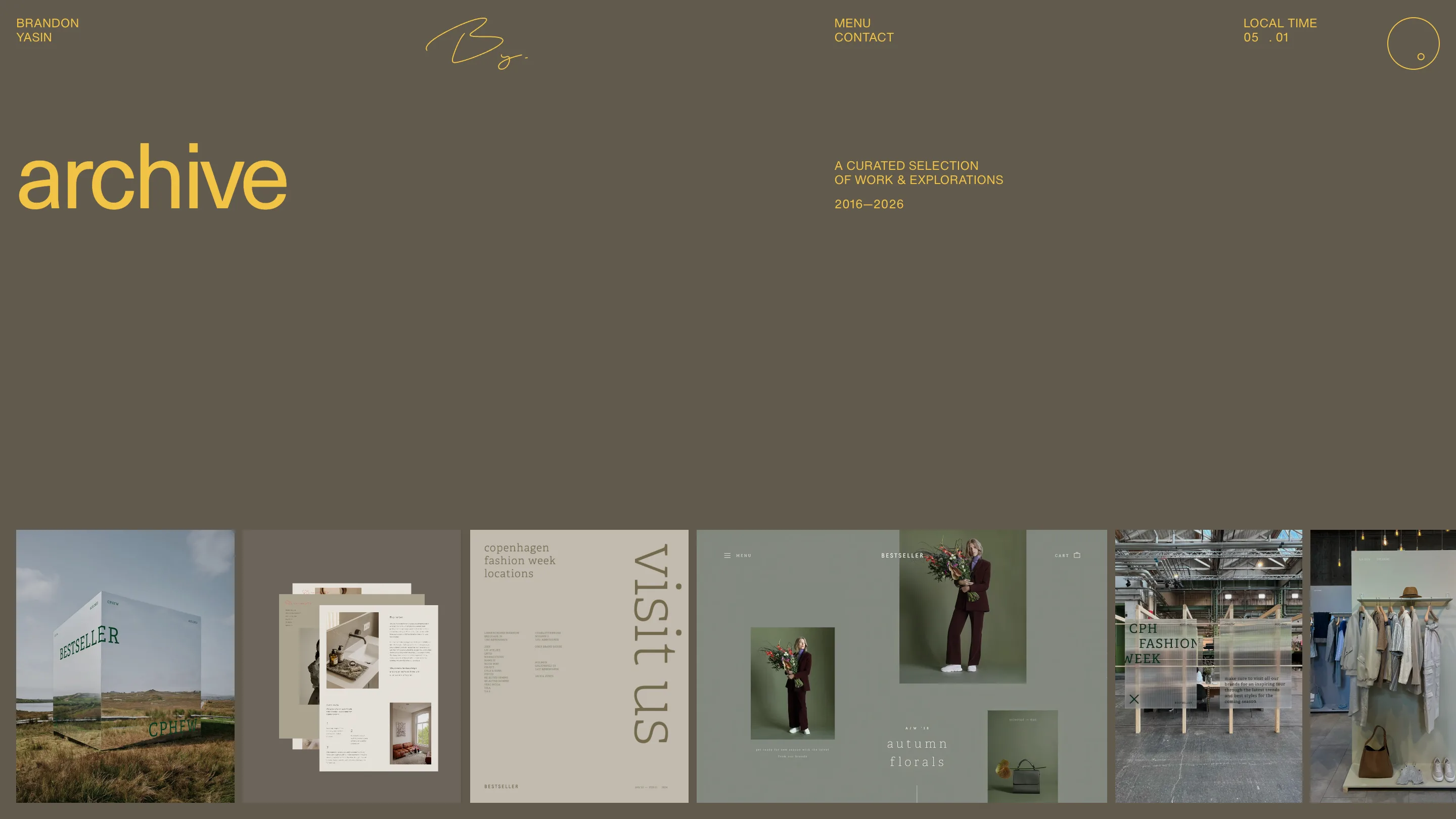
The archive covers ten years, 2016 to 2026, and it's where the two-colour rule pays off. A strip of thumbnails runs along the bottom: a mirrored Bestseller cube in a Danish field, Copenhagen Fashion Week wayfinding in a serif, a sage-green ecommerce page for autumn florals. The client work brings all the colour. The site's own ground stays a single flat tone, so it frames each piece.
The home page goes further. At first load it's one portrait image in the middle of an empty field, a phone leaning on a clay pot showing a Mall of the Emirates storefront. No headline over it, just the work and the clock.
The about page states the brief
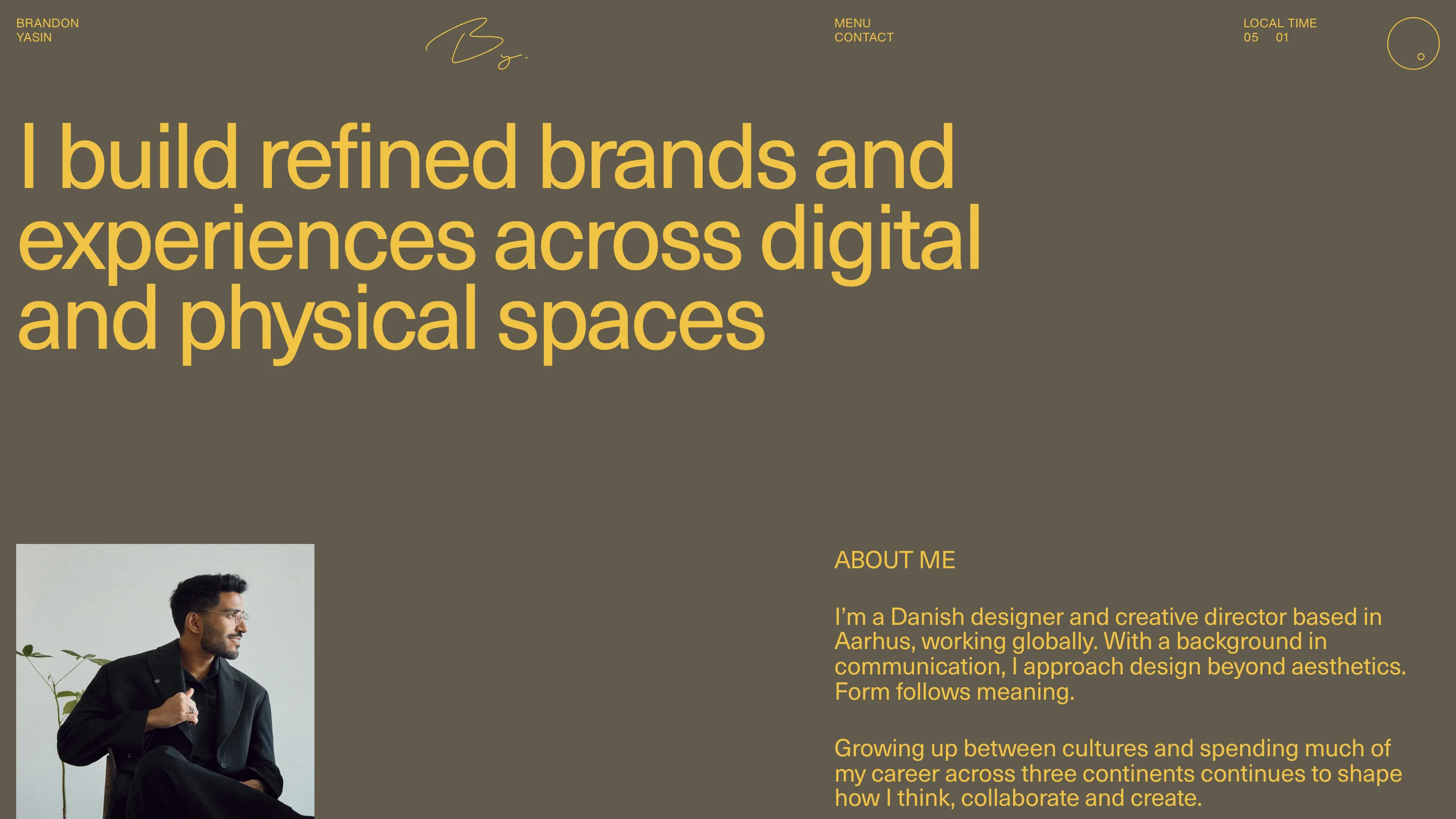
The about page opens with the sentence the rest of the site acts out: "I build refined brands and experiences across digital and physical spaces," three lines of mustard type across two thirds of the screen. Under it, Yasin says his work is rooted in minimalism because clarity makes for stronger experiences.
The build is Nuxt with GSAP for the motion. Jurors scored content highest, at 7.54, which tracks: the case studies read like a magazine you'd keep.
The lesson for anyone building a portfolio is the dial. One variable, the hour, changes the mood of every page, and two colours are enough to carry it.