ESR Bespoke hangs every caption from its menu column
NIGHTJAR's site for a Sydney prestige body shop runs on one grid line: the menu, every caption and every side note share the same column.
ESR Bespoke is a luxury car website built on a single vertical line. The menu sits in one column at the top right, and every caption on every page hangs from that same column further down. Once you see it, the whole site reads as one sheet of paper with a car photographed under it.
The site is the work of NIGHTJAR for ESR, a Sydney collision and restoration shop open since 1989 that works on Porsche, Ferrari and Rolls-Royce. It took awwwards Site of the Day on 23 October 2026 with a score of 7.31, and the jury rated the design highest of the four marks at 7.51.
One column does the work of a layout
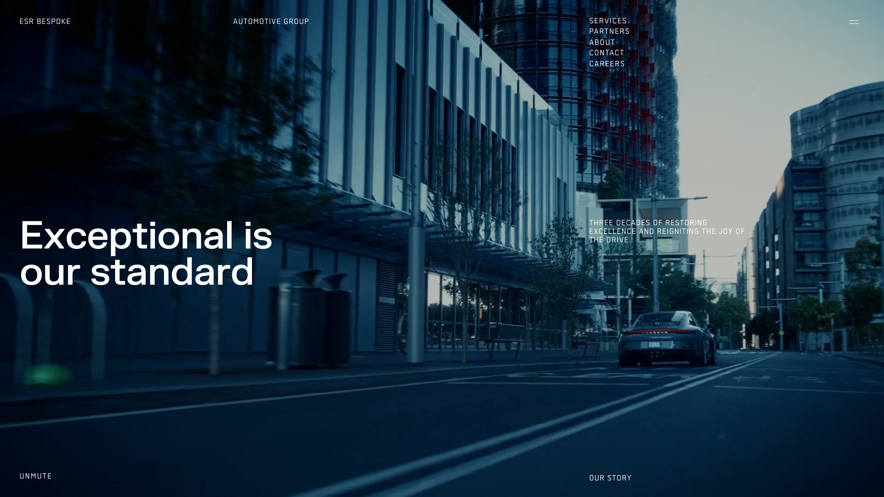
The home page opens on video: a grey 911 rolling down an empty street at dusk, shot low and cool. Over it, the header splits into four parts. ESR BESPOKE on the far left, AUTOMOTIVE GROUP a third of the way in, the five menu items stacked at the right, and a two-bar menu icon at the edge.
The headline, "Exceptional is our standard", sits on two lines at the left, set big in a clean grotesk. Its supporting line goes where the menu goes. "Three decades of restoring excellence and reigniting the joy of the drive" is set in small spaced capitals and starts on the exact x position of SERVICES above it. OUR STORY sits on that line again at the foot of the screen, with UNMUTE mirrored on the left.
That's the move. Two sizes of type, two columns, and the menu column carries every secondary voice on the page. Nothing needs a box or a rule to separate it, because its position already tells you its rank.
Every inner page is the same sheet
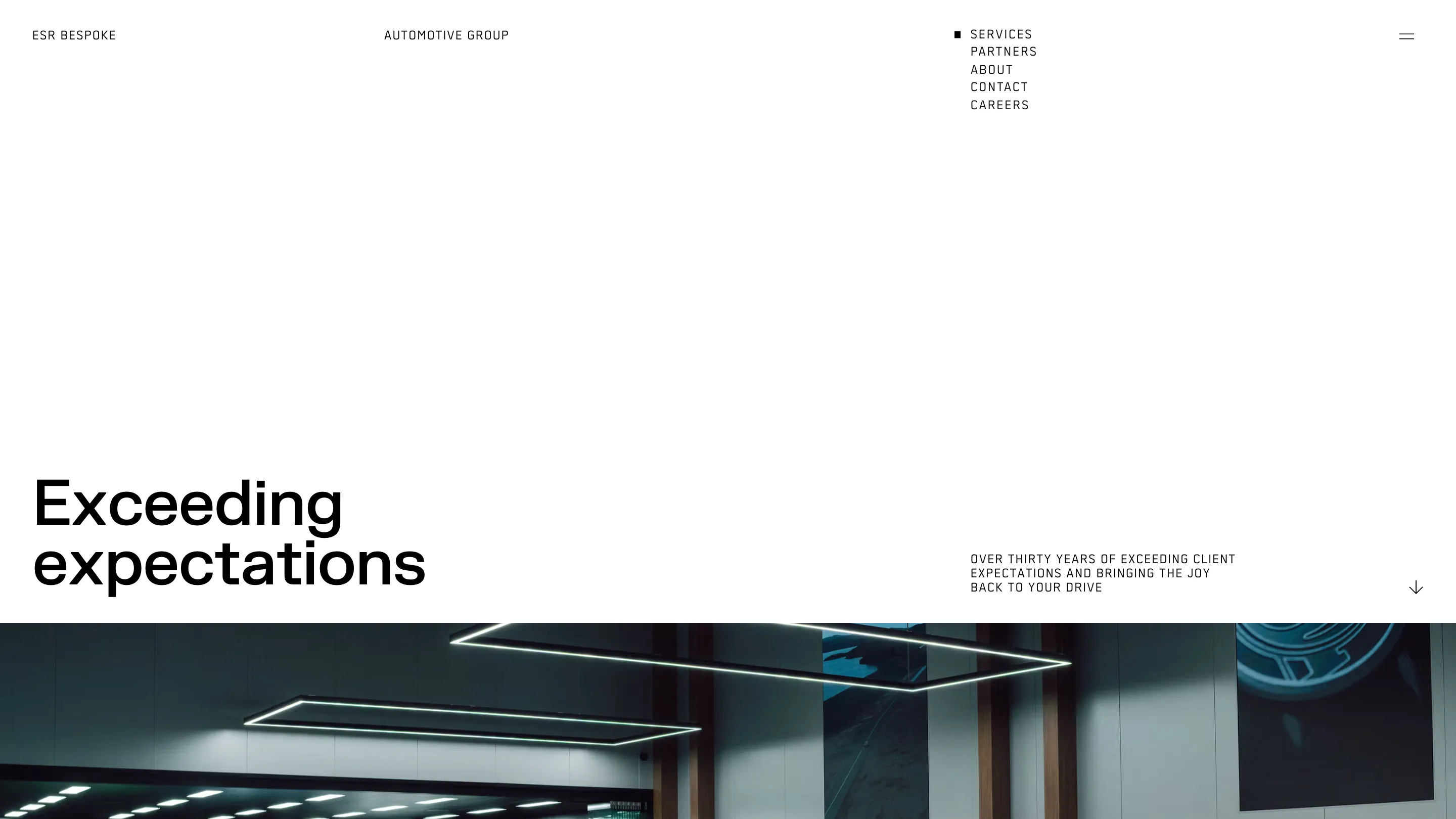
Open Services, About or Partners and the frame repeats exactly. A white field fills the top half of the screen. The headline sits at its bottom left, two lines at most: "Exceeding expectations", "Restoring luxury since 1989", "Luxury specialists". The caption hangs in the menu column, a small arrow points down at the far right, and the photograph cuts in across the full width at the same height on every page.
A small black square marks the current page in the menu, and that's the only navigation state the design shows. The repetition is the point. You learn the page once on Services and read About without looking for anything.
The photography carries the temperature
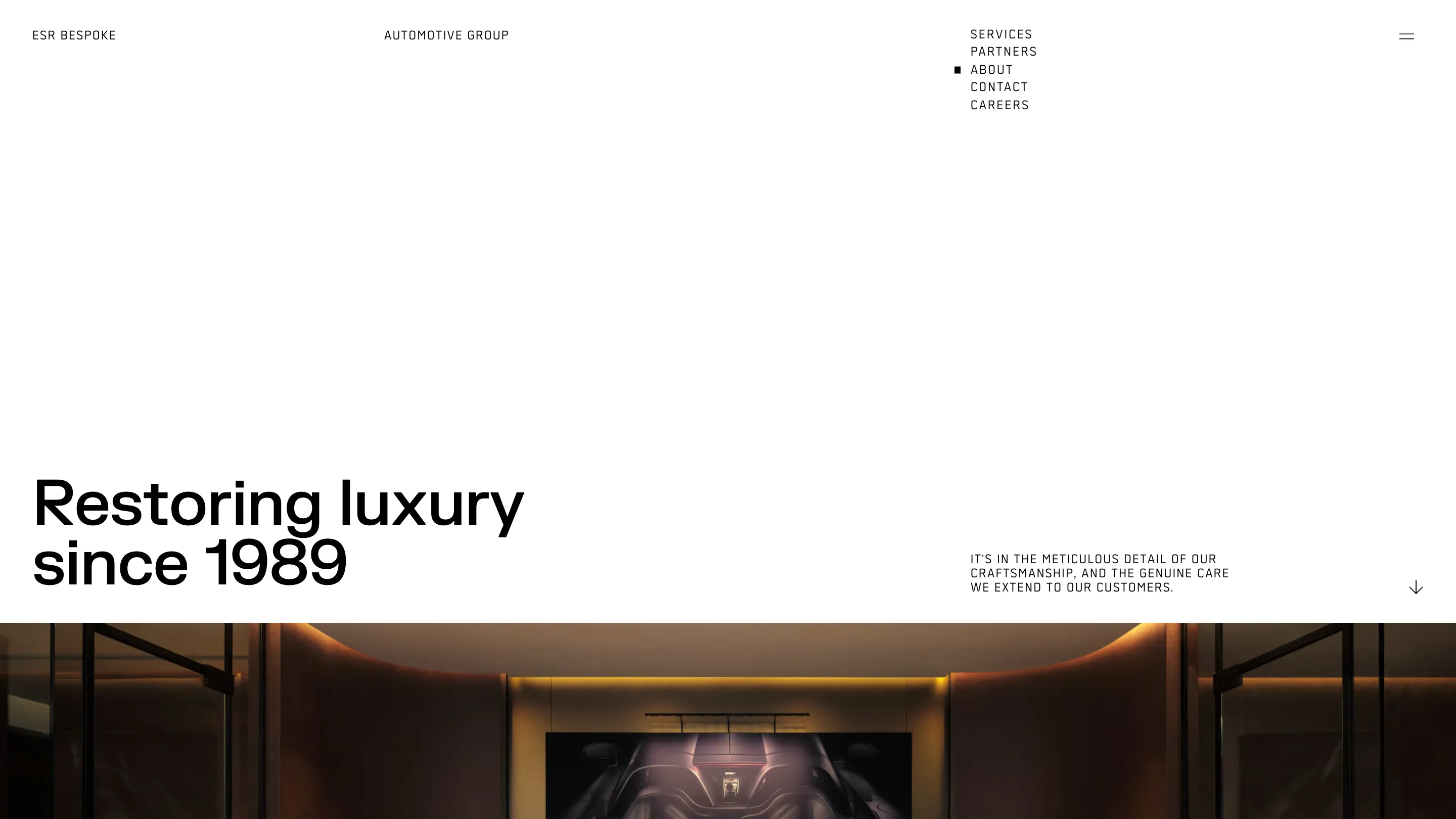
With the type held to black on white, colour comes from the pictures alone. The services page cuts to a cold workshop under hanging rectangles of LED light. About goes warm, a car under amber light at the end of a curved bay. The home page shows a Porsche 911 in pale blue with a white Lamborghini behind it on a polished floor.
That split is how the site sells a body shop as a luxury service. The type speaks in the even tone of a watch catalogue, and the photographs show the clean, lit rooms where the work happens. The pictures do the persuading so the copy can stay short.
Scale for the brands, small type for the claims
Scroll the home page and the marques section flips the hierarchy. The label MARQUES sits small on the left, the caption about prestige brands hangs in the menu column, and then the brand names arrive at display size, PORSCHE first, big enough to crop at the edge of the screen. A small image sits in the right column beside each one.
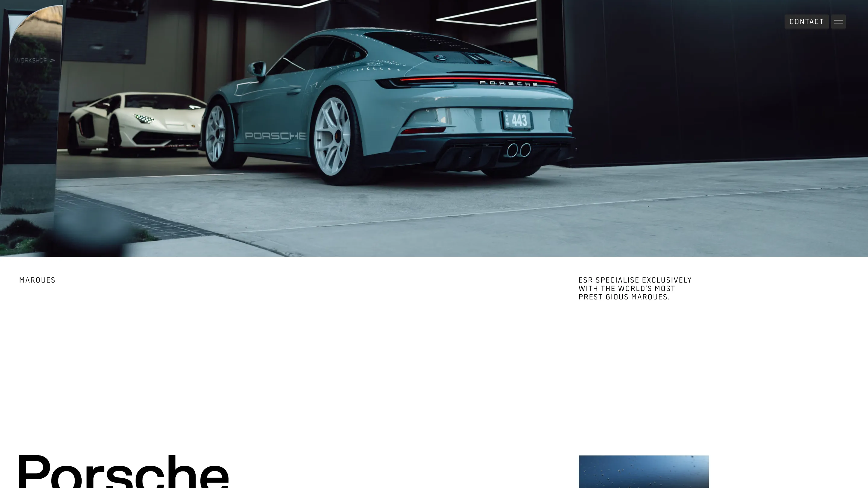
Further down, a black band labelled TAILORED SOLUTIONS sets a whole paragraph at headline size in white. It's the one place the site lets body copy shout, and it lands because everything before it was quiet. On scroll the five-item menu folds into a dark CONTACT pill next to the menu icon, so the call to action stays on screen without a banner.
The grid is simple enough to describe in one sentence, and NIGHTJAR held it on every page. A two-column system where the second column belongs to the menu is a move worth copying for any service brand that needs to look calm and expensive.