twks keeps its site black and white so the work can shout
The Geneva agency runs its whole site on one grotesk, black, white and a grey. Every colour on screen belongs to a client.
The new site of twks, an independent agency in Geneva since 2011, owns no colour. One grotesk, black, white and a single grey do all the work, and every bit of colour you see belongs to a client. That restraint is why it took awwwards Site of the Day on 7 October 2026, with a 7.35 overall and its best mark, 7.64, for content.
It's a black and white agency site in the strict sense. The interface has two values and a half. The half is the grey, and it carries more meaning than most accent colours do.
The client gets the colour
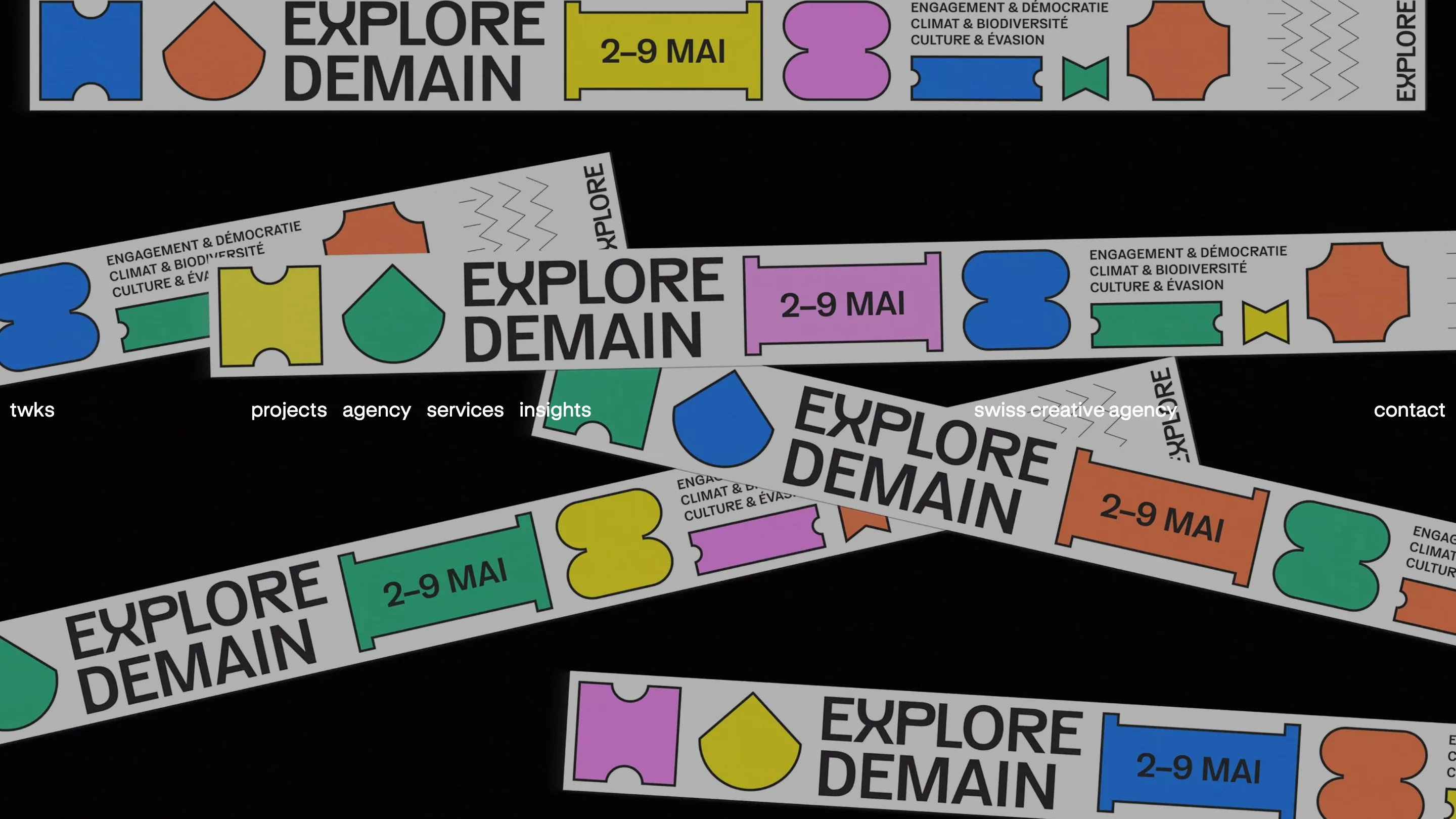
The home opens full-bleed on a black field crossed by printed banners for Explore Demain, a Geneva festival twks branded. Yellow, pink, blue, green and orange tickets, blob shapes and a chunky wordmark pile up at angles, like tape dropped on a studio floor. Over it sits a single line of white type: the name, four links, "swiss creative agency", contact.
The navigation doesn't fight for attention. It has no box, no bar and no blur, just text at reading size. So the first thing you remember is the festival, which is the point of a portfolio.
One grotesk, two sizes, one grey
The type system fits in a sentence. A neo-grotesk in two sizes, a nav size and a display size, set in black, with grey for whatever is second in line.
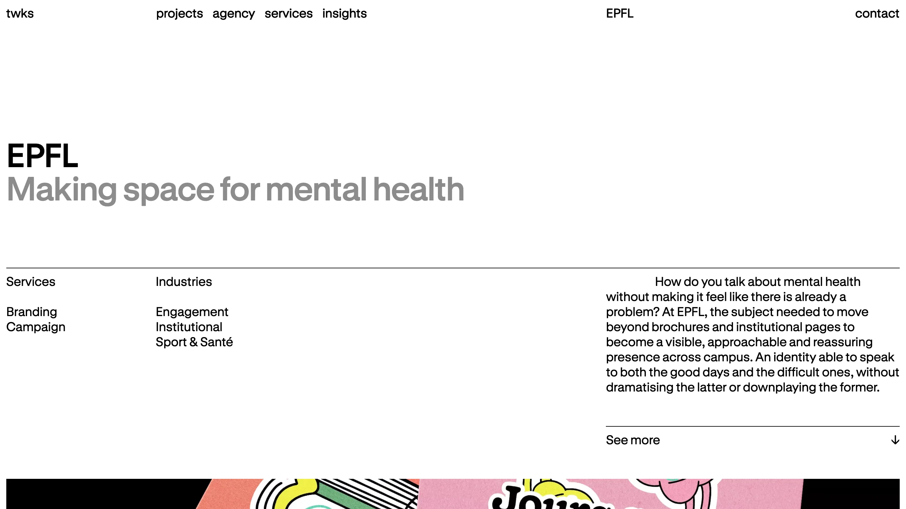
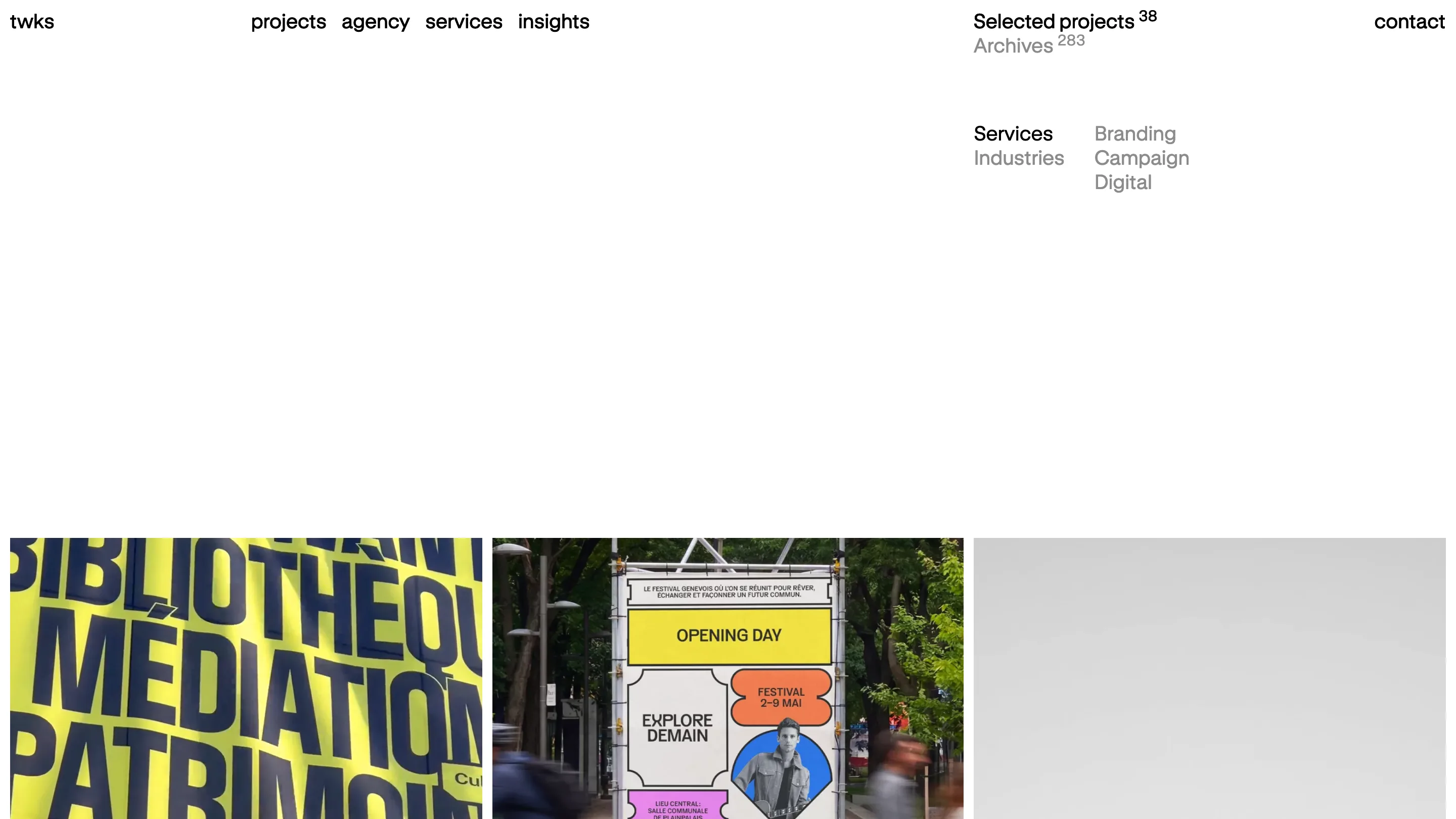
That grey does the hierarchy. On a case study, "EPFL" sits in black and the project line under it, "Making space for mental health", sits in grey at the same size and weight. You read the client first and the brief second without a change of font, a heavier cut or a label. On the projects index the same move splits "Selected projects 38" from "Archives 283", and "Services" from "Industries" in the filters.
The superscript counts are a nice touch. 38 selected, 283 in the archive. Two small numbers tell you the agency has been busy for 15 years without a single line of copy saying so.
Four columns hold everything
Watch where things start. The logo sits on the first column, the four links on the second, the page label on the third, contact on the far right. Every page below hangs off those same lines.
On the EPFL page, services and industries line up under the logo and the links, and the brief starts on the third column, under "EPFL" in the header. On the agency page, the big statement opens with "twks" in grey on the first column, then the sentence drops to the second column and wraps back to the margin. The paragraph's first-line indent is the grid.
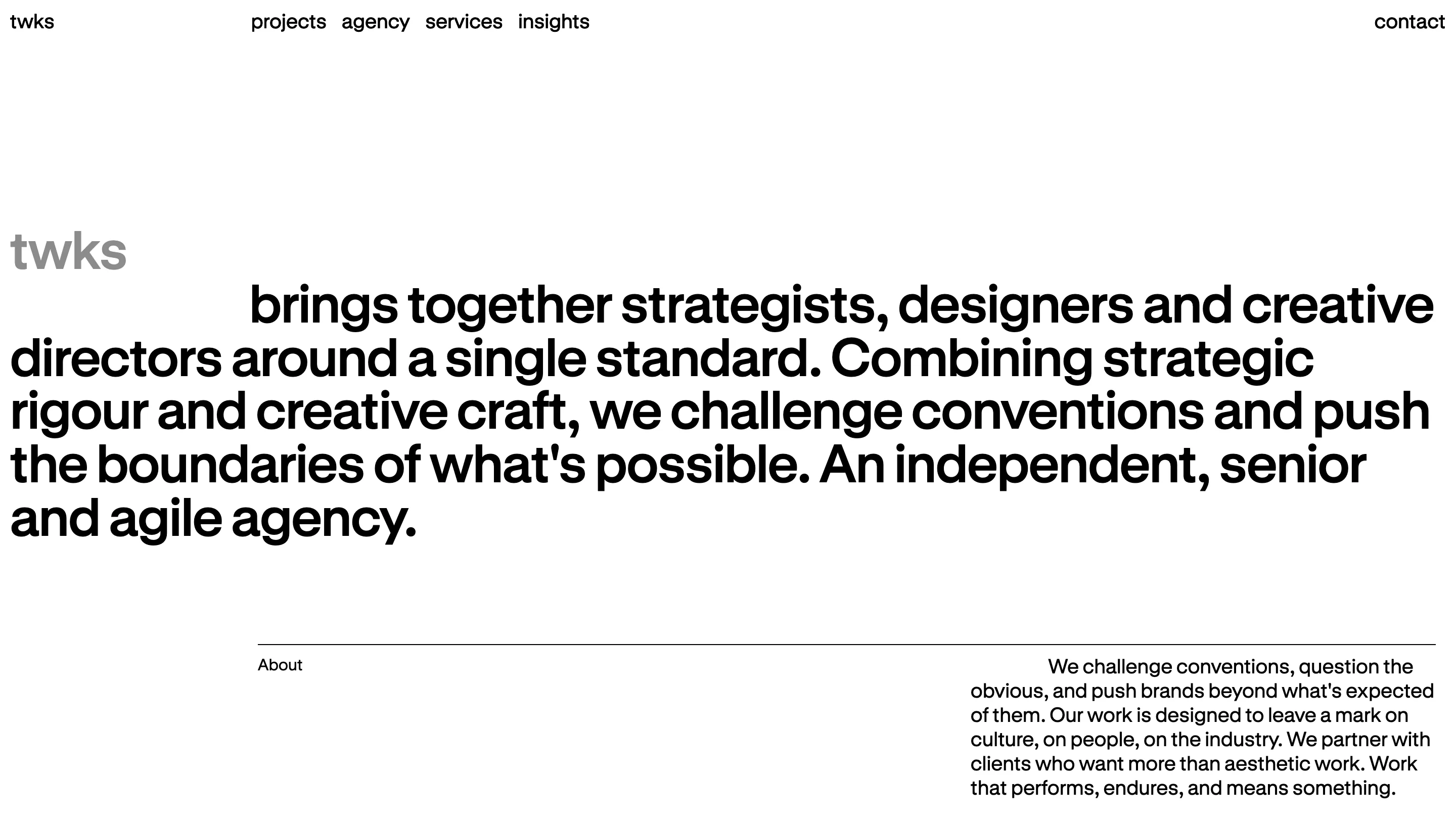
The body text does it again in miniature. The brief on each case study indents its first line to the next column stop, and so does the About paragraph. Hairlines mark where a section begins. No cards, no shadows, no rounded corners.
Swiss, and it says so once
This is the Swiss school done straight, on a site whose insights section carries a piece about why a 70-year-old Swiss graphic style has never looked more current. The grid is visible, the type is plain, and the colour comes from the content.
The craft is in what twks left in. A grey that means "second". A column that means "start here". Two counts in superscript. Each one does a job a lesser site would hand to a new style, and the projects get the rest of the screen.