Tengile MalaMala sets every page title as a staircase
DashDigital's site for a Sabi Sand safari collection breaks each title into two stepped lines of serif caps, and the copy starts where the step lands.
Every page on the Tengile MalaMala Collection site opens on the same typographic move: a title in thin serif capitals, broken over two lines, the second line pushed right until it meets the far margin. It's a staircase page title, and Cape Town studio DashDigital uses it as the spine of the whole site. The jury gave it awwwards Site of the Day on 3 October 2026 with a 7.22, plus a Developer Award at 7.48. Content scored highest of the four marks, 7.43, which tells you what the judges responded to.
The client is a group of six safari lodges and camps along the Sand River, in Greater Kruger and the Sabi Sand. The land has been protected since 1927 and is now co-owned with the Shangaan community. That's a lot of history for one homepage, and the site handles it with one rule repeated, plus restraint.
A staircase page title over moving film
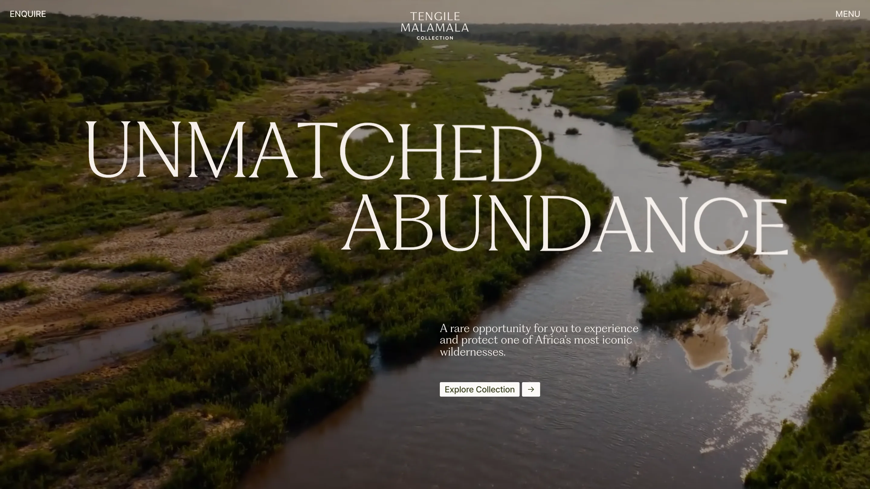
The home opens on drone footage of the river, full bleed. Over it, UNMATCHED sits on the left and ABUNDANCE drops a line and slides right, so the pair reads like a step down the bank. The type is light and wide-set, and the cream it's set in is the same off-white as the site's paper, #FBF8F6.
Under the step there's a three-line lede and one small button, Explore Collection, with its arrow in a separate square beside it. That's the whole hero. No badge, no booking widget, no carousel dots. The film does the selling, and the title gives your eye one diagonal to follow across it.
The step tells you where to read
Watch where the body copy starts. On the home, on Accommodation, on each lodge, the lede's left edge sits on the page's centre line, right under the second line of the title. So the title hands your eye down to the text. You never hunt for where to begin.
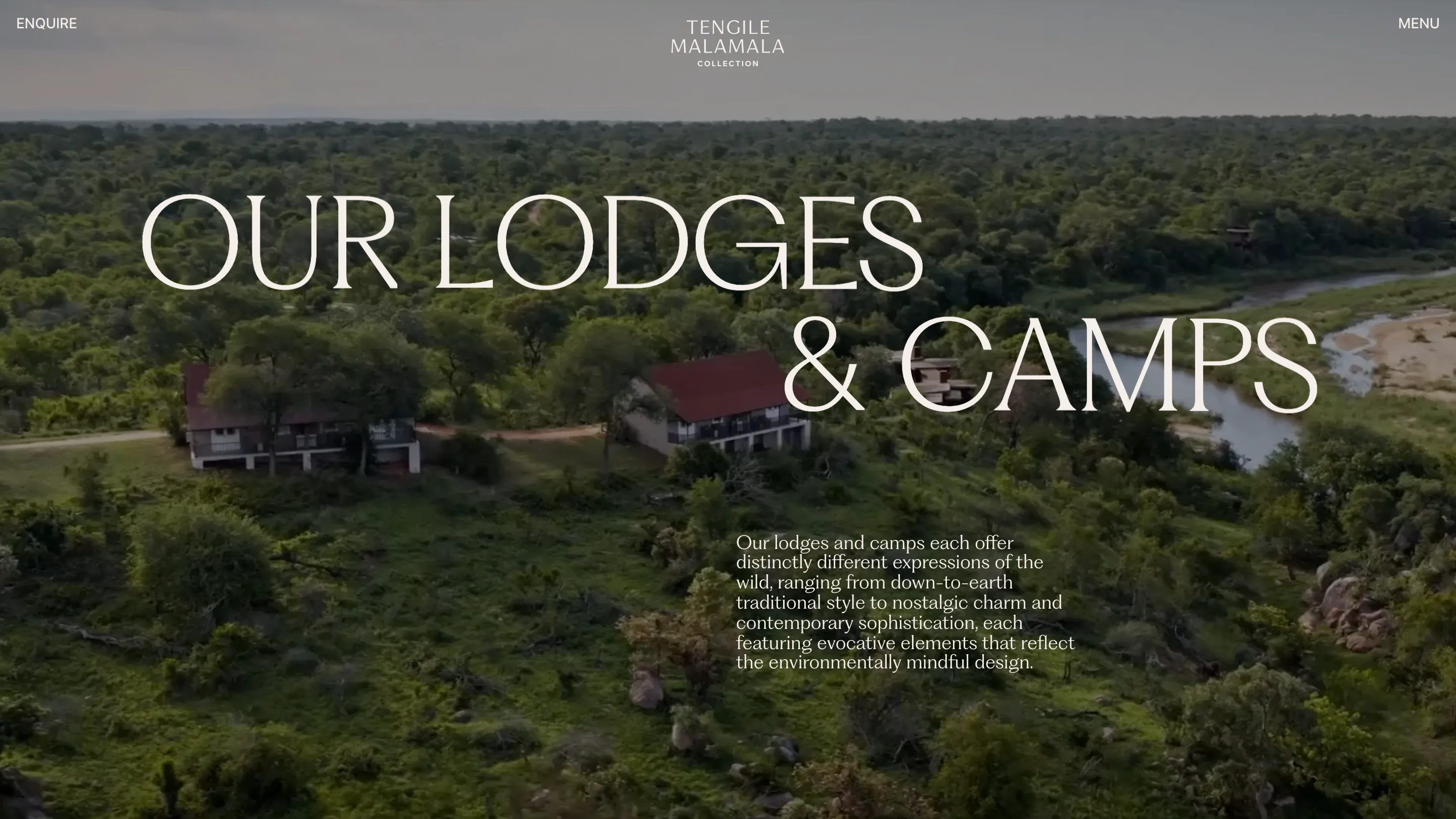
The Accommodation page runs the move again. OUR LODGES on the left, & CAMPS stepped right, over footage of two red-roofed buildings and the river behind them. Because the layout is identical, the pages feel like chapters of one book. The variation lives in the footage and the words, never in the grid.
The index under it lists each property with a number a guest cares about: Tengile River Lodge has 9 suites, Rattray's 8, MalaMala Camp 11 suites and 8 rooms, Sable Camp 7, Kirkman's Kamp 12 cottages. Khensani River Lodge is marked coming soon. Plain facts, set small, and they make the luxury claim believable.
Olive on paper when the film stops
Inside a lodge page the footage gives way to paper. The staircase title stays, now in an olive green, #5C6E21, the only strong colour in the palette. TENGILE sits left, RIVER LODGE steps right, and the lede explains that Tengile is Tsonga for tranquil. Then the film comes back as a narrow inset under the text instead of a full-bleed background.
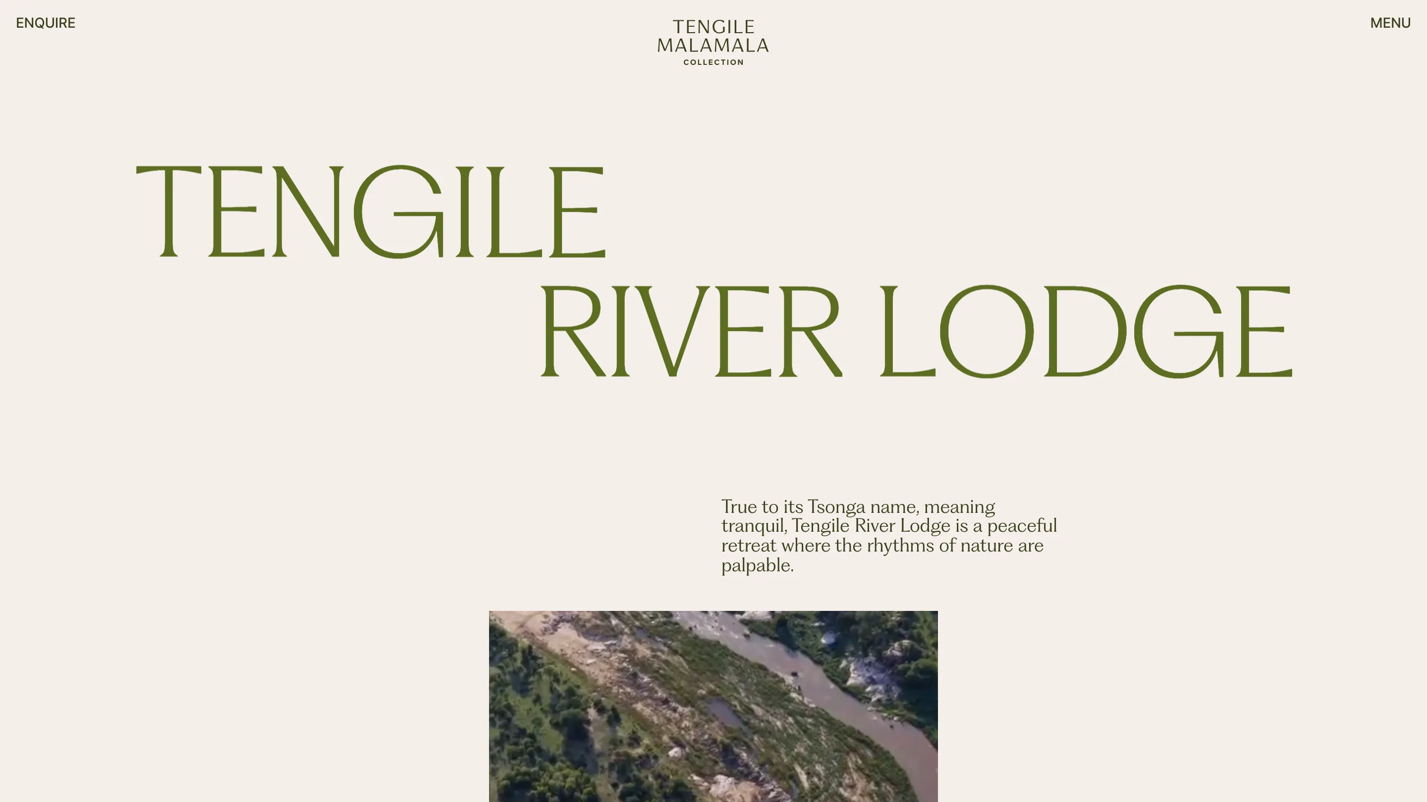
That switch is the smartest pacing decision on the site. The home and the section fronts are cinema. The detail pages are a printed brochure. Same type, same step, two moods, and you always know which kind of page you're on.
Where the rule bends
The Wildlife Journals page is the one place the staircase flattens. The two words run as a single line from margin to margin, and a photograph of a kudu fills the full width under them. It reads as the masthead of a magazine, which is what the journals are.
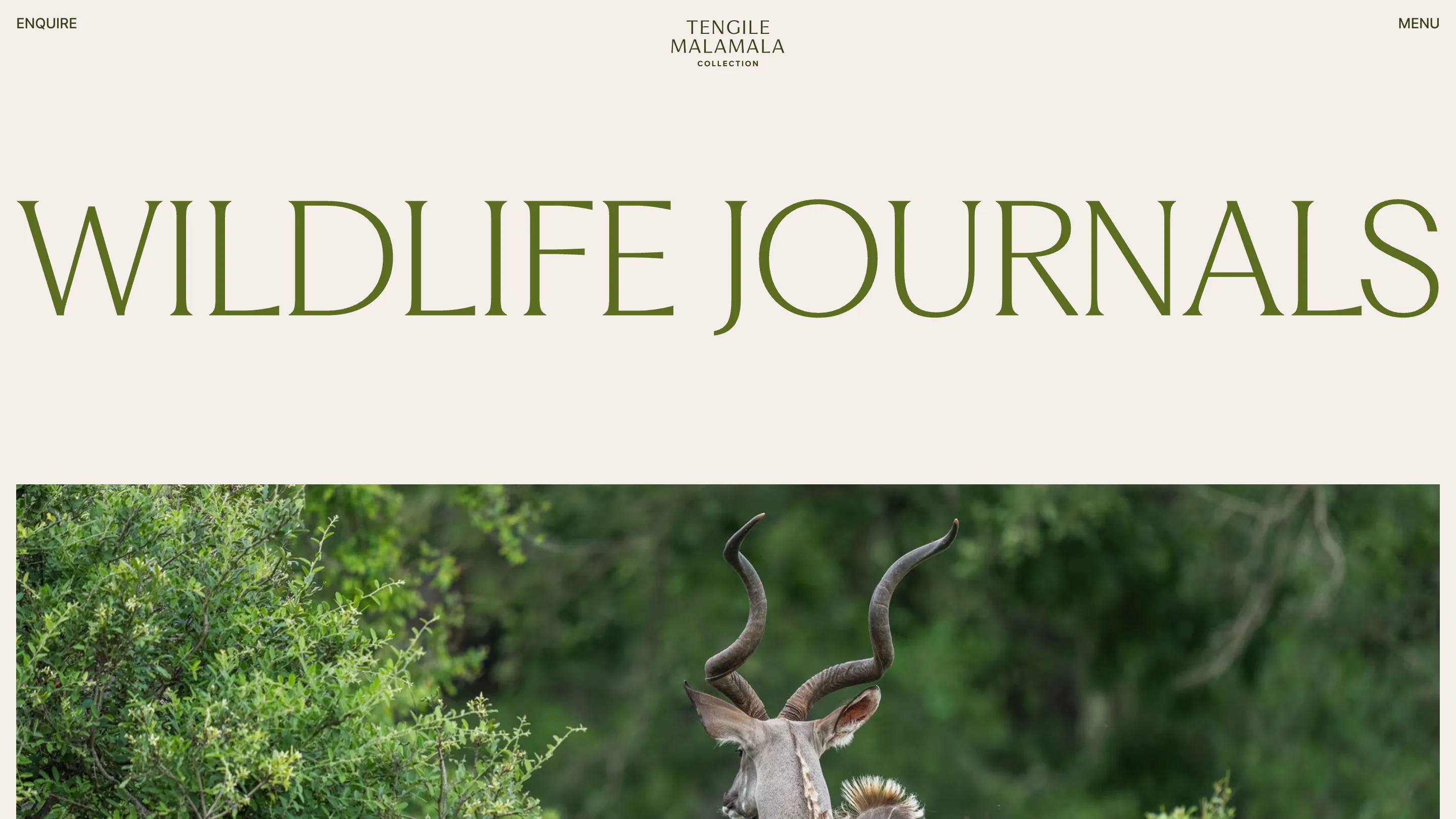
The chrome stays out of the way throughout. Enquire on the left, the stacked wordmark centred, Menu on the right, all in small capitals at the same size. The site is built on React with Sanity behind it, and the brand identity is HKLM's, credited in the footer next to DashDigital.
If you design for hospitality, take the step. One title shape, used on every page, with the copy anchored under its second line, gave six lodges, a century of history and a conservation story a single voice.