

A 900-designer survey art-directed like a magazine issue
The AI in Design Report 2026 gives every chapter a flat colour, a mono number and a dithered image band. It took Site of the Day at 7.4.
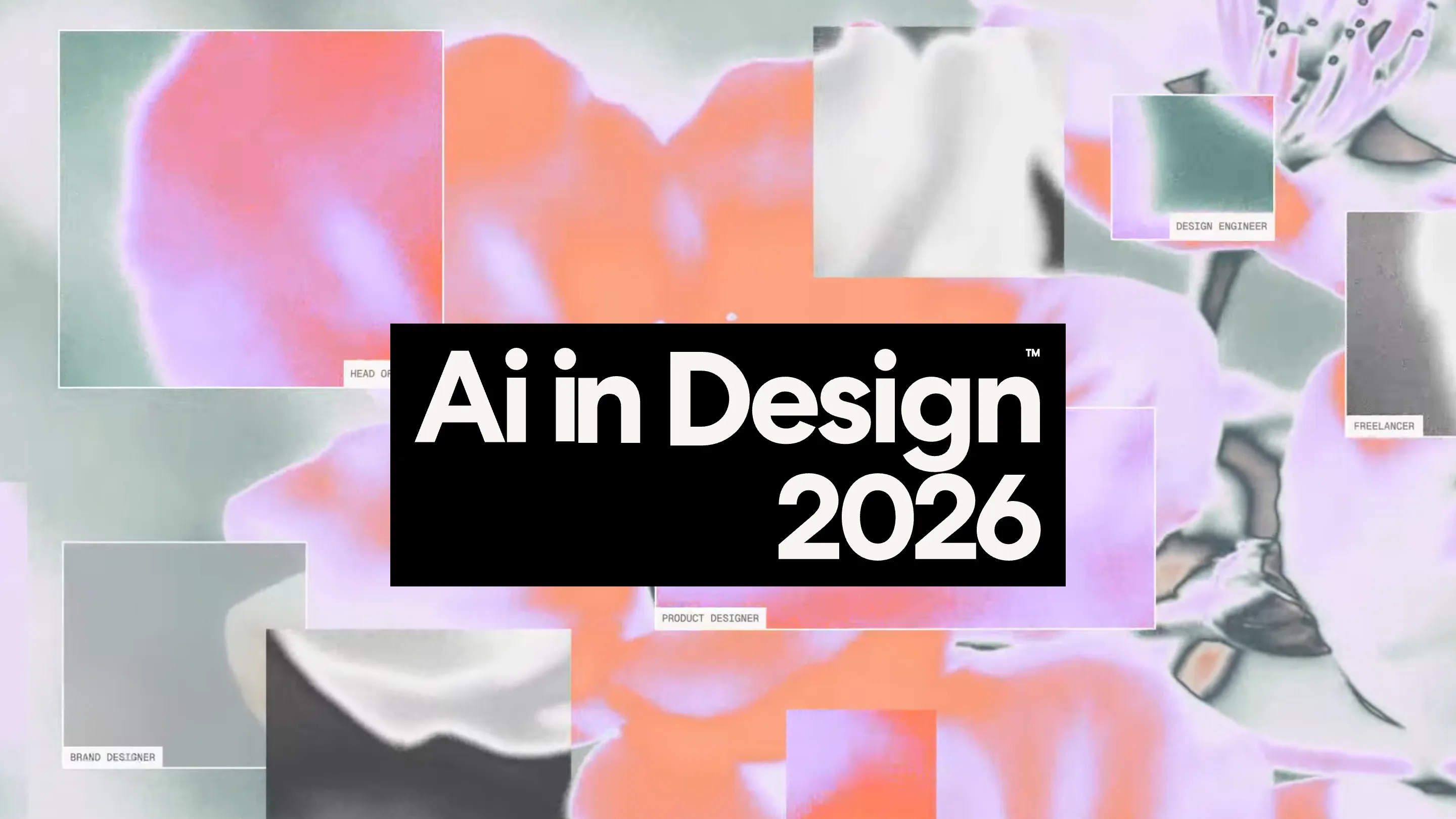
The AI in Design Report 2026 collects 900 survey answers, 20 leadership interviews and seven filmed case studies, and it is art-directed like a magazine issue rather than a PDF. It took awwwards Site of the Day on 26 August 2026 with a 7.4. ++hellohello built it in Framer for Designer Fund and Foundation Capital, and most of that score is art direction doing its job.
Research sites usually lose on the second scroll. The cover is strong, the data pages are a wall of grey charts, and the reader leaves. This one holds because the visual system was decided before the numbers arrived, and every chapter inherits it.
Every chapter takes a colour and keeps it
01.TOOLS is a flat orange. 02.CRAFT is lilac. The chapter number sits top left in Fragment Mono at caption size, the headline lands underneath in a wide geometric grotesque set huge, two lines, leading tight enough that the descenders nearly touch the line below. Nothing else is on that screen.
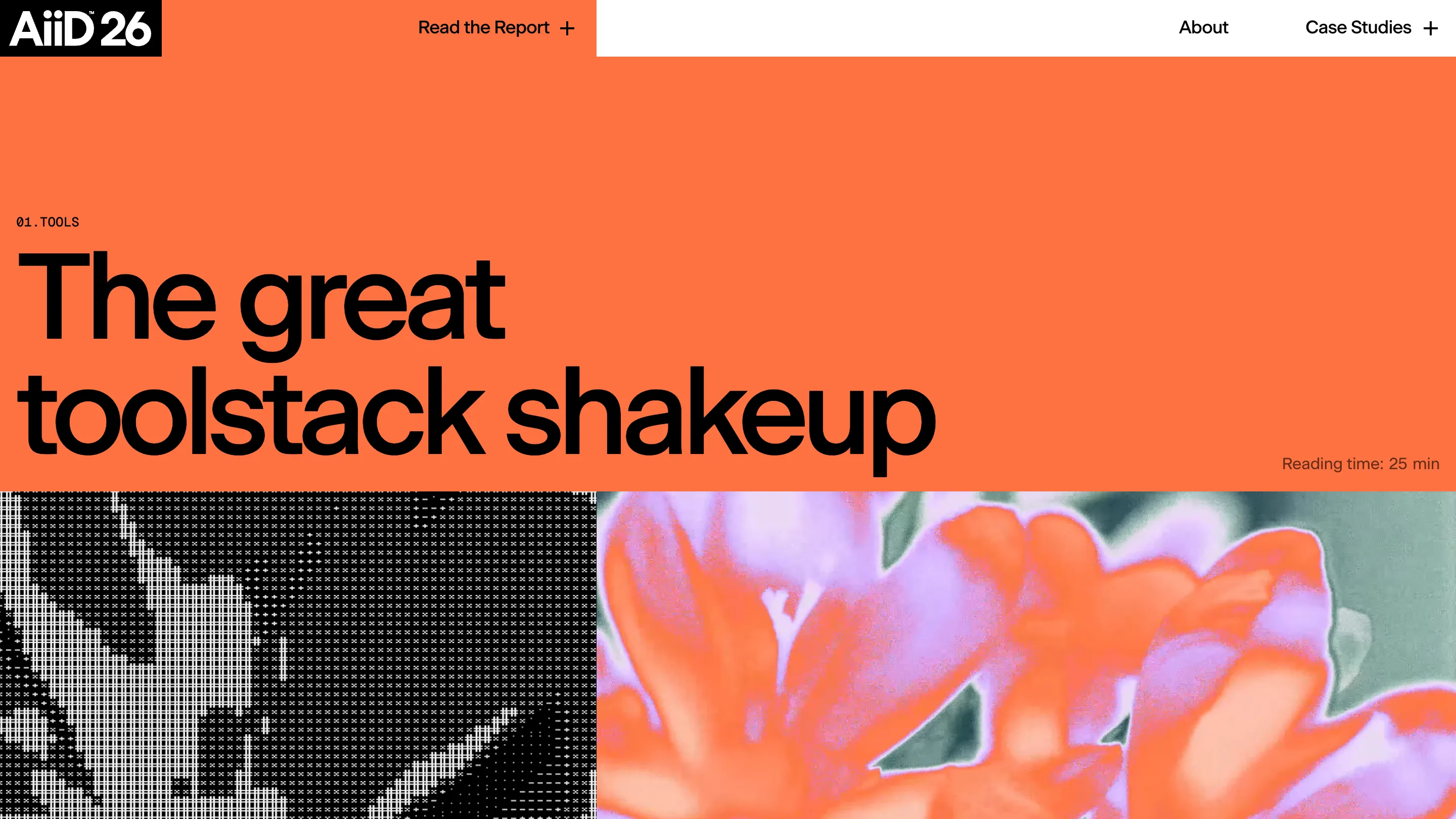
The only other element is a grey line in the bottom right corner: "Reading time: 25 min". Craft says 30. That line is the bravest decision on the site. It tells you the chapter is long before you commit, and it treats the reader as someone who reads.
The image band is the same diptych every time
Under each chapter header the page splits down the middle. Left half is a one-bit dither, black cross-hatch on white, the halftone you get out of an early Mac. Right half is a macro photograph of a flower pushed until the petals go orange and lilac and the foliage goes sage green.
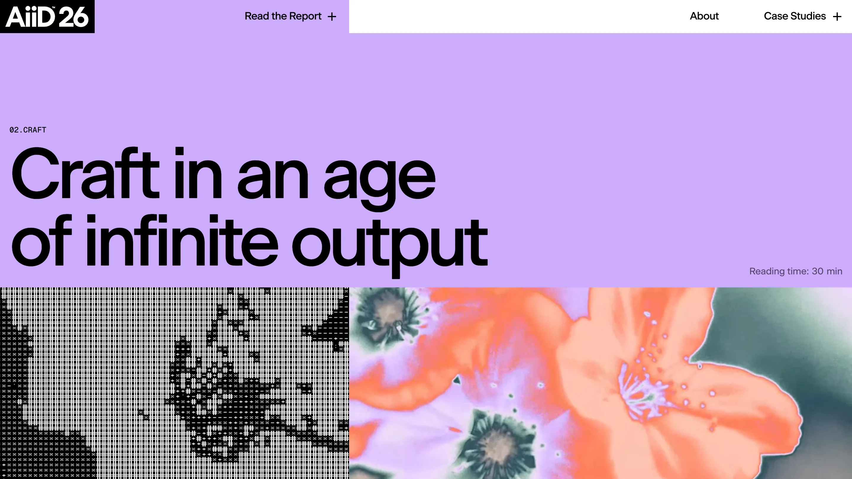
The pairing is the whole idea of the report in one band. Pixels on the left, an organic thing on the right, both processed by the same hand. A report about AI could have filled these slots with generated imagery and nobody would have complained. Photography and a dither pattern were harder and they date better.
The case studies change register without breaking
The seven company films, Anthropic, Framer, Linear, Notion, Shopify, Sierra and Stripe, sit on white instead of colour. Black headline, company logo in the bottom right, video frame filling the rest.
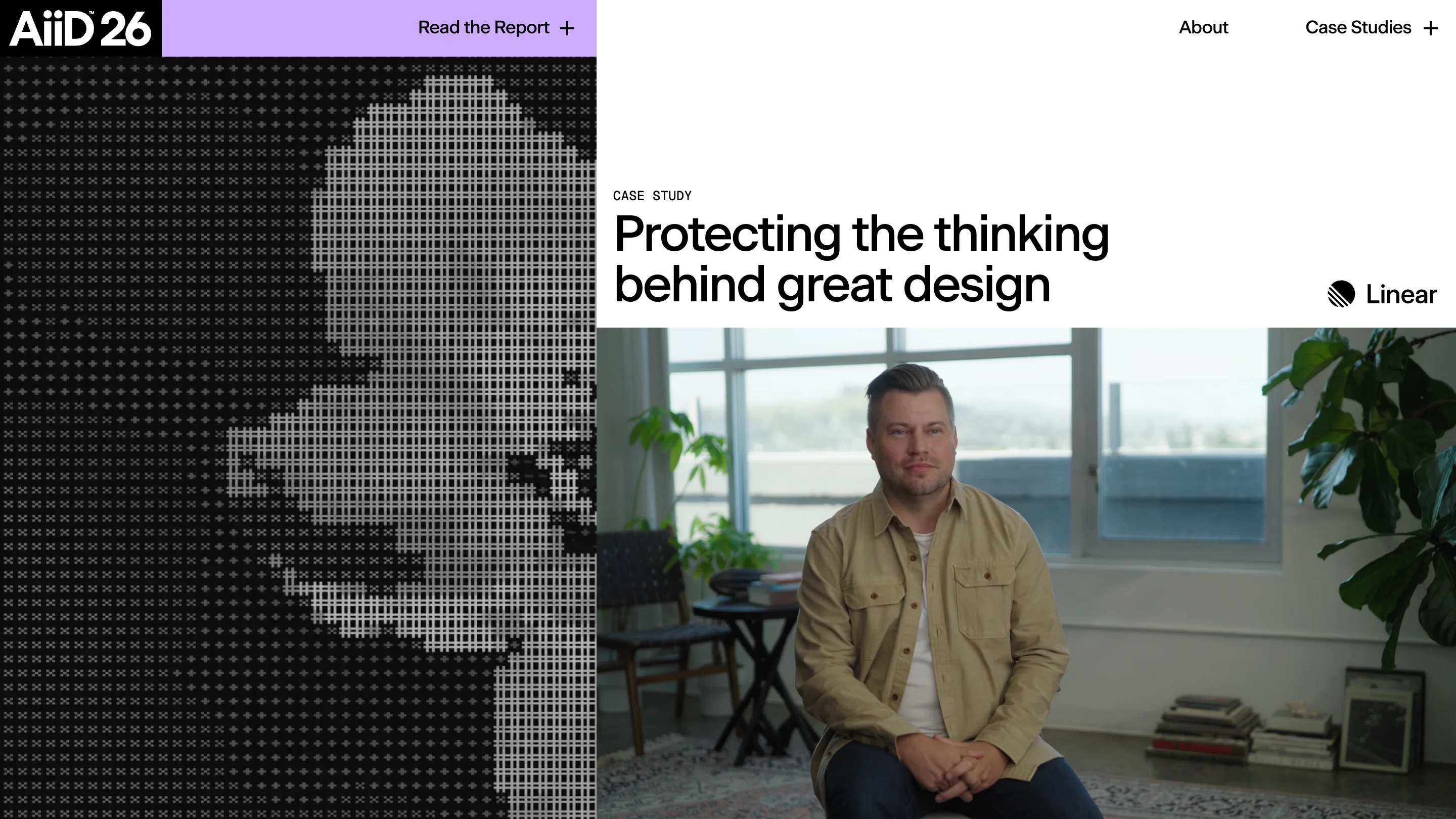
The left column keeps the dither, this time made from a portrait frame rather than a flower. So the device carries across a page type that shares nothing else with the chapters. That is the test a design system actually has to pass, and it passes.
The navigation holds the same discipline. The AiiD'26 wordmark sits in a black box locked to the top left, "Read the Report" sits on a coloured panel that picks up the current chapter, "About" and "Case Studies" sit on white. The bar tells you where you are without a breadcrumb.
The homepage sells the reader, not the data
The opening screen is a loose grid of floating thumbnails, each one captioned in mono with a job title: BRAND DESIGNER, DESIGN ENGINEER, PRODUCT DESIGNER, FREELANCER. The wordmark sits in a black box over the top. No headline stat, no counter, no chart.
It is a survey of 900 people in 60 countries and the cover shows you the people. The numbers are strong enough to have led with, 91% of designers now use AI weekly against 54% a year ago, the average toolstack up from three tools to seven, Claude at 78% ahead of ChatGPT at 65%. They are all in the chapters where they belong.
Where the score came from
The sub-scores read as design 7.66, usability 7.21, creativity 7.14, content 7.38. Design highest is right. The system is tight and it holds for three chapters plus seven case studies without a wobble.
Usability lowest is also right. Chapters of 25 and 30 minutes are a lot to ask of a browser tab, and four of the seven case studies are still marked coming soon, which leaves dead ends in the grid. The site is honest about both, which is more than most report microsites manage.
Worth stealing if you have research to publish: pick a colour per section, set the section number in mono, give the headline the whole screen, and print the reading time. Four decisions, and they carry an entire report.

