Moto runs a live world clock under its footage
Moto's card site keeps seven live clocks ticking along the bottom of the frame. It's the detail that makes a black-on-black fintech page feel awake.
Awards · The Editors · 3 min read ·
Featured: Properly Studio
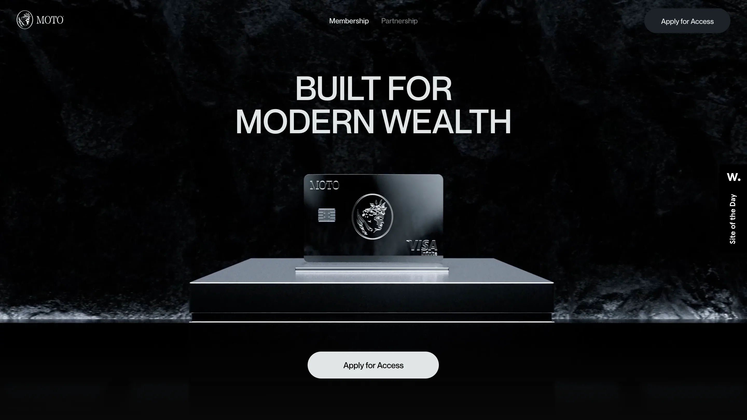
Moto's card site keeps a live world clock ticking along the bottom of its footage. Seven zones, to the second: GMT+2, EDT, BST, EEST, JST, CEST, CST. The strip sits under a near-black hotel room and never stops. Properly Studio built the site for Moto, a Visa Infinite membership card, and awwwards gave it Site of the Day on 24 September with a 7.3.
The clock is the argument
Moto sells the idea that you move a lot and pay in six currencies while you do it. The site says that with seven running clocks pinned across the bottom edge of the screen, so you read the claim off the interface instead of the copy. A small "24/7" marker anchors the left end, which makes the row scan as a status bar rather than decoration.
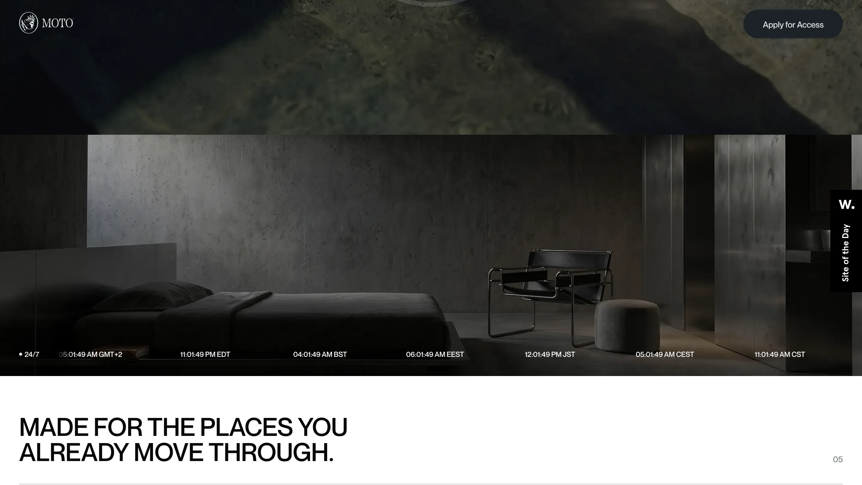
It also solves a layout problem. The footage behind it is dark, slow and nearly still, so the page needs one thing alive in frame or the scroll goes flat. The seconds column changes every second. Your eye catches it, and the stillness starts to read as composed.
One flip to white
The page is black for almost its whole length. At the FX section it goes to a flat near-white and holds there for one screen.
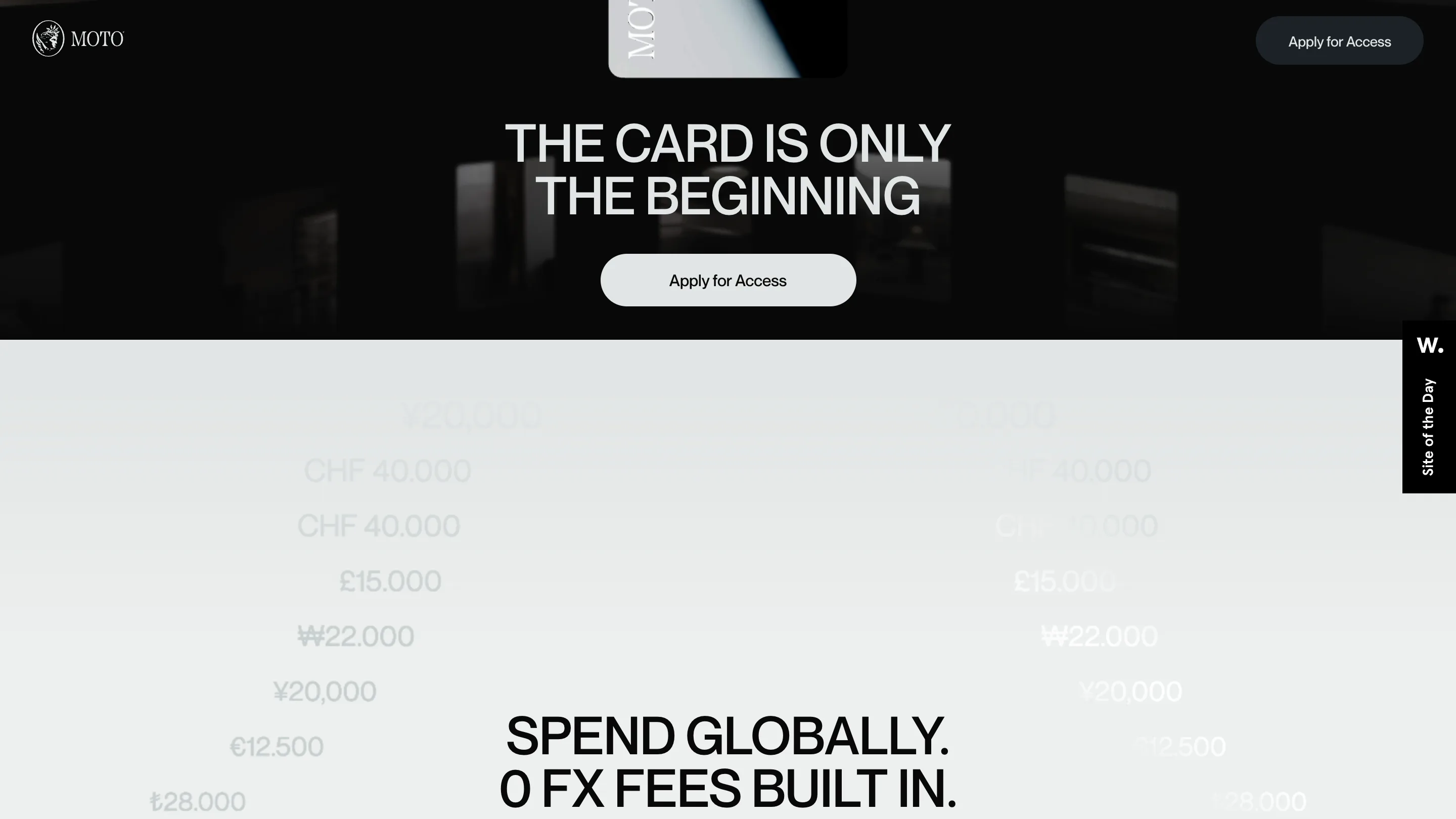
Two columns of amounts drift up behind the headline at low opacity, ¥20,000, CHF 40.000, £15.000, ₩22.000, €12.500, ₺28.000, so they land as texture. "SPEND GLOBALLY. 0 FX FEES BUILT IN." sits on top in the same grotesk as everything else. The flip is the loudest moment on the site and it's spent on the one commercial fact the card is sold on. Restraint used as emphasis.
The typography does one job
One uppercase grotesk, tight tracking, set large and centred. "BUILT FOR MODERN WEALTH." "THE CARD IS ONLY THE BEGINNING." "MADE FOR THE PLACES YOU ALREADY MOVE THROUGH." Every headline runs four to seven words and stops. There's no second display face, no serif standing in for the luxury signal, no italic anywhere. Two-digit section numbers sit in the right margin, greyed almost to nothing. They're the only chrome on the page.
The 3D stays still
The hero renders the card upright on a machined plinth against black rock, lit from one side. Three.js and GSAP are both in the stack, and rotating the render on scroll would have cost the team nothing. They held the shot. The card gets photographed like an object in a vitrine and left alone, and the one moving thing in frame stays the clock.
The partnership page changes the camera
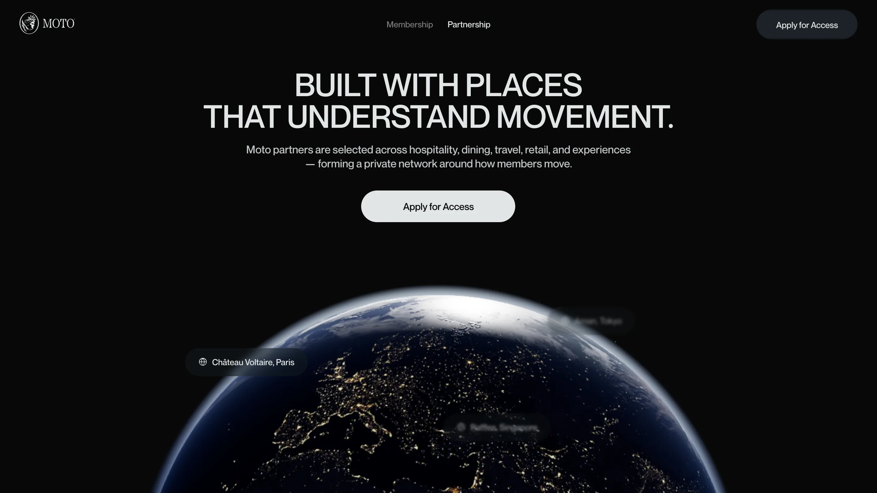
Partnerships get their own page and their own image: the night side of the earth, city lights burning along the coastlines, partner names pinned to it as small pills. Château Voltaire, Paris. Raffles, Singapore. It's the one place the site pulls back that far, and it lands because everything before it was shot at arm's length.
The judges scored it 7.25 design, 7.19 usability, 7.56 creativity, 7.31 content. Creativity leading is the right read. The site earns it by subtraction: one typeface, one colour flip, one thing moving.