Lama Lama's navbar carries a different slogan on every page
The Amsterdam studio swaps the label in its navigation bar page by page, then lets one bracketed kicker and one huge line do the rest.
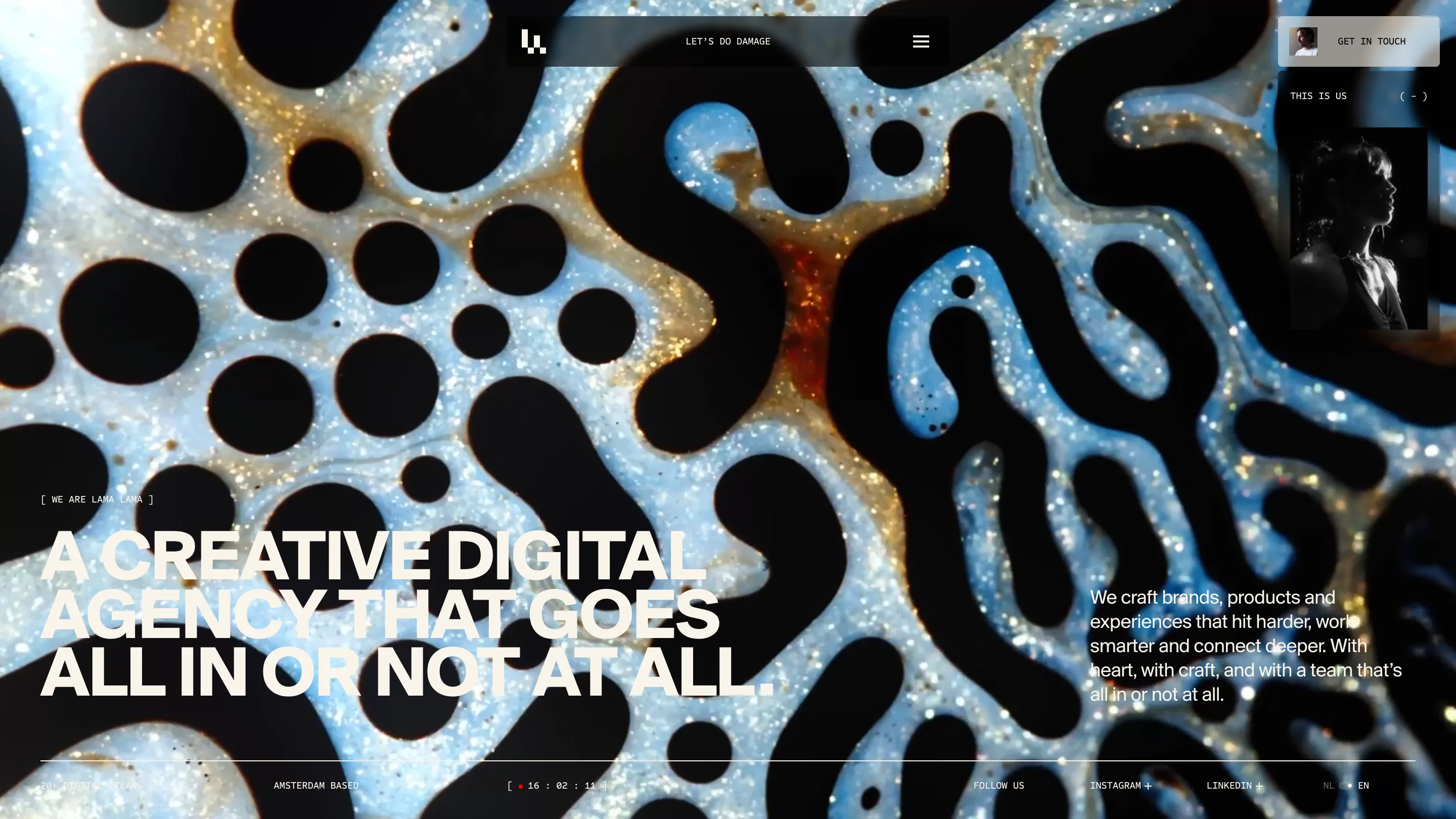
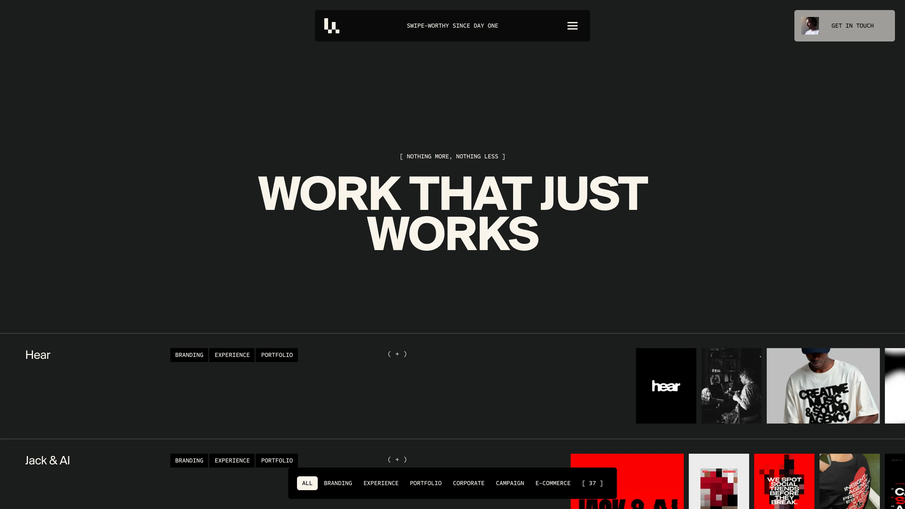
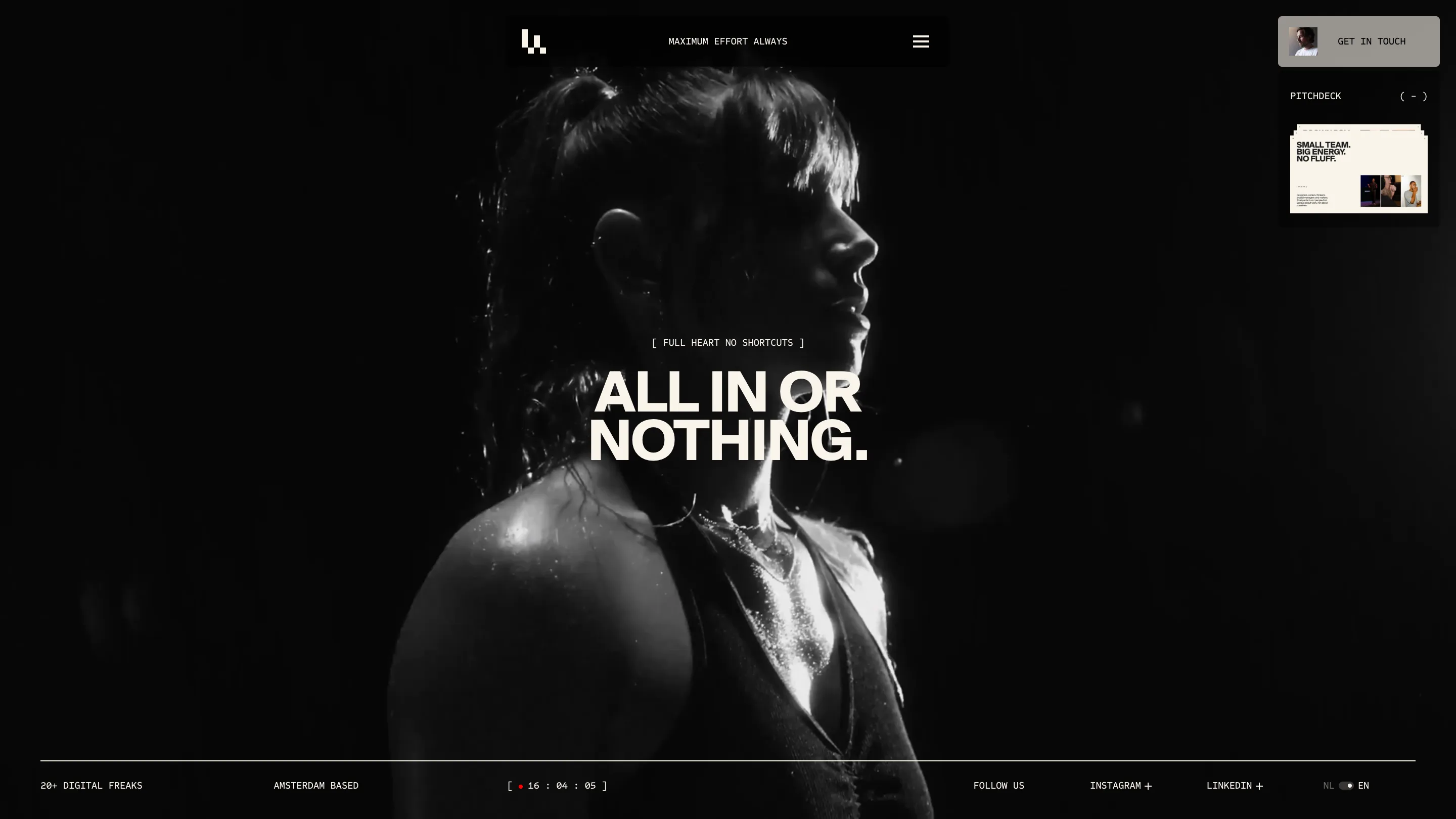
The navigation bar on Lama Lama's home page reads LET'S DO DAMAGE. Open the work page and it reads SWIPE-WORTHY SINCE DAY ONE. The branding page: BRANDS THAT BITE BACK. The about page: MAXIMUM EFFORT ALWAYS. The slot where most agency sites park a wordmark or a breadcrumb is doing copywriting, and the copy changes every time you move. The Amsterdam studio took awwwards Site of the Day on 20 July 2026 with a 7.51, and this is the first thing worth stealing.
A navigation bar that keeps talking
The bar itself is a floating pill, centered at the top, holding three things: a small pixel mark on the left, the line of copy in the middle, a hamburger on the right. That's it. No menu items, no services dropdown, no phone number.
Because the pill never moves and never changes shape, the swapped line reads as a caption on the page you're standing in. It tells you where you are the way a page title would, and it sounds like a person. SWIPE-WORTHY SINCE DAY ONE on a portfolio index is a joke about the format. BRANDS THAT BITE BACK on the branding service page is a positioning statement compressed to four words.
The risk with this move is that the reader stops noticing after two pages. Lama Lama keeps it alive by making each line specific to its page, so the bar rewards the person who's on their fourth click.
One kicker, one line, nothing else
Every page opens on the same two-part structure. First a mono label in square brackets, centered and small: [ WE ARE LAMA LAMA ] on home, [ NOTHING MORE, NOTHING LESS ] on work, [ NOT JUST SEEN. FELT. ] on branding, [ FULL HEART NO SHORTCUTS ] on about. Then one headline in a tight grotesque, set heavy and large enough to run two or three lines wide.
No deck, no supporting paragraph, no button. The work page gives you WORK THAT JUST WORKS and then a horizontal rule and then the project list. The whole hero is a kicker and a sentence.
That discipline is what makes the type carry. A studio site usually stacks a headline, a subhead, two CTAs and a scroll cue in the same viewport, and each one steals weight from the others. Here the headline has the screen to itself, so the studio can set it at a size that would look shouty anywhere else and it just reads as confident.
The cream page in the middle of the black ones
Home, work and about run on near-black with cream type. The service pages flip: warm off-white ground, black headline, the same bracketed kicker, the same floating pill now inverted to white.
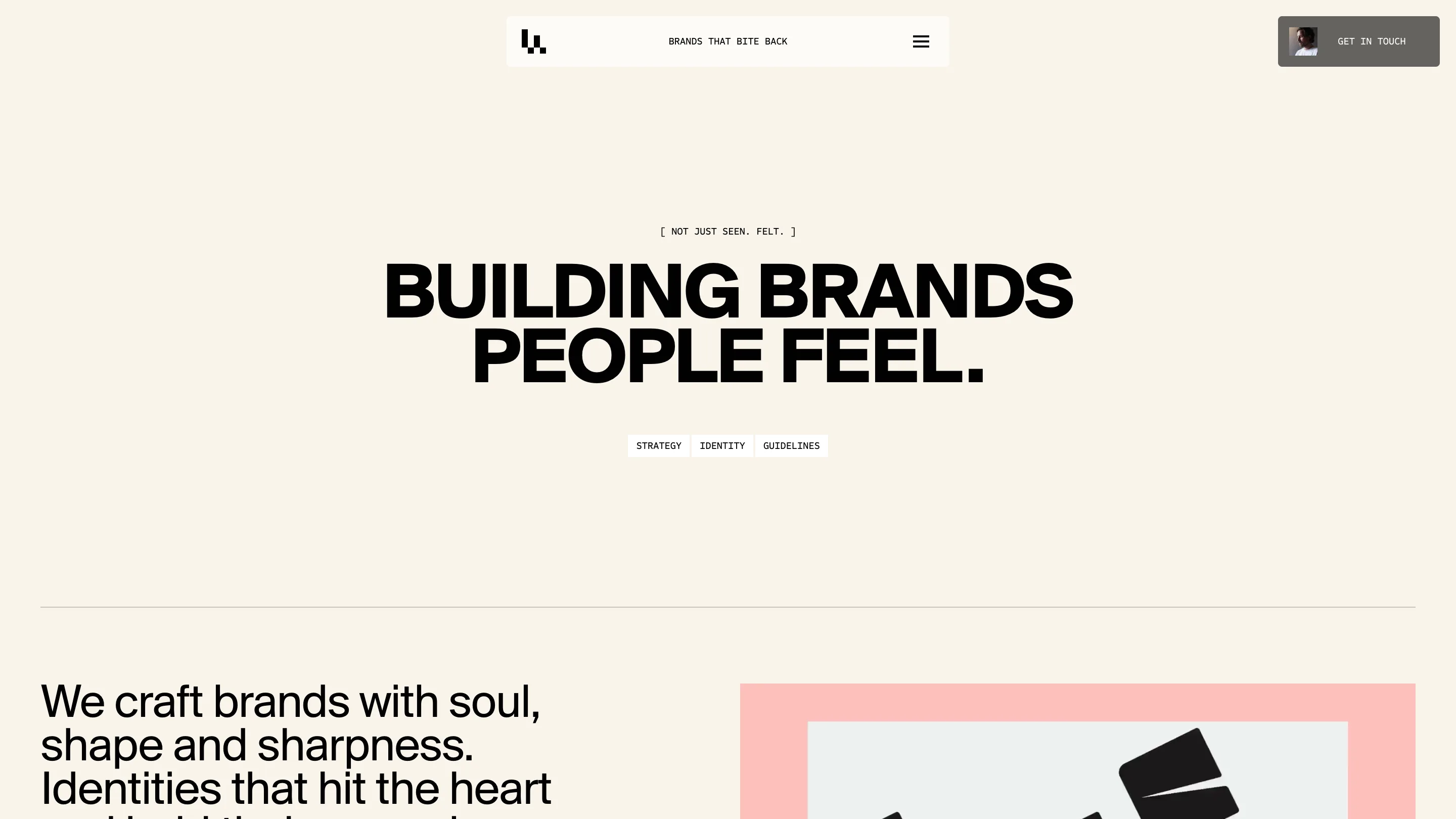
The flip does navigational work. You know you've crossed from the studio's own story into what they sell, before you've read a word. And it gives the pink and red client artwork on the branding page somewhere bright to sit, which it wouldn't get on black.
The rail along the bottom
A thin line runs across the base of the full-bleed pages with five bits of mono text on it: 20+ DIGITAL FREAKS, AMSTERDAM BASED, a live Amsterdam clock ticking seconds inside brackets, FOLLOW US with Instagram and LinkedIn, and an NL/EN toggle.
The clock is the detail I keep coming back to. It costs almost nothing, it dates nothing, and it makes the page feel connected to a room with people in it. Compare that to the animated counter of awards won that most studios put in the same position.
Why it scored
The imagery is loud. The home hero is macro photography of black ink pooling on wet blue and gold glitter, and the about page is a hard-lit portrait shot against pure black. Loud art direction usually drags the typography up with it, and then everything competes.
Lama Lama went the other way. One typeface, one weight, one size per page, centered, cream or black. The system is small enough to hold across a home page, a 37-project index, four service pages and an about page without a single exception. That consistency is most of the 7.51.