Lacoste's 3D polo factory saves its colour for the product
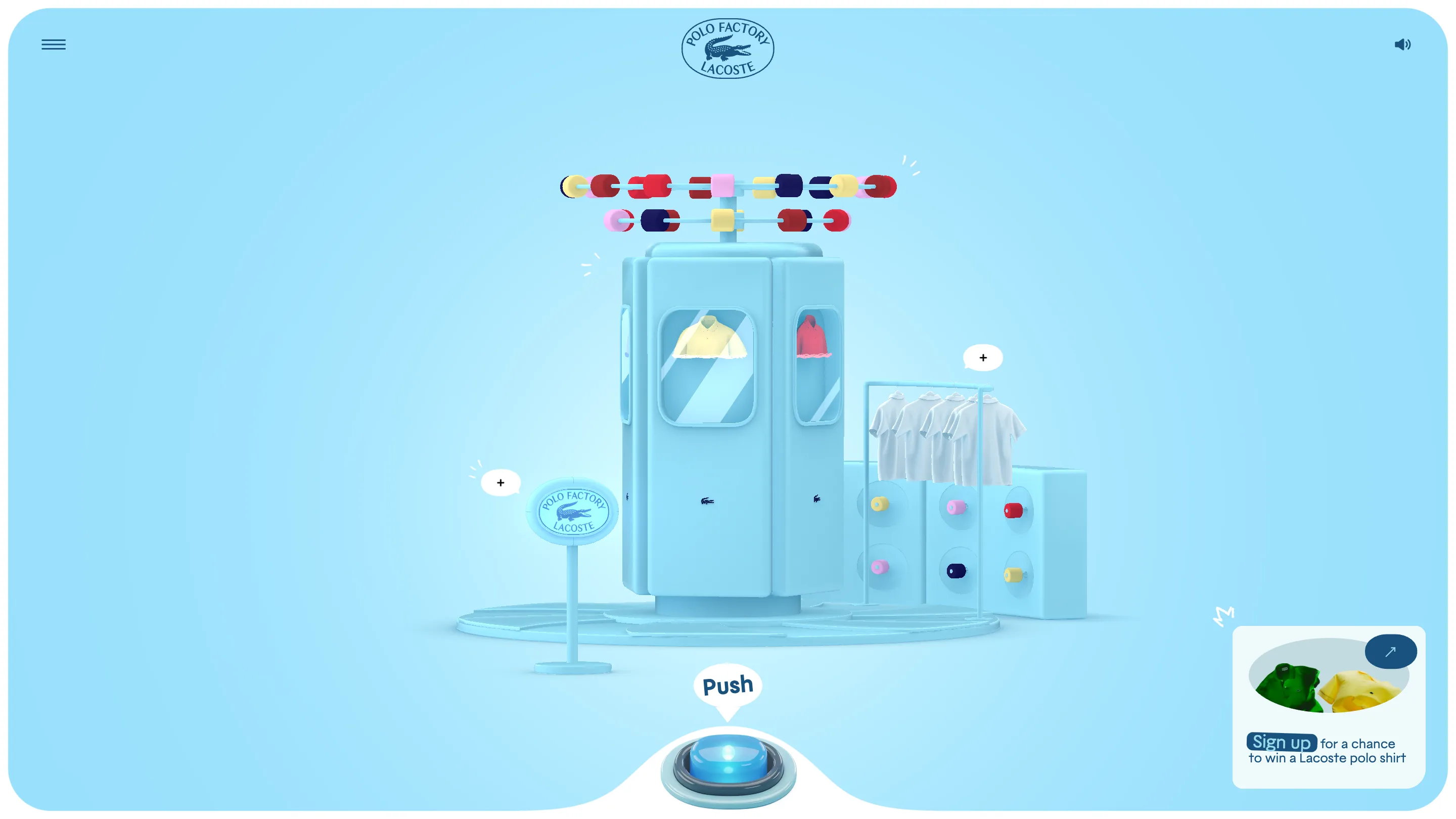
Merci Michel modelled the whole Lacoste factory in one pale blue. The thread, the buttons and the polos hold every bit of colour in the scene.
The best decision on Lacoste's new polo factory site is a subtraction. Once you're through the front door, the entire machine room is one pale blue: floor, plinth, knitting cabinets, drying racks, the crocodile plaque on its little stand. The only colour anywhere in frame is thread, buttons, and the polos coming off the line.
That's the whole idea, and it's why the site works. Merci Michel built it in Three.js for Lacoste's members programme, and it took awwwards Site of the Day on 21 July 2026 with a 7.49. Creativity scored highest at 8.13, which sounds about right for a 3D product experience that spends its budget on one rule instead of ten effects.
Colour is the only signal
Drain a scene to a single hue and every saturated pixel becomes information. Look at the reels spinning above the machine: red, navy, pink, yellow, all reading as thread because nothing competes with them. The button wall on the right does the same job. Six coloured studs on a blue block, and you know instantly which parts of this factory are stock and which are furniture.
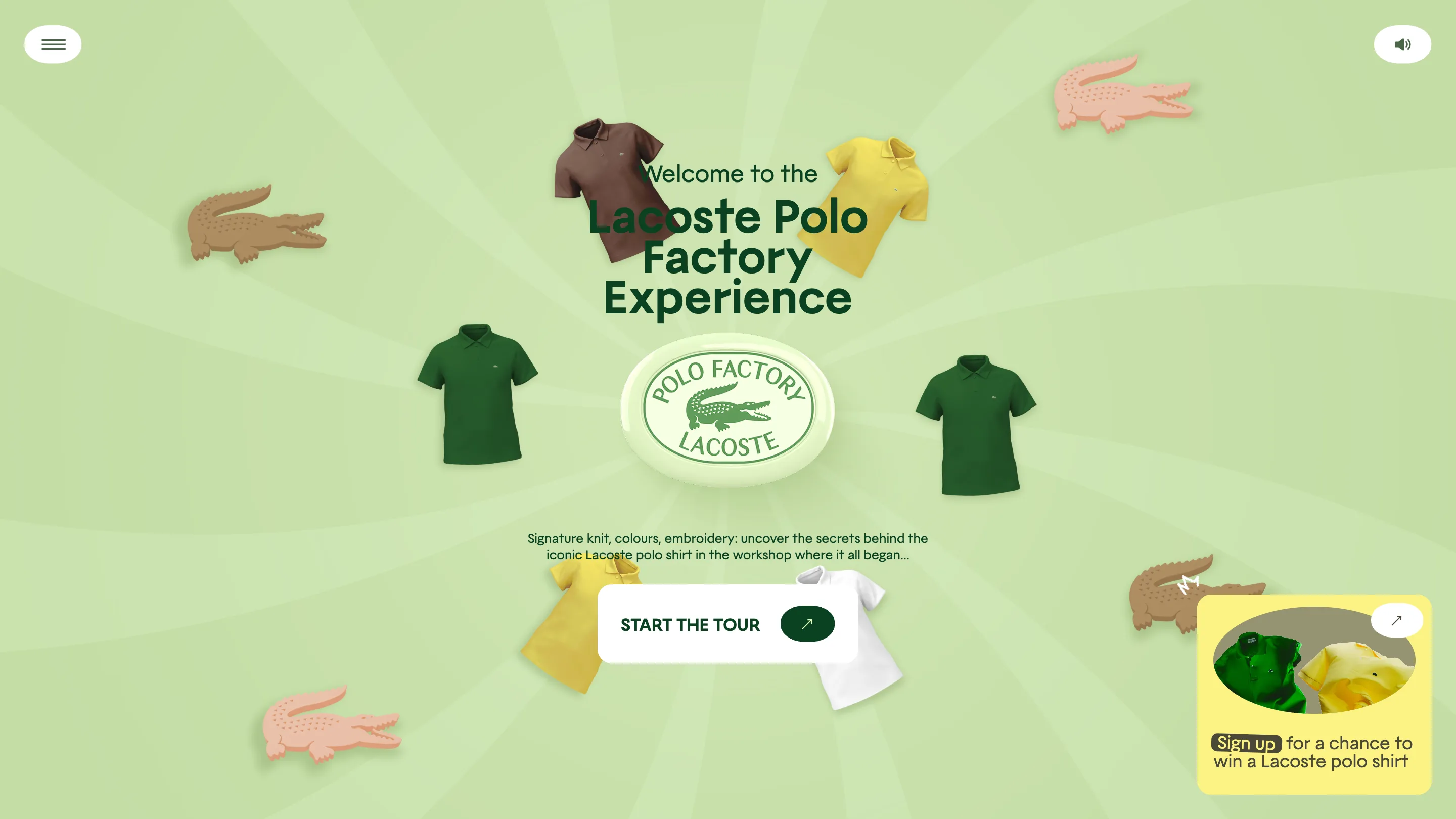
The entry screen goes the other way and it's a good contrast. Lacoste green, crocodiles drifting across the field, polos in brown and yellow and forest, a big soft type stack in the middle. Then you click through and the palette drops out. The green screen sells the brand, the blue room sells the craft, and you feel the switch.
One button does the pacing
There's no scroll. No timeline scrubber, no chapter arrows on the canvas. At the bottom of the screen sits a chunky glass arcade button labelled Push, and you hold it. Reels turn, fabric feeds, a polo appears in the cabinet window. Let go and the machine stops.
Holding rather than clicking is the part that earns the interaction. It puts the pace of the machine in your hand, and it's how a real production line behaves: nothing runs unless someone is standing there. Most 3D brand sites give you a scroll bar and pretend it's agency. This one gives you a switch.
Three rooms, three verbs
The tour runs Knitting, Dyeing, Embroidering. Same camera, same plinth, same button, and the machine reconfigures around you. In the dyeing room the cabinet windows fill with colour and a rack of blank white polos waits alongside, which is a neat piece of staging: the raw goods stay white so the dye reads as an event.
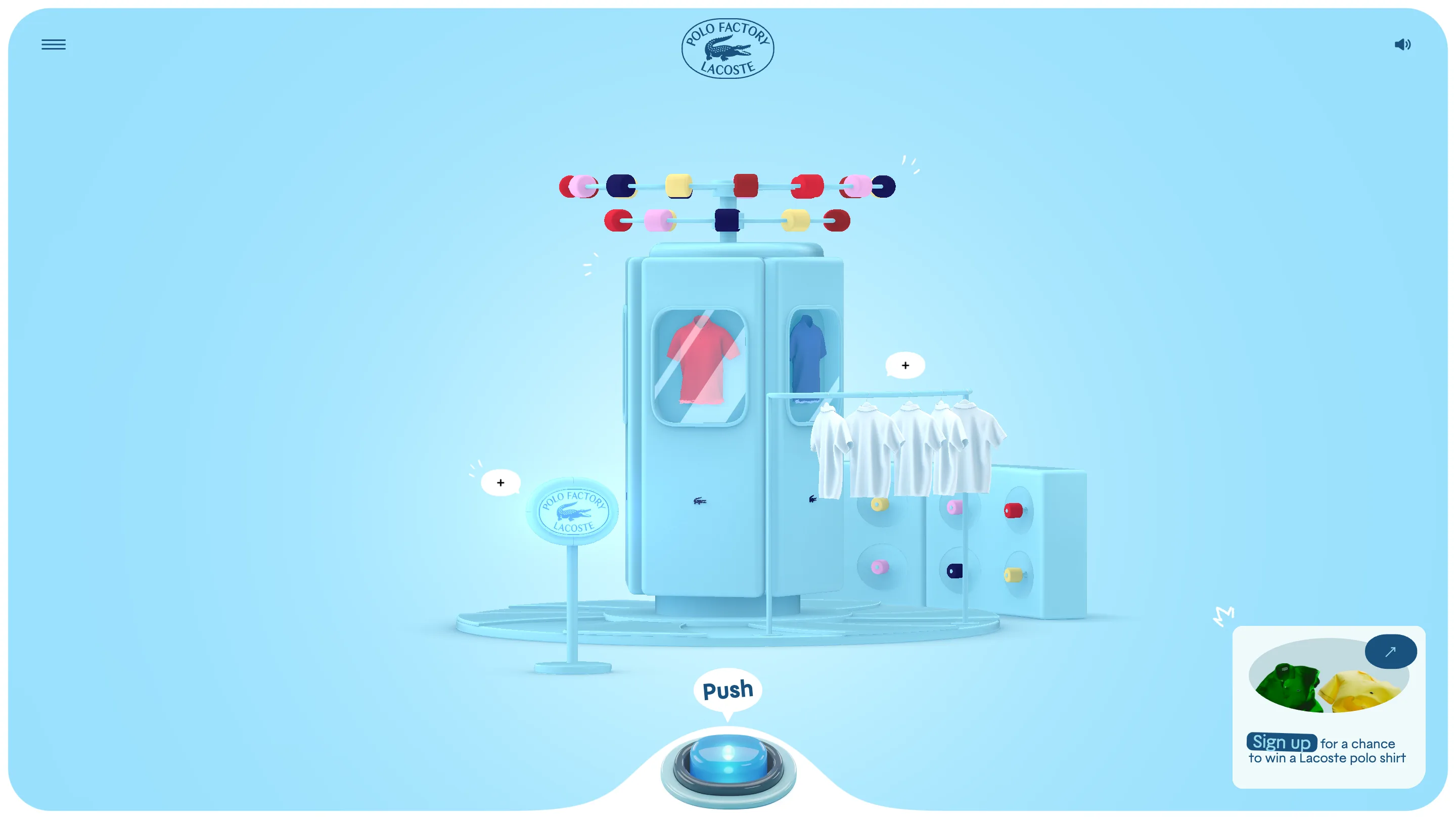
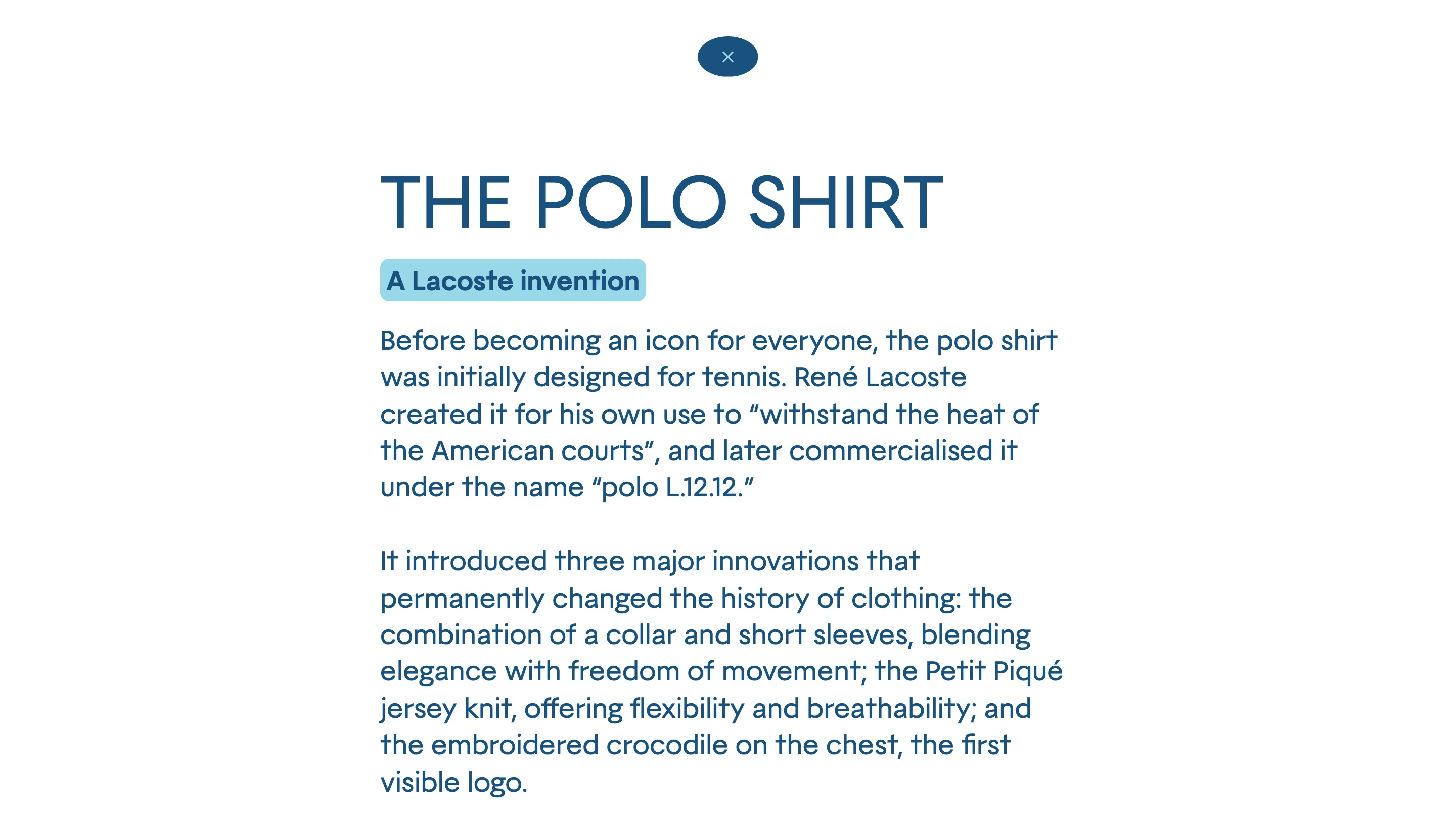
Small plus markers float over the set. Open one and the 3D drops away for a full-bleed text panel: heavy blue display type, a tinted label, two paragraphs on René Lacoste designing the L.12.12 to survive the heat of the American courts. The typographic register is completely different from the rest of the site and it works, because the reading moment wants stillness.
Where the judges docked it
Usability came in at 7.09, the lowest of the five sub-scores, and you can see why. Nothing tells you the button is a hold rather than a tap, so the first few presses do nothing and the machine sits there. The chapter list hides behind a burger. A sign-up card parks itself in the bottom right through the whole experience, close enough to the button to fight for the same attention.
The fix for most of that is copy, not code. Change Push to Hold and the entry problem goes away.
The takeaway
Restraint on colour buys you clarity everywhere else. Merci Michel gave up an entire palette to make five thread reels legible, and the site reads faster because of it. Worth trying the next time a 3D scene starts fighting itself.