Glitch&Grit turns its portfolio filter into the headline
The work page opens with one hero-size sentence that names every discipline and doubles as the category filter. No chips, no dropdown, no thumbnail needed to explain the studio.
Glitch&Grit puts its category filter where most studio sites put a hero headline. On the work page the first thing you read is a single line set in heavy grotesk at display size: All Work, Brand & Identity, Content & Marketing, Film & Documentary, Web & Digital. The active term sits in white. The others sit in a mid grey. Click one and the highlight moves. That is the whole filter.
It took awwwards Site of the Day on 19 July 2026 with a 7.17. The studio is Glitch&Grit, founded by Kelly Bernard, with OpenAI, UTA, Puma Running, ESPN and MillerKnoll in the reel.
The filter is the headline
The move works because it does two jobs with one block of type. A chip row tells you how to sort. A hero headline tells you what the studio does. This tells you both, in the reading order you'd use anyway, before a single thumbnail loads. By the time you reach the grid you already know the studio shoots film, builds sites, and makes identities, because you read it as a sentence rather than parsing it as UI.
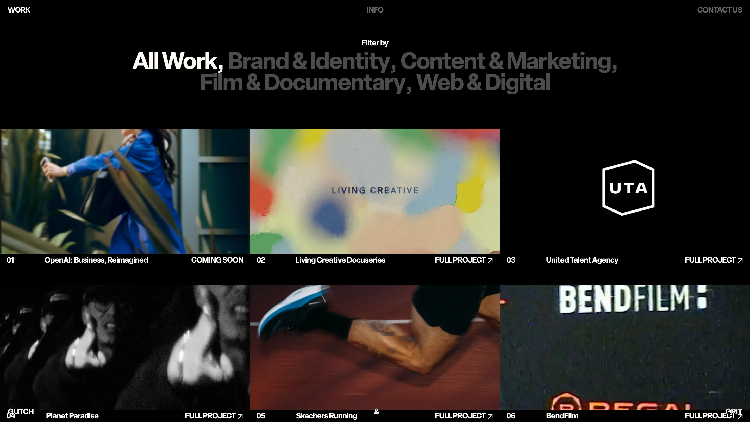
Keeping the inactive terms visible in grey is the part worth stealing. Most filters hide what you didn't pick. Here the unpicked options stay on the page as copy, so the list keeps working as a description even while it's working as a control. Under the grid, each tile carries a flat caption row: number, project name, FULL PROJECT with an arrow. No cards, no hover reveal, no shadow.
One colour per project, taken from the footage
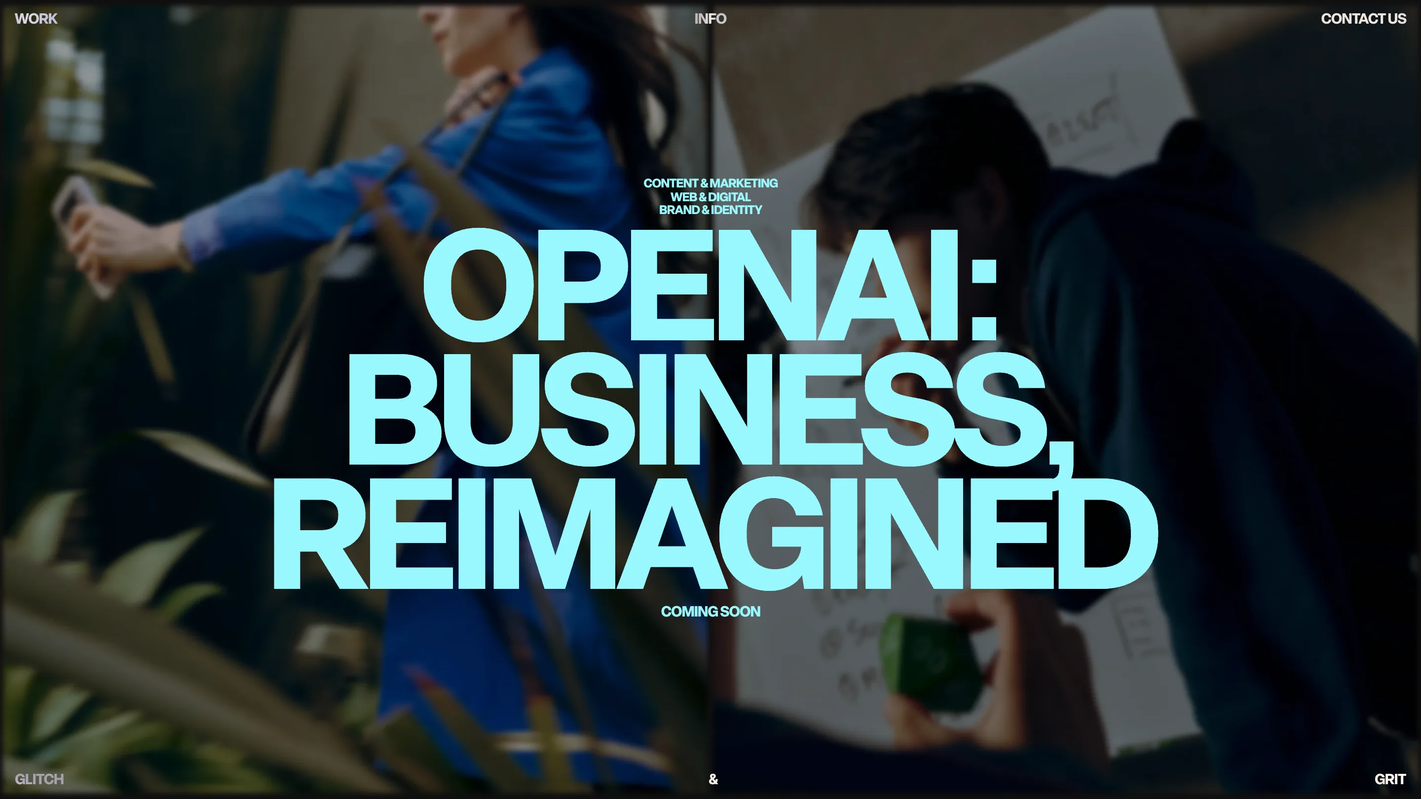
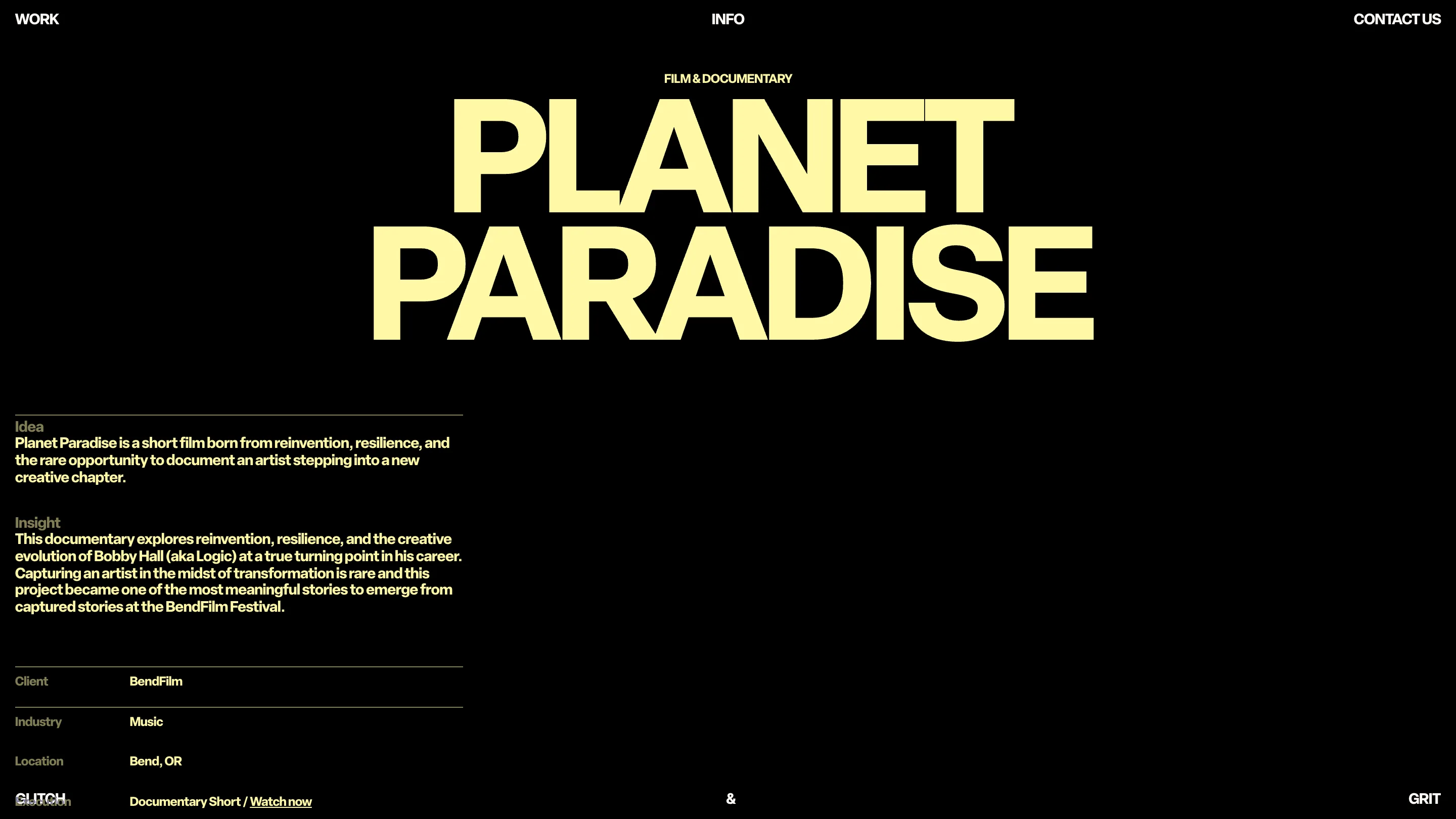
The home page runs the OpenAI film full bleed and sets the title over it in an ice cyan. The Planet Paradise page runs butter yellow on black. Each project gets one accent, and each accent looks pulled from its own frames rather than from a brand palette. It's a small discipline that keeps a portfolio of loud client work from collapsing into noise: the studio holds the type and the layout constant, and lets the colour change per story.
The case study pages drop the video entirely
This is the decision that surprised me. After a home page built on moving image, the project pages go quiet. Planet Paradise is the title in yellow on black, then two short blocks headed Idea and Insight, then a spec table: Client BendFilm, Industry Music, Location Bend OR, Execution Documentary Short with a Watch now link. It reads like a call sheet. The film sits behind one text link instead of autoplaying at you.
For a studio that sells filmmaking, choosing not to show the film first is a real position. It says the thinking is the product and the footage is the evidence. Judges rate that kind of consistency, and it's rarer than good motion.
The frame spells the name
Nothing floats in the middle of this site. WORK, INFO and CONTACT US are pinned to the top left, centre and right. GLITCH sits bottom left, GRIT bottom right, an ampersand centred between them. The fixed chrome traces the edge of the viewport and, read across the bottom, it spells the studio name. You never see a logo lockup because the page frame is the logo.
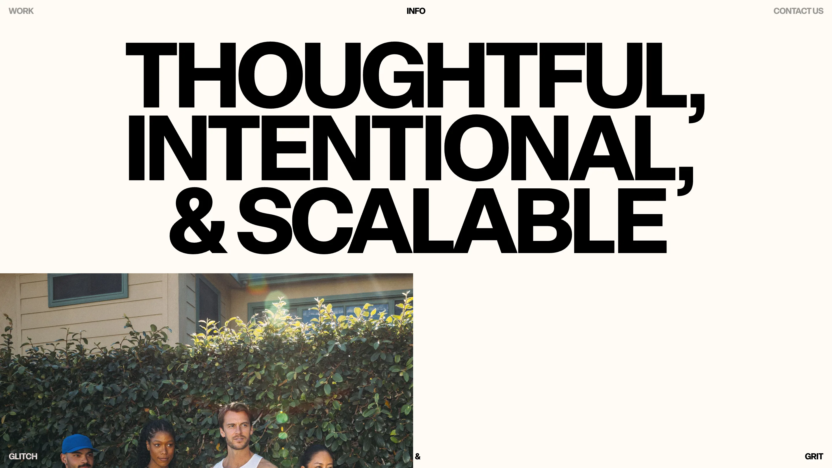
The info page flips to off-white and runs the same grotesk in black at the same weight. One typeface, two backgrounds, an accent that changes per project. That's the entire system.
What a judge would rate
The craft here is editorial rather than technical. There's no WebGL, no scroll hijack, no clever transition doing the heavy lifting. What carries it is type at the right size, a filter that earns its place at the top of the page, and case studies confident enough to be text. Sites win on less.