Decathlon dresses a 90s capsule in Memphis stickers
Decathlon's Yestalgia site scatters flat 90s stickers and a VHS-gradient logo across a capsule collection. Site of the Day on 28 August, 7.33.
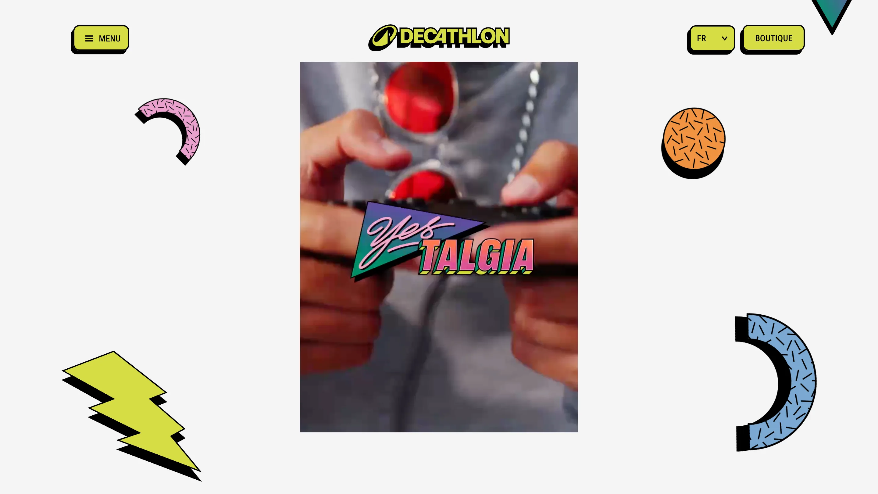
Decathlon's Yestalgia site opens on a pile of stickers. A pink squiggle top left. A lime lightning bolt under it. An orange dot flecked with black dashes on the right, and in the middle a portrait video the size of a postcard, with a VHS-gradient logo burned over footage of someone snapping open a pair of red-lens sunglasses. The 90s art direction is doing all the talking, and the product it sells is a €20 t-shirt.
The site took awwwards Site of the Day on 28 August 2026 with a 7.33, and the Developer Award at 7.35. index built it with Jonathan Da Costa and Quentin Hocdé for a Decathlon capsule collection priced between €12 and €90.
The stickers do the art direction
Every shape on the page carries a solid black copy of itself, pushed a few pixels down and right. No blur, no gradient, no soft shadow. That hard offset is how cheap 90s print reproduced a drop shadow, and repeating it across a dozen flat shapes is what makes the page read as one era instead of a mood board.
The restraint is in the hero. A brand with Decathlon's money could have filled the viewport with video. Here the video sits in the middle at roughly a third of the screen width, on near-white, with the stickers floating around it and never touching it. The negative space is what lets a lime lightning bolt look designed rather than loud.
An illustrator gets a full screen
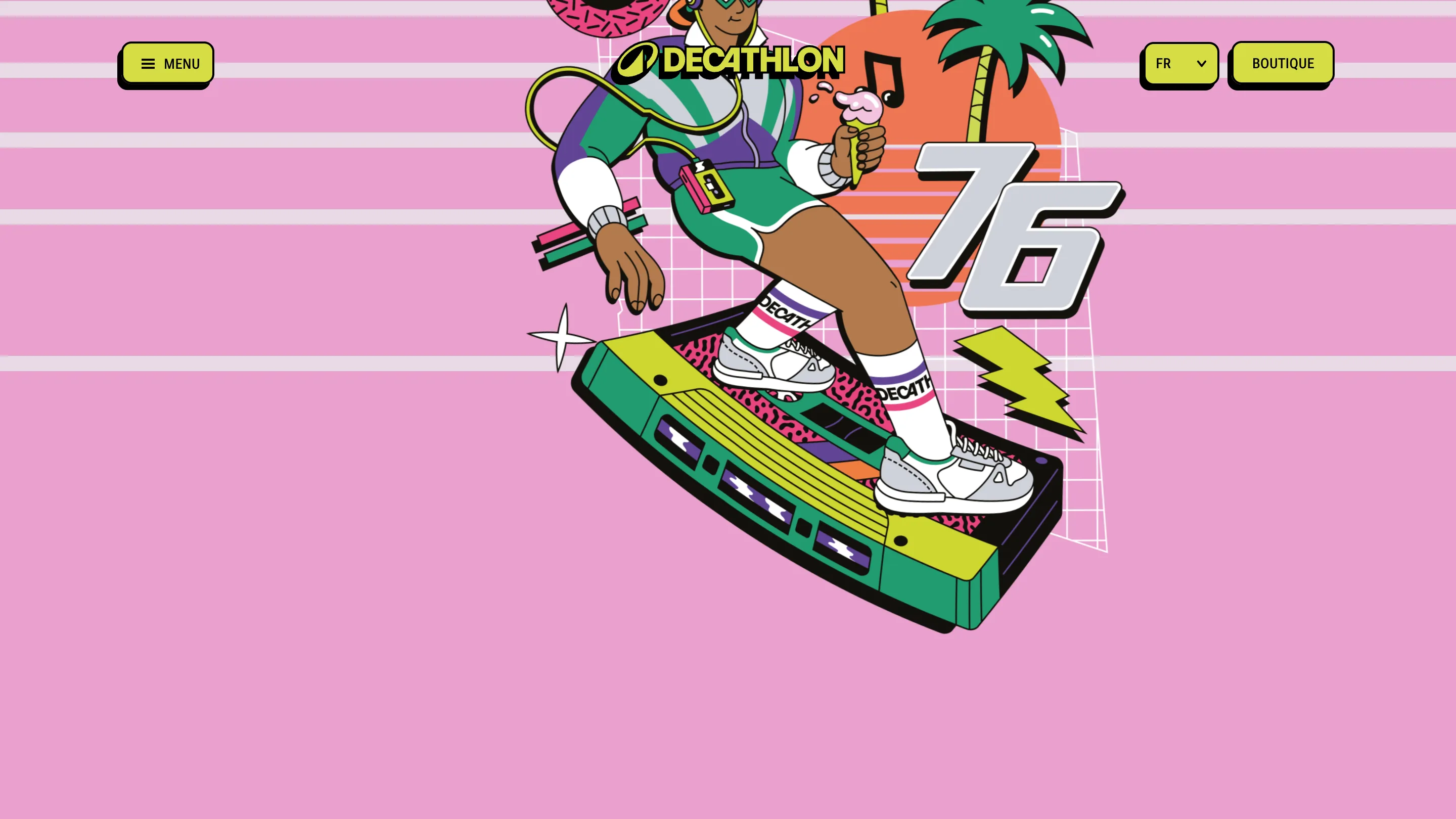
The middle of the site belongs to Dalkhafine, the Franco-Canadian artist behind the collection's graphics. A skater rides a green and yellow boombox across a pink grid horizon, cassette Walkman clipped to the hip, chrome 76 sitting in front of an orange sun. Decathlon opened in 1976 and the number is the only piece of brand history on the page.
The drawing also sets the palette. Green, purple, coral and lime come straight out of the illustration and then run the rest of the site, which is why the sticker layer never feels bolted on.
The product list is a stack of headlines
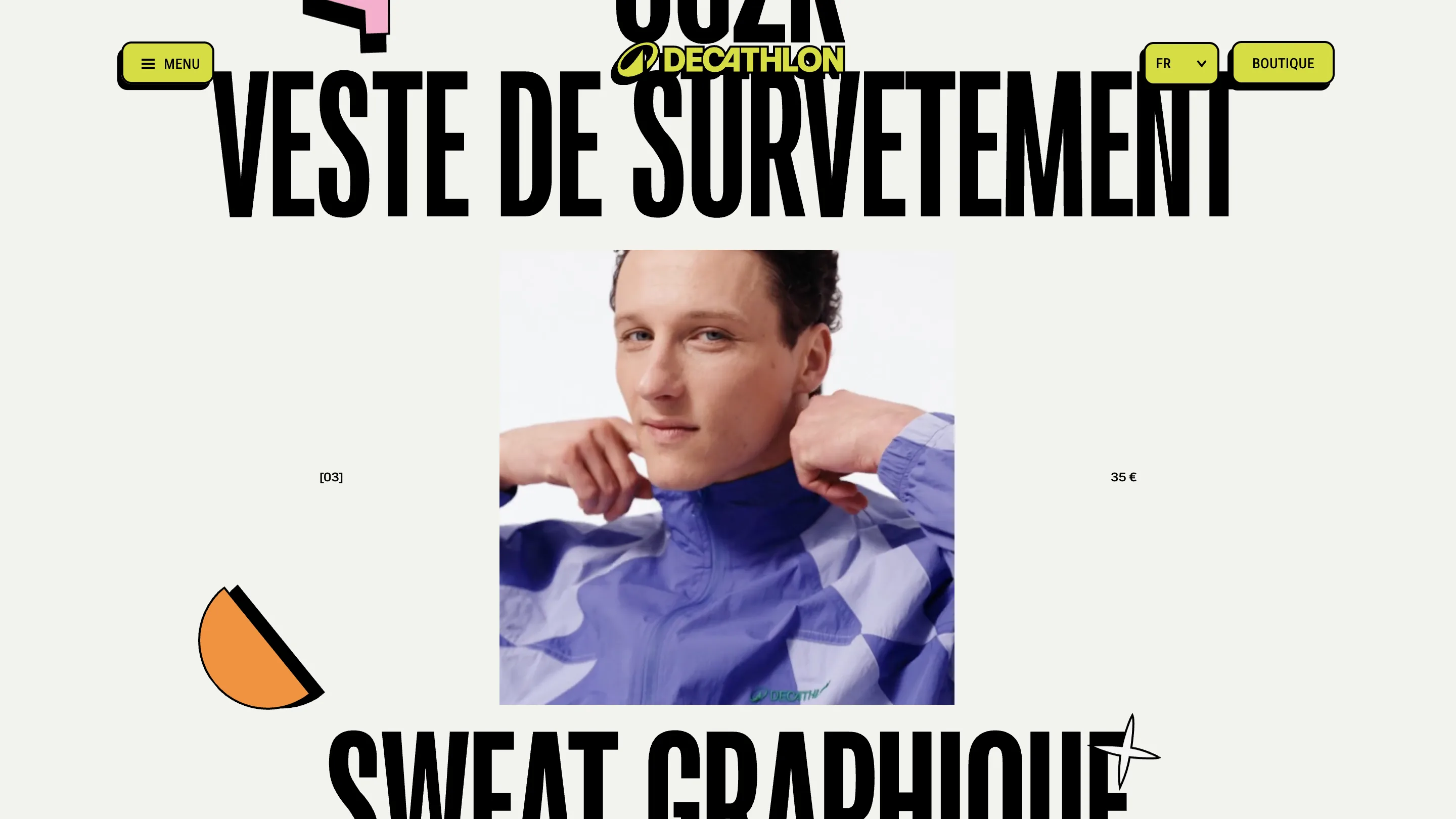
The catalogue is where the craft shows. Each product name is set in an ultra-condensed grotesque at display size, VESTE DE SURVETEMENT running the full width of the screen, with a small [03] on the left and 35 € on the right. The photo drops in underneath at about a third of that width.
So the type is the biggest thing in the shop and the photography is the smallest. Scrolling the collection means reading eight headlines in a row, each one a garment name, each one the same weight. It's the move a fashion lookbook makes, applied to a tracksuit jacket that costs less than a takeaway.
Pink, for one section only
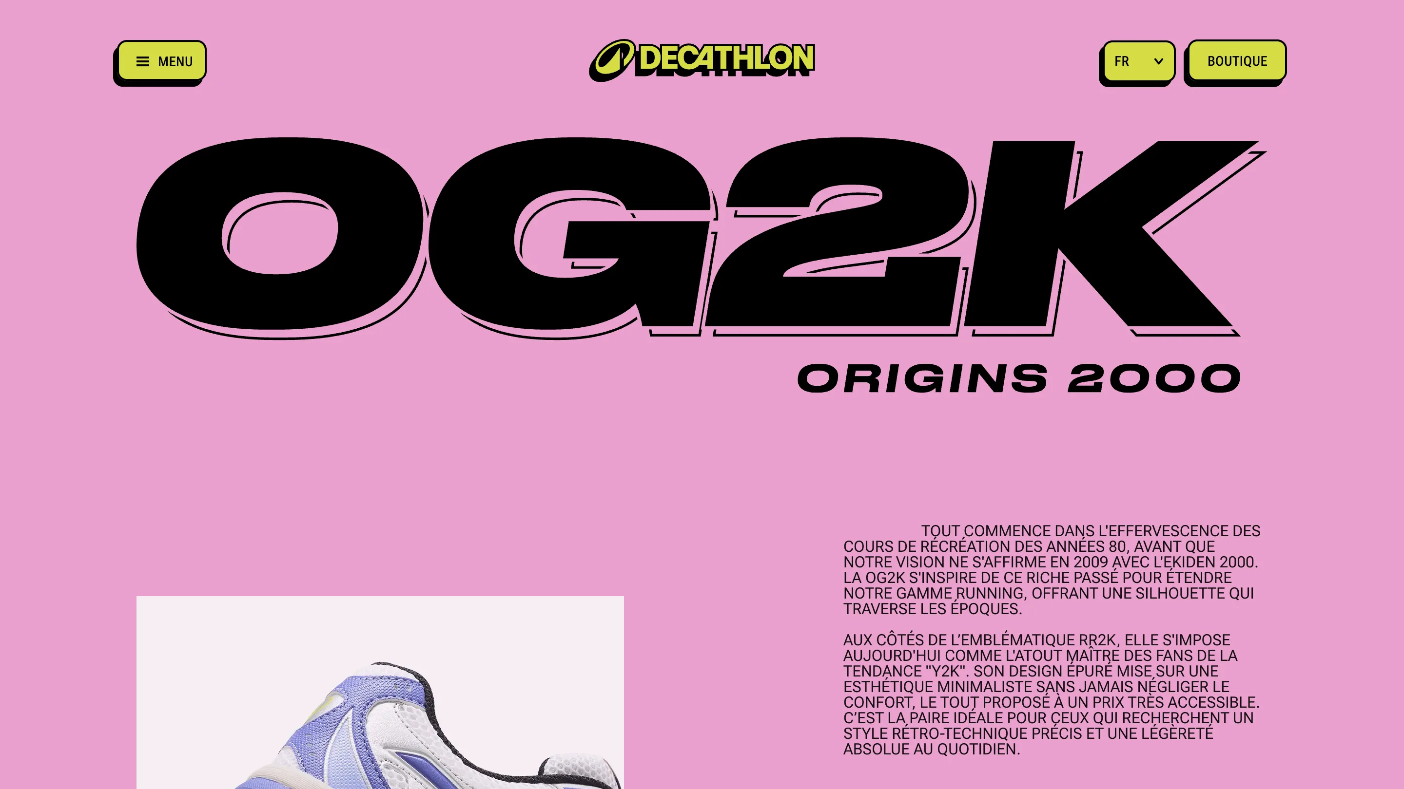
Then the background turns pink. OG2K, the running shoe, gets its own chapter in a saturated rose, with the name set in a heavy grotesque and an outline copy offset behind it rather than the solid black used everywhere else. ORIGINS 2000 sits under it in italic. Two short paragraphs of caps copy run down the right at small size while the shoe fills the left.
One section, one colour, then the site goes back to near-white. Colour as a chapter marker is an old editorial habit and it still works: you know where you are in the page without a nav telling you.
Why it scored
7.33 is a normal Site of the Day number, and this site earns it on consistency rather than on effects. GSAP handles the motion, the transitions are quick, and nothing hijacks the scroll. What a judge rates here is that one visual system, a black offset plus four saturated colours plus one condensed grotesque, holds from the hero to the legal footer.
The honest part is the scope. This is a landing page for thirteen products, and it behaves like one: the shop button sits top right on every screen, the prices are visible in the list, and the whole thing hands you off to decathlon.fr when you're ready. The 90s dress-up never gets in the way of that.
Credit: Decathlon Yestalgia by index, with illustration by Dalkhafine.