Aardvark's blob changes colour on every page
One wobbly blob sits behind every page of the Aardvark Book Club site, recoloured page by page. It took awwwards Site of the Day with a 7.2.
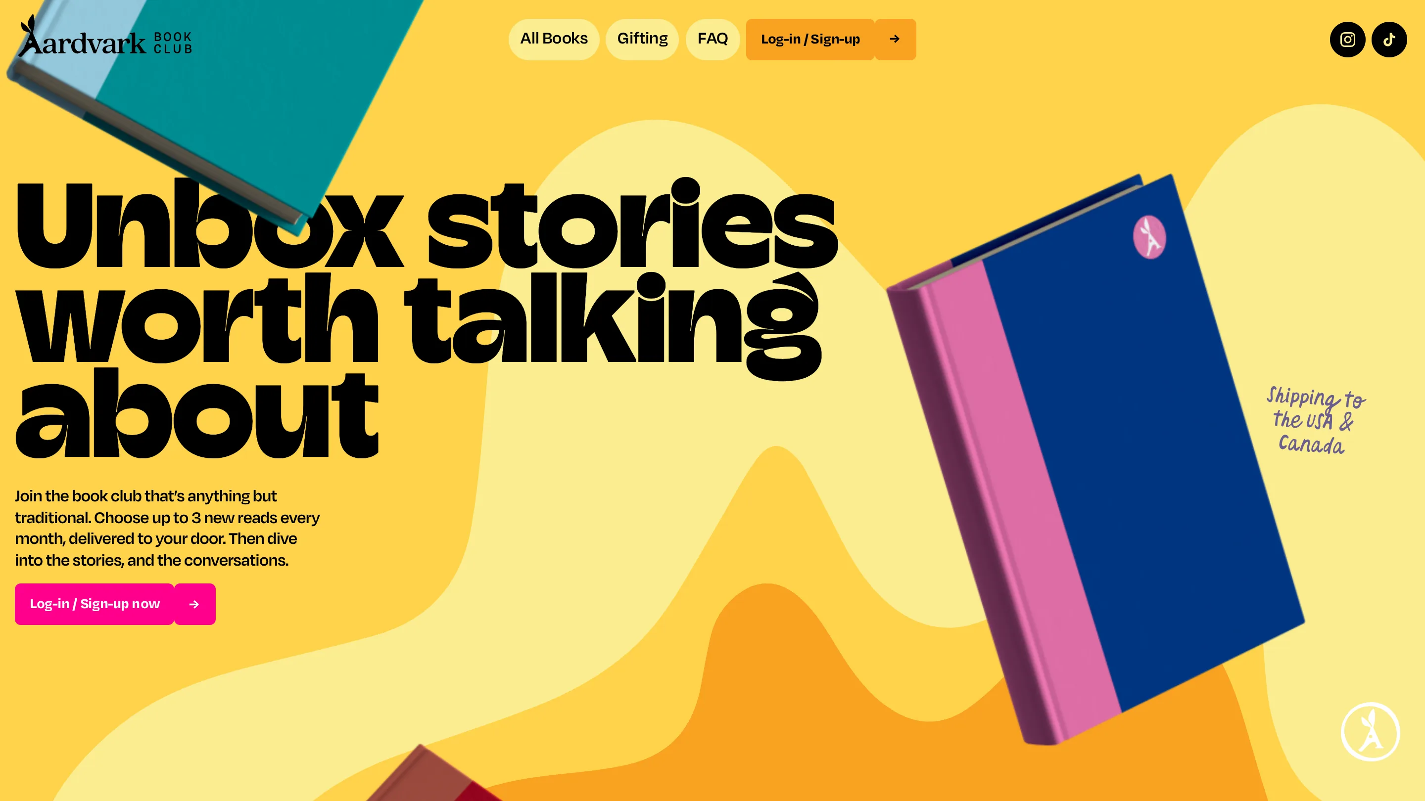
Four pages, four background colours, one shape. Aardvark Book Club puts a soft amoeba blob behind every screen and repaints it as you move through the site: mustard yellow on the home page, lavender on All Books, hot pink on Gifting, cyan on the FAQ. The silhouette wobbles in the same places each time. Only the hue changes. The site took awwwards Site of the Day on 30 August 2026 with a 7.2, and this colour-per-page system is the thing holding it up.
One shape, one colour per page
The blob does a job most subscription sites hand to a photograph. It fills the top half of the page, it sits behind the type, and it gives the page transition something to animate. FUTURE THREE®, the Wiesbaden studio behind the build, keeps the outline close enough between pages that a jump from All Books to the FAQ reads as a room changing colour rather than a new site loading. Barba.js and GSAP handle the swap. The consistency is what makes it land. Change the shape as well as the hue and you get four unrelated pages.
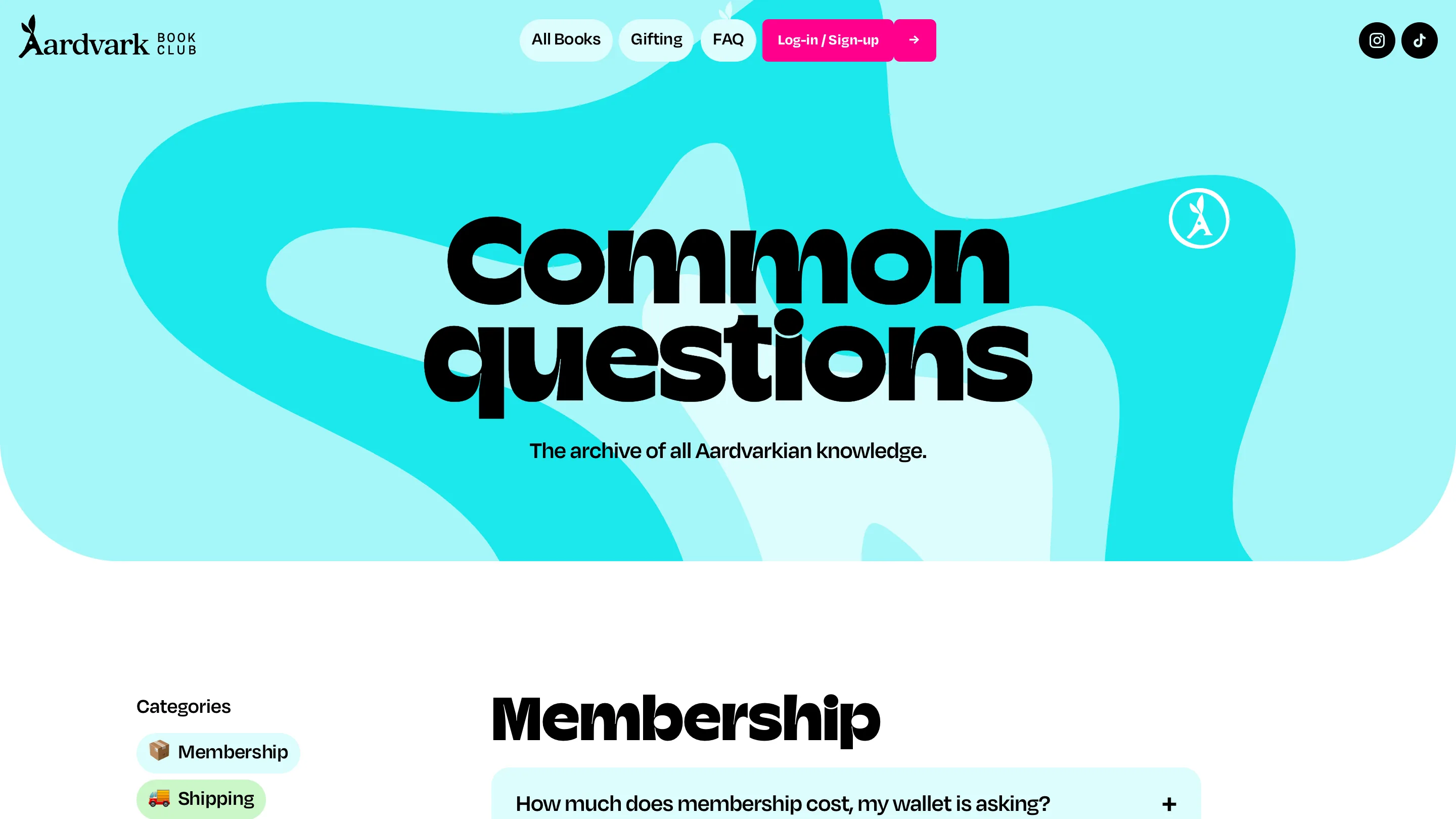
Cyan for the FAQ is the loudest of the four, and it lands on the page nobody designs. Membership questions, shipping questions, an accordion. Same blob, same headline weight, so the dullest page in the flow gets the treatment the home page gets.
The type is set to be read from across the room
One display face carries every headline: a fat rounded grotesk with ball terminals and counters squeezed almost shut. "Unbox stories worth talking about" runs three lines deep, black on yellow, wider than the book propped beside it. At that weight small sizes turn to mud, so they set it enormous and let it crop against the edge of the frame. Body copy sits in a plain grotesk at ordinary size and does none of the shouting.
There's a third voice too: a purple marker script for the asides. "Shipping to the USA & Canada" next to the hero book. "Mentioned by" above the press logos. Two or three words at a time, never a full sentence. It's the annotation layer, and it saves the display type from having to sound friendly on its own.
Colour as a filing system
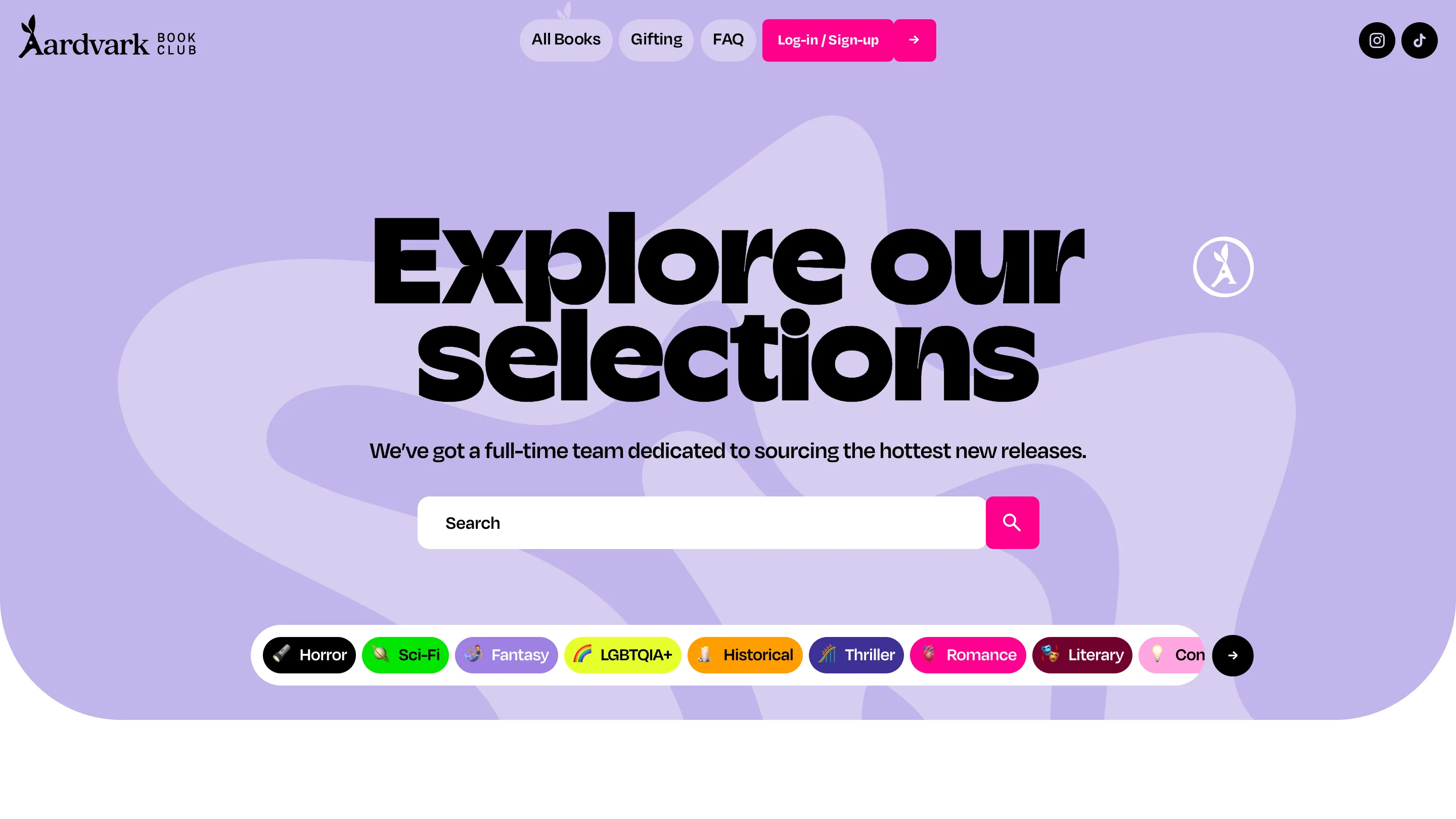
The catalogue carries the same logic down to the genre chips. Horror is black, Sci-Fi acid green, Fantasy lavender, LGBTQIA+ a rainbow gradient, Historical orange, Thriller navy, Romance magenta, Literary maroon. Each one locks an emoji to the left of the label, and the row scrolls sideways with an arrow at the end. It reads like a shelf of spines, which is the right instinct for a book club. A member picks a genre by colour before reading a word of it.
The product is the only photograph
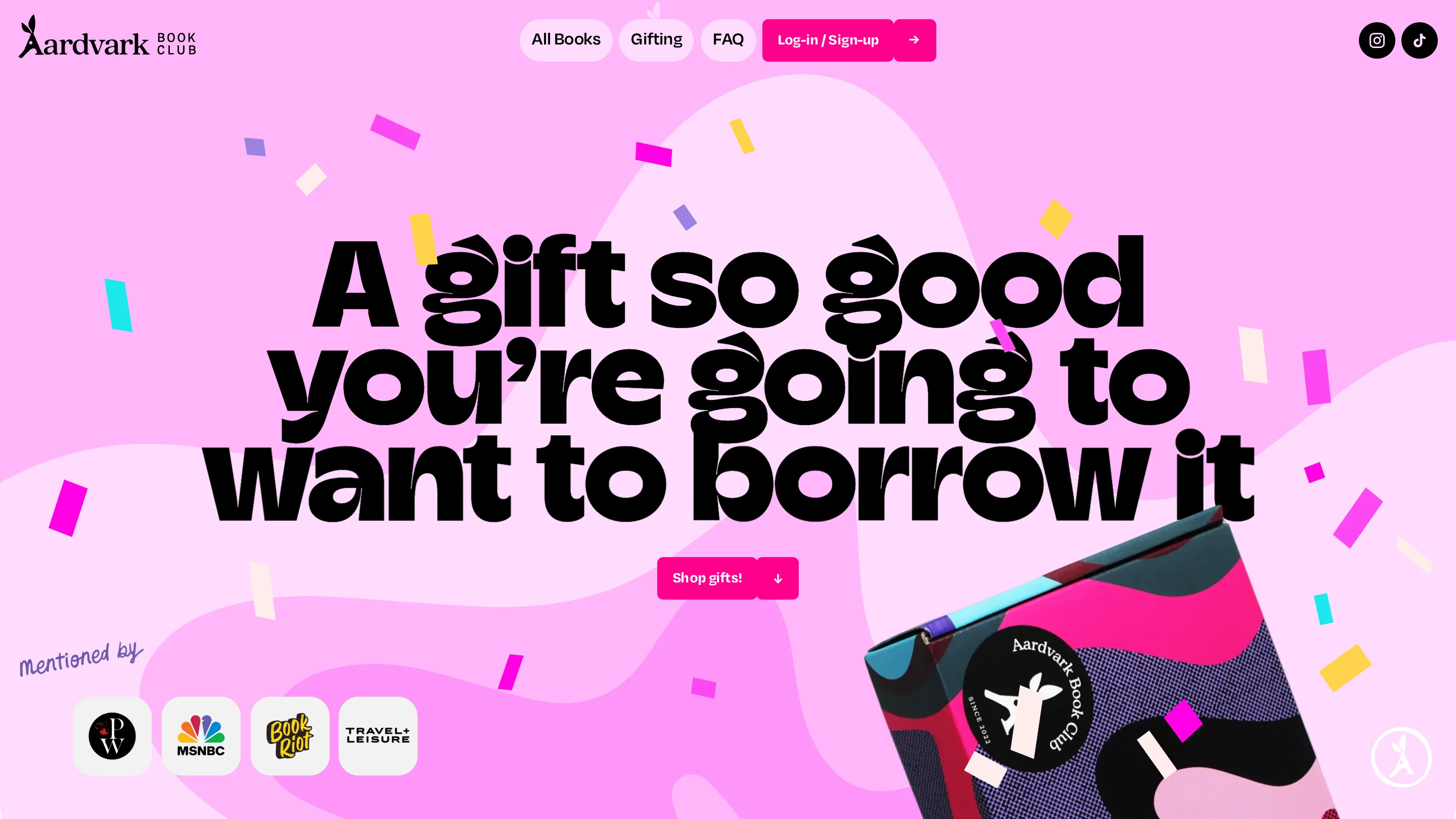
Nothing here is stock. The imagery is hardcover books, shot and dropped into the layout at a tilt, plus a printed box on the Gifting page with the aardvark sticker seal and confetti rectangles in the house palette. Physical goods sold on a screen need the object present. This is a subscription people film when the box arrives, so the box had better be worth filming.
Where the 7.2 comes from
Under the colour, the structure is ordinary. Hero, monthly picks, four steps, a genre carousel, testimonials, a Webflow stack you could name in your sleep. Any judge scoring creativity separately will see that. What lifts it is the discipline of the system: one shape, one display face, one pink call to action sitting in the same place on all four pages, and a colour rule strong enough that you always know which room you're in. For an e-commerce site with $17.99 a month on the page, that's a good trade.