Pegassi's Ascension EP site hands you its step sequencer
Pegassi's debut EP site lets you rebuild each track on a 16-step sequencer, kick by clap, then share the loop. The record becomes an instrument.
Pegassi's EP site gives you the step sequencer the tracks were built on. The site for Ascension, the Belgian trance and techno producer's debut EP, opens each of its four tracks as a 16-step grid you can play, rewrite and send to a friend. It took awwwards Site of the Day on 21 October 2026 with a 7.51, plus the Developer Award, and its highest mark was creativity at 7.88.
Jesper Landberg designed and built it with Gil Huybrecht, on Nuxt, Three.js and GSAP. The palette is black and white with one green light, and the whole thing sits under a fine layer of grain.
A step sequencer as the music website's centrepiece
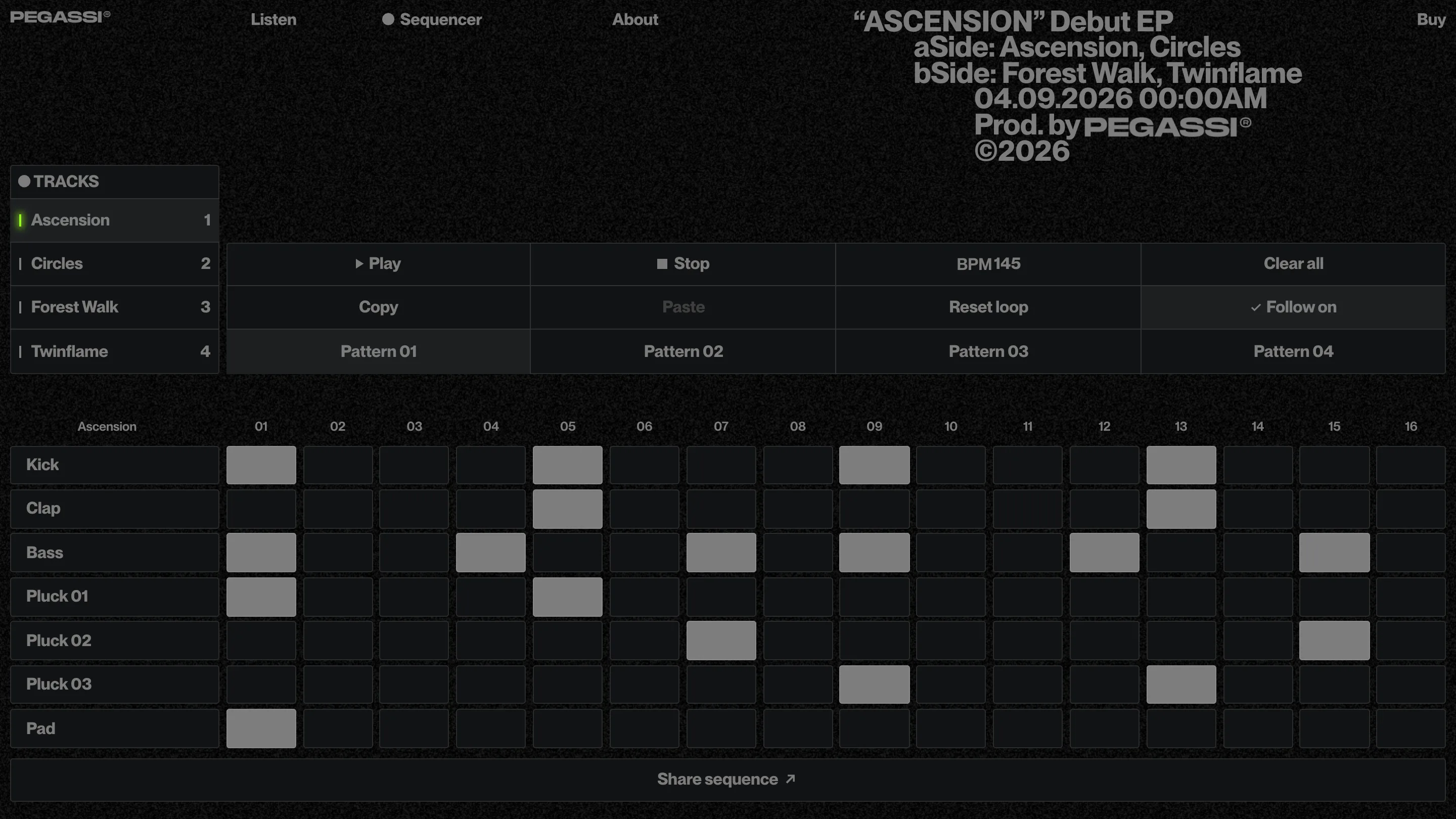
The Sequencer page is the reason this won. Pick a track on the left and the grid loads its parts: Kick, Clap, Bass, Pluck 01, 02 and 03, Pad. Seven rows, sixteen steps, BPM 145. The default pattern for the title track is the real skeleton of a rave tune. Kick on 1, 5, 9 and 13. Clap on the backbeat. Bass dodging the kick on the off-steps.
Then it hands you the controls a producer would want. Four patterns per track. Copy and Paste between them. Reset loop, Clear all, and a Follow on toggle that chains the patterns. At the bottom, a full-width Share sequence button turns your version into a link.
That last button is the clever bit. A fan who spends five minutes moving claps around now has something of their own to post, and every post is an ad for the EP. The interaction and the marketing are the same object.
The interface looks like hardware
The grid doesn't pretend to be a toy. Cells are flat dark squares that switch to a flat grey when they're on. Labels sit in a plain grotesk at one size. The control bar is a row of equal buttons with hairline borders, laid out like the top panel of a drum machine. Nothing glows except the small green bar beside the track that's playing.
That restraint is what makes it usable. A sequencer with sixteen columns and seven rows is 112 targets on one screen, and the design spends its whole budget on making those targets readable.
The Listen page spins a 3D record
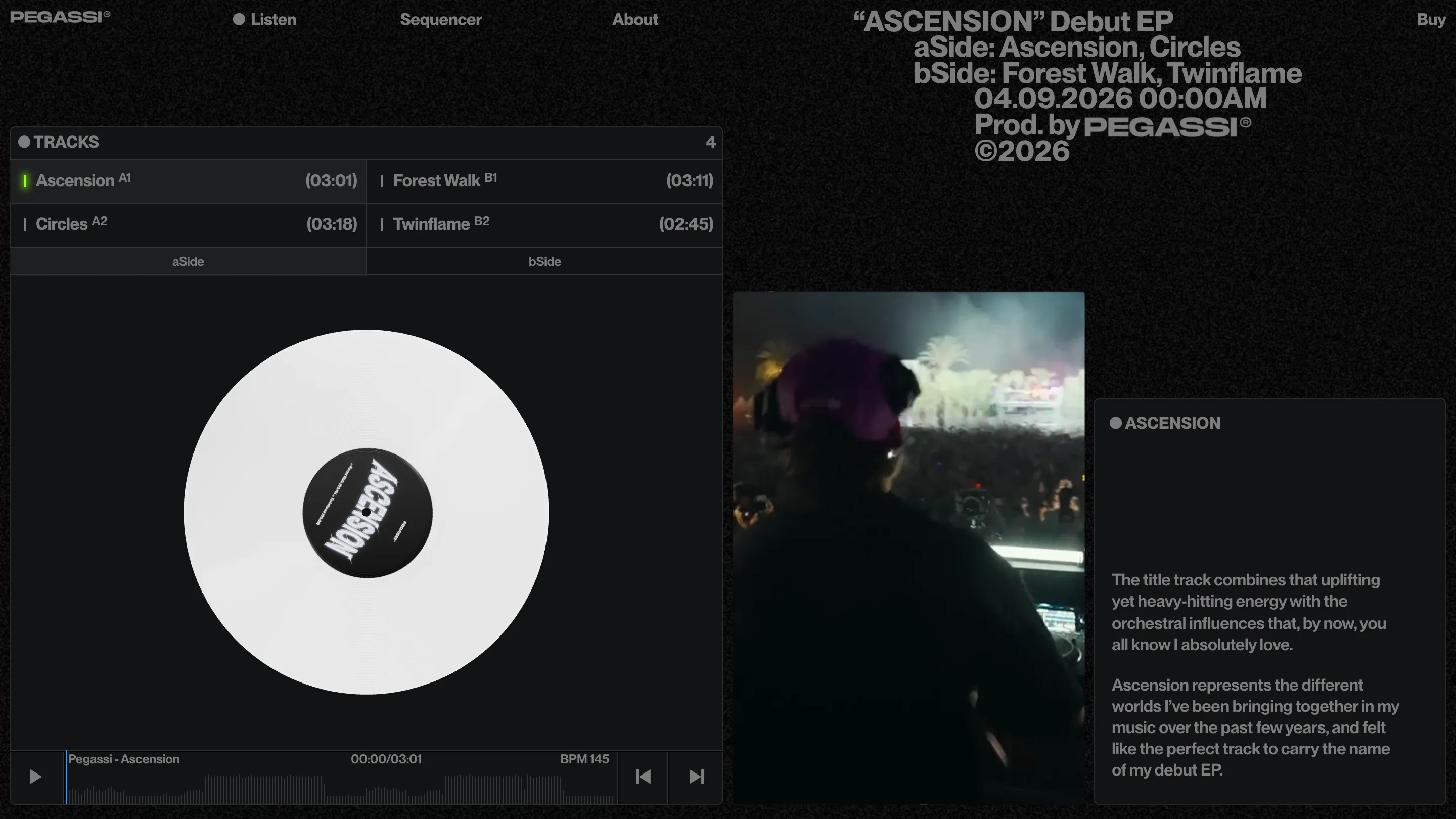
Listen keeps the record-shop logic. The four tracks are split into aSide and bSide, A1 Ascension (03:01) to B2 Twinflame (02:45), and the centre of the screen is a white vinyl rendered in Three.js, its label set in the same stretched chrome lettering as the cover. Under it runs a player with the waveform drawn as the scrub bar and the BPM printed next to the timecode.
To the right, a column of crowd footage, and beside it Pegassi's own notes on the track, in the first person. "Ascension represents the different worlds I've been bringing together in my music over the past few years." A press release would say it in the third person. This sounds like the artist leaning over the decks to tell you.
A colophon set as a staircase
The top right of every page carries the release details: title, aSide, bSide, the date 04.09.2026 00:00AM, Prod. by PEGASSI, ©2026. Each line steps further right than the one above, so the block climbs. It echoes the cover, where a figure stands at the top of a stair in front of a lit door.
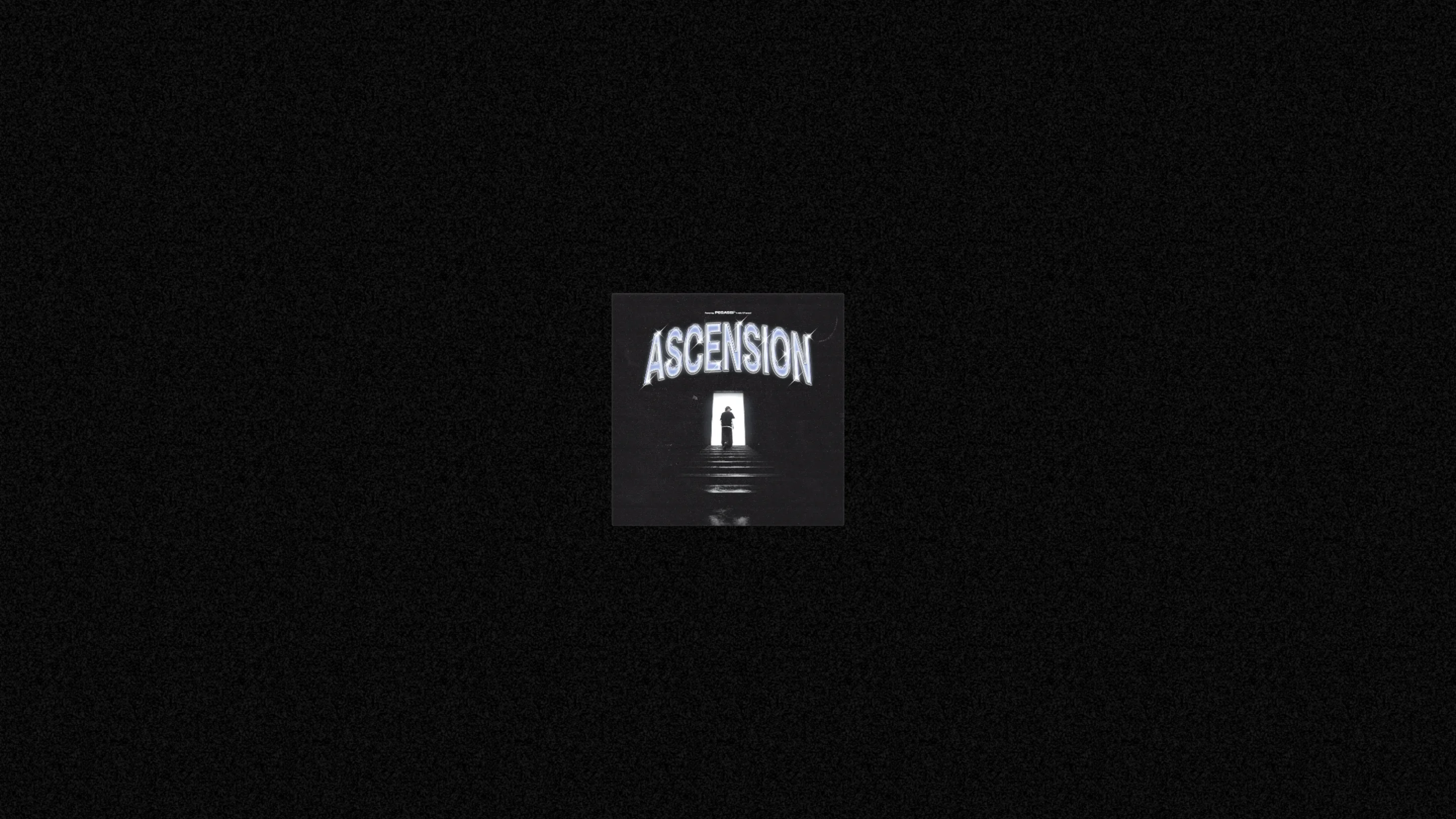
The intro screen does the same with less. The cover sits small in the middle of a black, grainy field and waits. No headline, no button. It's the moment before the lights come up.
Why the judges rated it
The usability score, 7.26, was the lowest of the four, and you can see why: a 112-cell grid is a lot to ask of a phone. The idea carries it anyway. A fan can get inside a track, take it apart at 145 BPM and send it on, which gives them a reason to come back after the first listen.