

Cipher's monochrome portfolio is built on the letter C
Magnetism dressed the Paris production company Cipher in black and paper grey, and worked the letter C into the mark, the copy and the cursor.
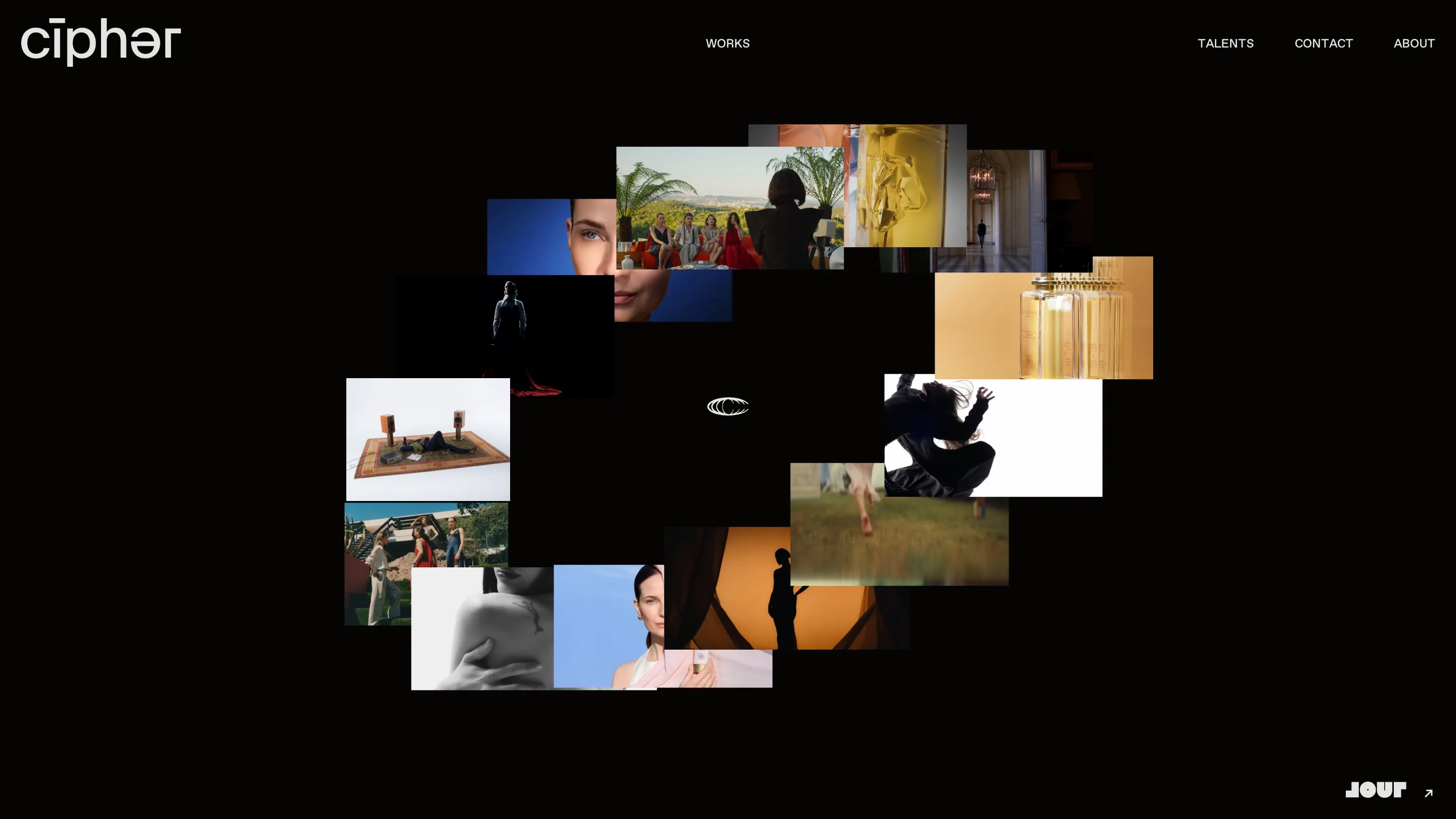
Cipher's homepage is a black field with a pile of film stills floating in the middle of it. There's no grid and no headline. Around sixteen frames from commercials and fashion shoots overlap like contact prints dropped on a table, with one small white mark at the centre holding the stack together. The site took awwwards Site of the Day on 20 August 2026 with a 7.38, and the case for this monochrome portfolio is really made on the pages after the homepage.
The monochrome portfolio flips to paper inside
Click Works and the whole temperature turns over. Black becomes a pale warm grey, close to newsprint, laid with a fine dot grid you only notice once you look for it. The type changes with it: white sans on the home screen, black engraved serif here, letterspaced wide and set in caps. IT'S SUBTLE YET STRIKING, MEANING SHAPED IN QUIET, INTENTIONAL FORMS runs across the foot of the page at the size most sites reserve for a hero.
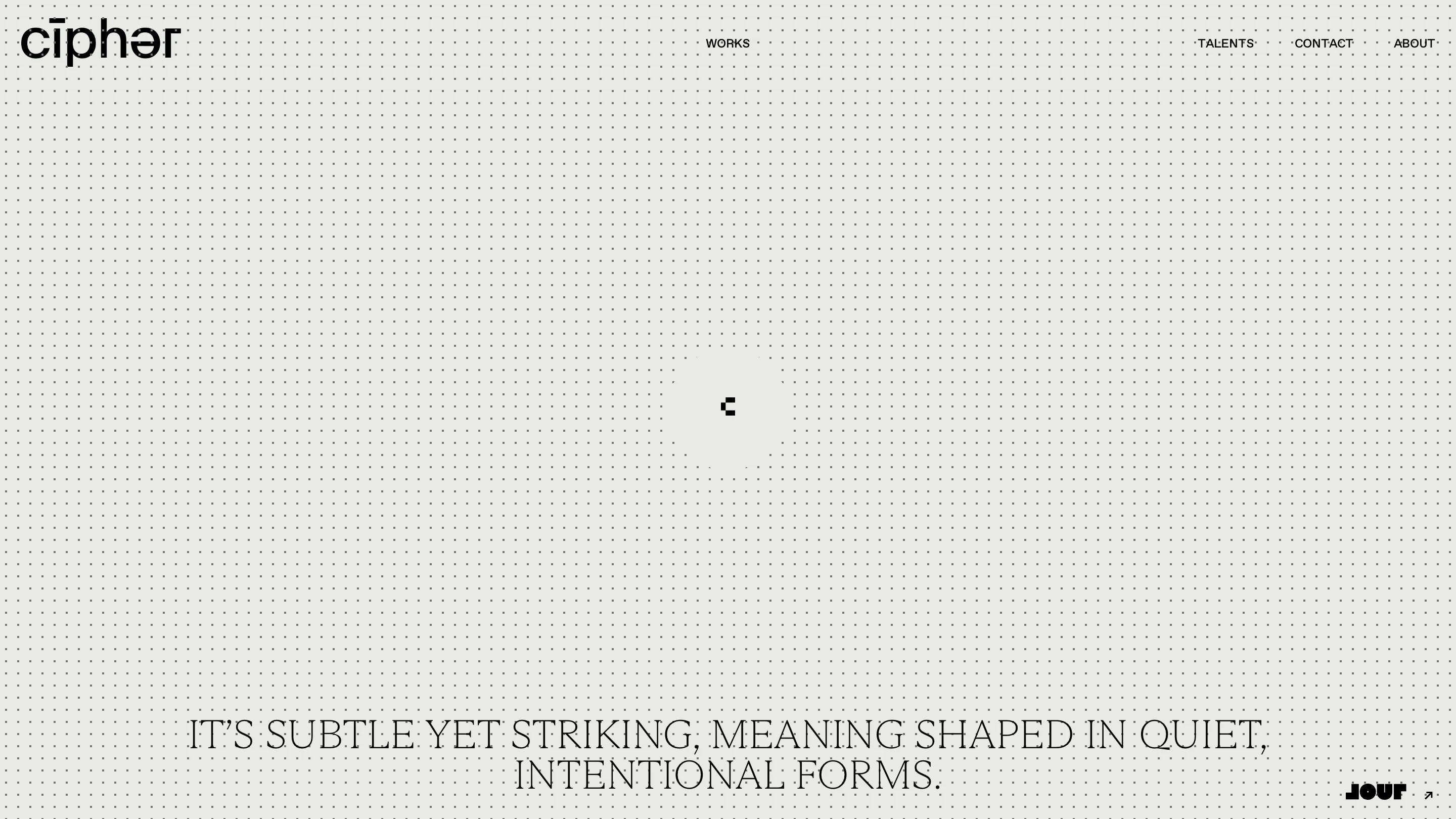
That flip is the art direction in one move. The reel is the loud part, so the reel gets the dark room. Everything Cipher says about itself gets paper.
The letter C does most of the work
Cipher is a production company born in Paris, and the site treats its own initial as the identity system. The wordmark sets it as cīphər, a macron over the i and a schwa where the e should be, so the logo reads like a pronunciation key. The cursor is a lowercase c. On the about page the same shape hardens into a ©, parked in the middle of the screen like a watermark.
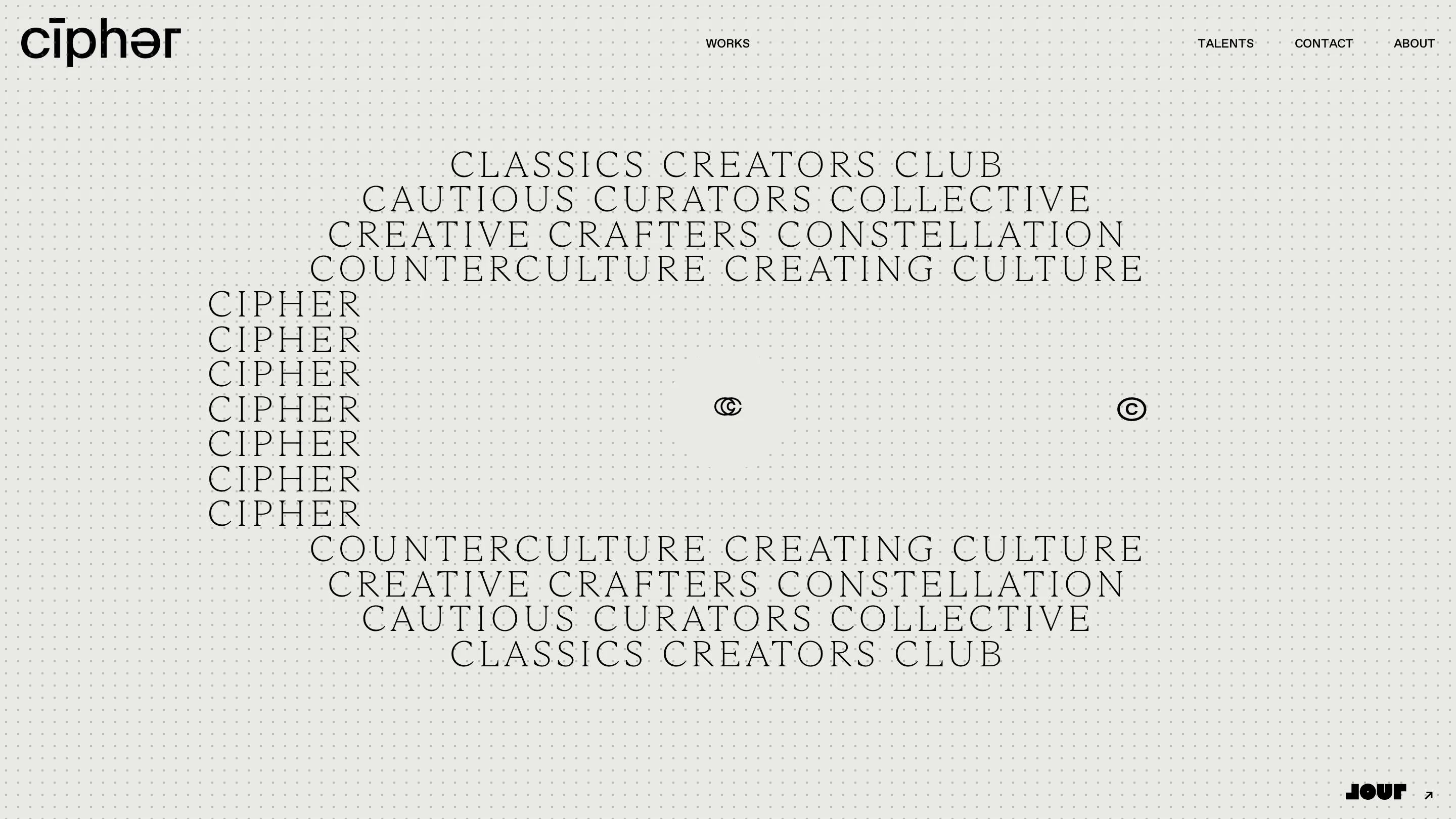
Then the about copy. CLASSICS CREATORS CLUB. CAUTIOUS CURATORS COLLECTIVE. CREATIVE CRAFTERS CONSTELLATION. COUNTERCULTURE CREATING CULTURE. Every word starts with a C, the four lines stack centred and get wider as they fall, a column of CIPHER repeats seven times down the left, and the four lines mirror back out underneath. Read it as a company description and it's four alliterative slogans. Look at it as a shape and it's a lens, wide at the top, pinched through the middle, wide again at the base.
Talents gets a poster instead of a grid
A roster page is usually a grid of headshots with names underneath. Cipher gives each name a poster. ALJAZ sits huge in the same engraved serif, DIRECTOR underneath in small letterspaced caps, one black-and-white portrait below it, halftoned so the page's dot grid reads straight through the image. The role filters, director and photographer, sit small in the left margin and stay grey until you pick one.
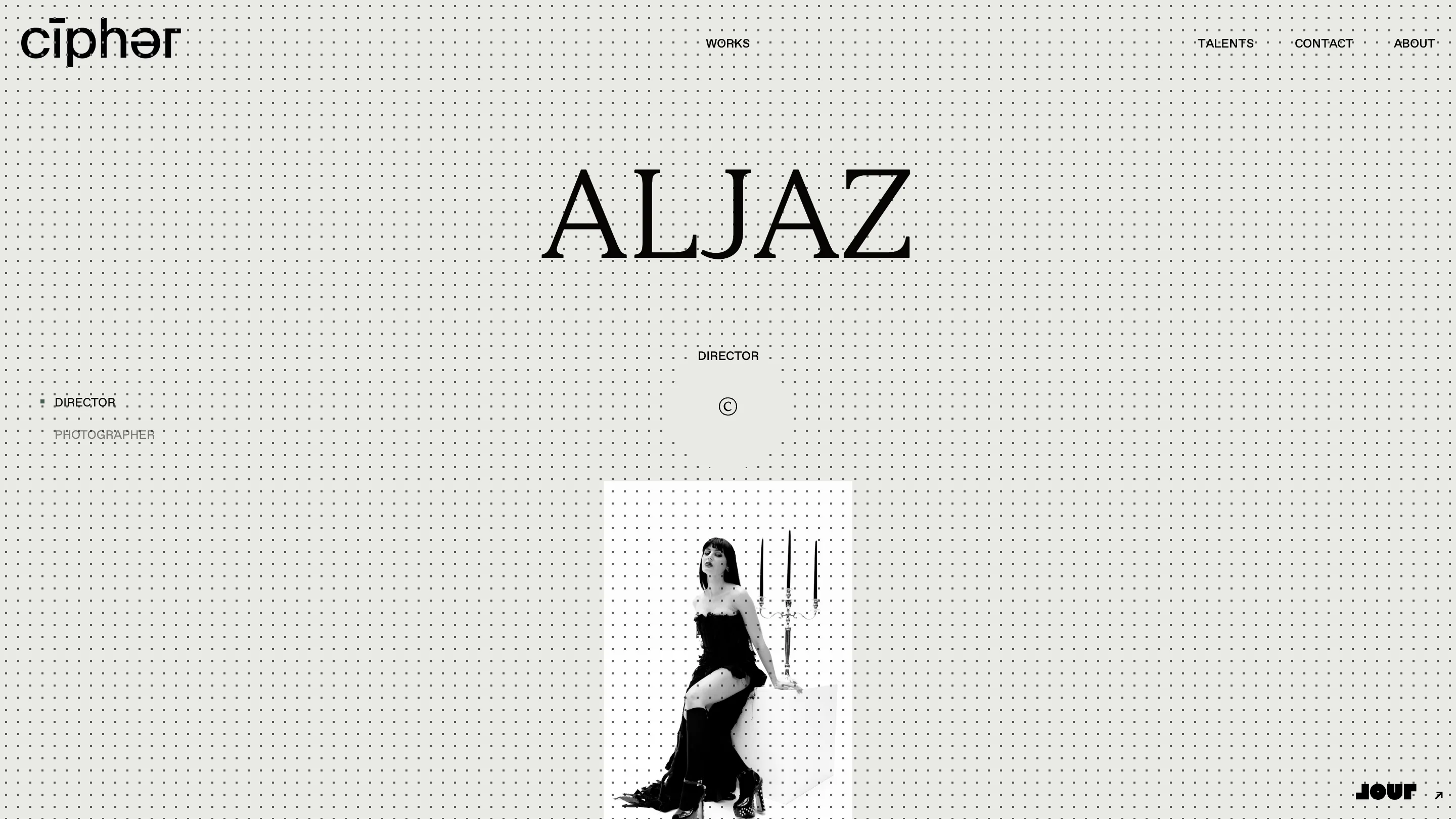
One name at a time is a slower way to browse a roster. It's also the only arrangement where the type gets to be the point, and on a site this stripped the type is carrying the brand.
What the judges were rating
The score splits into 7.54 design, 7.4 creativity, 7.35 content and 7.17 usability. That last number is the honest one. A homepage with no words on it asks a visitor to trust the company before it tells them anything, and the loader runs long enough for you to wonder. Magnetism, the Paris agency that built it in Nuxt with GSAP, picked up a Developer Award at 7.28 on the same entry, with Elisa Dubois and Valentin Mor credited alongside.
The move here is easy to describe and hard to hold. One letter, two colours, one typeface with a strong voice, and a refusal to add a third of anything. The footer signs off with "for culture and its counter", and the site earns the line by being this stubborn about its own alphabet.

