

Oimachi runs a studio site on sidebar navigation
Oimachi pins a client index to the left edge and opens every case study in the pane beside it. Site of the Day on 21 August, scored 7.31.
Oimachi keeps the client list pinned to the left edge of the screen and never takes it away. Click Evooq and the case study opens in the pane on the right while the index stays exactly where it was, the plus sign on the Evooq card flipped to a minus. The Copenhagen studio Oimachi took awwwards Site of the Day on 21 August 2026 with a 7.31, and the sidebar navigation is the reason to look at it.
The index is the interface
The left rail holds seven cards, one per client, each with a rounded logo tile and two lines of plain description. Evooq: Swiss wealthtech serving the world's biggest banks. Danelec: global leader in maritime data collection and analytics. Above every card sits a small grey label naming the sector. Fintech, Maritime, Pharma, Networks, Recruitment, Sports Tech, Real Estate.
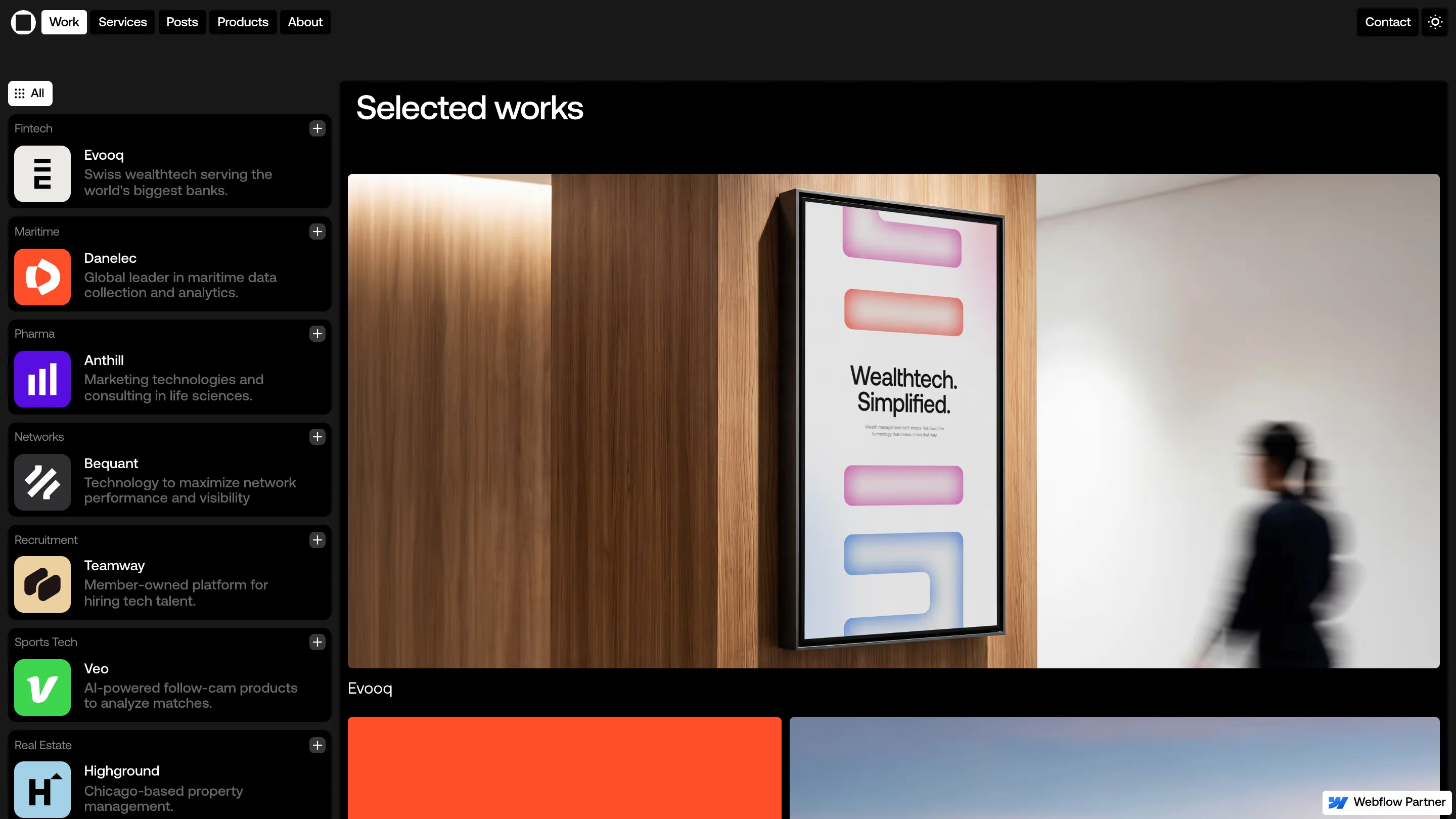
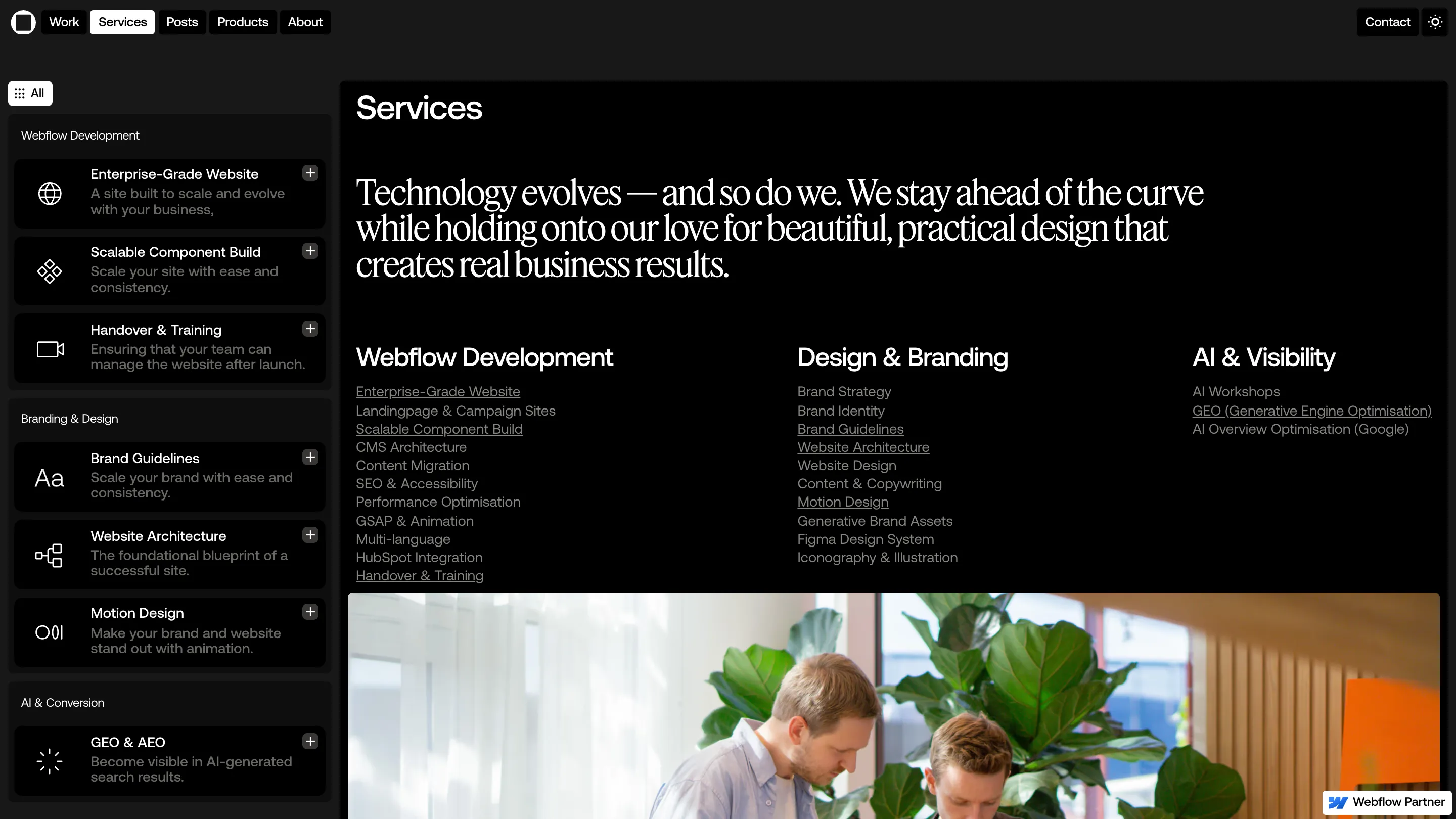
That rail doesn't move between pages. Go to Services and the same column reloads with service cards under Webflow Development, Branding & Design, AI & Conversion. The shell stays, the contents swap. It's the pattern of a mail client, and on a portfolio of seven projects it holds up. You read the entire body of work without scrolling, then open one piece of it without losing your place.
One glyph does the breadcrumb's job
Each card carries a plus in its top right corner. Open a project and that plus becomes a minus. No highlight bar, no colour change, no label saying you are here. One character tells you which of the seven is currently in the pane, and the same character invites you to close it.
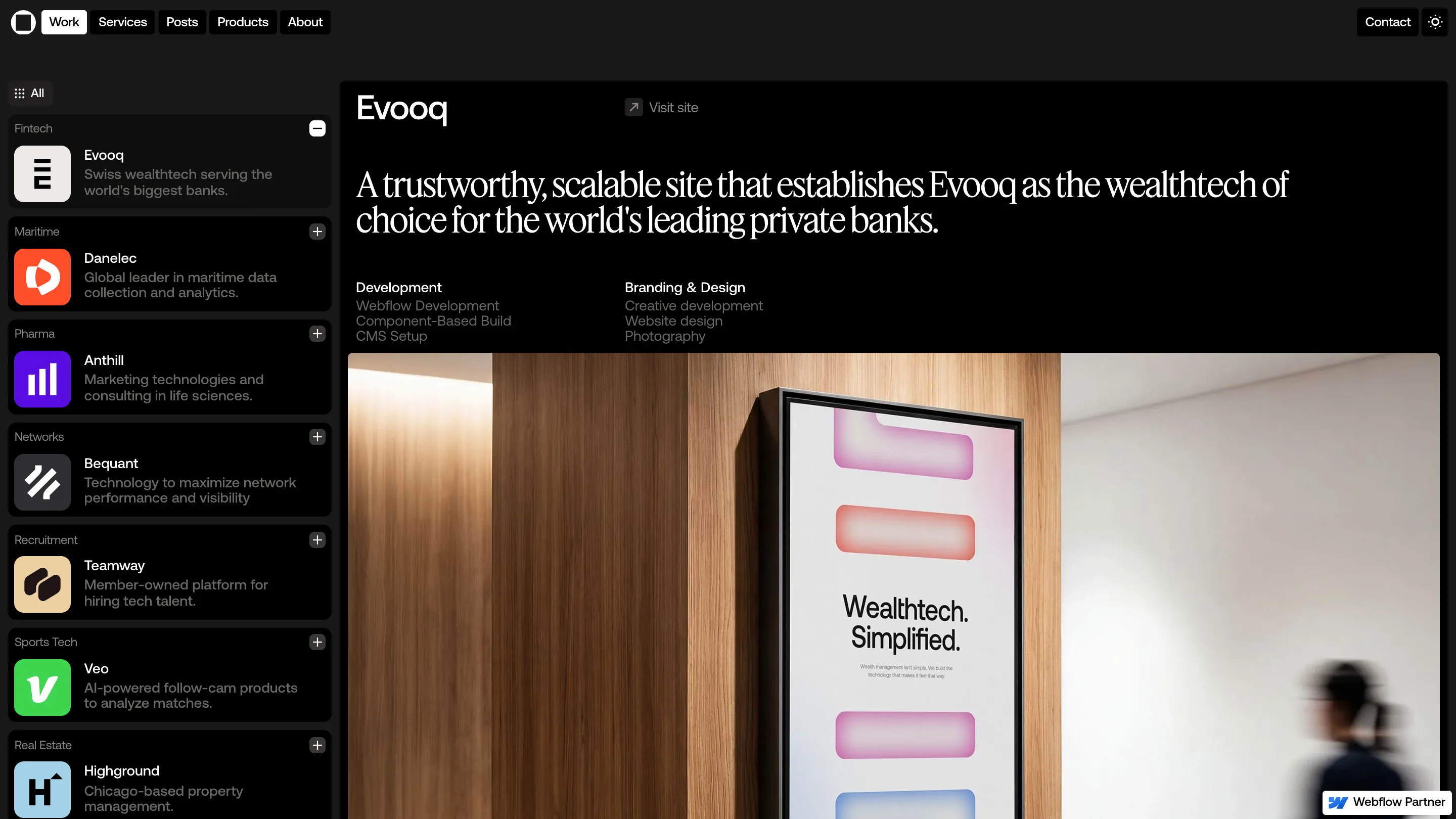
The case study itself is laid out for a buyer rather than a scroller. Project name, a Visit site link, one serif sentence saying what the work achieved, then two short credit columns: Development on the left, Branding & Design on the right. Photography starts below that. A prospect can read the whole pitch for a project in the top third of the pane.
Two typefaces, each with one job
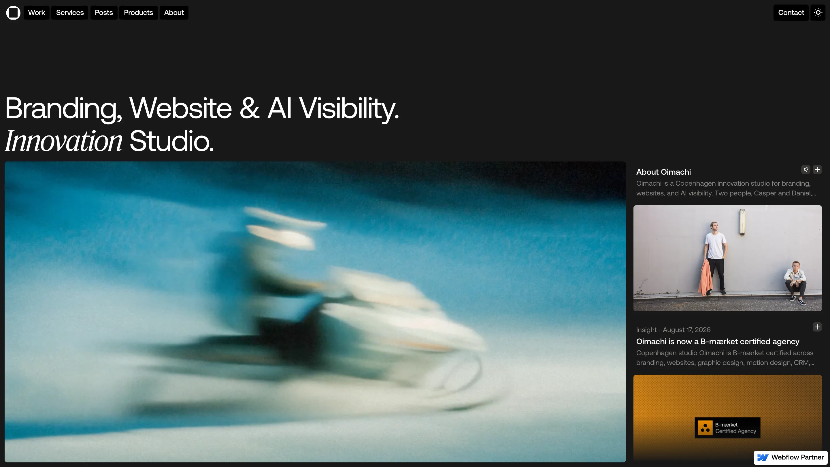
The homepage headline reads "Branding, Website & AI Visibility. Innovation Studio." in a neutral grotesque, except for the word Innovation, which is set in a serif italic. One word out of seven. It's the only decoration above the fold, and it keeps the line from reading like a price list.
The serif comes back at full size inside, where it carries the sentence the studio most wants read. On the Evooq page: "A trustworthy, scalable site that establishes Evooq as the wealthtech of choice for the world's leading private banks." Sans for the navigation, the labels, the service lists. Serif for the claims.
The score, and what earned it
The judges scored design 7.29, usability 7.38, creativity 7.26, content 7.31, with a separate development mark of 7.17. Usability came out on top, which fits the build. This is two people, Casper Nielsen and Daniel Bech, selling enterprise Webflow work to fintech and pharma buyers, and the site is arranged the way those buyers read: sector label first, one line on the client, one line on the result. GSAP handles the motion, and the theme toggle in the top right swaps the whole shell to light.
What the sidebar costs
Roughly a quarter of the viewport goes to the rail, so the photography lives in a pane instead of filling the screen. The Evooq shot of a poster on an oak wall with a figure blurring past would carry a full-bleed hero on any other portfolio. Oimachi gives that up to keep the index visible. For a studio site whose job is to move a prospect through seven projects and into a contact form, the trade is worth making, and it's the kind of decision a judge notices before the animation does.

