Grail's app landing page keeps the phone still
Grail's site pins one iPhone to the middle of the screen and lets chapter after chapter of serif type and colour change around it.
Grail's app landing page does one brave thing with its product shot: it leaves it alone. An iPhone sits dead centre, showing the same quest card, while chapter after chapter of type, colour and copy changes around it. The site, built by Denormalized for an iOS app that turns real-world quests into RPG stats, took awwwards Site of the Day on 4 November 2026 with a score of 7.35, plus the Developer Award at 7.57. Content scored highest of the four, at 7.71, and that's the right place to start.
A hero made of the quests themselves
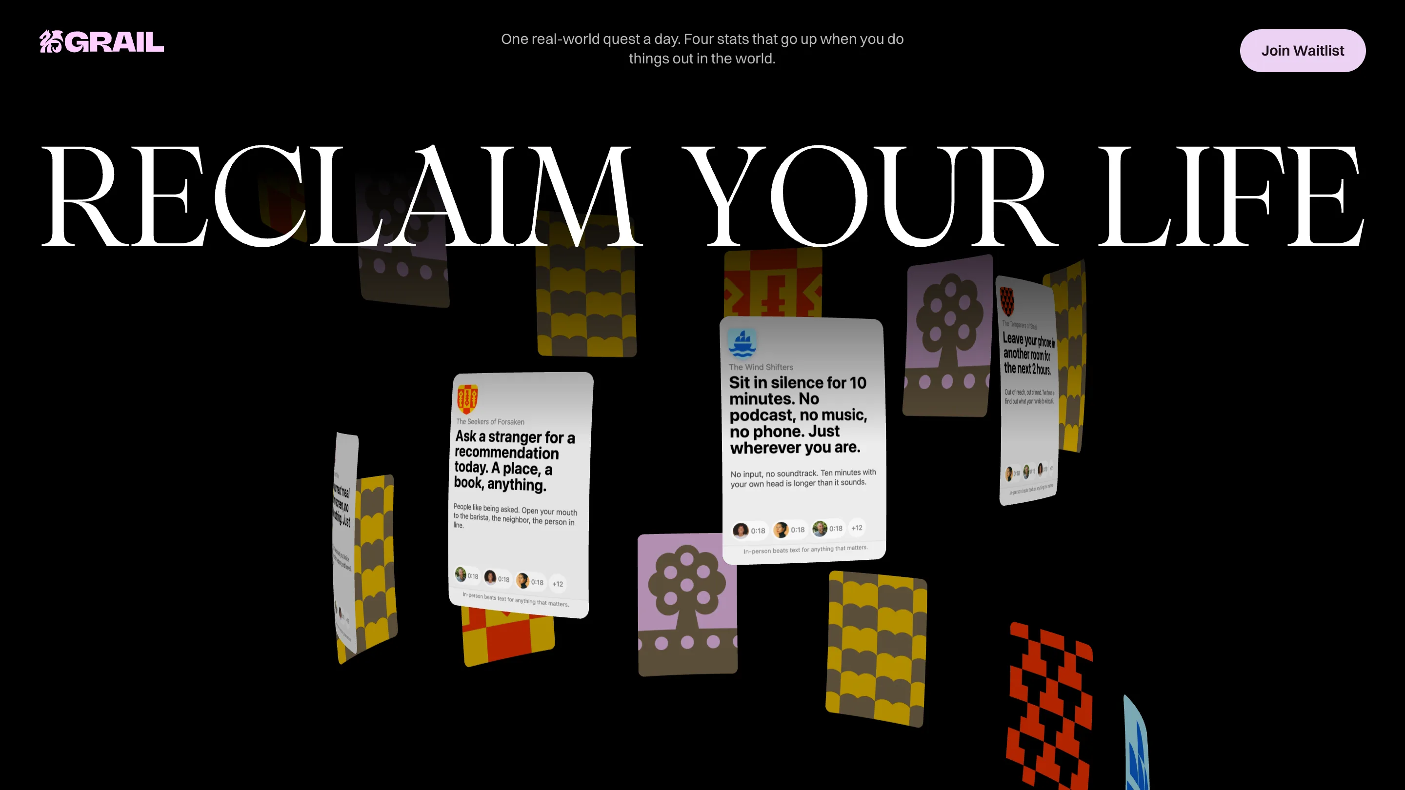
The page opens on black, with RECLAIM YOUR LIFE set wall to wall in PP Pangaia Light, a high-contrast serif with long, sharp serifs. Under it, quest cards float on a spiral of bent WebGL planes, mixed in with the guild crests: a purple tree, yellow scallops, a red cross-stitch pattern. Scroll or drag and the spiral turns.
Read the cards and you've read the product. "Ask a stranger for a recommendation today. A place, a book, anything." "Sit in silence for 10 minutes. No podcast, no music, no phone." Each one carries its guild name, a line of small print and a row of voice-note avatars marked 0:18. The hero is a sample of the feed, so nobody has to explain what a quest is.
One phone, eight chapters
Then the black gives way to a soft, cloudy pink, and the phone arrives in the middle. It stays there for most of the scroll. Each of the eight sections is labelled like a book, with a topic in the top left corner (About Timer, About Voice Feedback, About Stats) and a chapter number in the top right. The headline, the background and the two columns of text change. The phone barely does.
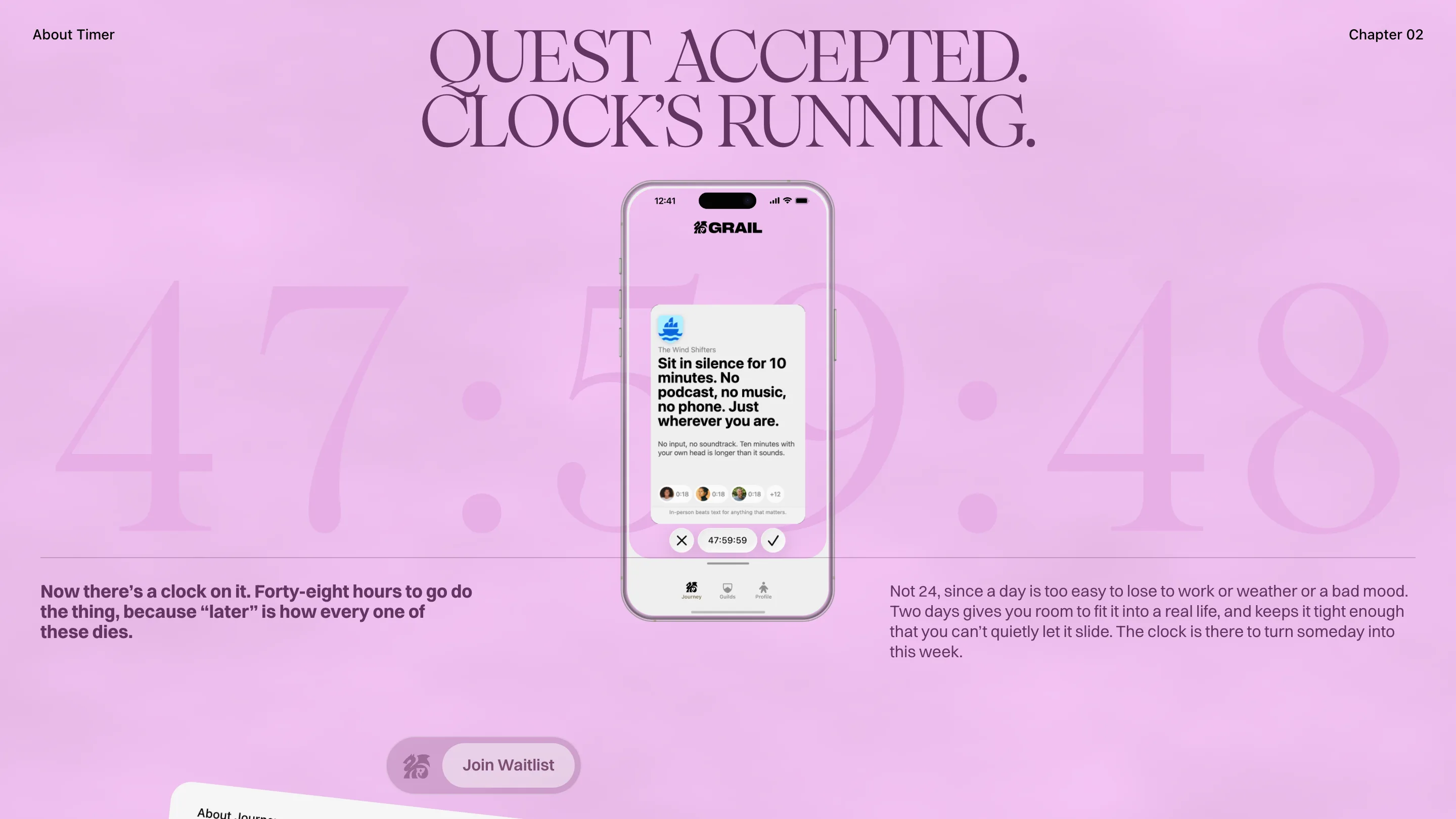
Chapter 02 shows why that works. QUEST ACCEPTED. CLOCK'S RUNNING. sits on top, and behind the phone a countdown reading 47:59:48 runs across the whole width in the same serif, tinted a few steps darker than the pink. The same timer appears small inside the app, 47:59:59 between a cross and a tick. You see the feature twice, once as the interface and once as a poster, and the poster explains the interface. The copy below gives the reason in plain words: 48 hours, because a day is too easy to lose to work or weather or a bad mood.
Keeping the device fixed is a discipline call. Most of the motion budget goes into the type and the ground, so the reader's eye has one stable thing to return to on every scroll. It also means each chapter has to earn its place with an idea, since the screenshot can't carry it.
Serif headlines split across the phone
Chapter 04, on voice feedback, splits its headline in two: TELL FUTURE SELF on the left, AND SEEKERS AFTER on the right, ranged to the outside edges, with the phone between them. Inside the app a black sheet slides up asking WHAT WAS THAT LIKE? in the same Pangaia caps. The site's display face is the app's display face, so the marketing and the product read as one voice.
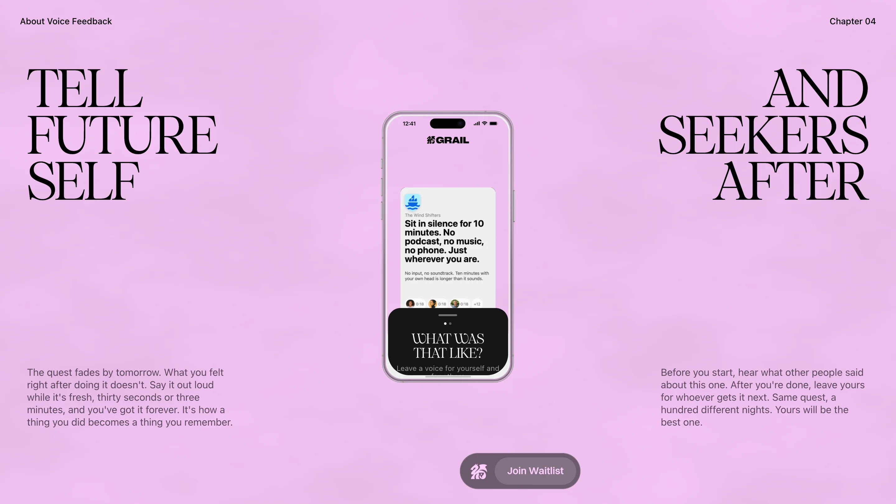
The body text is Switzer, a plain grotesk, set in two columns that sit low on the screen. It's the quiet half of the pairing. The serif does the shouting, the grotesk explains, and the line lengths stay short enough to read in one pass while the page is still moving.
Where it slips
Usability was the lowest score at 6.98, and you can feel why. The later chapters lean on scroll-driven reveals: the stats chapter, about strength, intellect, charisma and wisdom, builds its headline line by line over a dark, smoky ground, and if you scroll fast you catch half-drawn letters. The waitlist pill floats over the layout in a different spot on each chapter. Small costs, and the kind a judge notices.
What Denormalized got right is the hierarchy. One product shot, held still. One serif, used big. The quest copy, written with care, doing the selling. A site for an app about getting off your phone puts a phone in the middle of every screen, and still makes you want to go outside.