Neutomni builds its whole studio site out of its wordmark
A red and white Webflow studio site where one cut-up wordmark supplies the layout, the ornament, the loader and the footer.
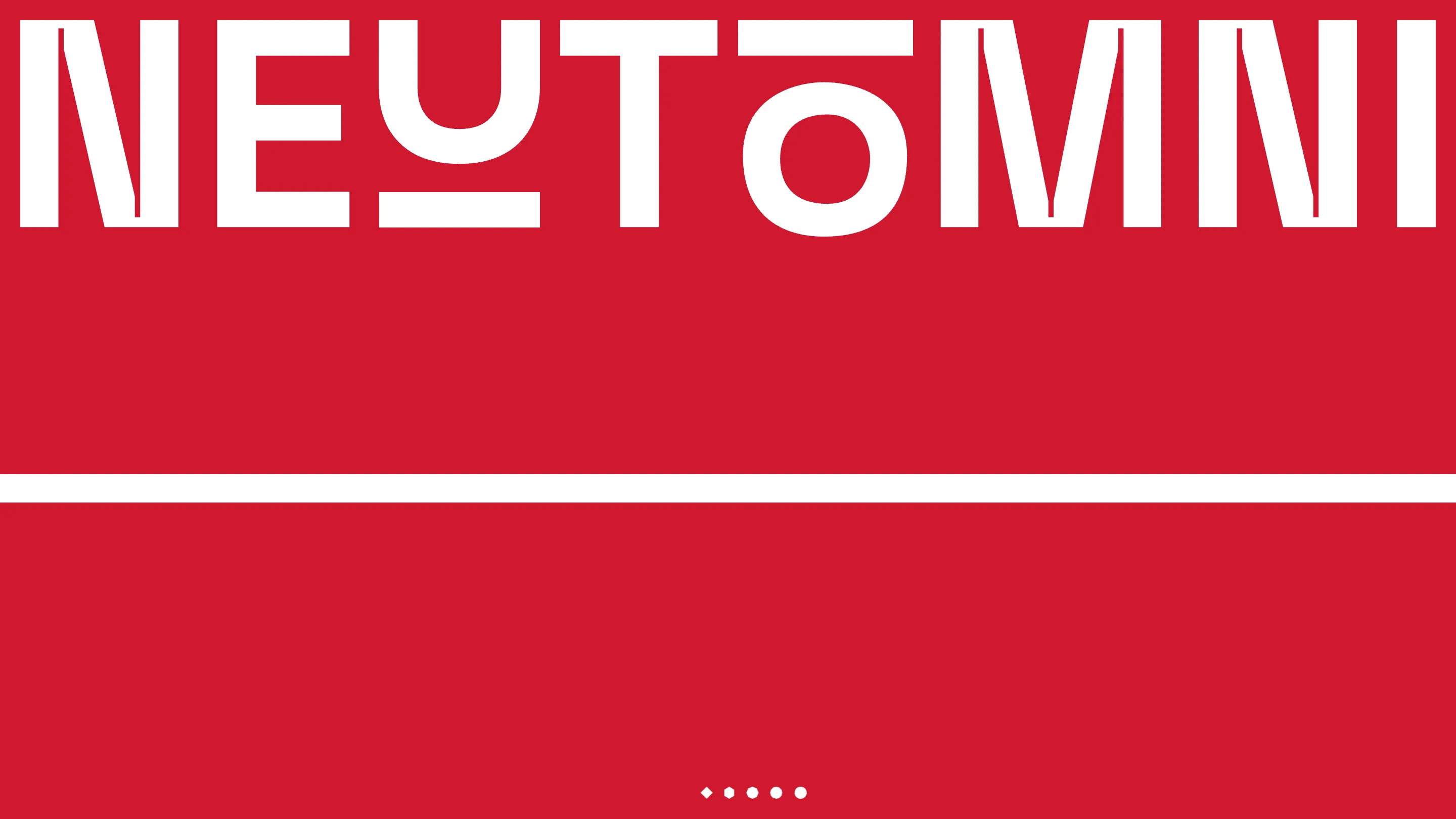
Neutomni's studio site runs on one asset: its wordmark. The letters are cut like a stencil, the U sits on a bar, the O wears a bar like a hat, and every shape the site uses after that comes out of those eight letters. The Polish Webflow studio took awwwards Site of the Day on 13 October 2026 with a 7.38, and the creativity mark (7.69) was the highest of the four. You can see why in the first second.
A wordmark that fills the screen
The home opens on a field of red, #CF1830, with NEUTOMNI set edge to edge across the top. No nav bar fighting it, no headline under it. A single white rule cuts the red in half, and at the foot of the screen five small white marks sit in a row: a diamond, a hexagon, then shapes that round off into circles. That row is the loader, and it's also the brand's grammar in miniature. Straight edges turn into curves, the same way the wordmark mixes a square N and E with a fat round O.
It's a confident way to start a studio site. A visitor gets the studio's taste before reading a single sentence.
The letters keep working as you scroll
Scroll down and the wordmark doesn't leave. It slides up and gets clipped, so only the tops of the letters show as a red band over the process section. The four steps hang under it like pages pinned to a rail: numbered 01 to 04 in a monospace, each a tall red panel with a dashed centre line and one drawn object. On the last panel, post-launch support, that object is a thin white circle with a dot on the line, which reads like a target or a lens.
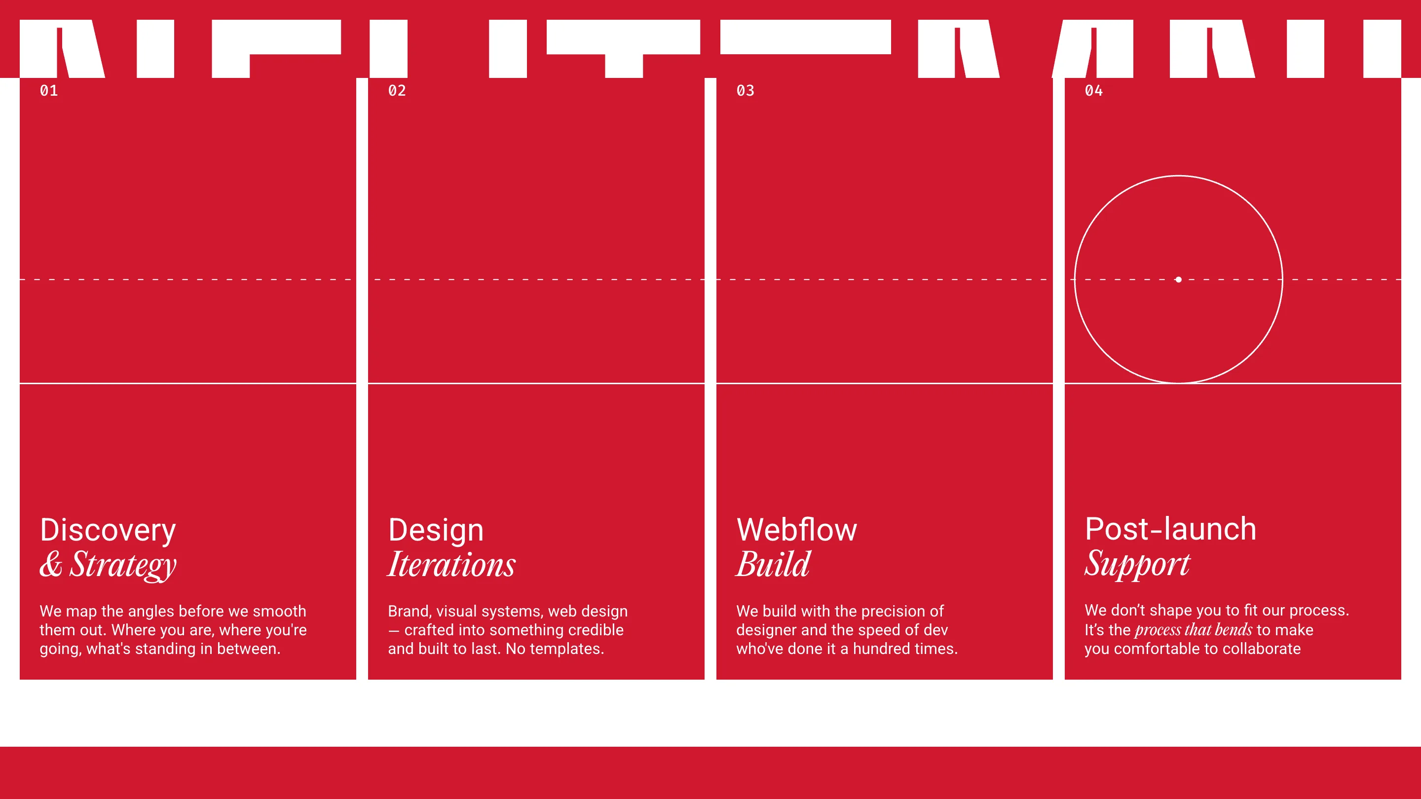
The titles are where the type pairing lands. Each one sets the first word in a plain grotesk and the second in a soft italic serif: Discovery & Strategy, Design Iterations, Webflow Build, Post-launch Support. Three families on one panel (mono for labels, sans for body, serif italic for emphasis) and it still reads clean, because each family has exactly one job.
A break in the colour, on purpose
The site holds red and white so strictly that the one exception hits hard. Midway down, the page turns into a blurred sky blue, the kind of default wallpaper you'd find on an old desktop, and a line comes into focus word by word: "We keep our focus on important things." The first words stay soft. Only the italic pair at the end resolves. The copy is about focus, and the screen does it.
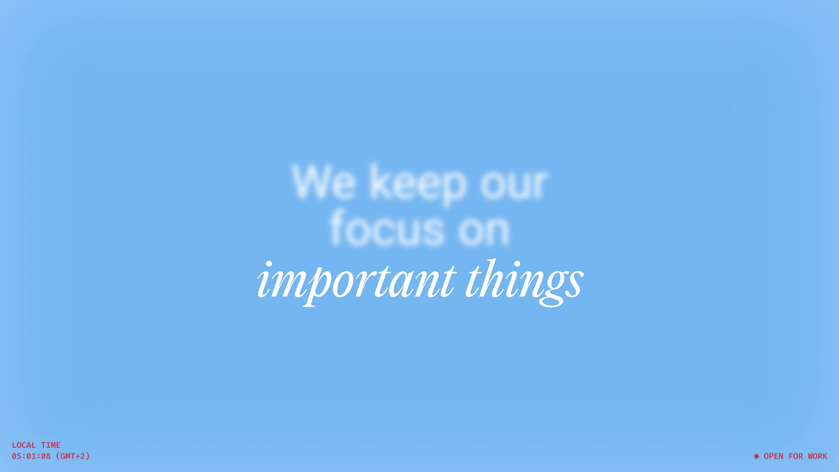
This is where the retro UI comes in. The site borrows from early desktop software: files labelled Pricing.html and FAQ.md, a mock menu bar, a CRT monitor showing a wallpaper you'll recognise if you used a PC in 2002. A live clock in the corner gives the studio's local time in GMT+2, with a small red "open for work" next to it. It's playful, and it never touches the type system, which is what keeps it from turning into a theme.
The footer closes the loop
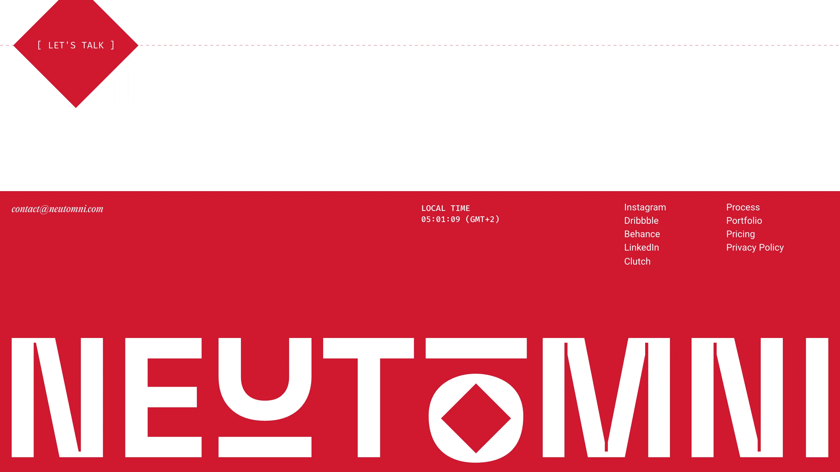
The footer brings the wordmark back at full size, and this time the O holds a red diamond in its counter. It's the same diamond as the "Let's talk" button above it, a rotated square with the call to action in bracketed mono caps. The loader at the top promised a set of shapes. The footer puts one inside a letter and signs off.
What a designer can take from it
Neutomni is a small team, Andrii Chernysh on design and strategy and Natalia Matys on Webflow and motion, and the site shows how far one well-drawn mark can carry a small studio. One red, one white, three typefaces with fixed roles, and a wordmark whose parts double as the ornament. Everything else on the page (the pricing tiers, the testimonials, the FAQ) can stay plain, because the identity already did the talking.