CoffeeTech's manufacturer website design is drawn in vw
CoffeeTech sizes type, padding and radii in viewport units, so the page scales as one drawing. A close read of Or Halevi's Webflow build.
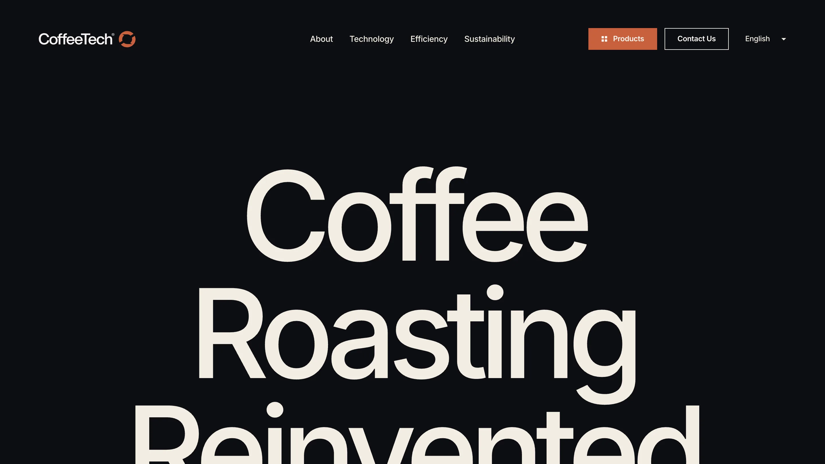
CoffeeTech sells industrial coffee roasters out of Matsli'ah, Israel, and its site is sized almost entirely in viewport units. Display type, section padding, corner radii, the hairline on a button: each one is a fraction of the screen width. The page redraws at the same proportions on a 13-inch laptop and a 32-inch monitor. Or Halevi built it in Webflow with a hand-written CSS and GSAP layer on top, and the result is a manufacturer website design that behaves like a printed catalogue.
One drawing, scaled
Numbers straight from the stylesheet. The display type runs at 10.31vw, tracked at -0.07em, with a line height of 0.85. Section padding is 4.63vw. The grid gutter is 2.89vw. Corner radius, 0.868vw. The category chips under each machine are set at 0.619vw. There is barely a pixel value in the file.
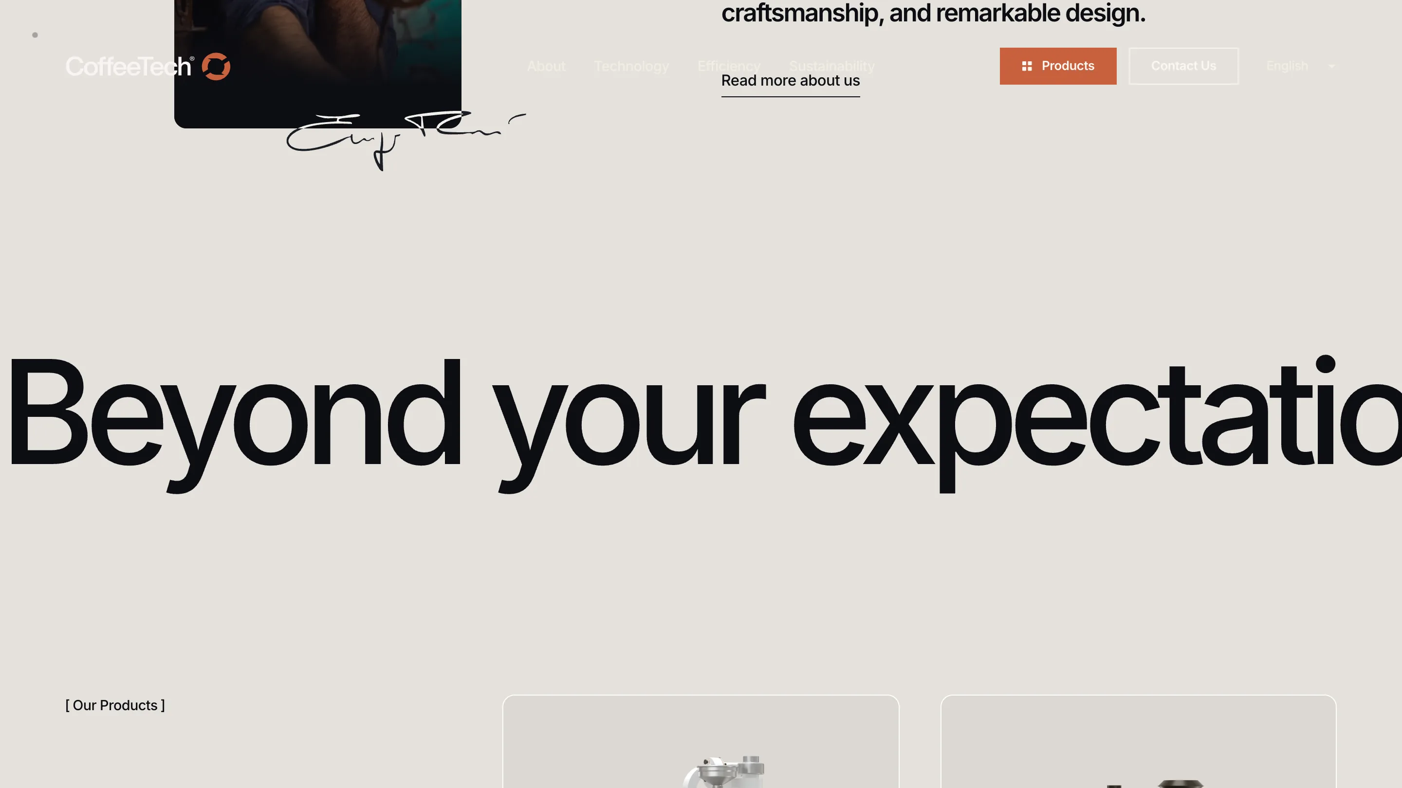
That is why the home page reads the way it does. "Coffee Roasting Reinvented" fills the viewport edge to edge because it was never given a fixed size to outgrow, and the rule holds on a phone, where the same display class jumps to 28vw.
There is a cost. At 1280px wide, 0.619vw lands around 8px, and viewport type ignores the reader's browser font-size setting. Zoom still works. Someone who raised their default text size to 20px gets nothing.
The header reads what is under it
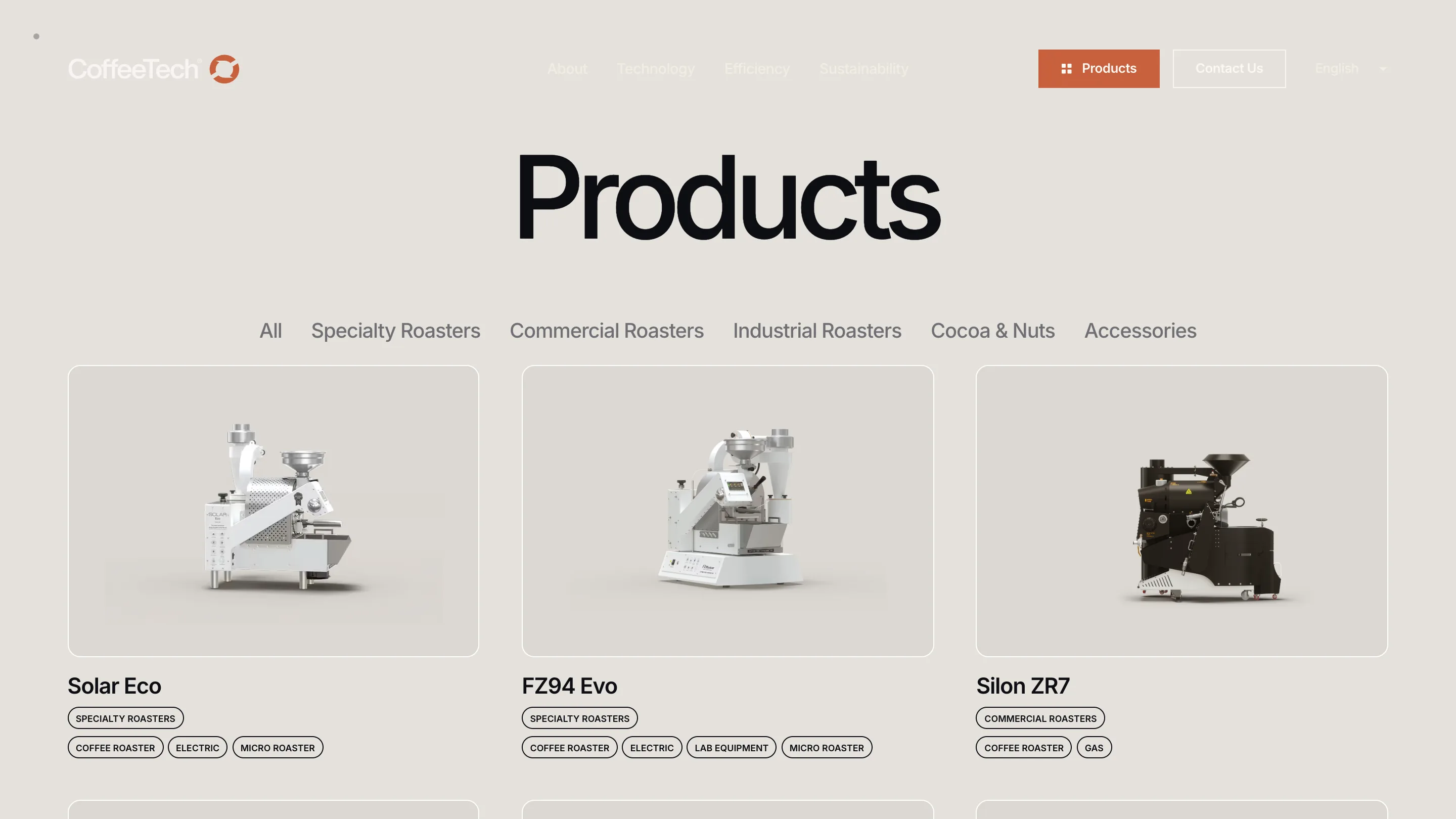
The site alternates between a near-black #0D0E13 and a cream #F3EDE3, sometimes twice in one scroll. A fixed bar would vanish at every switch. Halevi kept the header transparent and swapped the ink: a class called above-light-theme flips the nav colour, crossfades between two logo files and redraws the outline button's border, all on one shared 0.5s transition token. Watch the Contact Us outline go from cream to near-black as the product grid comes up. Nothing moves. Only the colour does.
Where manufacturer website design gets hard

Dozens of machines across five categories, each with a spec sheet behind it. The catalogue handles that with a filter row of plain text, no chrome around it, then a three-up grid of cutout renders on flat grey cards. Each card carries its taxonomy as small pills: COFFEE ROASTER, ELECTRIC, MICRO ROASTER. It reads like a parts list, which is the right feeling for someone weighing a Solar Eco against an FZ94 Evo.
Orange, #C8603D, appears in two places: the primary button and the small control details on the machines themselves. Three colours in the palette, and the third one is rationed.
Hebrew gets its own layout
This is the part I would steal. Under html:lang(he) the site turns RTL, swaps the primary typeface from Inter to Google Sans, resets the h1 to 7.09vw and the h2 to 3.96vw, mirrors a set of images with scaleX(-1), and reorders two grids so the sidebar lands on the correct edge.
Then it makes an exception. A :has(.catalog-section) rule pushes the catalogue back to LTR, because the model names are Latin and a mirrored grid would have people reading FZ94 Evo backwards. Someone treated the second language as a design problem with its own decisions.
What carries over
The token file is the lesson. Next to the palette it holds --motion-duration: 0.6s, --standard-easing: cubic-bezier(.50, 0, 0, .99) and that separate half-second curve for the header theme change. Timing and easing live in the same place as colour, so the whole site moves at one tempo. For a factory selling roasters to cafés, that consistency does more work than any single effect on the page.