Figma auto layout spacing now matches how CSS does it
Auto spacing gets Around and Evenly next to Between. Same names, same ratios as CSS, so the Figma file says what the stylesheet says.
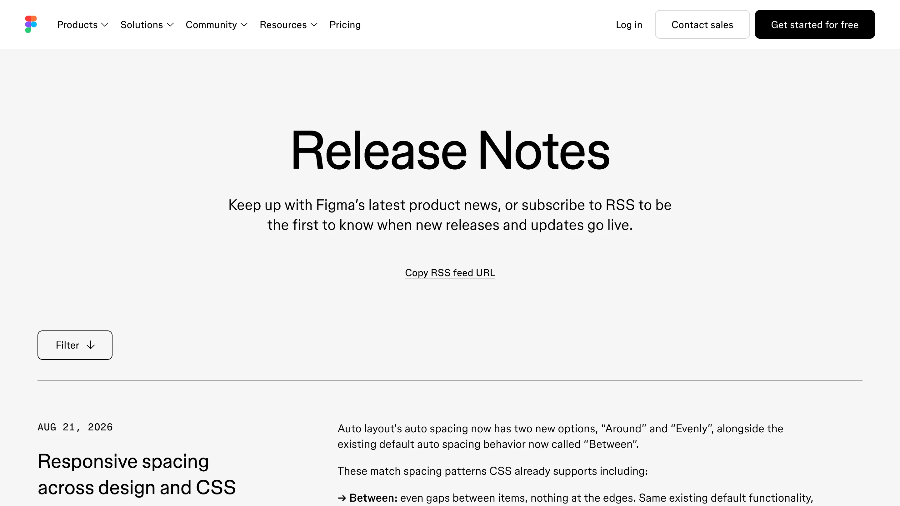
Figma shipped two new auto layout spacing options on August 21: Around and Evenly. The behavior you already had is now called Between. All three carry the same names as the CSS keywords they map to, which is most of the story.
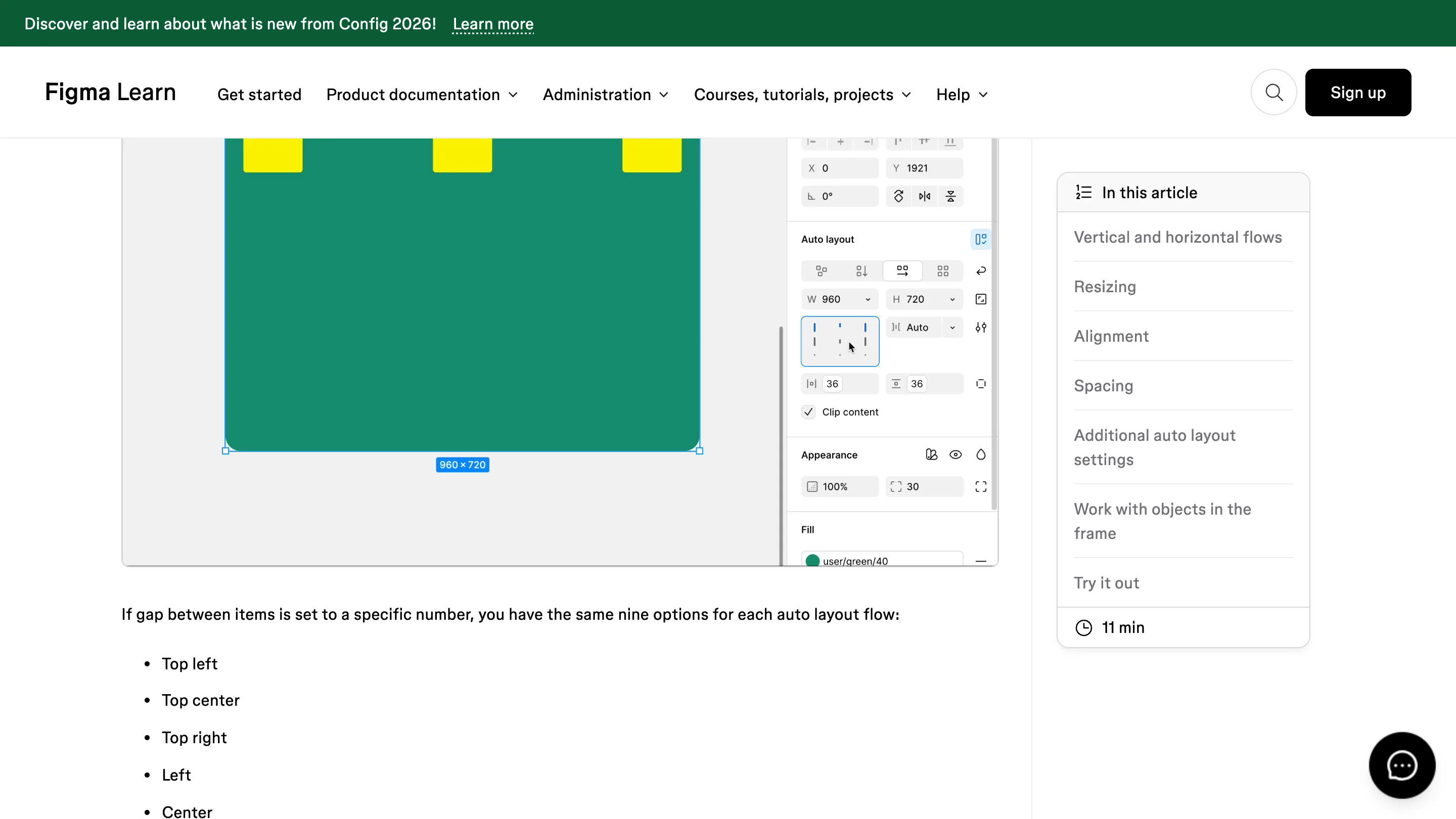
Auto spacing only shows up when Gap is set to Auto. Open the auto layout settings modal, find the Auto spacing dropdown, pick one.
The three options in plain terms
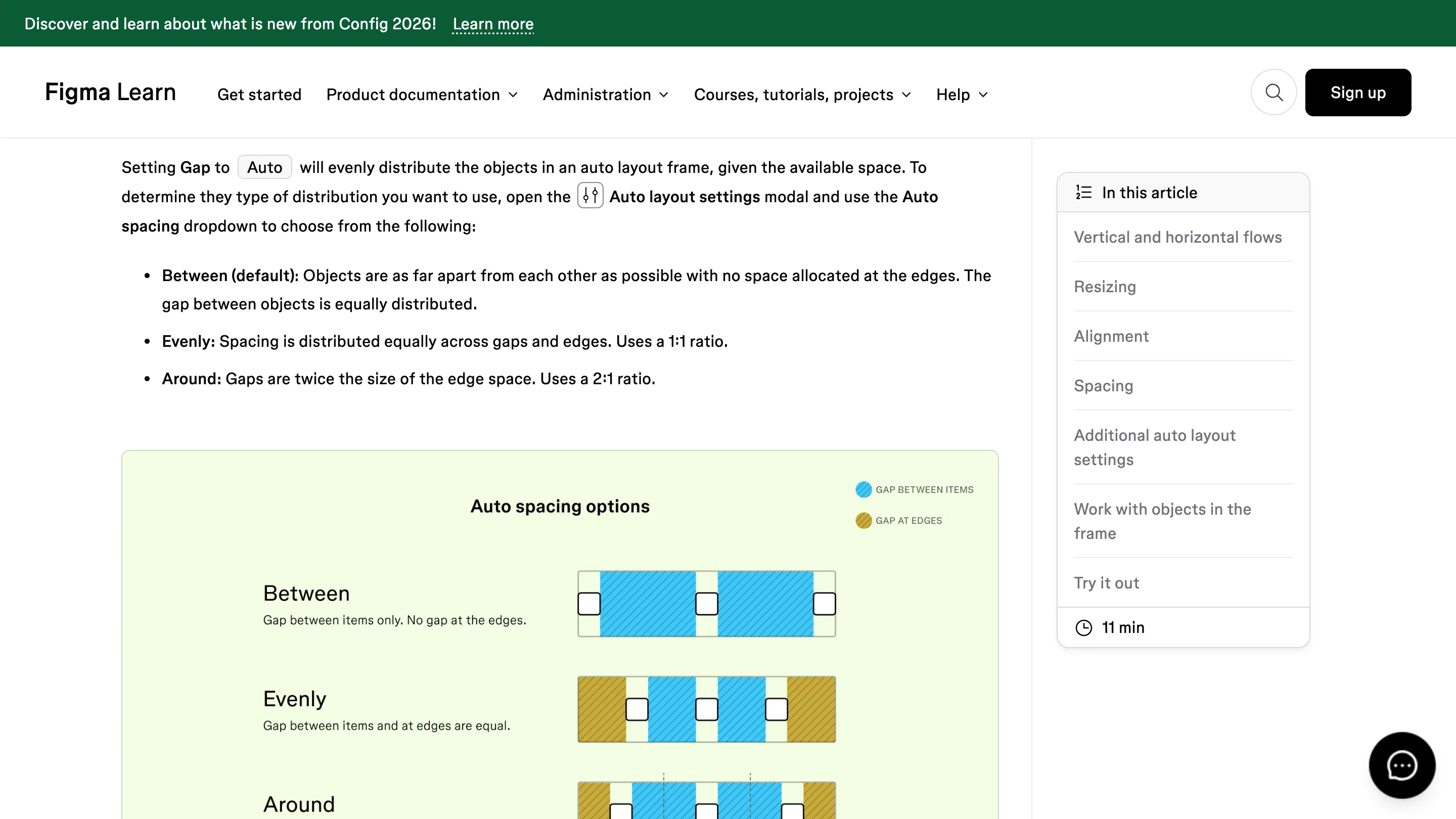
Between is the default and the old behavior. Objects sit as far apart as the frame allows, nothing at the edges. In the stylesheet that is space-between.
Evenly spreads the space equally across gaps and edges on a 1:1 ratio. Every gap in the row, including the two at the ends, comes out the same width. That is space-evenly.
Around makes the gaps twice the size of the edge space. A 2:1 ratio, so the item at the end of a row keeps half a gap of air. That is space-around.
The naming is the feature
You could always build these by hand. Set a fixed gap, add padding, redo the arithmetic when the frame resizes. It worked, and it broke the moment someone added a fourth item.
Using the CSS names is the part that changes the work. A designer says Evenly, the engineer reads space-evenly, and the review has no translation step in it. Design system teams have been writing that mapping into their documentation for years. The tool carries it now.
The overflow case changed too
Small detail, real consequence. When the objects in a frame are too big to fit with any positive spacing, the gap stops at zero. Items sit flush against each other instead of overlapping.
Anyone who has watched a tab row pile its labels on top of one another at a narrow breakpoint knows why that matters. The frame still fails, but it fails legibly.
Text got the same treatment a week earlier
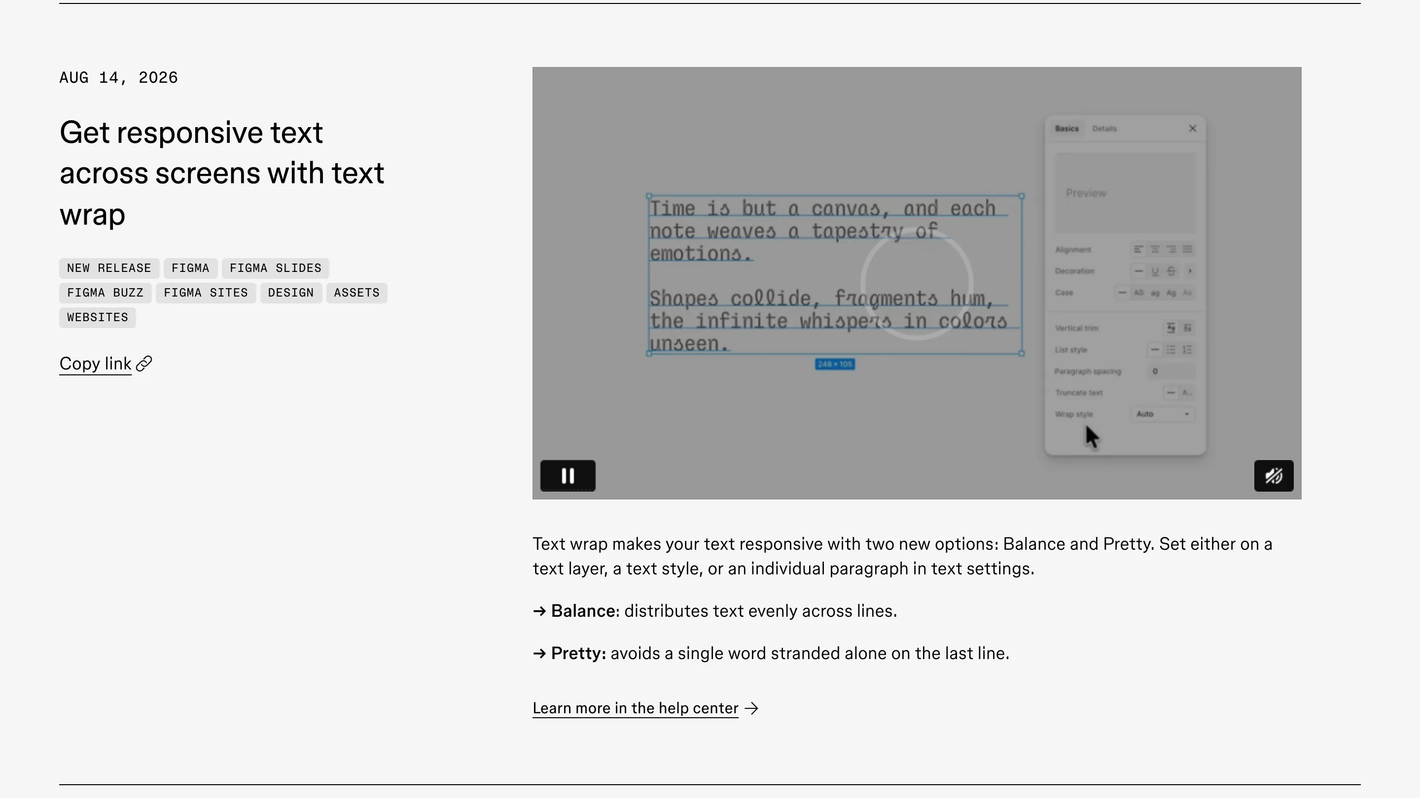
On August 14, text wrap picked up Balance and Pretty. You can set either one on a text layer, on a text style, or on a single paragraph.
Balance evens out the line lengths so a short block reads as a shape. Figma caps the advice at six lines, which is right: this is for headlines, buttons, badges, tooltips. Pretty keeps the lines full and adjusts the last four to stop one word stranding alone at the bottom. That one is for body copy and descriptions.
Dev Mode prints text-wrap: balance and text-wrap: pretty in the typography section. Same move as the spacing options. The canvas is learning the stylesheet's vocabulary.
Where it stops
Auto spacing needs Gap set to Auto. If your system tokenizes a 24px gap, none of this touches your components, and it should not. This is for the container that has to stretch: a toolbar, a tab row, a footer with three links in it.
Evenly and Around are also still rolling out, so you and the person reviewing your file may not have them on the same day. Check before you leave a comment about someone's spacing.
Open a frame with three items, set the gap to Auto, and cycle the dropdown. Thirty seconds tells you which of the three you have been faking with padding.