

nk.studio sets its 20-year archive in serif and teal light
The studio's anniversary site drops imagery and lets one big serif carry every page over a living teal glow. It took awwwards Site of the Day.
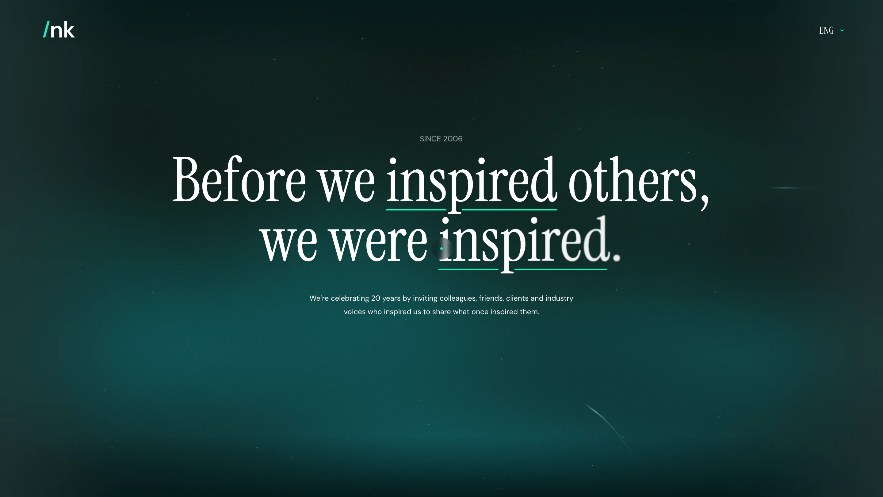
nk.studio spent its 20th anniversary building a website with almost nothing on it. No case studies, no reel, no grid of client logos. One serif, set large, floats over a deep teal glow, and the words do all the work. The project, called 20 Years Inspired by People, took awwwards Site of the Day on 7 August 2026 and a Developer Award the same day. It earns both by trusting type and restraint further than most studio sites dare.
The serif carries the whole page
Open the site and the first thing you read is a sentence, not a headline treatment: Before we inspired others, we were inspired. It's set in a warm old-style serif at display size, centred, white on a near-black teal field. A thin green rule slides in under two words as you land, the studio's one flash of colour against the ink. That green picks up the slash in the /nk logo top left, so the accent reads as brand rather than ornament.
Most studio anniversary sites reach for a showreel here. nk.studio reaches for a typeface. The serif does the branding, the pacing and the tone at once, and the page stays quiet enough that each line lands like a spoken sentence.
The glow is doing quiet work
Look past the type and the background is alive. A dark teal gradient breathes, black at the edges, a lit green-blue at the centre, with slow particles and faint light streaks drifting across it. A small glowing dot trails your cursor. None of it competes with the words. It reads like deep water or a night sky, an atmosphere that makes the white serif feel lit from within.
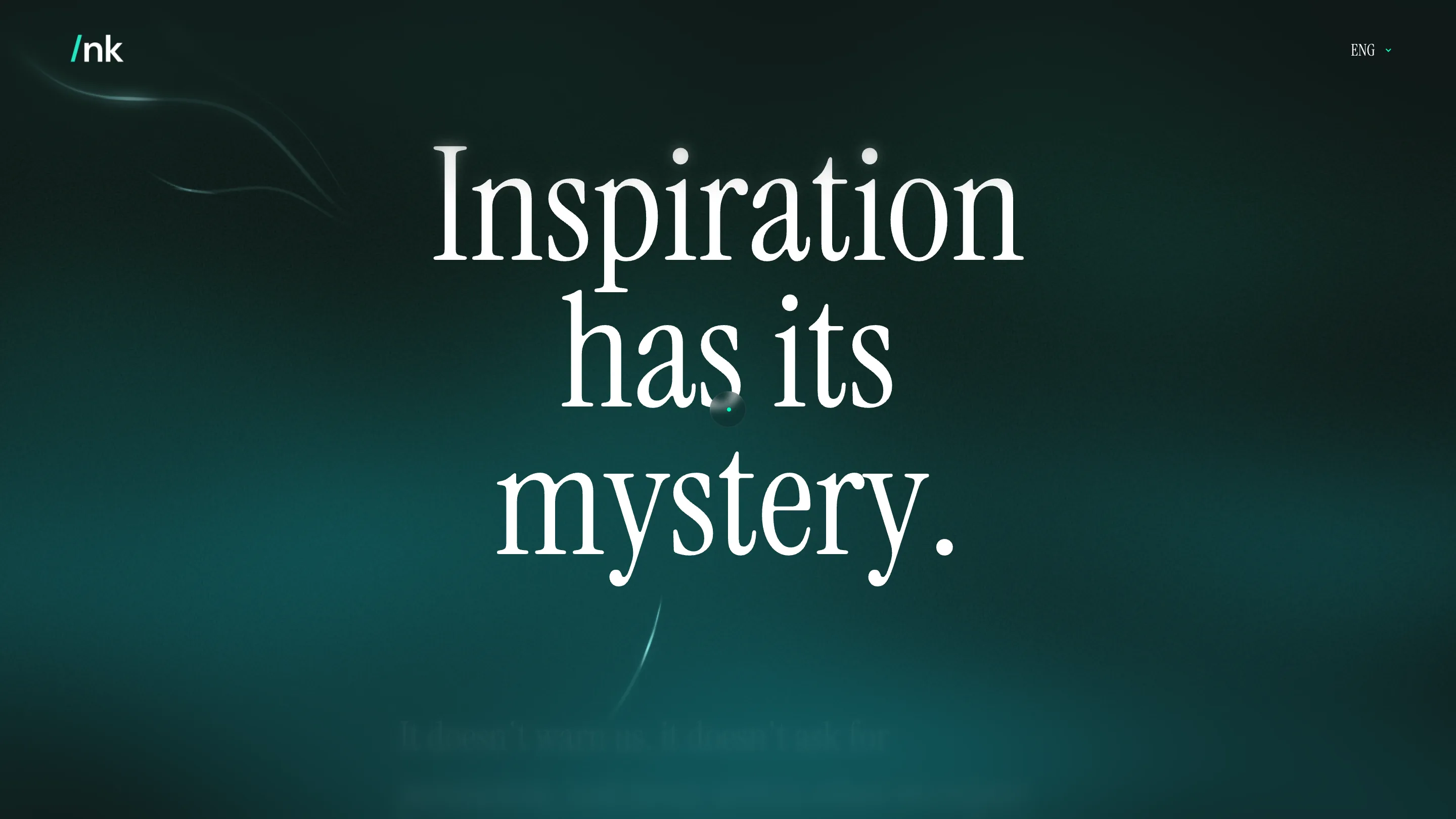
The manifesto page pushes the same idea harder. Inspiration has its mystery. fills the full height of the screen in three stacked lines, and the body copy underneath stays dim until you scroll to it. The restraint is the point. When the only element is type, the size, the weight and the line breaks become the layout.
An archive of people, set like a book
The concept underneath is simple and human. Over 20 years nk.studio asked the colleagues, clients and friends who shaped the studio to share what once inspired them. The site is the archive of those stories, and it's built to be read, not skimmed. There's a reading-mode toggle that strips the page back to plain text, plus a progress indicator and reading-time estimates, the kind of detail you'd expect from a long-form publication.
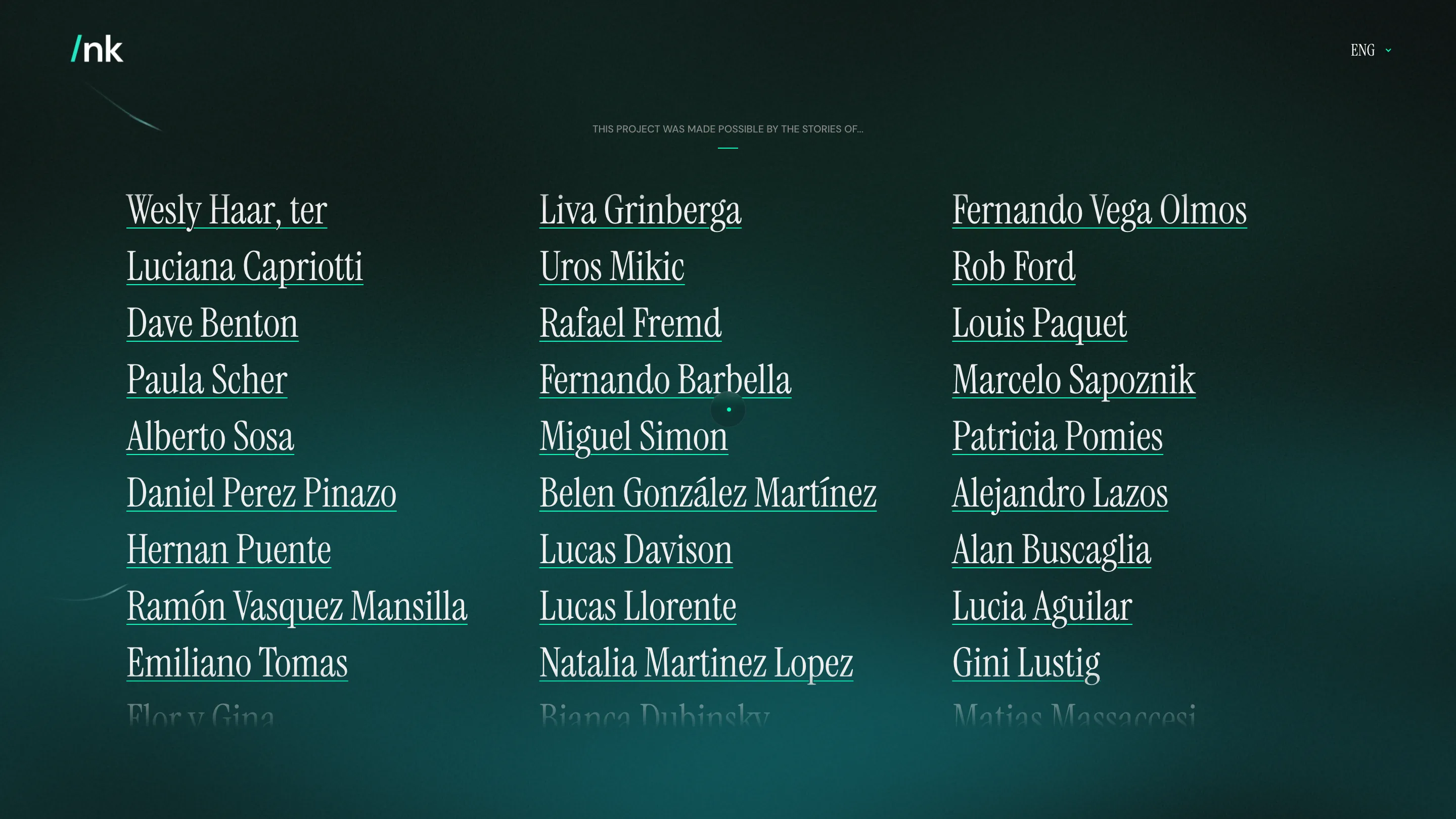
The credits page is the clearest example. Every contributor is a serif link in one of three columns, underlined in the same teal, names like Paula Scher and Fernando Vega Olmos sitting beside the studio's own people. The list fades out at the top and bottom edges instead of stopping hard, so scrolling feels like turning pages. It's a roll call rendered as typography, and it holds attention because the type is good enough to carry it.
Why it won
A judge rates two things here. The build is tight enough to earn a Developer Award: the motion stays smooth, the cursor and particle work never stutter, and the reading mode is a real feature rather than a toy. And the art direction commits. Picking one serif, one accent colour and one atmosphere, then holding that line across every page, is harder than piling on effects. nk.studio took an anniversary, usually an excuse for a highlight reel, and made something closer to a quiet book you actually want to read.

