Unbelievably Crap runs a portfolio as a surveillance feed
Liubomyr Ulytskyi's portfolio puts you under a surveillance HUD: coordinates, warnings, a log of awards and a 404 you can pick from the menu.
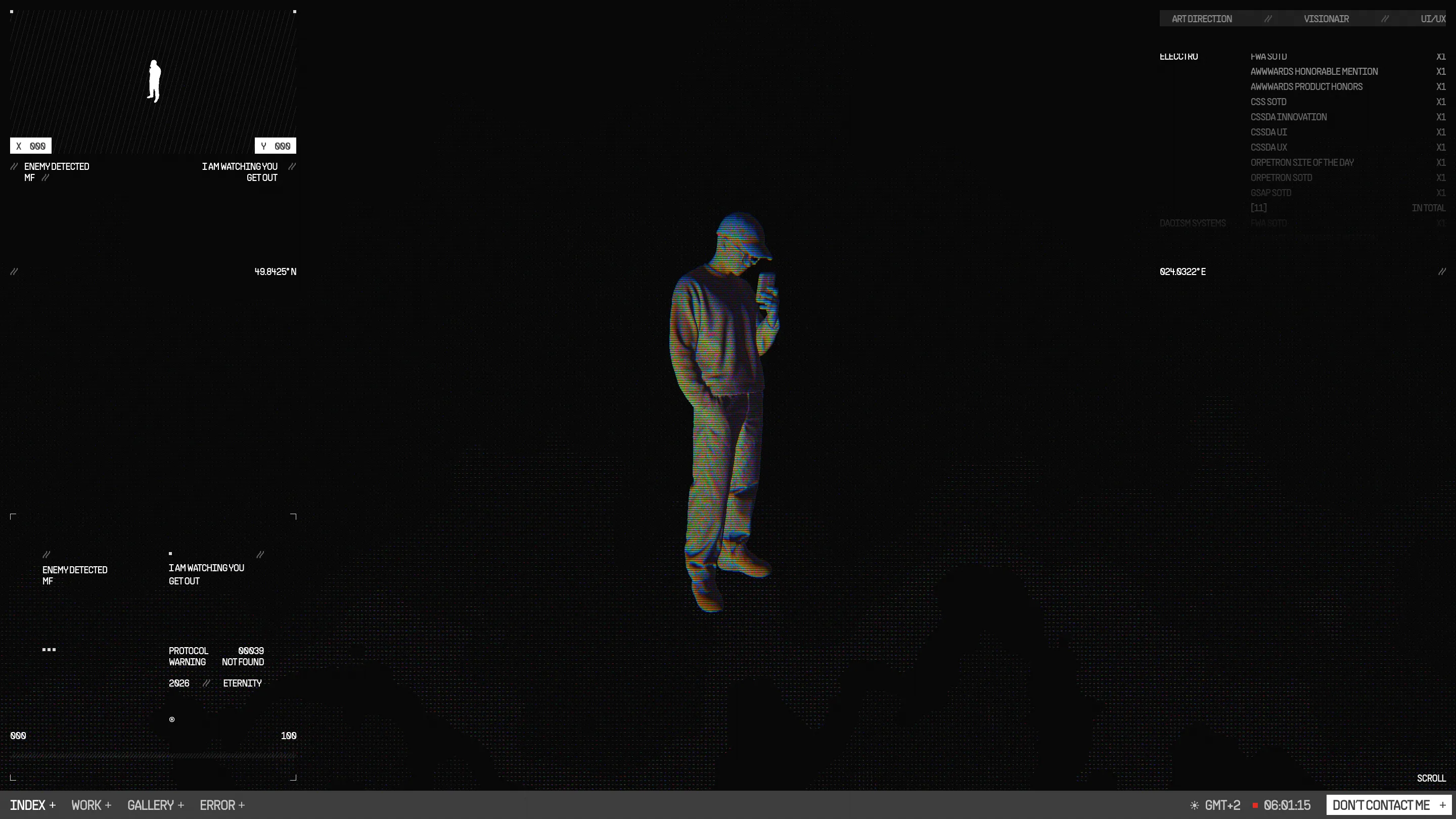
Liubomyr Ulytskyi built his portfolio as a surveillance feed. You land on a scanned 3D figure of the designer, standing in the dark with a phone in hand, and every corner of the screen reads you back: X and Y coordinates, a warning that says ENEMY DETECTED, and a line that tells you I AM WATCHING YOU, GET OUT. The site is called Unbelievably Crap, and it took awwwards Site of the Day on 29 October 2026 with a 7.44.
That surveillance HUD is the whole idea. Every page, every label and every error is a reading on a monitor somebody else is running, and you're the one being watched.
A portfolio that greets you with a warning
The first screen you get is a gate: "the crap experience is best viewed with a desktop. sorry, not sorry." Then a loader that says "your experience is loading" and a line of copy that sets the tone for everything after it: "design is dead. who killed it? you did."
The site tells you off from the first screen, and the tone holds. The contact button in the bottom bar reads DON'T CONTACT ME.
The surveillance HUD does the layout work
Look at how the home is built. The figure sits dead centre, rendered in WebGL with chromatic scanlines running across the clothes, so the figure reads like footage from a thermal camera. Around him, the interface works as a set of readouts. The top left is a radar box with a tiny white silhouette and live X and Y counters. The two coordinates at mid height, 49.8425° N and 024.0322° E, are Lviv, where Ulytskyi works. Lower down sits a status block: PROTOCOL 00039, WARNING NOT FOUND, 2026 // ETERNITY.
The awards list in the top right is the smartest move. It's set as a log, one row per award with an X1 counter and an [11] IN TOTAL line, and the rows fade out as they go down, like old entries scrolling off a terminal. The trophy shelf reads as data on a file.
All of it is set in one face, PP Supply Sans, in caps at small sizes. One typeface keeps the HUD believable: real instruments don't switch fonts between panels.
Work, gallery and error, all on the same monitor
The bottom bar never changes: INDEX, WORK, GALLERY, ERROR, a live clock with a red recording dot, and the contact button. Barba.js carries you between pages, so the bar stays put while the feed underneath swaps.
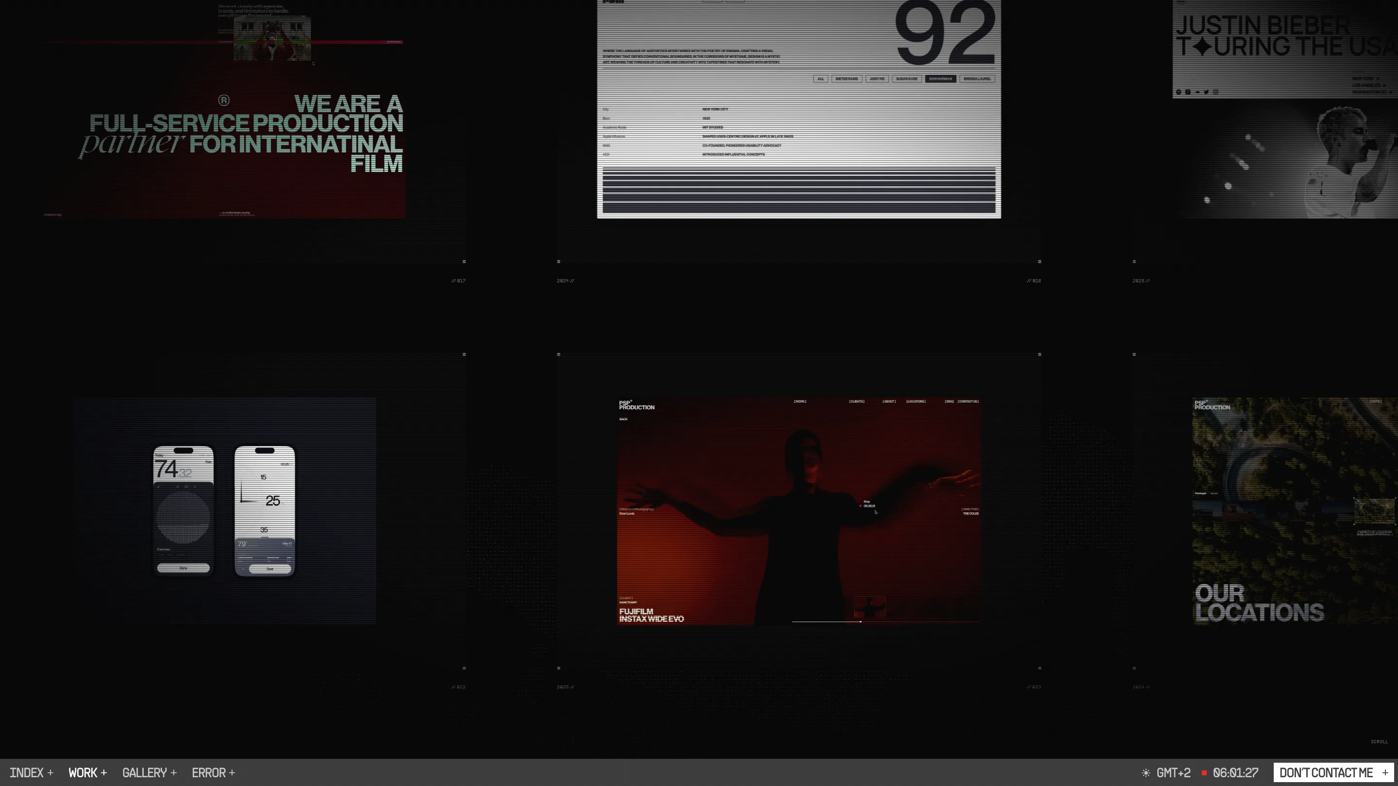
The work page lays the projects out as a wall of screens, each one under the same scanline filter, tagged with a file number like // 017 and a year. You're browsing a security desk, and the case studies are the cameras.
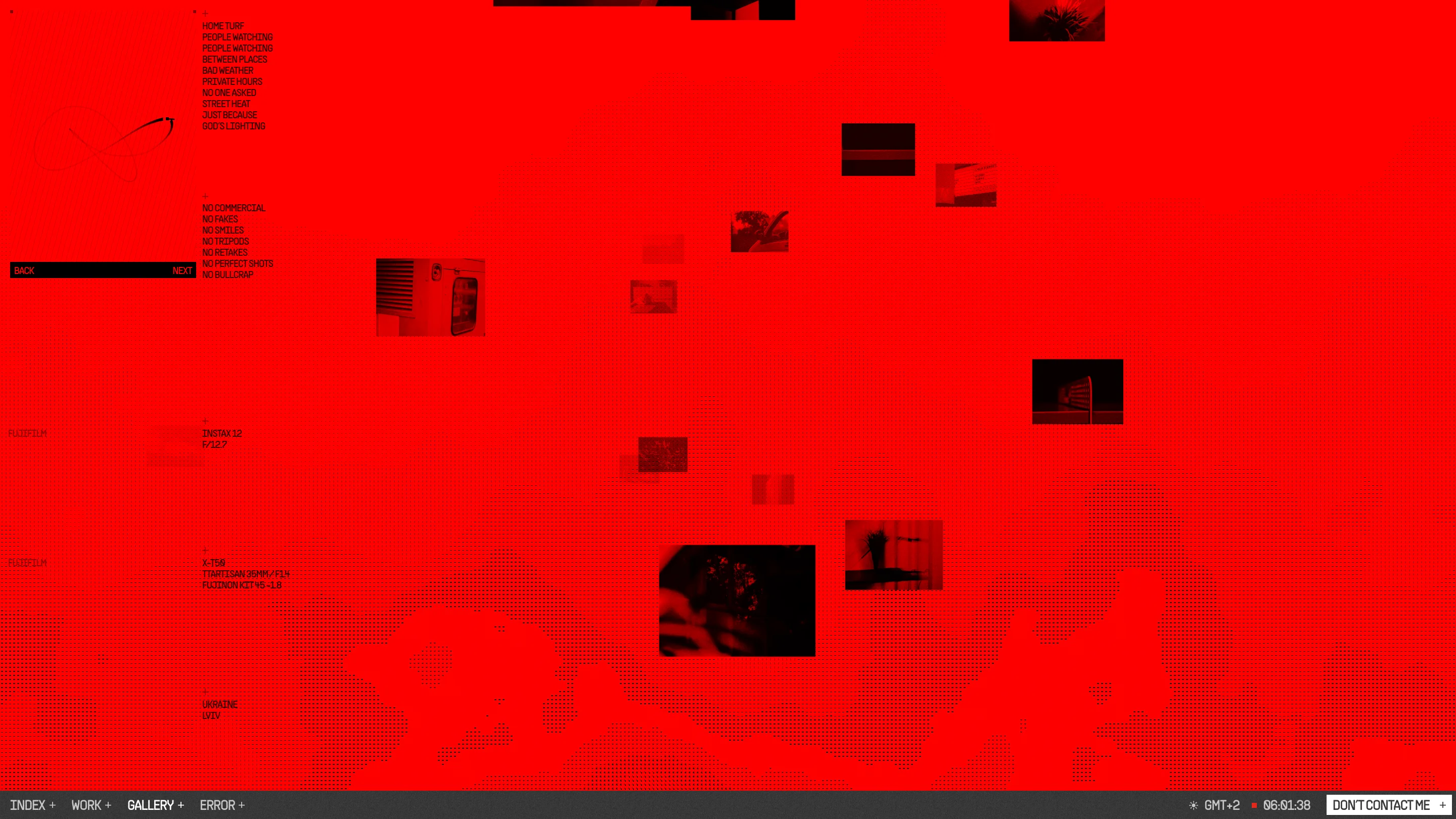
The gallery flips the whole site to flat red. Small photos float across a halftone field, and down the left runs a list of captions that work as a photographer's manifesto: home turf, people watching, bad weather, no one asked, god's lighting. Then the rules: no commercial, no fakes, no smiles, no tripods, no retakes, no perfect shots. Then the gear, down to the Instax 12 at f/12.7 and a TTArtisan 35mm f/1.4 on an X-T50. It's a contact sheet written as a spec.
Why it won
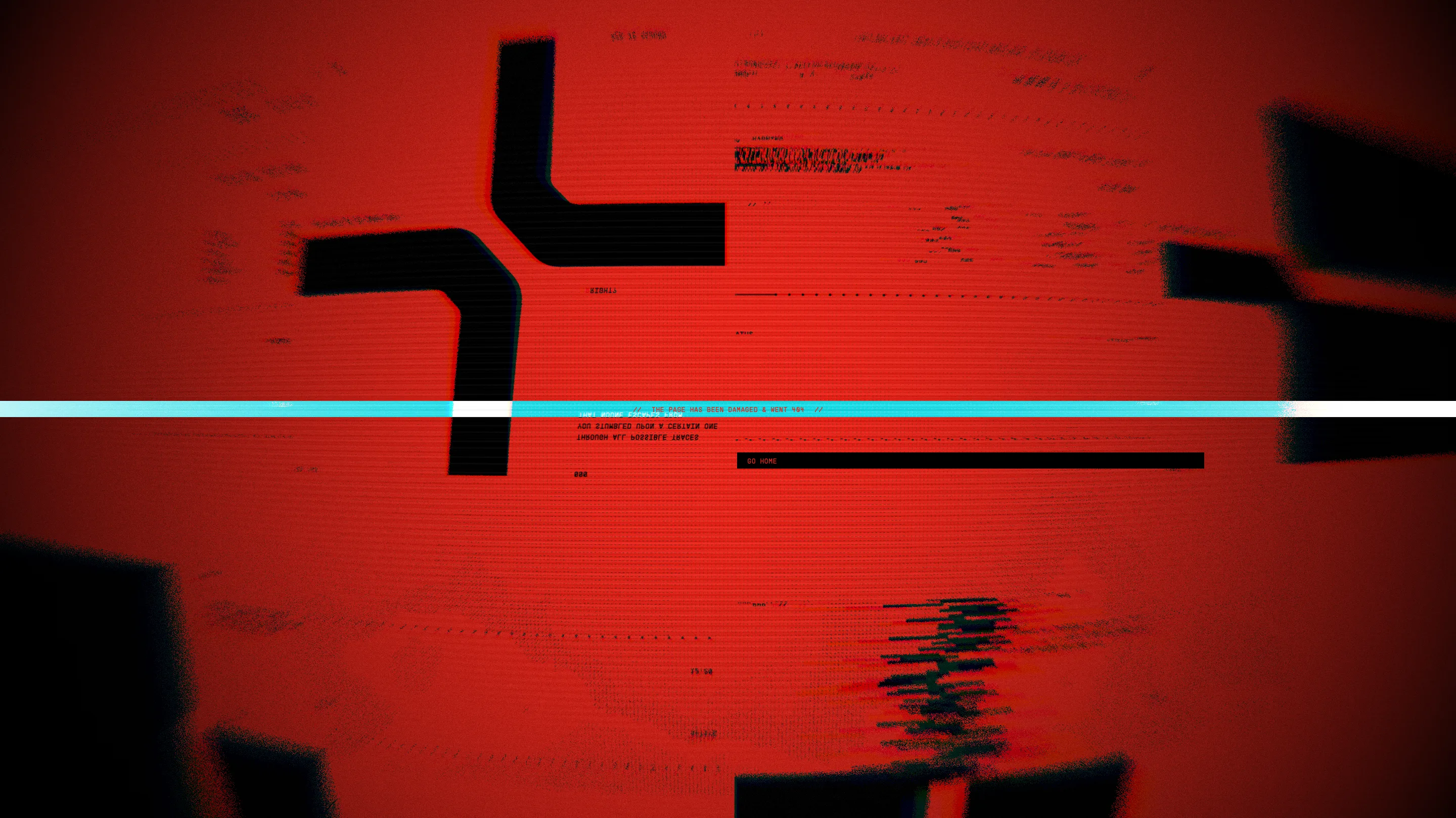
The 404 is in the main navigation. Ulytskyi made the error page a destination, a warped red CRT with a cyan tracking line that reads "the page has been damaged & went 404" and a single GO HOME bar. It's the most finished screen on the site.
The jury's split says what the site is. Creativity scored 7.84 and design 7.66, the top two marks, while usability came in at 6.89. Low-contrast labels and a desktop-only gate cost points, and the site doesn't apologise for them. The "case file" text on the home, written about Ulytskyi in the third person, gives the reason: "Attention is not given. It is taken."
What a working designer can take from it is the discipline. One metaphor, the monitor, decides the type, the colour, the layout, the copy and even the error state. Nothing on the site sits outside it.