Guillaume Colombel's WebGL portfolio shatters one stone
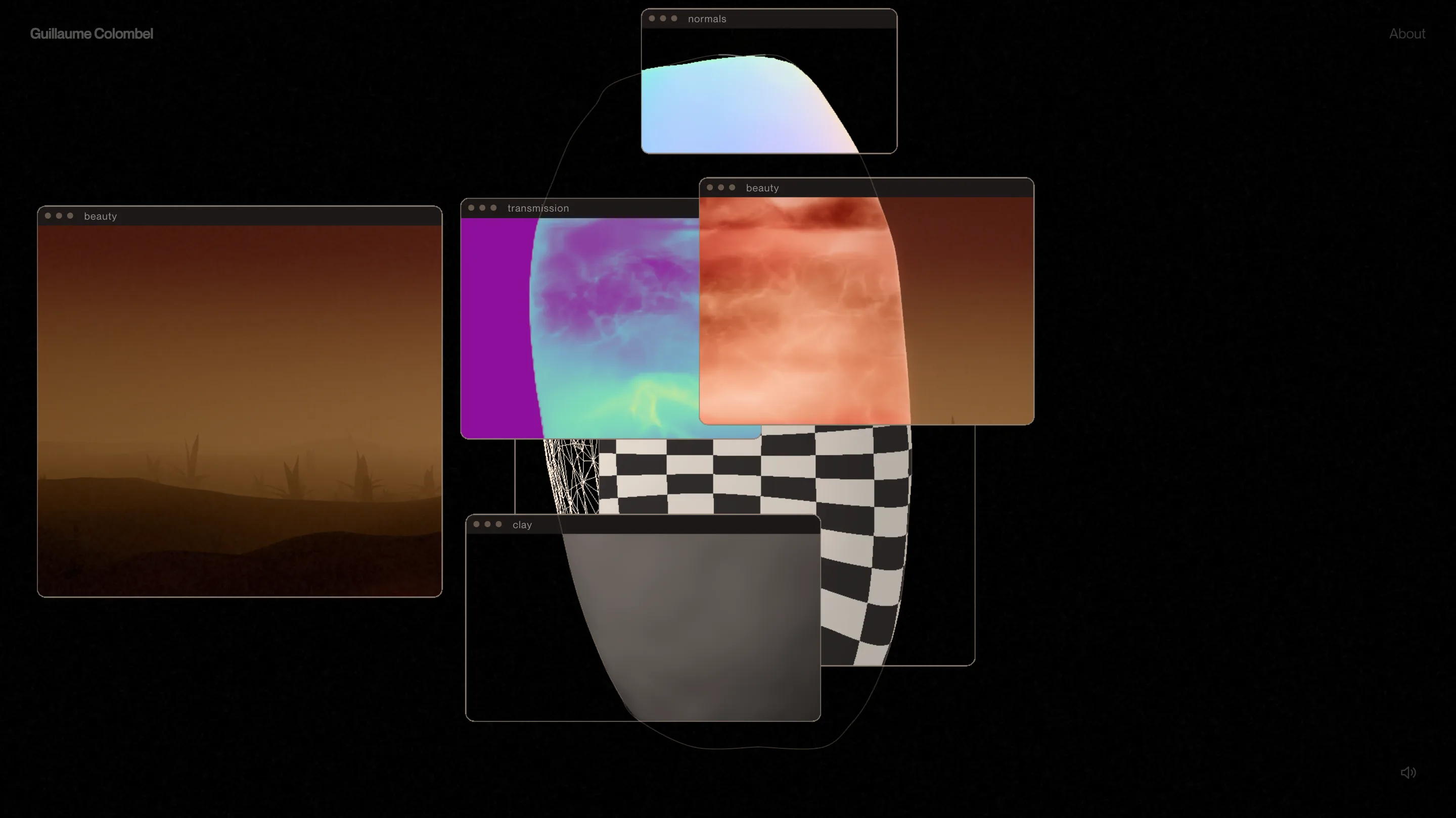
Guillaume Colombel's portfolio is one glowing stone: its loader shows the render passes, and each of the twelve projects breaks it into shards.
Guillaume Colombel's WebGL portfolio is a single glowing stone, and every project you open breaks it apart. The site took awwwards Site of the Day on 28 October 2026 with a 7.5, and its creativity mark (7.81) was the highest of the four. That fits. The whole portfolio is one object, built and rebuilt in front of you.
Guillaume Colombel is a freelance interactive developer in Paris, formerly at Locomotive and makemepulse, and on the awwwards jury since 2019. So this portfolio was made by someone who scores these sites for a living. You can tell.
A loader that shows the render passes
Most of the home's first seconds are spent on the stone, a tall rounded slab the code calls the stele. While it loads, a thin outline of it draws itself in a pale orange line, and the progress travels along that edge with a bright tip.
Then the stone arrives in pieces. Small app windows open over it, each with three dots and a label: normals, transmission, clay, beauty. Each one shows the same object through a different render pass. Normals is a pastel gradient. Clay is flat grey. A checkerboard UV map and a wireframe sit behind them. Beauty is the finished thing, red and amber, lit from inside.
It's a developer's portfolio, and the loader is the CV. You watch the shader stack come together before you've read a word, and the windows double as a joke about the desktop the work was made on. Then they close and leave the stone standing in a dark, wet desert with its reflection under it.
Twelve projects, one stone broken twelve ways
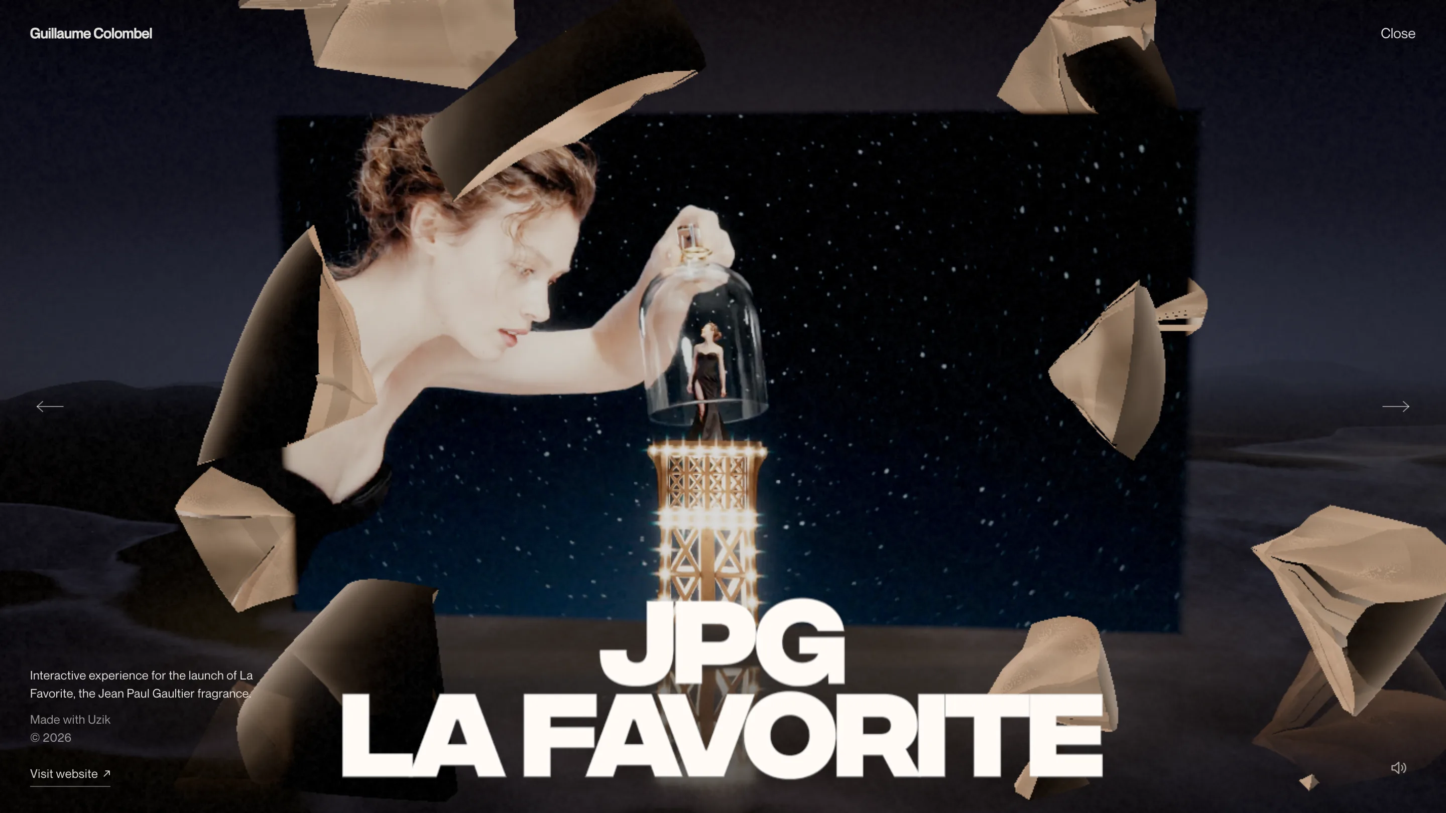
The project list is twelve titles, numbered 01 to 12, from CLARTÉ to Rabanne 1 Million Black. You drag the canvas to move through them. Open one and the stele shatters. Its shards hang in a ring around a flat screen playing the project's footage, and they take on that project's light: rose and copper around CLARTÉ, cold bronze against the night sky of Jean Paul Gaultier's La Favorite.
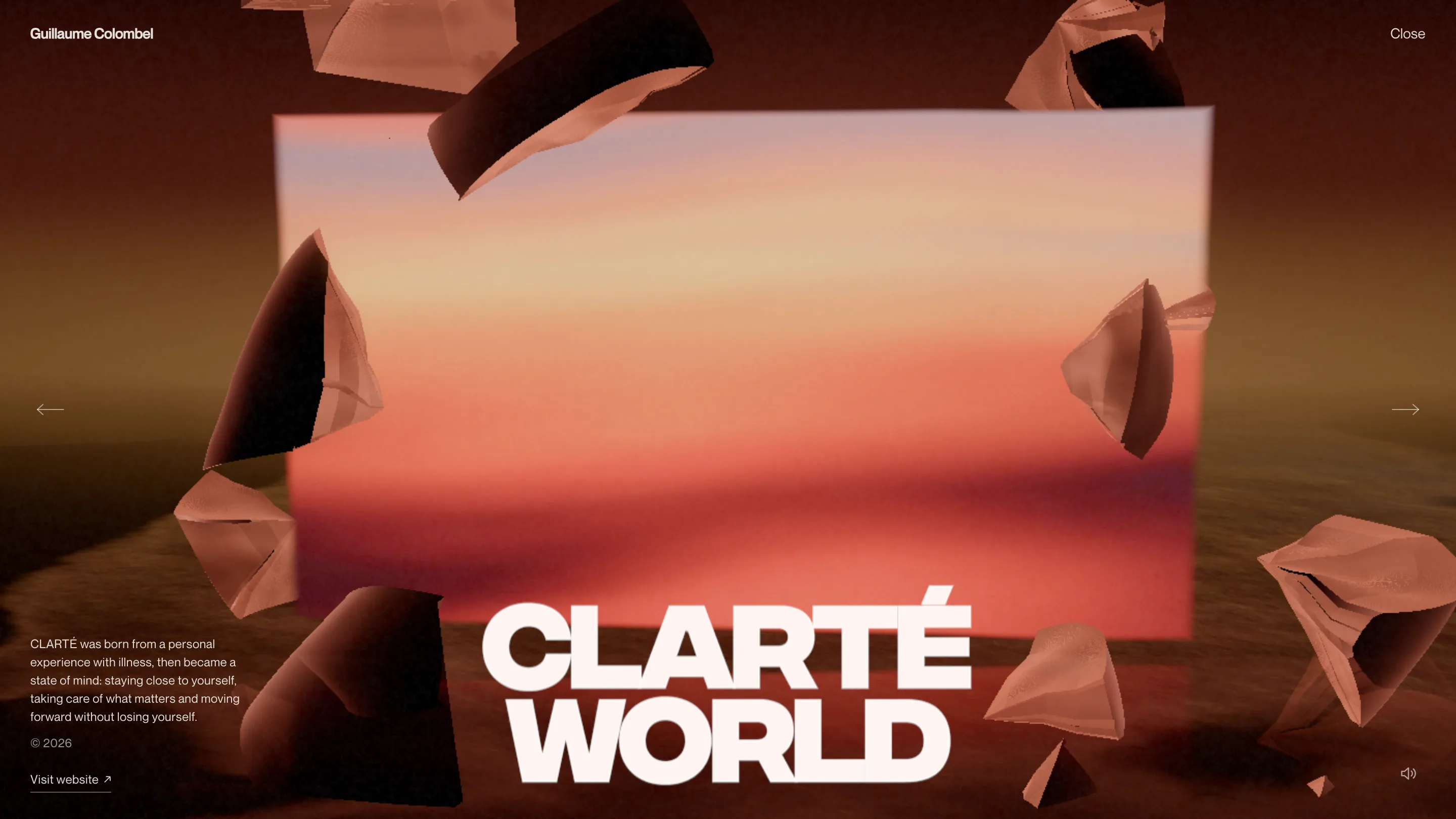
The title sits on the bottom edge in a wide, heavy grotesk, drawn inside WebGL from a signed distance field font so it lives in the same scene as the shards. CLARTÉ WORLD on two lines. JPG LA FAVORITE on two. Each one overlaps the footage and the floor, which ties the type to the set.
Everything else on the page stays small. A two-line description sits bottom left, a year, a Visit website link with an underline that wipes out and back on hover. Arrows sit at the left and right edges at mid-height. The name stays top left, Close stays top right. Four corners, one object in the middle.
The about page puts the stone back together
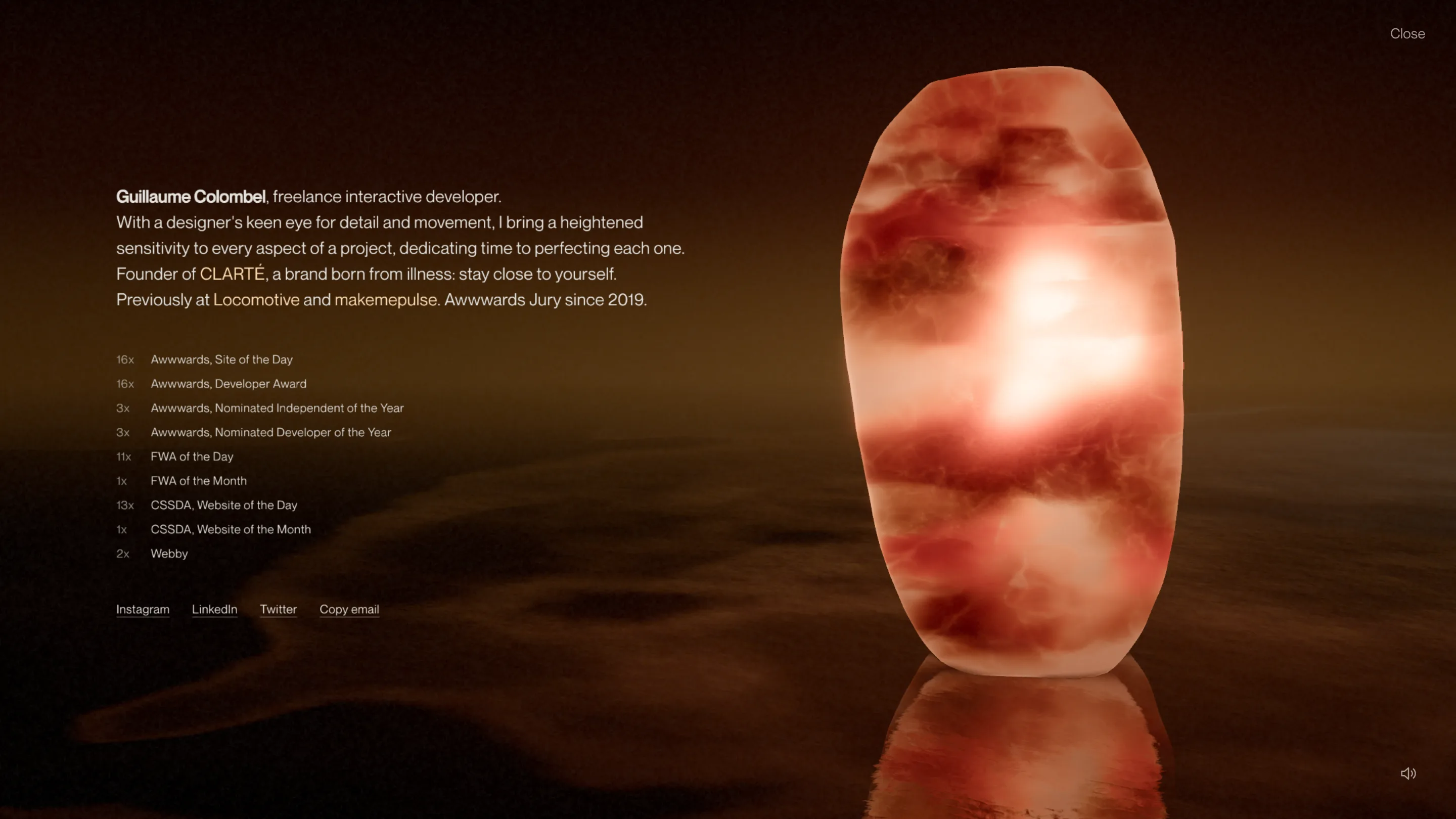
About is where the stele comes back whole. It stands on the right, lit from within like alabaster, with its reflection on the water. The bio runs on the left in Neue Montreal at about 17px, with the links in a pale peach that picks up the stone's colour.
Under it, the record: 16 Sites of the Day, 16 Developer Awards, 11 FWA of the Day, 13 CSSDA, two Webbys. Small grey counts in tabular figures, labels after them. It's the most conventional part of the site, and that's the right call. After two pages of shattered rock, the facts sit in a plain list.
The quiet work under the stone
The craft a jury rewards often sits in the parts you don't see. The palette is two colours plus light: a near-black (#050404) and an ivory, with rust and amber coming from the renders. The nav words split along a jagged diagonal when you hover them, two halves nudged a pixel apart.
And the canvas has an escape hatch. The numbered project list is in the markup the whole time, hidden until a keyboard user tabs into it, and a stone-off mode shows it as plain links. Reduced motion turns off the animations. The sound is off until you ask for it.
That balance is why it works. One heavy idea, the stone, carries the visual load, and the rest of the interface gets out of its way.