Seasats' colour-coded menu maps one long page
Raw Materials gave each section of the Seasats site its own colour, then stacked those colours into the menu. The nav doubles as a map.
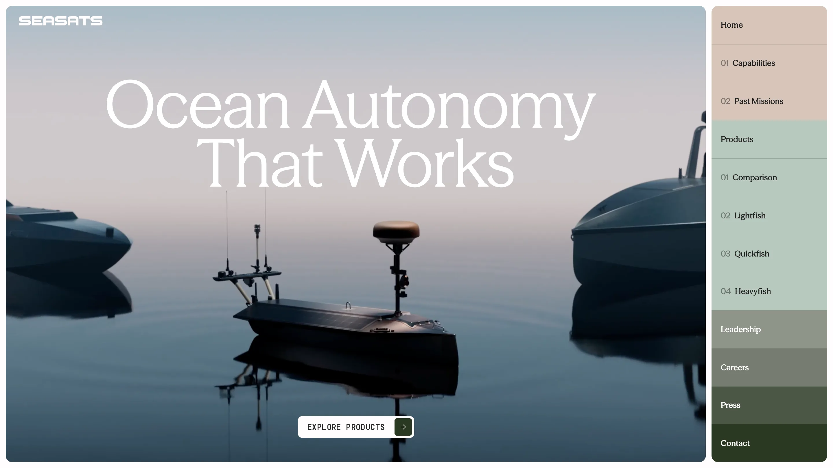
Open the menu on the Seasats site and you get a stack of coloured bands. Warm beige at the top, mint under it, grey-green below that, near-black green at the bottom. Each band is a stretch of the page. Scroll into the vessel section and the background turns mint. Scroll to the end and it goes dark. That's colour-coded navigation doing real work: the menu is a map of the page.
Seasats builds autonomous boats out of San Diego. Raw Materials built the site, and it took awwwards Site of the Day on 8 September 2026 with a 7.44, plus a Developer Award at 7.22.
Colour-coded navigation on a single page
The whole site is one page. A long scroll with twelve anchors leaves you guessing how far in you are, and the colour answers it twice. The menu paints each group the colour its section will be. The scroll rail on the right edge repeats the same stack in miniature, so the map stays on screen after the menu retracts.
The structure is two shallow levels. Home carries 01 Capabilities and 02 Past Missions. Products resets the counter and carries 01 Comparison, 02 Lightfish, 03 Quickfish, 04 Heavyfish. Leadership, Careers, Press and Contact then sit as standalone rows in progressively darker greens. Numbering a list like that is usually decoration. Here the numbers are a scroll order, so they earn the space.
The background does the work
The page runs one long gradient. The hero sits in a pale blue and grey dawn, a vessel on flat water with its own reflection under it. Mint takes over through the product section. Cream warms it. By the footer the screen is burnt orange, a low sun over rendered swell.
Then there's the switch. Pick Lightfish in the vessel selector and the background is mint.
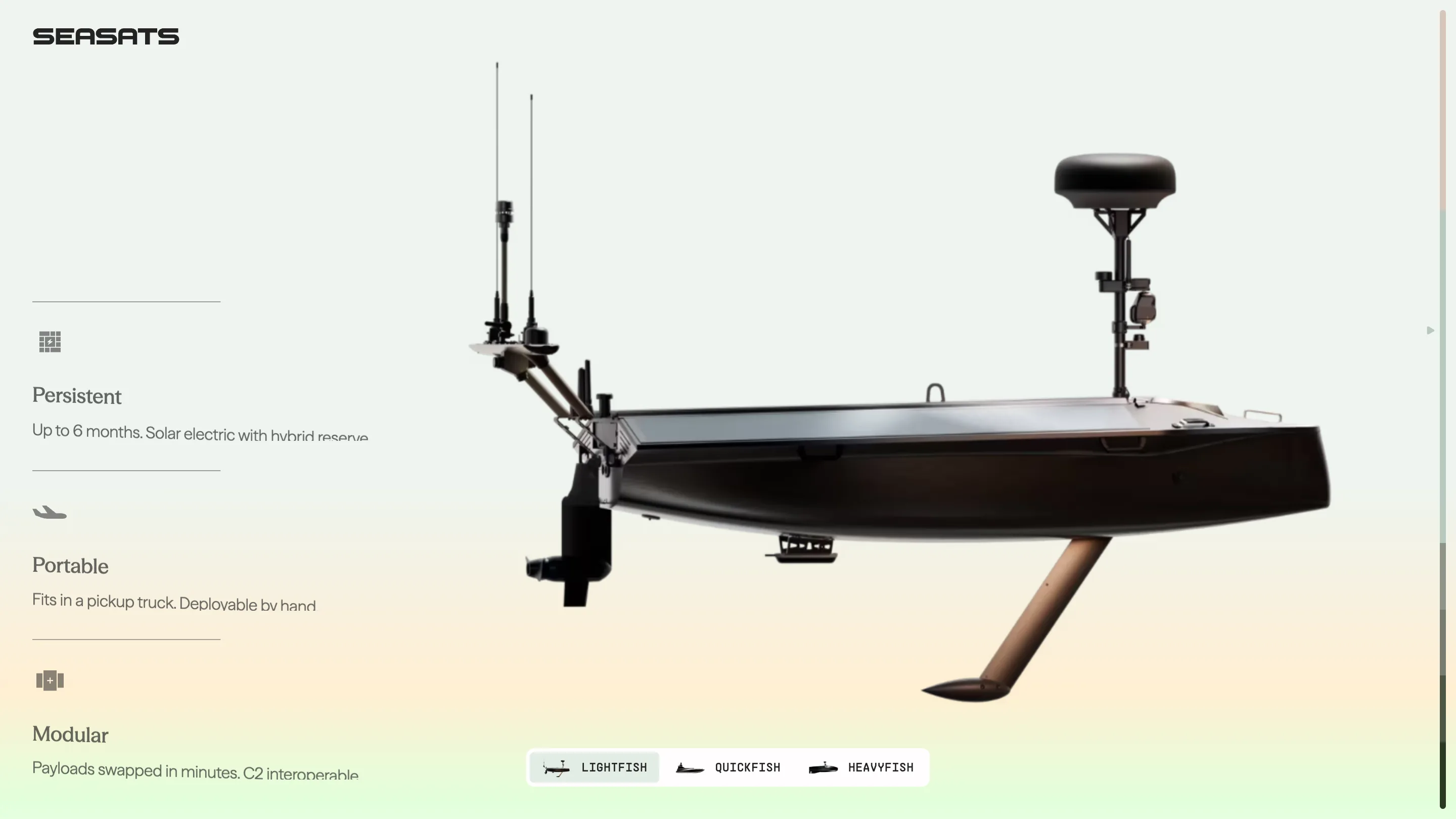
Pick Quickfish and it turns burnt orange.
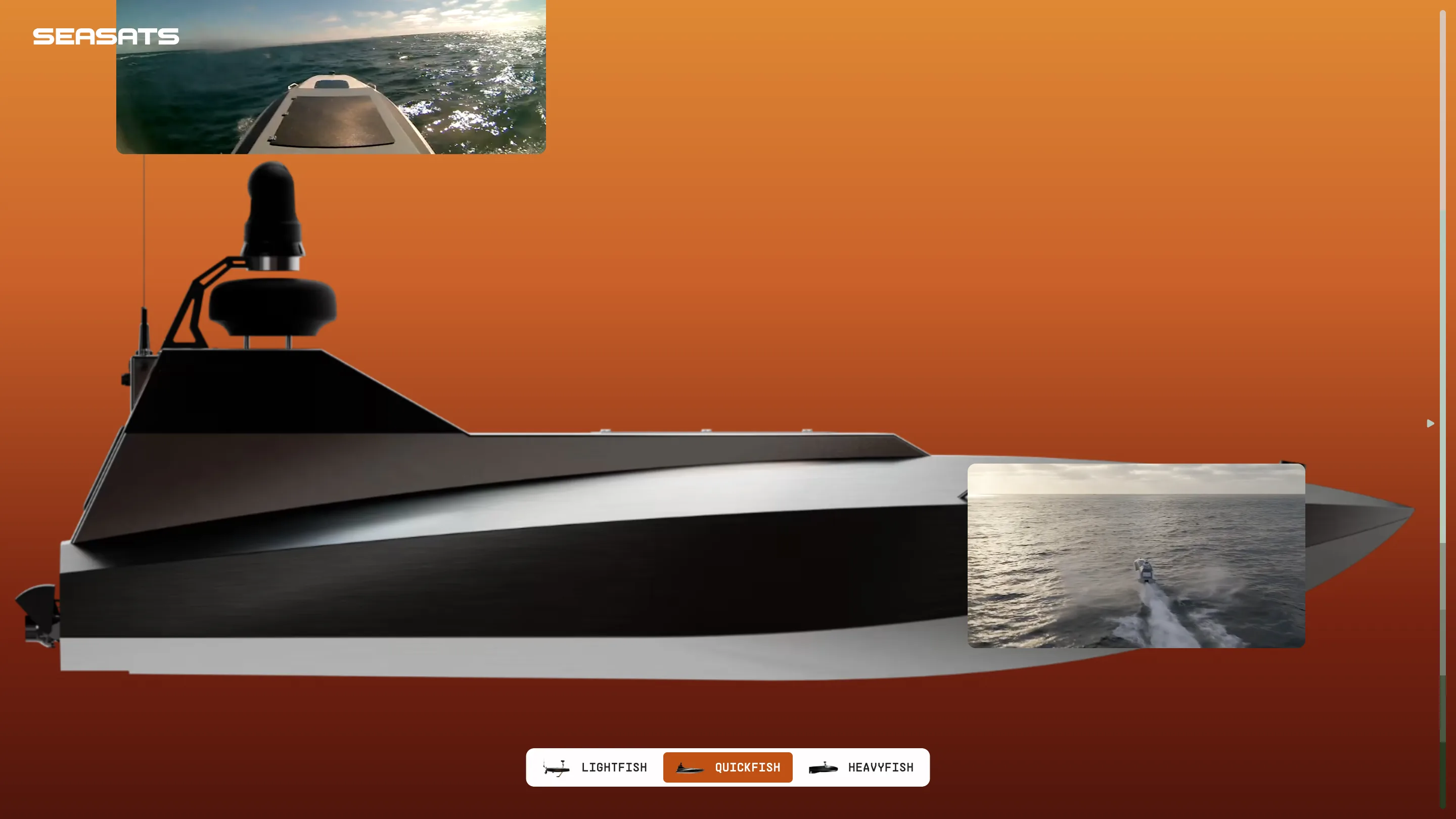
Same layout, same camera angle, same switcher pill. Only the colour and the boat change. It reads like a spec sheet you flip through, and it hands each product a colour you remember.
Three typefaces, three jobs
The display face is a high-contrast serif with fine hairlines. It sets "Ocean Autonomy That Works" and the vessel names. The wordmark is a squared techno grotesk, wide and closed, the kind of letterform that ends up printed on hulls and flight cases. The spec tables are mono: 5 KTS, 305 LBS (138 KG), UP TO 6 MONTHS.
The split is the smart part. Serif carries the language, mono carries the numbers, the wordmark stamps the thing. A defence-adjacent robotics company could have set the whole site in the techno face and ended up looking like a game HUD. The serif keeps it calm, and calm is the pitch.
The footer counts your scroll in knots
At the bottom the site tells you how far you scrolled. Distance scrolled, 3.1 meters. Average scroll speed, 4.292 knots. Under it, one line of copy: "That's like driftwood nudging along a quiet swell."
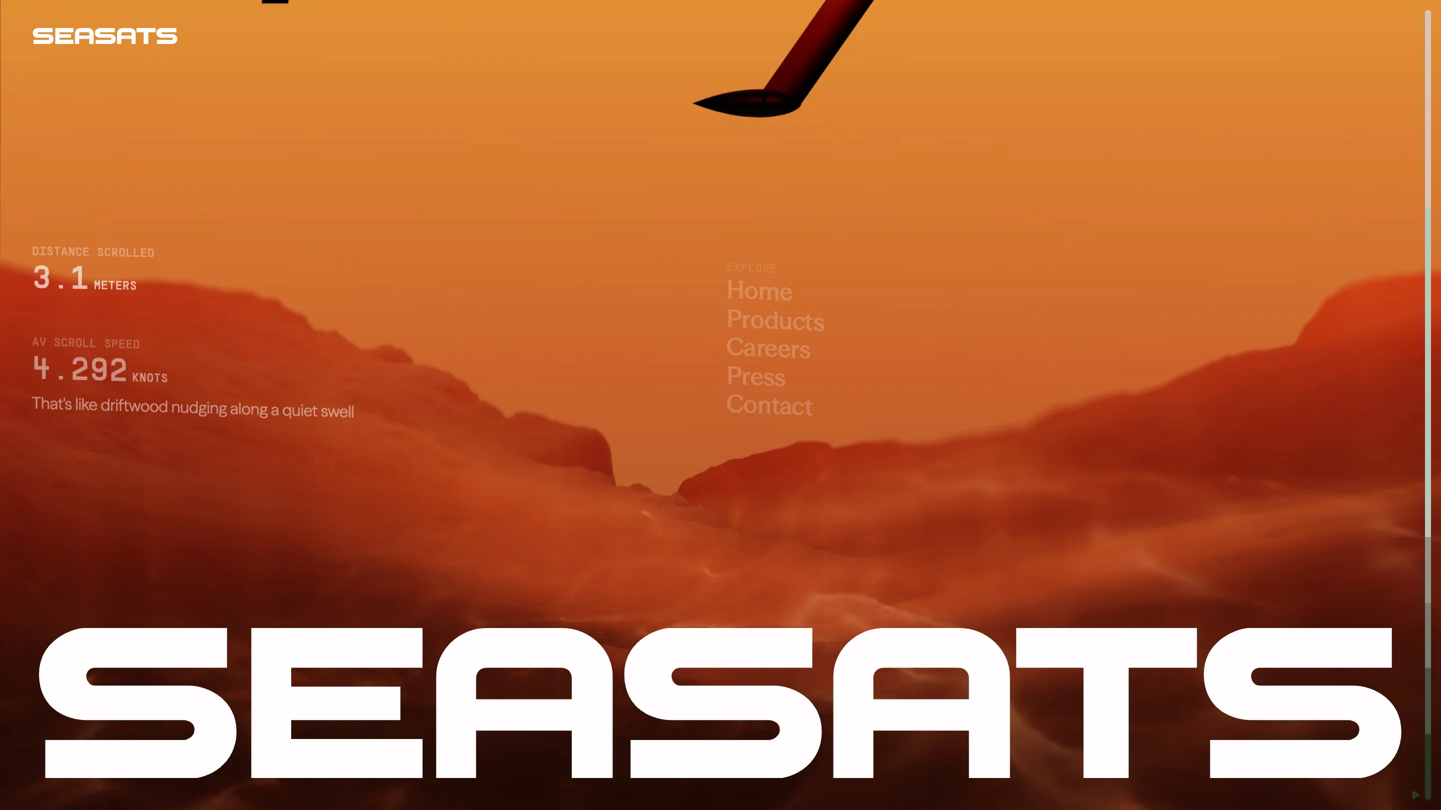
It's a small gag and it stays in character. A company that measures endurance in months and speed in knots gets to measure your reading in knots too.
What it cost
The sub-scores tell the story. Content 7.65, design 7.61, creativity 7.38, usability 7.17. Usability sits lowest, which is what unusual navigation costs. A retractable vertical menu on a one-page site is a bet: people have to open it before it explains anything. The colour is what pays the bet back. Once you've seen mint mean vessels, you stop reading the labels.